Twister in the City Photoshop Tutorial
This tutorial is very customizable, and you can end up with totally different results from what you see here. This tutorial is to show you how to achieve the effect, and perhaps to give you an idea of how it can look, but you should think of the final image that I will create as more of an inspiration than a rule. In other words, learn the concepts, but experiment and try to make it your own as well. Secondly, because this is my first tutorial ever written, it may be a bit different from what you are used to. The steps for example, are quite thorough (sometimes multiple tasks per step) so they are kind of like chapters. Also, this tutorial might be geared more towards intermediate/advanced photoshoppers, but even if you are brand new to the software, you should be able to follow along (I have tried to be as detailed as possible in the procedure. For example: mapping out how to create a new layer).Preview of Final Results

Stock Photos
Here is the stock photo used for this tutorial. You can download the image through Dreamstime by clicking on the image below. We used the highest resolution (unscaled) images available to write this tutorial. If you would like to follow this tutorial using the same settings we used, download the highest resolution (unscaled) images available.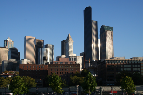
When working with any image in Photoshop, always play things on the cautious side and make new layers for everything. This way, if you make a mistake, you won't have to start all over, but you might just have to re-do one layer, possibly saving you hours of work. Everything in this tutorial should be done on separate layers.
Step 1 – Open the image of the city
Lets get started! Load the image of the model into Photoshop. To do this, choose File > Open, browse for the file, then click OK. For this tutorial, I just decided that I wanted to leave out some of the city, because it was a really big image. So, in the picture below, you can see that I selected a portion of the city to use in the rest of the tutorial using the marquee tool.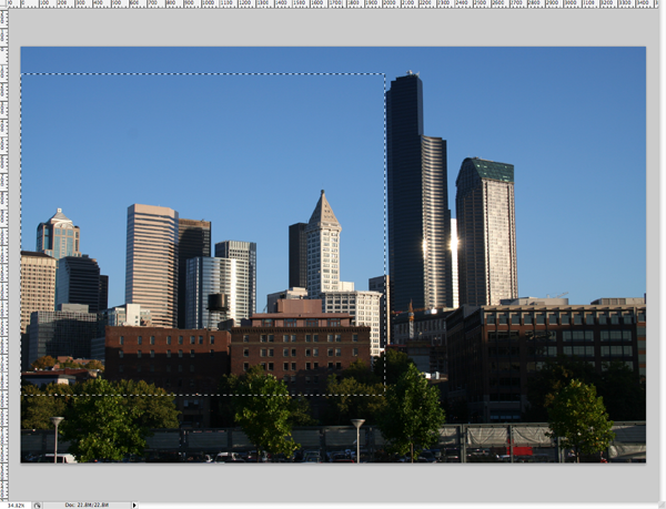
Step 2 - Scale the image selection that you chose in step 1
Alright, so with that selected, copy it (control/command + C) and paste it into a new document (File > New). The default settings will be fine, and click OK. At this point, you will want to resize the document to a smaller scale (or keep it huge, but the tutorial will work with smaller units, so you will have to adjust everything if you keep the image really big). I rescaled the image to a width of 1200 px (Image > Image Size...) put 1200 in for the width, and the height will scale appropriately, automatically. Before you go any further, name this layer "city".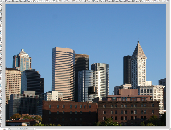
Step 3 - Select the sky
The next thing to do is to select the sky. There are lots of ways to do this, but for this tutorial, I wanted to be quick, so I just grabbed the quick selection (or magic wand) tool "w", and painted the sky until I had it selected. The pen tool will give you more exact results, but you probably won't notice small mistakes further on because of the clouds that we will add later. Just try to get a good selection.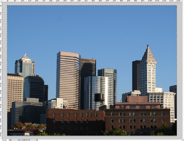
Step 4 - Isolate your buildings
Now you get to choose which buildings you want to apply the effect to. First, you are going to want to select the city instead of the sky, so go to Select > Inverse, and then take the marquee tool "m" and choose the buildings that you want. Hold down option when you click and drag (this will get rid of the selected city on either side of your buildings. You should arrive at something that looks like the following image.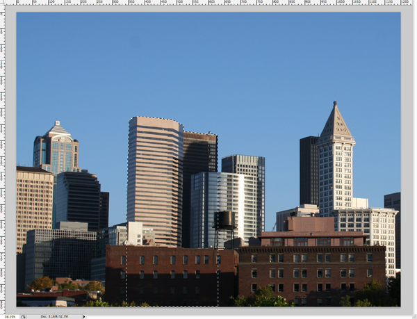
Step 5 - Prepping for a new sky
With these buildings selected, copy them (control/command + c) and paste them into a new layer, right where they were before (nothing should look different, you've only moved the buildings to a different layer). Name this layer "buildings". Now, in the layers palette, select the layer "buildings" (control/command + click on the layer "buildings"), and then turn of the visibility of the "buildings" layer, so you can see what you're doing.
Now go back to the "city" layer (which now is without the buildings that you moved). Then, fill the selection with the color of the sky (use the eye dropper tool "i" to select a blue color somewhere in the sky, and then, fill the selection with the paint bucket/fill tool "g"). You should come up with something like this.
Note: If you cannot seem to select the layer by clicking on it, you are probably clicking the wrong thing. To the left of the layer name, there is a small icon of the layer. You should control/command + click on that image, not the text itself.
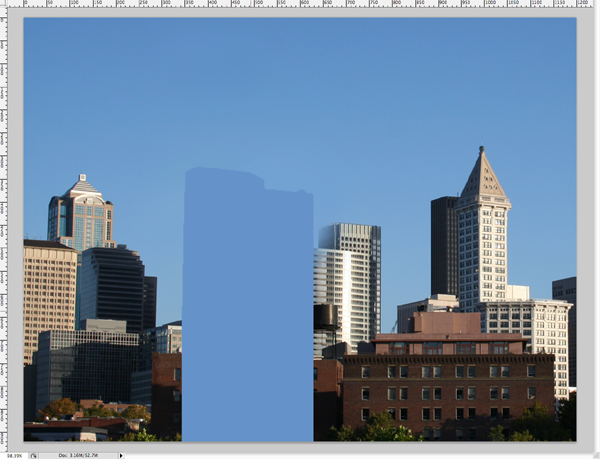
Step 6 - Add a new sky (part 1)
Now, select all the blue like you did before with the wand/quick select "w" tool. With this new selection, create a new layer (Layer > New > Layer) and fill it "g" with a brown (I used #5e5139). You should now see something like this.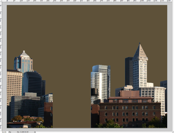
Step 7 - Add a new sky (part 2)
Now we are going to add clouds. In a new layer, using a brown foreground and a black background, go to Filter > Render > Clouds. Once you've done that, hit control/command + T, and drag out the sides of the box so that the clouds get a little flatter, and stretched out looking. At this point, you should only see clouds. Take the eraser (using a brush size of about 300px, hardness of 0) and start erasing the bottom of the clouds layer, so that you can begin to see your city again. Customize this as much as you'd like. You probably want to see most of the buildings though. This is what my result looked like.Don't worry if your colors are a little off, we will fix that in the last step.
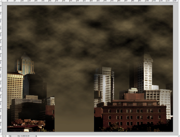
Step 8 - Bring your selected buildings to the top
This is a simple step. Locate your buildings that you isolated a while back in step 4, turn on the layer visibility and move the layer to the top of the stack. You should now see something like this.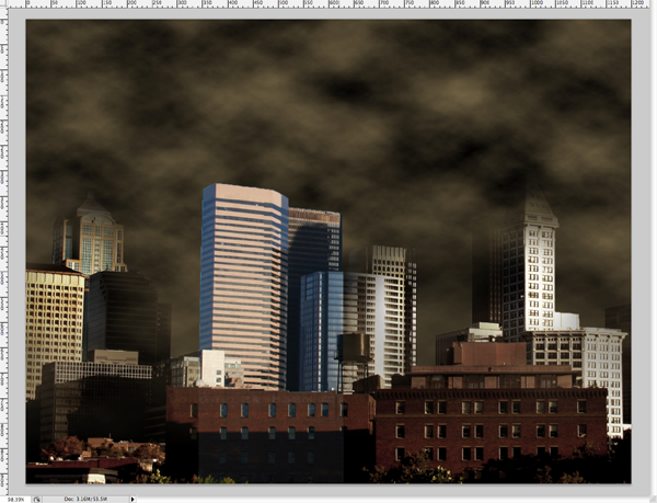
Step 9 - Dissolve Effect (Setup)
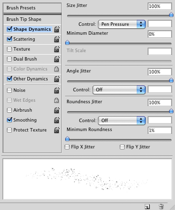
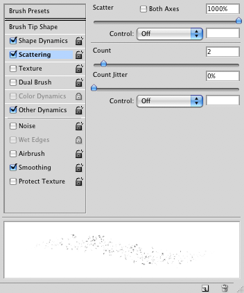
Another easy step. Just follow along with the following images, and set up your eraser tool "e" to mimic these effects. In order to see this brush palette, go to Window > Brushes.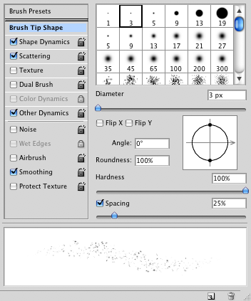
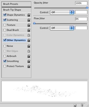
Step 10 - Dissolve Effect (Erasing)
Now for the fun part -- the dissolve effect! Using either a pen tablet, or your mouse, start erasing the top(s) of your building(s) with your newly customized eraser tool "e". This step is very customizable, so results may very significantly. This is what I got.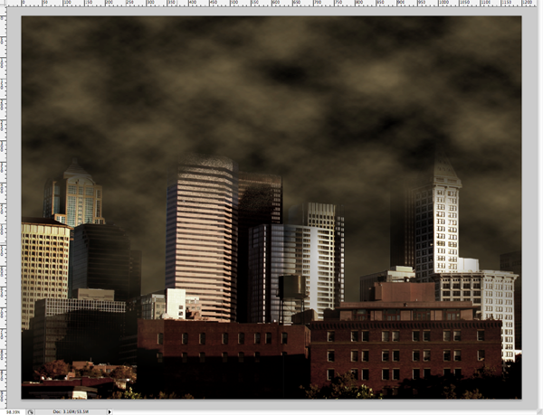
Step 11 - Dissolve Effect (Debris)
This is probably the most fun you're going to have in this tutorial, because now you get to draw the debris! First configure your brush tool "b" to look exactly like your eraser by just following the images in step 9 in case you forgot the settings. In a new layer, starting with the color black, begin to put debris into the scene. Keep in mind that a twister will be sucking it up into the sky, so make it go upward, and off to an angle to add realism. It might look a bit unnatural right now, but it will be fixed later when we add the twister. I said to start with black as your foreground color, but as you go on, start option + clicking around the area you're working on to pick up new colors from the background like browns, reds, and grays. Your debris shouldn't just be one color, but a combination of colors taken from the surrounding environment instead. Play around with it until it looks right to you. Once again, this step is very customizable (like most of this tutorial in fact... so your results can very dramatically.)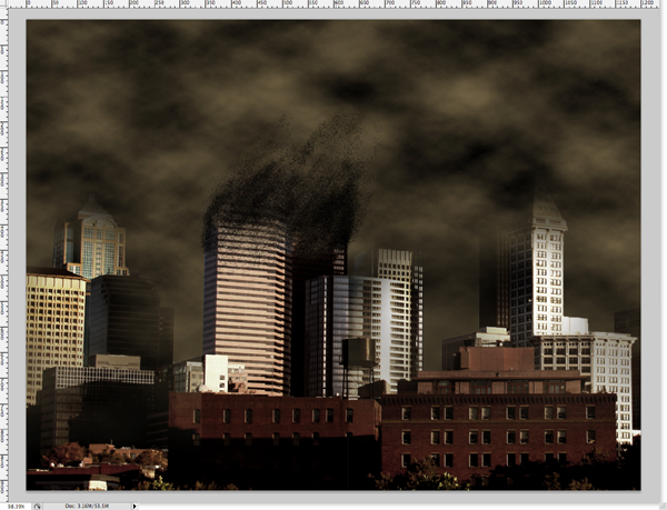
Step 12 - Twister Effect (part 1)
You may have been wondering when this part was going to show up, but fret not, you've made it this far, and you're here now (hopefully, ha). Okay now, exactly like we did in step 7, we are going to add clouds once again (in a new layer of course). Same colors as before will work (black and #5e5139). Once again, click control/command + T and stretch out the sides. Now you have to shape your twister, so take your eraser "e" and (using a size of 300px, hardness of 0) erase the sides of your clouds layer, so that what you are left with looks like a twister. You can also erase some of the inside of the twister so that you can see your buildings of focus more clearly (especially towards the top, where all the action with the debris is happening). When you've done all this, adjust the brightness (Image > Adjustments > Brightness/Contrast and set the brightness to -75).
Step 13 - Twister Effect (part 2)
Now we are going to break up the twister into two parts, a top half and a bottom half. To do this, select your marquee tool "m" set a feather of 100px (we want this to be blurry so that there isn't a harsh line where we've halved the twister). Now, select the bottom half with the marquee tool, and cut and paste this into a new layer (and if necessary, move it back into the position where it was before we cut and pasted it). In the layers palette, set the opacity of the bottom half to 95%. I know it isn't much, but it is just enough to let you see the buildings a bit more clearly.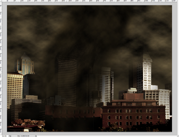
Step 14 - Twister Effect (part 3)
We are going to make this twister look more menacing by applying some layer styles. In the layers palette, double click the layer with the top half of the twister to add layer styles. Follow along the following pictures, and apply the layer styles.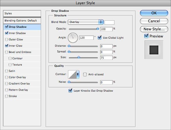
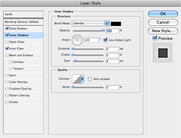
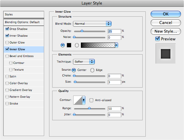

Step 15 - Letterbox Effect
This is something that I like to do to my images to give them sort of an epic/cinematic feel to them. It is extremely simple, and in my opinion, makes a great difference. To do this effect, in a new layer, you take the marquee tool (feather should be set to 0, in case it was still on 100px), and select as much as you want to eliminate on either the top or the bottom. But only do one. As soon as you do one bar, copy the layer (control/command + J) and move it to either the top or the bottom (whichever is missing the bar) until it snaps in place. Then click control/command + E to merge both bars onto one layer. The whole reason that I say to only do one bar, and then copy it is to ensure that both bars are the same size/height as one another.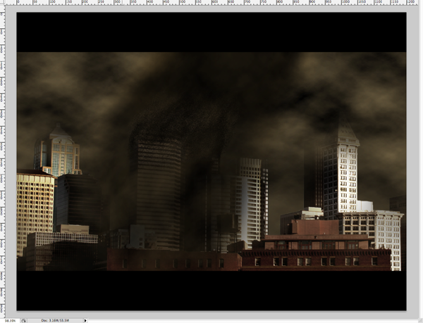
Step 16 - Final Coloring
In order to change the coloring of the entire image, we have to flatten it first. In order to do this, to Layer > Flatten Image. After you've done this, you'll notice that everything has been merged into one layer, and that way, any changes we make to that layer will effect the whole image rather than just parts. Go to Image > Adjustments > Hue/Saturation. Apply the settings in the following image. You can change the hue according to the mood that you want to set in your image, but I suggest that you keep the saturation low like this (from 10 to 25), because in movies, they always take most of the color out of the film. And make sure that you have colorized checked at the bottom.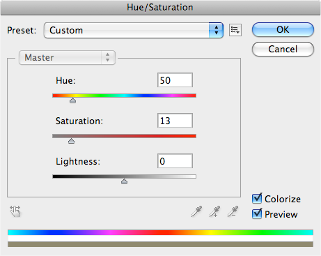
The End - Congratulations
Congratulations, you've reached the end of the tutorial! I hope you understood what was going on, and enjoyed learning about this effect as much as I did teaching it. You have just learned how to take a daytime, clear-weathered, intact city, and turn it into a dark, stormy, destroyed city under attack. Looking back at your original image, you should be able to see quite a difference, and you did it all without premade brushes and photos. If your image doesn't look exactly like mine does, don't freak out. Rather, see this is as a good thing, because you have changed it to make it your own. Keep playing around with it, practice the techniques, and try to improve on areas here and there that you think could use improvement. It is all up to you as the artist -- good luck!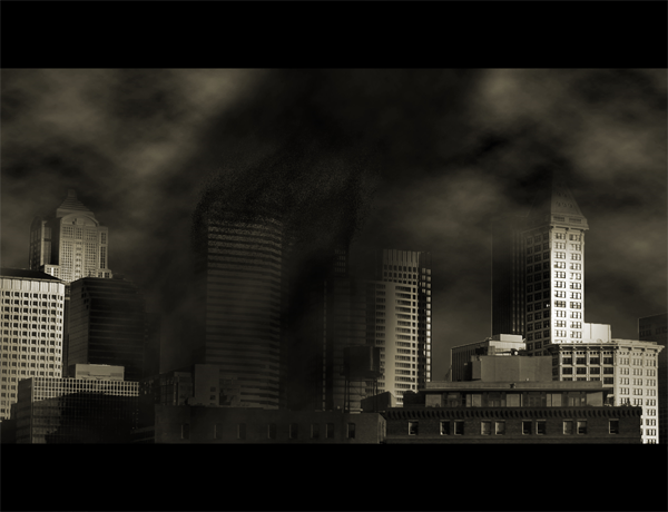
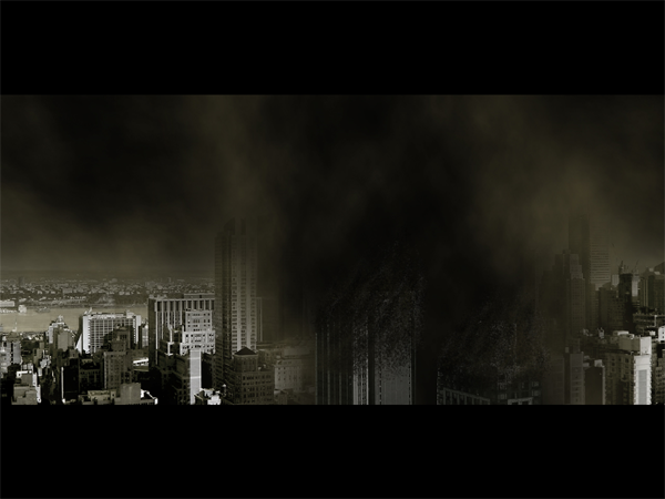
Here’s an alternative outcome using a different image:
0 comments:
Post a Comment