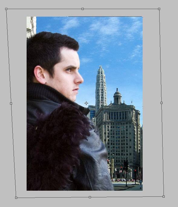
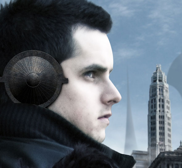
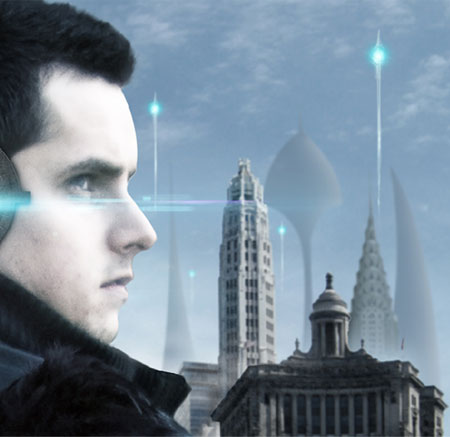
Final Preview

Step 1: Set Up the Canvas in Photoshop
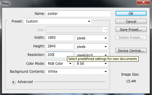
Create a new canvas in Photoshop with Width at 1893px, Height at 2840px, and Resolution at 200px/inch.
Step 2: Place the Poster’s Subject in the Canvas
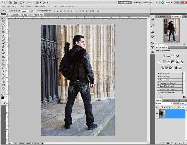
Download and place the image of our model onto the canvas.
Photoshop CS5 offers better edge detection, making masking and selecting objects on top of complex/rich backgrounds quicker and easier. It also lets us adjust values like feathering and contrast on the fly while previewing the result before committing to our settings. Smart Radius helps in detecting the complex edges for creating quick selections.
To begin, load a selection around the model using the Magic Wand Tool (W).
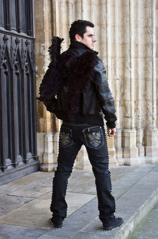
Go to Select > Refine Edge (Ctrl/Cmd + Alt/Option + R). Use the Refine Radius Tool (E) to brush along the edges of the model to get a finer selection.

Set the Smart Radius option to 1.6px. Before finalizing the selection, set the Decontaminate Colors amount to 100%–this removes the background colors present in tricky areas like the subject’s hair.
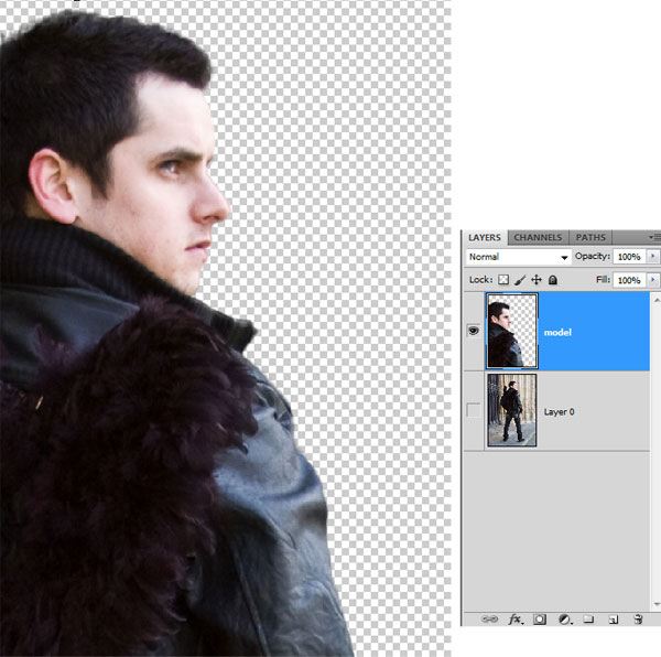
Next, set the output to New Layer because we don’t require any further modifications on the model.
Tip: Setting output to New Layer with Layer Mask lets you modify the selection later on.
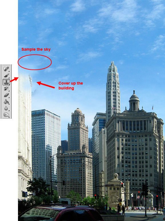
Step 3: Creating and Cleaning Up the City Backdrop
Download and open the Downtown Chicago stock image onto our canvas and transform it as needed with Free Transform (Ctrl/Cmd + T) to match the perspective and scale of our poster.
Let us remove some unwanted buildings using the Clone Stamp Tool by cloning portions of the sky and using those to cover the unwanted buildings.
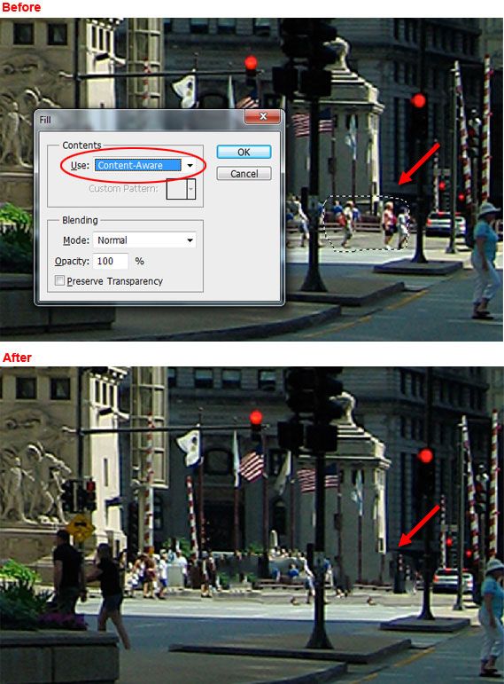
Next, let’s remove pedestrians in the image so that they don’t take away from our sci-fi futuristic theme. We can leverage Photoshop CS5’s Content-Aware option to automatically fill target areas with surrounding content nearby. This makes it easy to hide the pedestrians in the city image. This option is also a wonderful upgrade to the Spot Healing Tool, making the tool much more powerful than ever before.
First, we must select the group of people in the image that we want to remove using the Lasso Tool (L). Then we can access the Fill dialog window by going to Edit > Fill (or pressing Shift + Backspace). Set the Use option dropdown menu to Content-Aware and click OK; and poof, just like magic, our pedestrians are gone!
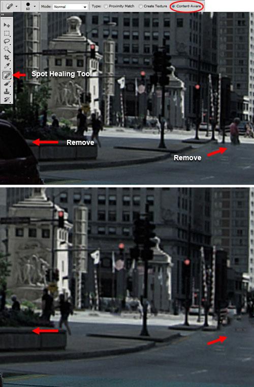
Now select the Spot Healing Tool and set the Type option to Content-Aware in the Options Bar, then brush on the person that is at the bottom-right corner. Also, remove the end of the car on the bottom-left corner.
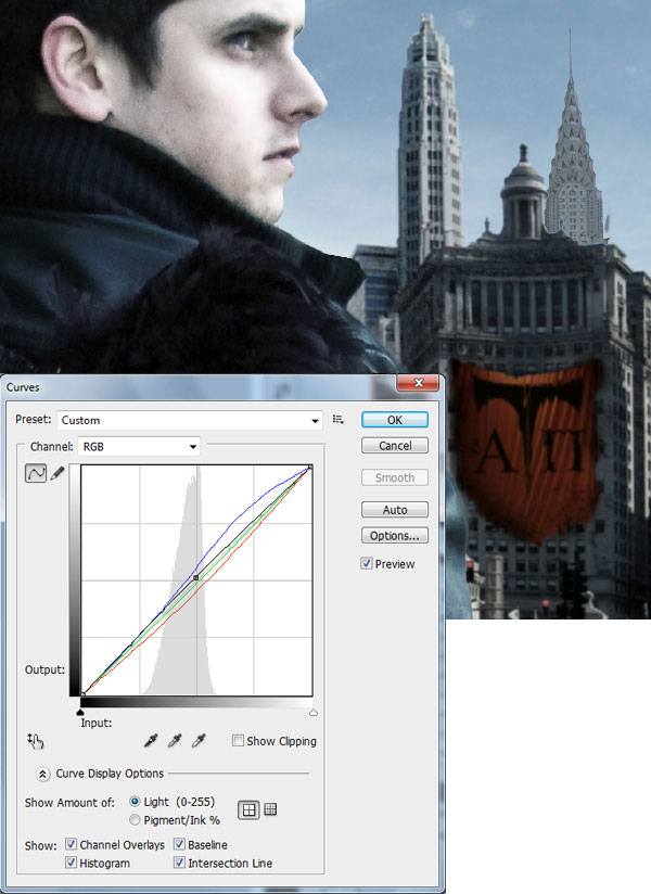
Step 4: Color Corrections on the Subject
In order to combine all the images perfectly, we need to correct the various images to the same color tones. We’ll start with our subject.
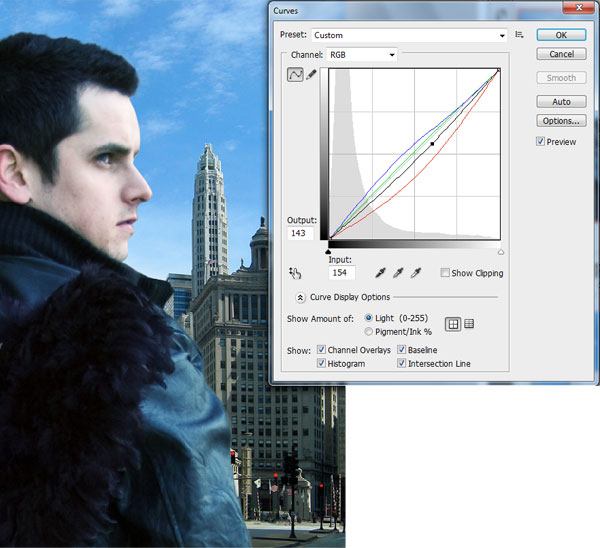
With the model layer selected in the Layers Panel, go to Image > Adjustments > Curves and set the RGB curves as shown below.
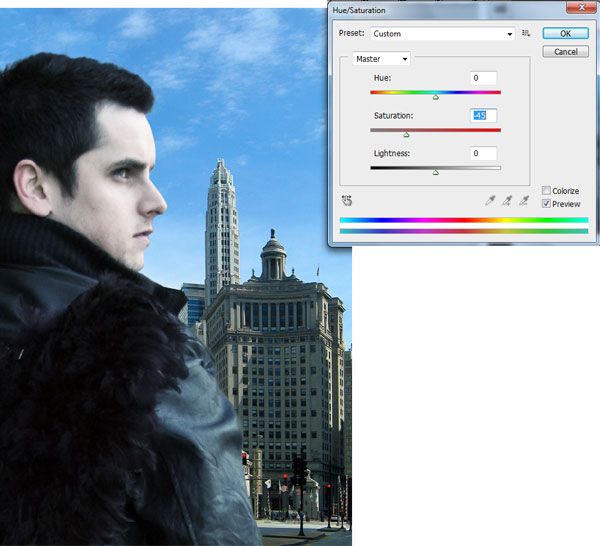
Now desaturate the image to -45 using Hue/Saturation image adjustment (Ctrl/Cmd + U).
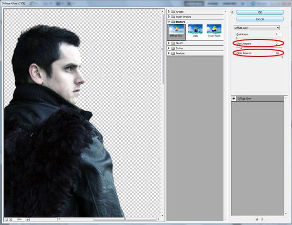
Give the subject a soft glow using Filter > Distort > Diffuse Glow, with Glow Amount set to 2 and Clear Amount to 20.
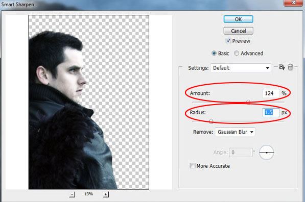
After adding the glow effect, you will see that the subject of our poster is too smooth and blurry. Let’s correct that by sharpening the layer using Smart Sharpen (Filter > Sharpen > Smart Sharpen); set the Amount to 124% and Radius to 1.5px.
Step 5: Enhancing the City Backdrop
Using a technique similar to the previous step for correcting the poster’s subject, go ahead and correct the color of the city background layer.

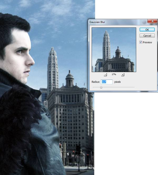
Generally, when we want to make an element of a composition attract the viewer’s focus, what we can do is slightly blur the other components within the composition. Since we want our subject (the model) to be the focal point, we can blur the city backdrop a tiny bit. Moving forward: With the city layer selected, go to Filter > Blur > Gaussian Blur (set the Radius to 3.7px).
Step 6: Creating a Banner on a Building
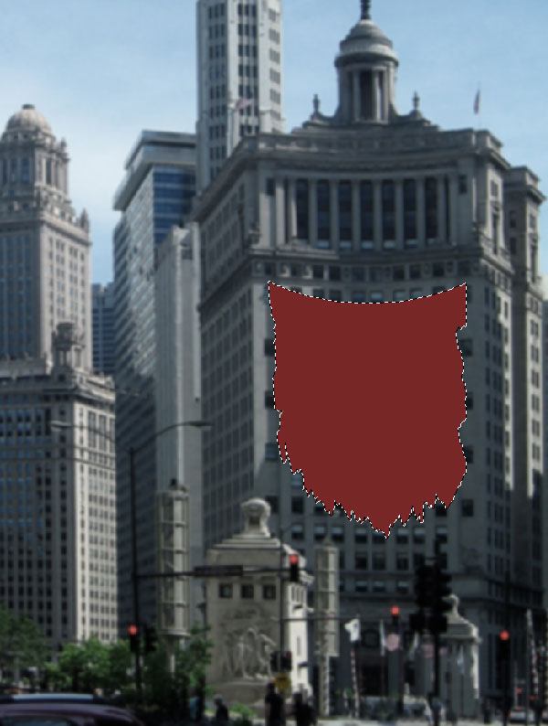
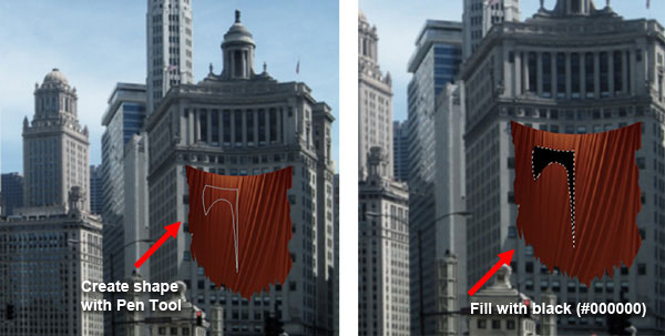
Let’s accent the backdrop a little bit by adding a new element: A banner. Create the shape of the banner on one of the buildings in the cityscape backdrop using the Pen Tool (P) with the mode set to Shape layers and Color at #782726.

Switch your tool to the Lasso Tool, make jagged edges around banner to make it look worn and torn, then just press Delete to remove the selected areas.
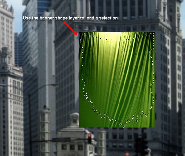
Now we should give our solid-surfaced banner some folds to make it look more realistic. Locate a stock image of some sort of cloth or folds texture, preferably one that is smooth (like silk) and with creases and folds. Get creative with this! Here are some suggestions:
- Red Silk Fabric Texture 1
- Red Silk Fabric Texture 3
- Folds: Texture Pack
- cloth2
- Stock Fabric 14
- Ivory Curtain Cloth Texture
Place your chosen stock image over the banner and resize it to match the scale of our composition. Cut its edges by Ctrl/Cmd + clicking on the banner shape’s layer, going to Select > Inverse and pressing delete to remove the selected area.
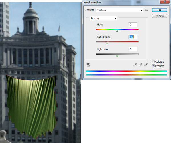
In this scene, we don’t want the banner to be bright because it might take away from our focal point too much (the model), hence, we need to desaturate and decrease the brightness of the folds layer in order to harmonize it with the scene and to make sure that our visual hierarchy is correct.
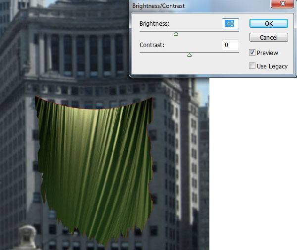
With the folds layer selected, go to Image > Adjustments > Hue/Saturation and decrease the Saturation level depending on the image you chose (with my stock image, I had to decrease the Saturation to -47).
Then use the Brightness/Contrast image adjustment to decrease the Brightness of the image (I used -40).
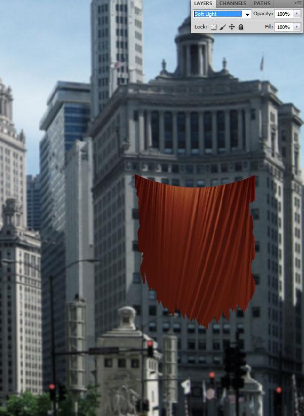
Now set the Blend Mode of the folds layer to Soft Light to let the red color we originally chose show through.
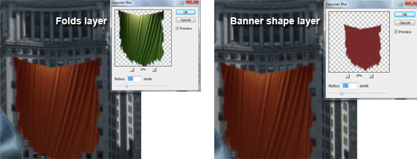
In order to blend the banner with the building better, give both the banner layer and folds layer a Gaussian Blur (Radius: 3.7px).
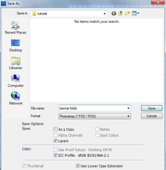
Step 7: Save the Folds Layer as a PSD
Hide all the layers except the folds layer, and then save it as PSD file. I saved this file with the filename of banner folds.psd. Keep this file handy; we will be using it in a subsequent step.
Step 8: Creating Artwork on the Banner
We should make some artwork on our banner to make it more interesting.
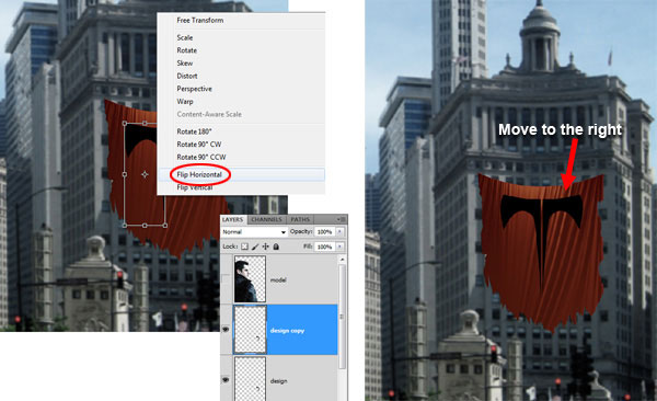
Create a new layer for the banner’s artwork. With the Pen Tool (P), create a shape as shown below and fill it with black.
Duplicate the layer we just created, then use Transform > Flip Horizontal (or right-click on the shape in the canvas and choose Flip Horizontal from the contextual menu that appears); move the duplicate on the right side of the original.
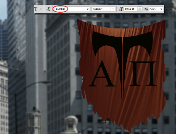
Now let’s add some letters towards the bottom of the banner. Use the Horizontal Type Tool (T) to type "A" and "P" with the Symbol font. Right-click on the text layer and choose Rasterize from the contextual menu that appears so that we can perform transformations on it and change its Blend Mode later on.
Step 9: Blending the Artwork with the Banner
In the Layers Panel, select the artwork layers and the text layer, and merge them together (Ctrl/Cmd + E). Name this layer "Artwork" to keep our work tidy.
Make sure that the "Artwork" layer is the active layer, then go to Filter > Distort > Displace, set Horizontal Scale and Vertical Scale to 10, and then press OK, which will open up the Choose a displacement map dialog window where you should locate and choose the banner folds.psd file we saved in a previous step. This results in a better blending of the artwork with the folds of the banner.

Let’s further enhance the blending. Right now, the artwork is still too harsh. Let’s give it a Gaussian Blur (Radius: 3.7px). This will also improve our depth of field (i.e. since it’s farther away from the foreground, it’s blurrier).

Step 10: Give the Banner Dark Highlights and a Shadow
We will manually highlight portions of the banner, as well as give it a drop shadow. Create a new layer for the dark highlights and use the Brush Tool (B) to paint some soft highlights onto the left side of the banner–load a selection around the banner shape to keep yourself from painting outside the banner. Decrease the Opacity of the highlights layer to 30%.
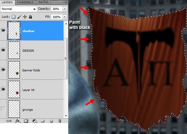
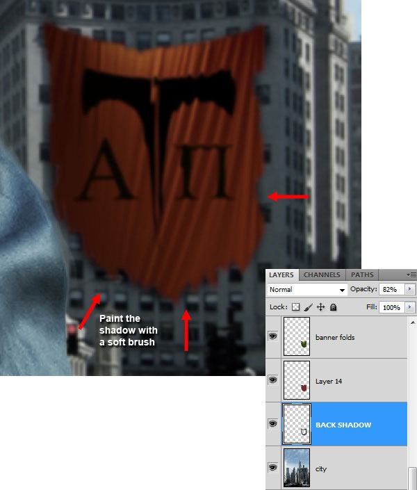
For the shadow, create a new layer under the banner layer, then use the Brush Tool again to paint the drop shadow that is casted by the banner onto the building behind it.
Step 11: Give the Banner a Grungy Appearance
I really want to reinforce the worn-and-torn look of the banner, and as it stands, it can become a bit "dirtier". So let us use some grunge brushes to stylize our banner. Find your favorite grunge brush (make one of your own, use one of the brushes you already have installed, or download and install this Grunge brushes library).
Create a new layer, and then use the Brush Tool to paint the grunge brush strokes on the edges of the banner. Again, you could load a selection around the banner shape so that you don’t accidentally paint outside of the banner area.
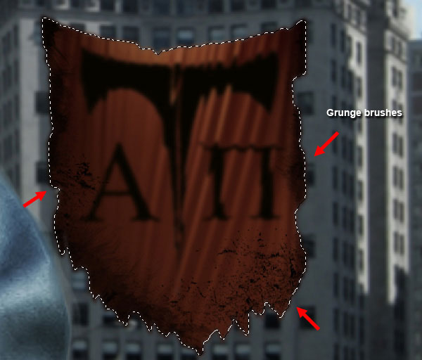
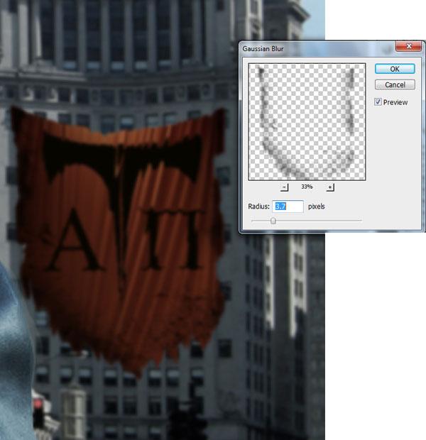
Use the Gaussian Blur filter (Radius: 3.7px) on the grunge brush layer to soften it up a bit.
Step 12: Grunging Up the Buildings
Let’s give the buildings a worn-and-torn look; I think this is an interesting juxtaposition to the foreground and our focal point, which will be futuristic, new, and sci-fi themed.
Load a selection around the buildings, copy the selected area, and then place it on a new layer to isolate them (let’s call this layer "city buildings" to distinguish it from the "city" layer).
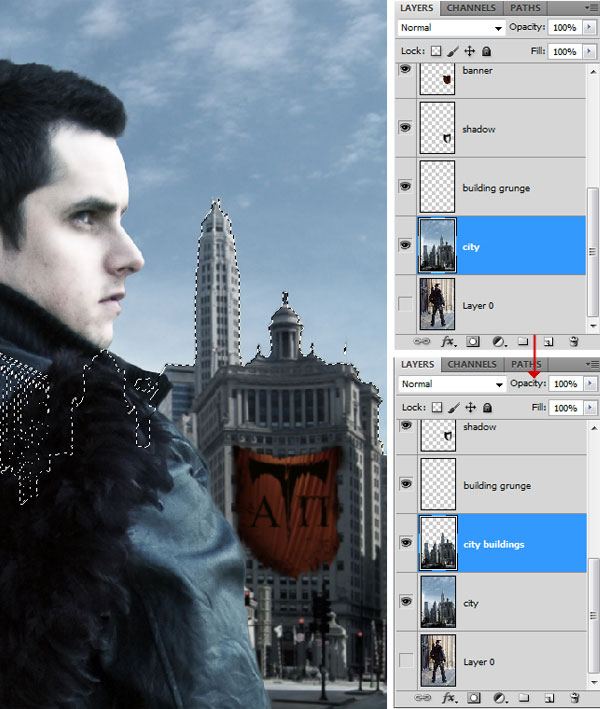
With the buildings still selected, create another new layer (let us call this layer "building grunge"). Make sure that your Foreground Color is still set to black (#000000) and paint on the new layer using some grunge brushes (you could use the one we used before, or you could try out the Ice Grunge Brush Set).
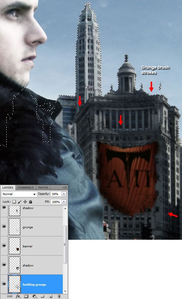
Now apply the Gaussian Blur filter (Radius: 3.7px) to the "building grunge" layer.
Step 13: Adding a New Building (Tower)
Let us create a building that is located behind the "city buildings" layer. Download and open the City Stock 5 image in Photoshop. Isolate one of the buildings from the stock image and copy it over to our main document (behind the "city buildings" layer).


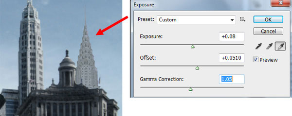
Correct the colors of the tower using Curves image adjustment and Exposure image adjustment.
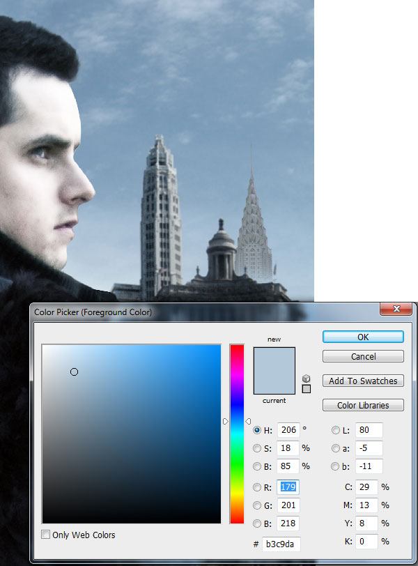
Step 14: Creating a Foggy Atmosphere
Generally, when buildings are seen from a distance, the base appears to be vanishing due to it being farther away from the viewer’s position, or because of fog. So, we are going to create the illusion that the base is slightly foggy by painting the base of the tower with a grayish blue color (#b3c9da) using a soft brush.
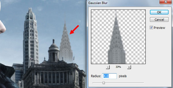
The tower we added in the previous step must be blurred, but since it is farther away (compared to the other buildings behind it), it must appear more blurred than the buildings in the "city buildings" layer. Hence, let us use a slightly stronger Gaussian Blur filter (Radius: 4.0px) on the tower’s layer.
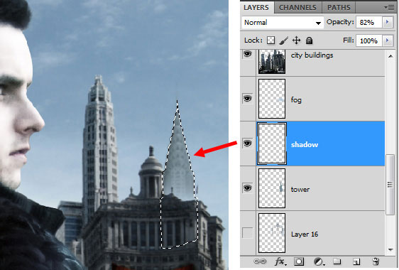
Next, hold down Ctrl/Cmd and then (in the Layers Panel) click on the thumbnail of the tower layer to load a selection around the tower. Then, create a new layer and paint dark highlights around its edges.
Step 15: Creating Sci-Fi Buildings from Scratch
Create a new layer behind the tower layer for some new buildings that we will be introducing to our poster. Draw futuristic-looking building shapes with the Pen Tool (P), right-click inside the paths you drew, and choose Make Selection in the contextual menu that appears.
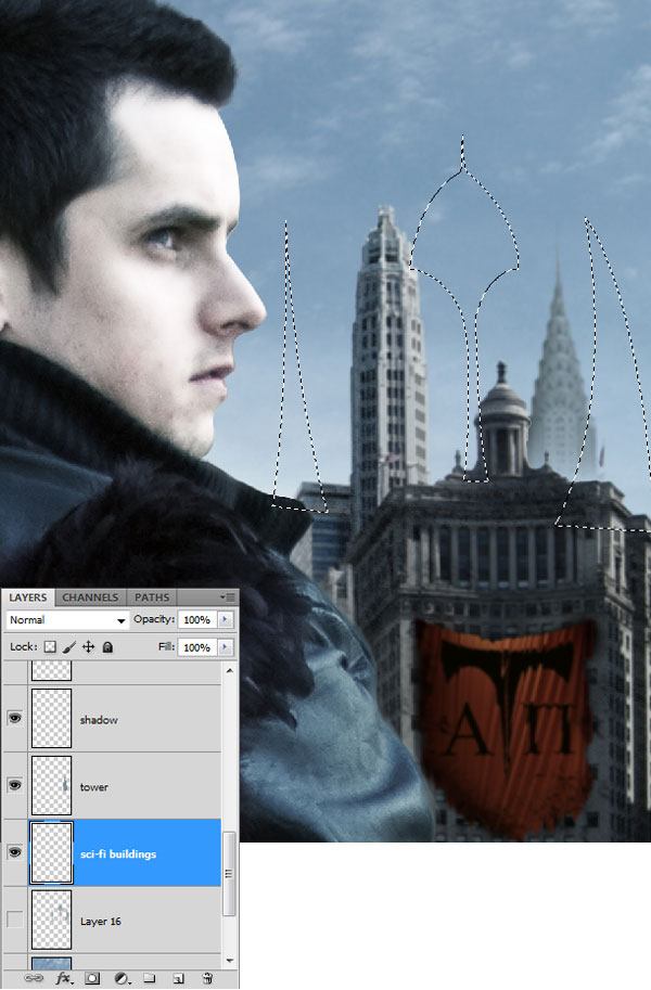
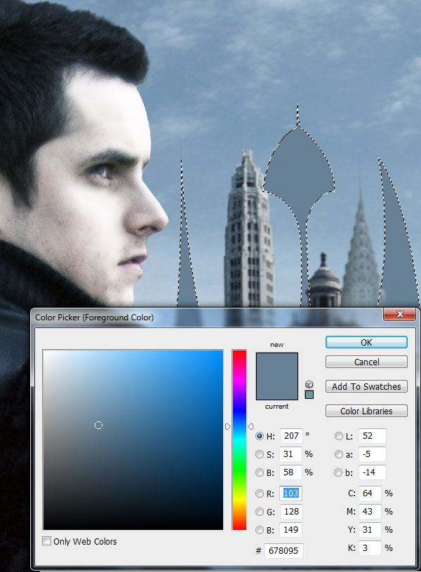
With a dark gray, bluish color (#678095), paint inside the selection.
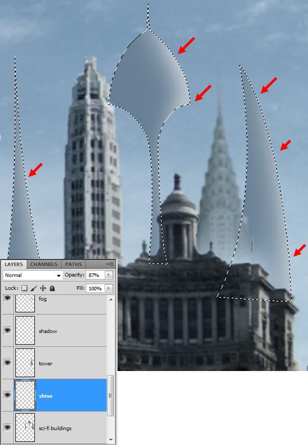
In our composition, we can see that the light source is coming from the right side, so we need to paint highlights on the right side of the buildings. Create a new layer, switch your Foreground Color to white (#ffffff), and then use the Brush Tool to paint along the right sides of the building.
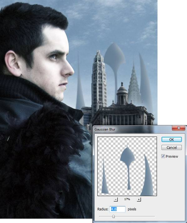
Make the "sci-fi buildings" layer active, then give it a Gaussian Blur (Radius: 4.8px).
Step 16: Creating Fog Behind the Buildings
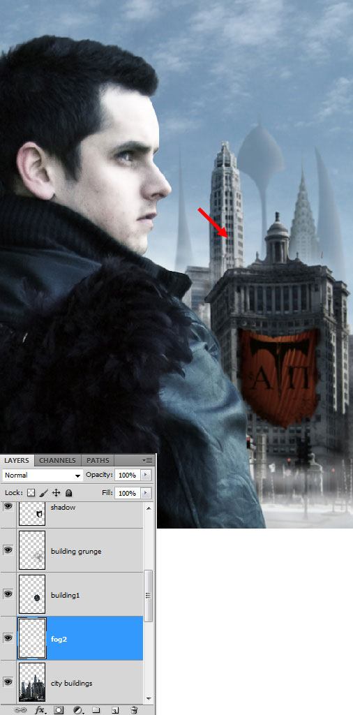
To create the fog behind the buildings, create a selection of parts of a building then copy the selected area on a new layer (let’s name this layer "building1").

Create a new layer in between the "building1" layer and the "city buildings" layers for the fog. Then, for the Brush Tool, locate a fog-like or cloud-like brush tip (or use the fog-mist brushes listed under Tutorial Resources) and then paint some white fog. Since this layer is in between the "building1" layer and the "city buildings" layer, it is as if the fog is behind the building. Continue to use this technique to add as much fog behind the buildings as you would like.
Step 17: Creating a Futuristic Headphone
Let us give our subject an interesting accessory: a headphone. Download this Textured Disk, place it above the right ear of the subject, and resize it as needed using Free Transform (Ctrl/Cmd + T).
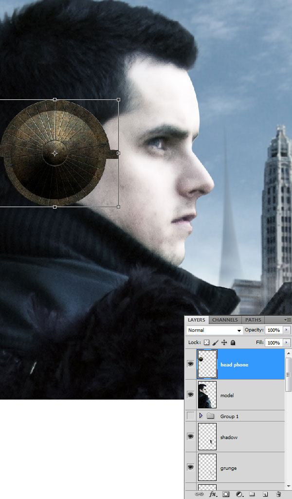
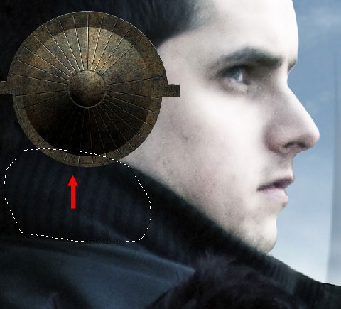
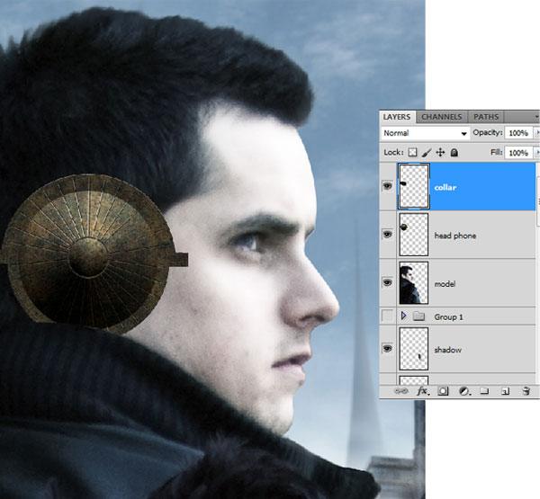
We need to retouch this a bit to make it more seamless with our scene; in particular, the bottom part of the headphone should be below the jacket collar. Let us correct this by using the Polygonal Lasso Tool to select the unwanted parts and then deleting them.
Use the techniques we have used before to correct the colors of the headphone to match our color theme.
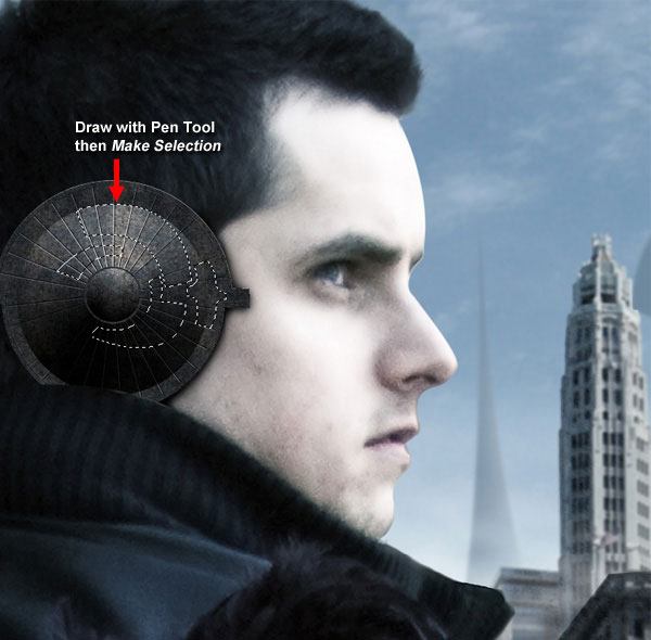
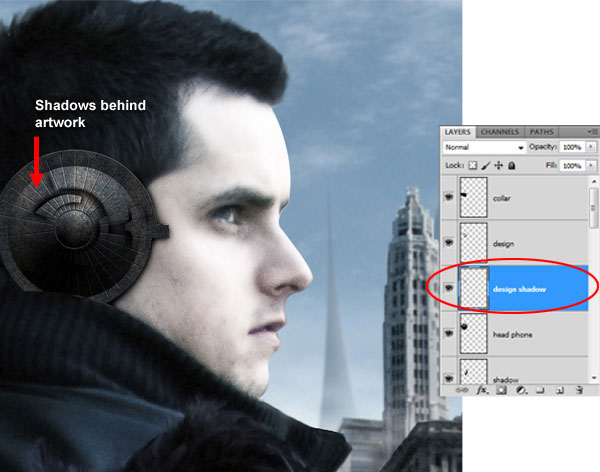
Let us create some artwork on the headphones. Use the Pen Tool (P) to draw some futuristic-looking shapes on the headphone, right-click inside your Pen path, choose Make Selection, copy the area underneath your selection, and paste it on a new layer.
Create a new layer under the artwork layer (and above the headphone layer), and use the Brush Tool (B) with a soft, black brush to paint some shadows behind the artwork.
Step 18: Adding Lens Flare
Since the headphone is close to the viewer’s focal point, we should take some time to accentuate its features as it will help develop our sci-fi theme. We will now add a sort of lens flare on it using stock images. Download Lens Flare-1, place it on top of the headphone such that the flare passes just beneath our subject’s eye, resize it as needed using Free Transform, then set the layer’s Blend Mode to Screen to remove the black background.
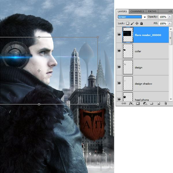
Download Lens Flare-2 and place it into our composition using the same technique as above.

Step 19: Creating a Ball of Light
Time to introduce another sci-fi element: a ball of light streaking up the sky. Make a new layer above the "city" layer for our ball of light. Use a soft brush with a bright blue color (#11f7fc) to paint a spot above the buildings, somewhere at the top-right of the poster.

Reduce the Master Diameter of your Brush Tool, switch your Foreground Color to white (#ffffff), and click once at the center of the ball; this gives us a subtle glow effect.

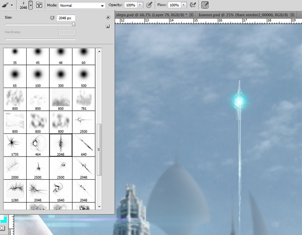
To create the trail, select a brush tip from the Light streak brushes brush library and paint with it using white.
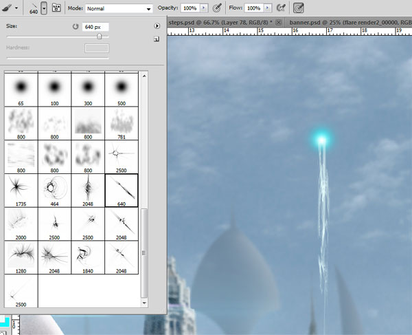
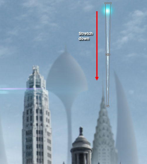
The trail must be fainter the closer it is to the surface, so use Free Transform to stretch the trail.
Use the "lights4 glow" brush tip from the Light streak brushes to give the perfect glow to the ball of light.
Step 20: Creating More Balls of Light
Duplicate (Ctrl/Cmd + J) the "light ball" layer we just created and then place them on various places in the canvas. Resize the duplicates to match the perspective of our poster; the smaller it is, the farther it is from our viewer’s focal point.
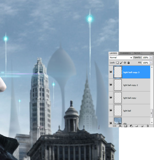
Select the original "light ball" layer and give it a Gaussian Blur (Radius: 1.8px).
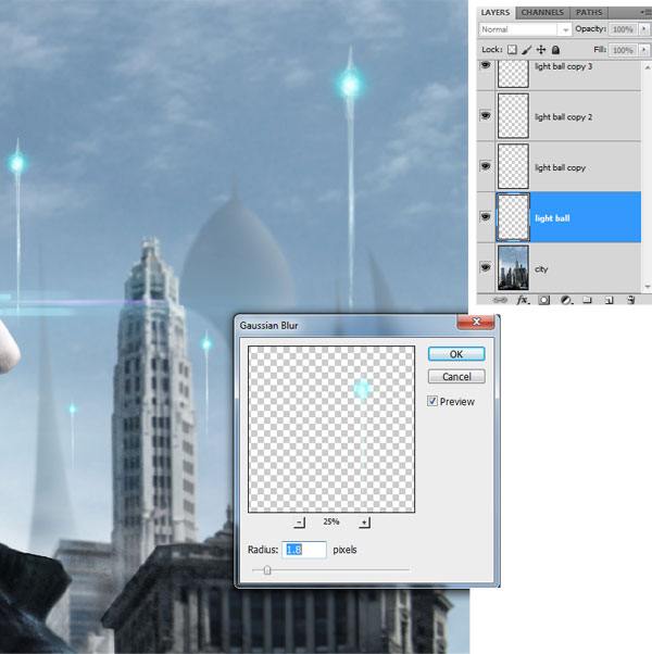
The farther away a ball of light is, the more blurry it should be. So select a "light ball" layer that is farther away and use a stronger Gaussian Blur (Radius: 2.2px) so that it appears more distant.
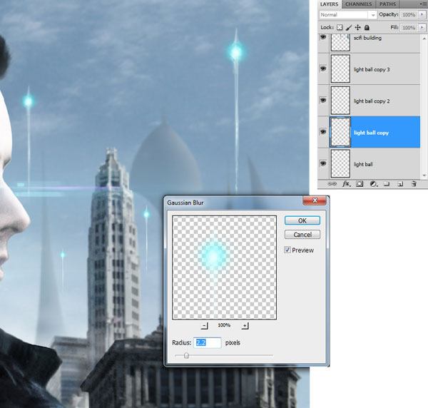
Continue applying varying levels of Gaussian Blur to other "light ball" layers.
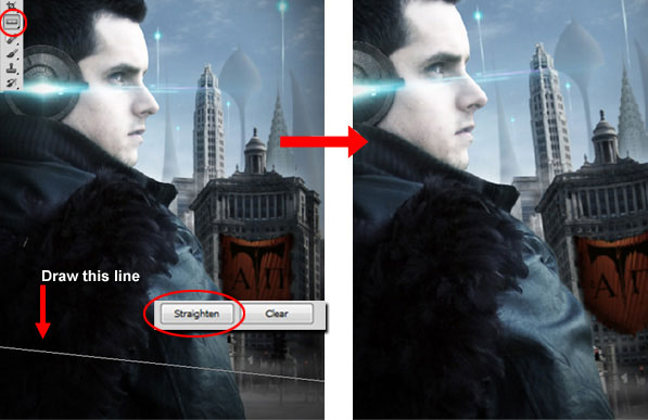
Step 21: Taking Advantage of Photoshop CS5’s Ruler Tool
The Ruler Tool has been revamped in CS5. For example, if you need to straighten up a photo, all you need to do is draw a horizontal line with the tool, then click the Straighten button, and your image will be re-angled.
We will use this tool to straighten up our poster. Choose the Ruler Tool (I) from the Tools Panel and draw a slightly-angled horizontal line (as shown below), and then click on the Straighten button. Just like magic, our scene’s angle is corrected.
Step 22: Creating the Movie Title
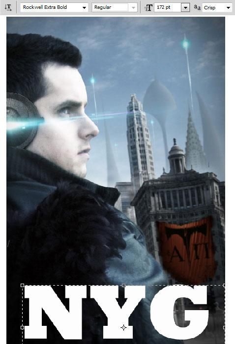
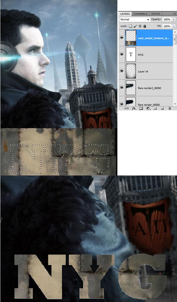
Let us add some text to our poster. Choose a thick, bold font (I used Rockwell Extra Bold). Type out "NYC" in white, and place it somewhere towards the bottom of the canvas.
We will now give this text block a grungy/metallic texture. Download this cool metal texture, and place it over our text (resize it with Free Transform as needed). Ctrl/Cmd + click on the thumbnail of our text to create a selection around it. Make sure you are on the "cool metal texture" layer, copy the selected area, paste it into a new layer, and then hide or delete the original texture layer.
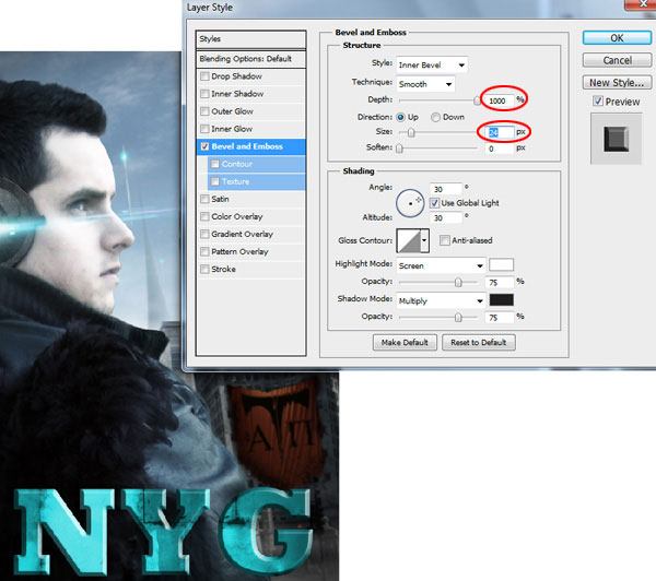
With the texture layer still selected, go to Image > Adjustments > Hue/Saturation and change the color of the texture to blue tones (Hue: 182, Saturation:73).

Double-click on the texture layer to open the Layer Style dialog window, and choose the Bevel and Emboss layer effect. For the settings of Bevel and Emboss, use Depth: 1000% and Size: 24px (leave the other values alone).
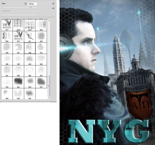
Step 23: Creating a Honeycomb Grid Effect
Let us accent our poster with a honeycomb effect that will further support our futuristic, sci-fi theme. Create a new layer on top of all layers for the honeycomb grid. Download and install Eltops Grid Set 2. Select a grid brush from the set, and use the Brush Tool (B) and a Foreground Color of white to paint some grids onto the poster.
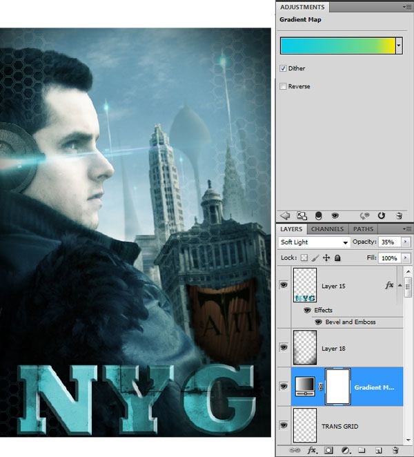
Step 24: Final Color Correction
It’s time to tie in our piece with an adjustment layer. For this, we nee to add a Gradient Map adjustment layer on top of all the layers. Select blue and yellow colors for the gradient, set the Opacity of the adjustment layer to 35%, and switch the Blend Mode to Soft Light.
Tutorial Summary
This tutorial went over many techniques for creating a sci-fi themed movie poster. We leveraged some great, new features in Adobe Photoshop CS5 that speeds up the creation of our graphics. We created banners, performed color corrections, used blurring techniques to create a depth of field, utilized several free resources to add elements in our work, and more.
Be sure to link to your version in the comments and please add it to our Flickr group to share it with the rest of the community.


1 comments:
This is a nice blog post about Jackets and Outerwear. I am also a new blogger which is trying to give my best in this field by my own site yourbabyworld. Please visit my site and tell me how can i more improve my site by take some other best steps.
Post a Comment