Delay
This tutorial took me a day longer than I anticipated to write (you’ll see why from the number of steps), but I hope you enjoy it!
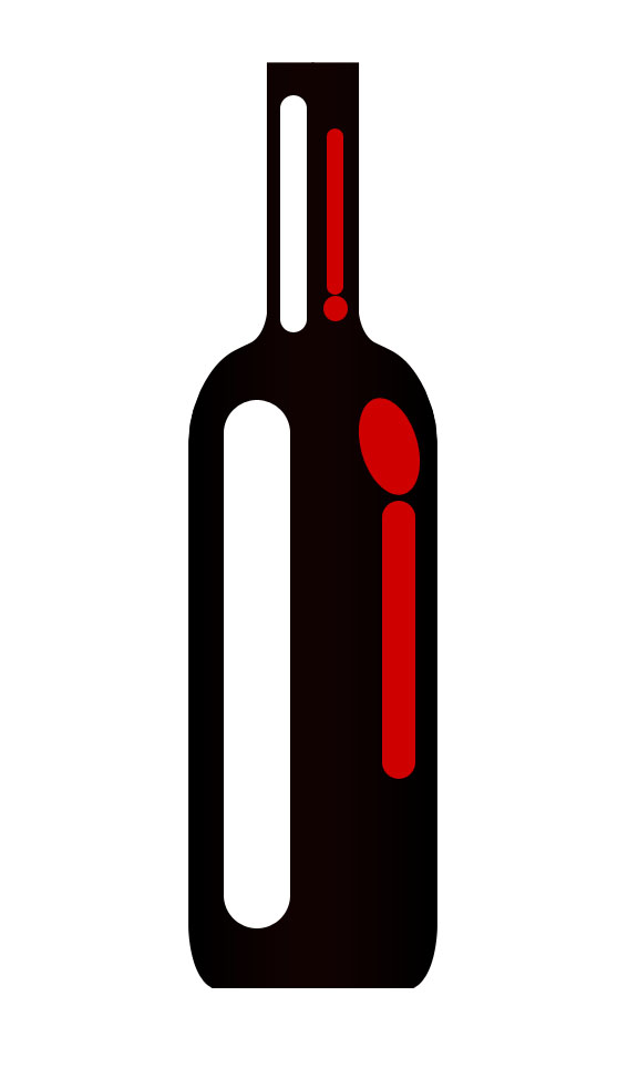
Final Image
As always, this is the final image that we’ll be creating:

Step 1
Open up a new document and go to view>show>grid. Then use your path tool to draw a path in the shape of half a wine bottle. Take your time with this step in order to get a really nice shape. Use a photo for reference if necessary.

Step 2
Create a new layer called ‘bottle shape’. Then go to your paths palette and click ‘load path as a selection’. Then fill your selection with black. I had to go in with the lasso tool and tidy up a copy of edges. Duplicate this layer and go to edit>transform>flip horizontal. Then move the duplicate to complete the other half of the bottle shape. Then merge the two layers together.


Step 3
Then go to layer blending options for this merged layer and apply a gradient overlay ranging from black to 110202 back to black. The bottle will still appear almost black, but the very dark red middle part of the gradient will give it a slight 3d appearance. The gradient overlay settings and result are shown below:


Step 4
Now select your rounded rectangle shape tool (radius 30px) and create a large white rounded rectangle running down the left side of your bottle. Then do the same on the right with a red rounded rectangle and also a red oval above this. Finally, repeat this using smaller rectangles in the neck of the bottle. Then for each layer go to layer>rasterize>layer. Then merge all of your highlight layers together.
Step 5
Go to filter>blur>gaussian blur and apply a blur of 14px. Then reduce this layer’s opacity to 40%.


Step 6
Now create a new layer called ‘wine label 1′. Use your rectangular marquee selection tool to create a selection across your bottle roughly the size of a wine bottle label. Then fill this selection with white.
Then apply a gradient overlay. You want to create a custom gradient that ranges from transparent in the center (allowing the white to show through), to very light gray as you get towards the edges, to a darker gray right at the edges. This creates the illusion of depth and gives the bottle a roundness. You can use the ‘location’ tool whilst making your gradient to specify where each of these shades go. I chose to position my medium gray – light gray – transparent – transparent – light gray – medium gray, at 0%, 10%, 25%, 75%, 90%, 100%. You can see all of these settings below as well as the result:


Step 7
Now create a new layer called ‘wine label 2′ and create a thin rectangular selection beneath your white label shape. Fill this with black, and then apply a gradient overlay ranging from black, to very dark gray, back to black.


Step 8
Now create a new layer called ‘wine label 3′. Create a 2px high rectangular selection above your black label and fill it with the gradient overlay shown below. Then duplicate this layer and move it below your black gradient.

Step 9
Now create a new layer called ‘wine label 4′ and create a dark blue rectangle below your current label shapes. Then apply a black-dark blue-black gradient overlay.


Step 10
Finally to finish off this part of the label copy one of the thin gold shape layers and move this below your dark blue label. Then finally apply a light gray – white – light gray gradient to a 1px line beneath this bottom bold line, and set this layer’s opacity to around 65%.

Step 11
Select your text tool and drag a text box that covers the size of your label shapes. Then align your text centrally. Type out various bits of text to cover your labels. I’ve written the various fonts, text sizes and spacings to the right of the bottle for your reference.

Step 12
Grab an appropriate photo to use for the top of your wine label and then paste it onto a new layer beneath your text layer. I chose a lovely photo of some vine grapes (http://www.sxc.hu/photo/1064352). Then go to image>adjustments>desaturate to grayscale the image. Finally cut around the top of the image, following the contours of the grapes/leaves, and delete this selection.


Step 13
Now cut away any parts of your photo that overlap the sides of the bottle. Go to image>adjustments>brightness/contrast and increase the brightness to +90 and the contrast to +50.
Use a large, soft eraser brush to erase away the bottom of your photo layer so that it blends smoothly into the white label beneath it. Now move this layer to be just above the ‘wine label 1′ layer, and merge down. This should mean that your gray-transparent-gray gradient on the ‘wine label 1′ layer now affects your photo also.

Step 14
Now type out some golden text above your wine label. Go to edit>transform>rotate to rotate your text very slightly anti clockwise. Then create a new layer and create a swoosh underline effect beneath your text, using your path tool. Then apply a gradient overlay to each layer, the settings of which are shown below. To apply the same gradient overlay to both layers be sure to right click on the gradient overlay in your layers palette and click ‘copy layer style’. Then right click on your second layer and click ‘paste layer style’.


Step 15
Now create a new layer called ‘wine bottle top’ and create a rectangular selection over the neck of the bottle. Be sure to make your selection 1px wider either side of your bottle neck, as we want to give the impression that the bottle neck coating is going around the bottle, and is not actually part of it. Then apply the gradient overlay settings shown below:


Step 16
Now select the top few pixels of this new layer and go to edit>transform>perspective. Then use the perspective tool to drag in the top corners of your selection.

Step 17
Now create a new layer called ‘gradient line’. Make a thin selection just under the area that you have distorted using the perspective tool. Apply a gradient ranging from transparent to 2C281D. This should give a subtle shadow to your bottle neck.

Step 18
Create a new layer called ‘highlight’. Select the top part of your label (above your ‘gradient line’ shape) using the lasso tool. Then fill this selection with white. Finally, set this layer to ‘overlay’ and reduce it’s opacity to 40%.

Step 19
Now use your marquee selection tool to select the very top of your ‘wine bottle top’ layer. Copy/paste this onto a new layer called ‘wine bottle top 2′, and then go to edit>transform>flip vertical. Fit this onto the top of your label so far, and then copy the layer style (the gradient overlay) of your ‘wine bottle top’ layer, and then paste this style onto your new duplicate layer.
Then create a new layer called shadows. You should still have your dark-transparent gradient selected, so use your lasso tool and gradient tool to apply further shadows to your bottle neck, as well as a highlight on the right side.


Step 20
Now duplicate your ‘wine bottle top 2′ layer and move this to be your top layer (call it ‘wine bottle top 3′. Then go to edit>transform>flip vertical and fit it on top of your current gold label areas. Then apply a 1px drop shadow, using the settings shown below. Finally select over this area using your lasso tool and create a new layer called ‘lighten’. Fill this with white and then set the blend mode to ‘overlay’ and reduce the opacity to 40%.


Step 21
Now create a new document (3px by 12px). Create a new layer and fill the far right pixel (3rd of 3) with black, then the 2nd middle pixel with white, and leave the left pixel empty. Then hide your original white background, leaving just the layer with these two lines visible. Then go to edit>define pattern and save your pattern as ‘wine stripes’.
Now return to your original document and create a new top layer called ‘wine stripes’. Create a selection over your ‘wine bottle top 3′ shape using your rectangular marquee tool and fill it with black. Then go to your layers palette and reduce the ‘fill’ of this layer to 0% (this is located under layer opacity). This means that you won’t see the black fill, but Photoshop still recognizes the data on that layer. Then go to blending options for this layer and apply a pattern overlay, using the ‘wine stripes’ pattern that we created a moment ago. The settings of the pattern overlay are shown below, but I set the blend mode to ‘overlay’ to allow the pattern to follow the shadows/highlights of the gold area underneath it.


Step 22
Now create a new top layer called ‘wine bottle top 4′. Create a selection above your patterned area that is about double it’s height. Then fill this with a gold color. Then copy the layer styles of one of your other ‘wine bottle top’ layers and paste this layer style onto your new layer. This should apply the same gradient overlay effect.

Step 23
Now create a new layer and use your shape tool to draw out a rounded rectangle (radius 6px), color: F7EDD3 over your ‘wine bottle top 4′ area. Then go to edit>transform>rotate and rotate it a little anticlockwise. Then go to blending options for the layer and apply the drop shadow, inner shadow and gradient overlay effects shown below:
Finally duplicate this layer and move the duplicate just above the original.


Step 24
Now create a new top layer called ‘bottle top’. Use your shape tool to create a rounded rectangle (radius 6px), color: F7EDD3. This shape should be slightly wider than the rounded rectangles that we created a moment ago and should overlap the top one of the two. Then rasterize this shape and use your marquee selection tool to cut off the very bottom 2px of it, creating a straight bottom edge, not a rounded one.

Step 25
Now copy the layer styles of ‘winer bottle top 3′ (the layer that we laid the pattern layer over the top of). Copy the layer styles back onto your ‘bottle top’ layer. This should give it a gradient overlay and 1px drop shadow.

Step 26
You should still have your dark-transparent gradient selected, so create a new layer called ‘bottle top shadows’ and then use your marquee tool and a linear gradient to apply a few lines of shadow over your bottle top. I reduced this shadow layer’s opacity to around 40% as the shadows initially looked a bit harsh.

Step 27
Just to finish off the bottle neck I see a few areas that aren’t looking quite right, and can’t be solved with simple gradients. Firstly I take a small, soft, white paintbrush to the center of my ‘bottle top’ shape (on a new layer of course)’. This gives the bottle top some nice highlights. Then I reduce the opacity of my highlights layer to 40% and my shadows layer to 20%.


Step 28
Now obviously areas of my original bottle shape are sticking out above my gold bottle top layers, so I simply use my marquee selection tool to delete the top of my bottle shape. After doing this let’s see where we are. Looks like we’ve created one pretty cool looking bottle of wine!

Step 29
Now hide your original white background layer, leaving only the layer’s comprising your bottle. Then go to layer>merge visible, leaving your bottle drawing on one single layer. Then duplicate this layer, and move it behind your original. Go to edit>transform>scale and reduce it’s size to be around 95% of the size of the original. Move it so that it is to the left of your original bottle. Duplicate this layer and move it to the right of your original (but still behind it). Use your documents grid option to make sure that you’ve made these two new bottles symmetrical.
For the sake of the .psd file I’ve kept all original bottle layers in tact.

Step 30
Now to create a nice background. Hide your bottle layers, and create a new bottom layer called ‘gray background’. Then fill your document with a radial gradient ranging from medium to medium/dark gray.

Step 31
Now create a new layer called ‘clouds’. Go to filter>render>clouds, and then set your layer blend mode to ‘overlay’ and reduce it’s opacity to 30%.


Step 32
Now make your bottle layers visible again, and hide your background layers (including your original white background). Merge all visible layers (to merge the 3 bottle together) and then duplicate this merged layer. Go to edit>transform>flip vertical, and then position this new layer directly below the 3 main original bottles. Then go to edit>transform>distort and stretch out the bottom corners of your reflected bottles, just to give them a little perspective. Finally, change this layer’s blend mode to ‘overlay’ and reduce it’s opacity to 30%.


And We’re Done!
I hope that you enjoyed this tutorial, and as always would love to hear your thoughts on it. You can see the finished result again below:


0 comments:
Post a Comment