This tutorial is going to focus on design choices and a little bit of theory. There are literally thousands of tutorials online that cover keyboard shortcuts and clever ways to tweak your custom brushes but less cover the reasons why we’ve chosen to do what we do when we’re creating a piece of art, which is often more important than the process of how you got there (but don’t worry, there will be some of that too!).
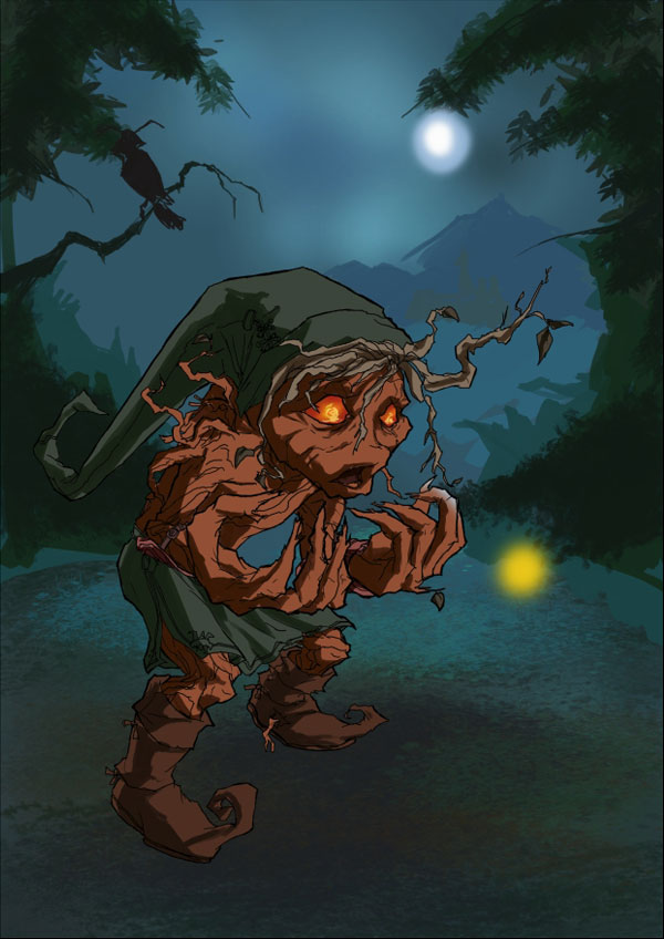
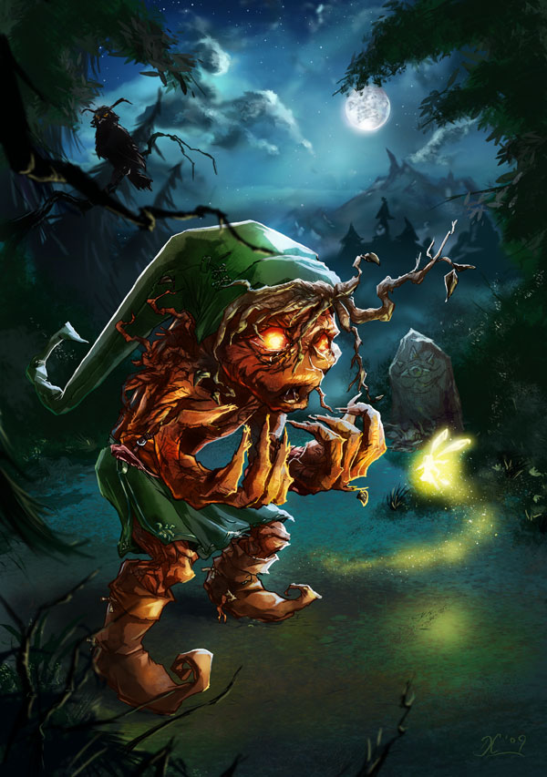
Final Image:
Here’s the final image that we will be creating:

What’s my motivation? (or ‘No, he wasn’t always a tree!’)
The goal of this image was to take an existing concept and push it further. For those of you that haven’t played The Legend of Zelda: Majora’s Mask I’ll give you a very brief explanation of the story behind this image. The Zelda franchise has always flirted with a dark narrative, but Majora’s Mask was the first game where they really looked into the dark side. The hero “Link” gets a spell put on him that mutates him into a Deku scrub (a strange tree like creature), and the moon crashes into the planet killing everyone! The transformations in the game always looked quite painful and upsetting; Link would scream in pain every time. I always felt that the game could have gone even further with the transformation, so I thought why not do it myself?
Fun Fact: When Link was in his normal human form, dogs would simply ignore him, when he was in his Deku Scrub form they would get angry and bite him! As if being a tree wasn’t bad enough! At least they didn’t confuse him with a hydrant…
Step1: A good foundation (or ‘How to obtain a hot beverage with minimal effort!’)
First things first, open up an A4 PSD at 300 dpi. Start off drawing a rough layout using my custom “dc colouring opacity” brush (in the brushes download pack) with a light blue colour. Always try to get the main character’s pose sorted out and think about the general composition as a whole. Don’t worry about details until you’re happy with the bare bones first; you’ll only end up having to fix things later. It always helps to stand up and “act out” the pose so you get a better understanding of it. If you can, have someone else act it and take a photo that you can use for reference. Not only that, it’ll make great blackmail material when you next want a cup of tea! 

Fun Fact: Despite being ‘ethically sketchy’, blackmail can indeed get you a nice cup of tea… 
Step 2: Lines
Once you’re happy with your rough lines, draw the character’s final lines on a new layer called ‘lines’ (imaginative, huh?) using the ‘ink’ brush (also in the brushes download pack!).

Step 3: Add some Colour
Next up, use the paint bucket tool to fill the background with an appropriate blue/teal colour. This serves 2 functions; firstly it helps set the mood of the piece, secondly it gets rid of the white space. Not only can white space be a bit intimidating, but colouring against white will throw your perceptions of colours.
Still using the ‘ink’ brush; lay in the flat colours of your image on relevant layers underneath the ‘Lines’ layer. Make sure to keep adjacent colours on separate layers to make shading easier, so colour all the skin on one layer, then clothes on a layer above, his strange branch hair on another, etc.

Step 4: Background
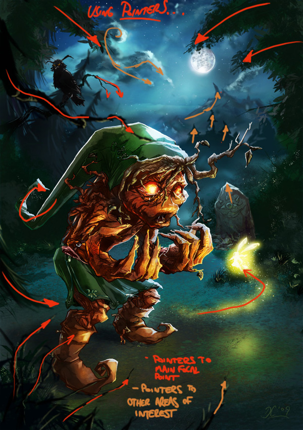
Open up your references to help inspire you. As you can see, everything from the game is a bit dark, twisted and creepy so let’s make our background evoke similar feelings. Using my “inking opacity” custom brush, lay in a basic background, with simple bushes and trees. Try to make sure everything in your background leads towards your focal point (e.g. all of the branches lead your eye towards Link). Remember the closer we are to things the more saturated the colour is, so use less saturated colours on trees that are further away to make them recede into the painting.

Step 5: Let there be light
Now we’re going to add our light sources; Link’s little Fairy companion (called “Tatl”) and the moon. We’ll keep it simple at first, as we are just adding them for reference so we can work out where the shading should go on Link. On the ‘skin’ layer, use an airbrush and choose a nice bright yellowy-orange, and draw a simple round glow in front of Link. Do the same with a white colour to establish the location of the moon.
Fun fact: Tatl has a brother called “Tael” which is a bad pun on the phrase “tattle-tale” which proves Nintendo loves bad puns even more than I do!
Step 6: More background elements
Add in some mountains in the background and draw the owl from the reference on a branch that is again pointed towards Link. Just render the owl as a silhouette for now; we’ll focus on him properly at a later stage. Use a texture brush to make the floor look a little varied. You don’t need to use a specific brush for this; it’s just something to make the ground look more varied at this stage. It helps to have things vaguely established so that you start to get a feel for the general environment you’re creating.

Step 7: The magic of clipping masks
Now for each of your flat colour layers, create two clipping masks each (create a new layer and tick the “use previous layer as clipping mask” box, then click ok). Set each of the top clipping mask layers to overlay in the blending modes, and the leave the bottom ones at normal. Using clipping masks will allow you to add basic shading to each layer without worrying about going over the edges; simple but brilliant!

Step 8: Shady business practices
We can now start adding some basic shading on the skin using the ‘inking opacity’ brush on the Skin’s normal clipping mask layer. Try to picture Link as a 3D object, and how the light sources would affect the light and shadows falling on him.

Step 9: Lather, rinse, repeat…
To avoid being repetitive, I’ll simply say that you need to repeat this step for the clothes, boots and hair on each of the relevant normal clipping mask layers. Add the strange fiery glow to Link’s eyes using a soft airbrush, and then a hard edge round brush to add the more defined parts (again this is just another element of his design that we’re pushing a bit further.)
Step 10: The Lockdown (or ‘you’re so transparent’)
Another tip which will help those of you that like to keep line work in your final image is to lock the transparency of the ‘lines’ layer by clicking the small chessboard icon in the layers palette. This means you will only affect existing pixels and not create any new ones on that layer, so you can now colour your lines easily on the ‘lines’ layer. Use colours darker than your darkest shading for each area (e.g. a really dark green for Link’s clothes outlines).

Step 11: Moonlighting
You can also render rim-lighting on the locked Lines layer (e.g. The moonlight on his hat and the light on Link’s hands cast by the fairy ‘Tatl’) by choosing a white colour or bright yellow and painting over the lines.
Add the moonlight to Link using a light blue colour (don’t use white as it looks far too strong) with the inking opacity brush. Try to fight the urge to render too much moonlight as we wouldn’t see much of it on Link from this view; he’s mostly blocking it from our viewpoint.
Step 12: Gradients
Lock the transparency of the skin layer (click the chessboard icon) and use the radial gradient fill tool on the skin layer to more accurately show the light emitting from Tatl casting a glow over Link’s hands, using a soft yellow colour at 25% opacity. Make the yellow more saturated the closer you get to the light source. If you repeat this on the ‘skin overlay’ layer it will add more variation and richness to the lighting. Add some more detailed shading and highlights to Link with the inking opacity brush, and don’t forget to colour the lines a bright yellow on his hands to simulate rim lighting.

Step 13: The overlay layer
Create a new layer called ‘Blends’, move it directly underneath ‘lines’ in the layers palette. Set the layer properties to ‘overlay’ and select the radial gradient too. We want to create the effect that light gives as it naturally scatters from a surface it has hit. Choose a light blue for the areas where the moonlight is hitting Link and light yellow for areas where Tatl’s glow is hitting him. Click on the point where light has hit the surface and drag the gradient tool outwards to create a subtle burst of reflected light. Remember that some surfaces are more reflective than others so vary the amount accordingly. Now add more glow to his eyes on this layer using a yellow radial gradient. Keep adding to the shading as you go; as you add more light to the image it will be clearer where shadows should fall, such as along the grooves of his hair.

Step 14: The overlay layer strikes again
You can also use the ‘blends’ overlay layer to enhance the colour variation on Link, eg. use a low saturation red to make his cheeks look more flushed and a soft orange on his boots, and a green on his hat to add more colour. The beauty of overlay and soft light layers is that they add richness without obscuring any existing details you’ve already rendered. It makes them very useful for editing colours on the fly.
Now spend some time perfecting the shading and lighting; add smaller details such as light and shadows in the grooves in Link’s body to make his skin appear more tree-like.
Now spend some time perfecting the shading and lighting; add smaller details such as light and shadows in the grooves in Link’s body to make his skin appear more tree-like.

Step 15: Get dirty! (also, get your minds out of the gutter!)
People always bemoan that working digitally produces very clean, artificial looking work, so use some grimy texture brushes on the overlay layers (the clipping masks we applied and set to overlay earlier) to mess things up a bit. Link is currently half tree, so there’s plenty of scope to go crazy with texturing here. Likewise because he’s in a forest, feel free to add dirt to his clothes and scuffmarks to his boots. Everything should look well-worn. Doing all of this on the overlay layers helps because again, you don’t lose any existing details you’ve already drawn in, it just adds to them.
Step 16: Tatl’s tale…
Going on with my theme of pushing the design into a more ‘realistic’ fantasy, I’ve decided to give Tatl a more humanoid appearance; I still keep her colour and 4 wings, but using an almost white yellow with the inking opacity brush give her a more obvious female form; the more elements the viewer can relate to because they have a basis in reality, the further you can push the fantastical elements and still have them believable. Despite being a fairy, a humanoid version will illicit a more empathic response than a simple glowing light; having a form makes it feel more authentic to the viewer.
Create Tatl’s ‘pixie dust’ motion trail with a low opacity yellow airbrush and then use a speckled brush with opacity set to 60% to add in some faerie dust particles, with a mixture of very light yellow and white shades to make it seem like it has more depth.

Step 17: Clouding over
The night sky should be rendered with a mixture of blues; no blacks should be used because the moon is out in full. Use the radial and linear gradient fill tools on the background layer to get a nice variation of colours, making the sky darker at the top. Create a new layer above that to render the clouds, using an airbrush for the majority of the work and adding to them with some of the cloud brushes that we have provided alongside this tutorial. Start from a dark base and add the lighter colours to the clouds as you go.

Step 18: Star get!
On a new layer, below the cloud layer, add some random stars to the sky using a star brush (there’ll be one in the tutorial download file). Change both the size of the brush and the opacity to create stars that appear to be different distances, as well as a mixture of yellow and blue-ish whites. Then apply a slight Gaussian blur to the layer to soften them, and also add a Gaussian blur to the clouds.

Step 19: A lesson in landscaping
Create a new layer above the background, stars and clouds and call it ‘mountains’. Using a low saturation blue, render in the mountains. As you’ll notice, my first attempt at mountains was both (a) too detailed and (b) quite dull, so I changed them later on in the process. Later on, I brushed out a lot of the detail in the mountains as they’re too far away to see that level of detail, then I made them more dramatic and jagged for a sinister appearance. Also notice I made the largest peak a subtle pointer to one of the minor focal points; the moon.
Using the airbrush (because it has soft edges, as do things in the distance), add in clock town on a layer above the mountains, in a slightly darker and more saturated blue. I’ve gone for a stylised representation of Clock Town as everything is more curved and crooked than it would be in realistic architecture.
Using the airbrush (because it has soft edges, as do things in the distance), add in clock town on a layer above the mountains, in a slightly darker and more saturated blue. I’ve gone for a stylised representation of Clock Town as everything is more curved and crooked than it would be in realistic architecture.
Add another layer in between the mountains and the town, and use a light grey airbrush to create the mist that collects at the bottom of mountains.

Step 20: “You look more like a flooring inspector” (+10 points if you get the quote!)
On a new layer, use a light blue brush suggest a very subtle path starting from Clock Town and leading down the hill to Link. Make it wind a bit because curves always look more interesting than straight lines. Create a new layer above the floor/path/etc. and set the blending mode to overlay. Add a yellow glow (cast by Tatl, of course) on the floor with the radial gradient tool. Erase this glow from the area near Link’s feet to imply the shadows they would cast.
Now that Tatl is even brighter, add some more yellow light to Link, and enhance the shadows even more. Use the inking opacity brush to add some light reflecting off of his boots and face, for example. Also enhance some of the smaller details at this point, such as using a light colour to trace the outline of the pattern on his clothes, and a small dark brush to add more detailed grooves and variation to his skin.

Step 21: The Menacing Moon! (or ‘I’m sure it wasn’t that close yesterday…’)
The moon in the game was given a lot of character as it would ultimately crash into the land of Termina and destroy the world; ending the game! (And your hands if you had the rumble feature enabled in your controller!) I’ve decided to reign this in a bit as the main story in this image is Link’s mutation; I want the moon to be there as an ominous threat of things to come that Link is unaware of at this time. We’re still going to keep the face, but make it much more subtle, and reminiscent of the faces people can see if they look at the moon. Use an airbrush to softly render an angry face, using reference of the in-game moon as a guide. To add authenticity, paste in a photo of the moon (there are a lot of photos around the web for you to use, it’s a pretty common image!), on a layer above your drawn moon, resize it (press CTRL+T to free transform) and set the layer’s blending mode to overlay.
Fun Fact: For the more curious among you, this is the point where I corrected the mountains.

Step 22: Sticks and stones (they’re more trees than sticks really…)
We have our far off background sorted, but it’d be helpful to have some mid-ground items to help push the illusion of depth, so on a new layer add some creepy trees on the left hand side. Use a fairly dark blue to show that they’re closer, but still far away enough that we’re still not seeing any real colour detail. Draw in the gossip stone (in the right hand side of the image) with the inking opacity brush, a search online will provide you with plenty of reference for it’s appearance. Once you’re happy with it, use the lasso tool to select it and open up a stone texture (once again, a quick check online should come up with something; there are plenty of free textures around), copy it and then back in the Broken Link image press Shift + Ctrl + V (or edit>Paste into) to paste the texture into the gossip stone selection. Make sure the texture is directly above your gossip stone in the layers palette, and set the layer properties to Hard Light.
Fun Fact: If you bombed the gossip stones in “The Ocarina of Time” and “Majora’s Mask” they would fly up into the sky like a rocket and explode. I don’t know why they did, but they did.

Step 23: The sky at night (or ‘I’ve drawn too many clouds, haven’t I?’)
You’ll notice I decided that the sky was looking far too busy with all of the clouds I had drawn in so erased a lot of them and went with just a few. Every picture needs some space for the eyes to rest; too much detail will start to harm your image because everything is fighting for attention. Copy and paste a cloudy sky photo texture above your sky layer and set it to overlay, to add a little authenticity and variation.

Step 24: “Eyes in the dark…” (or ‘Couldn’t they have just called him “the owl?” ’)
Time to take a look at Kaepora Gaebora; Link’s owl advisor. I’ve decided not to stray too far from his design as it works fairly well. A quick google image search for owl reference later, and we’ve found a fairly appropriate example to use in this pic. I like the way the real owl’s plumage is feathered (as in textured, not as in…um, feathers!) so I use this element in his design and exaggerate it a little further to continue the eerie nature of image. I also prefer the orange eyes that the real owl has to his blue eyed counterpart. I’ve kept in his trademarked eyebrows to make sure the audience will recognise him as a character and not just a creepy owl in the background. Just using a tiny bit of light to highlight some of his form keeps him mysterious.

Step 25: To the forefront (or ‘It’s rude to point!’)
On a new layer above everything else, draw in some dark silhouetted scenery in the foreground. Remember they are here to create depth and aid in composition so ensure they are all pointing towards a focal point (here the branches and grass all point to Link and an additional bit of foliage is leading our eyes towards Tatl). Draw in a very small amount of highlights just to suggest the 3d nature of the objects and apply a slight gaussian blur to these new foreground elements to make everything slightly out of focus. All that’s left to do now is make all of your small final touches, such as drawing some of the leaves that Tatl’s glow would hit to suggest more depth in the greenery and drawing a small clump of the ground in front of Link’s boots to suggest his weight on the ground.
Step 26: Final Touches
You can also add another layer set to Overlay at the very top and use gradients to add more “oomph” to your image. Feel free to experiment a bit, adding dark colour variation to the sky, mountains and clouds, or adding even more glow to Tatl and Link. Tidy up your image, before we finish with the final step…
Step 27: All good things
This last step is actually a really good method for improving photographs, but it works just as well on illustrations. Press Shift + Ctrl + Alt + ~ If you’ve managed to do this without breaking your hands, it will select the luminosity of the image (or all the light parts for those of you that have misplaced your thesaurus). Go to the very top layer and press Shift + Ctrl + C to copy from every visible layer and then Ctrl + V to paste it into a new layer. Set the new layer’s blending mode to Soft Light with an opacity of 45%, and you’ll notice that all of the colours are slightly richer. It’s a subtle effect but will often give that extra “pop” that arty people are always so concerned about having.
Not-so-fun Fact: This shortcut only works on the PC, as far as I’m aware, there currently is no mac equivalent shortcut.  If anyone knows otherwise, please feel free to put me straight; I’d love to know if there is a mac shortcut for this trick!


0 comments:
Post a Comment