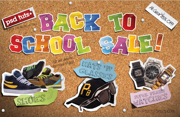
In this tutorial you will learn some easy methods to create a realistic looking corkboard composition for a back to school sale postcard. We’ll go over how to create cool paper letters, add some cutouts, realistic shadows, and add bleeds for printing. Let’s get started!
Tutorial Assets
The following images were used during the production of this tutorial.
- Corkboard Texture
- Paper Texture
- Freshman Font
- Walk Around the Block Font
- Jotting Font
- Mia’s Scribblings Font
- Shoe Image 1
- Shoe Image 2
- Shoe Image 3
- Hat Image 1
- Glasses Image 1
- Watch Image 1
- Watch Image 2
- Watch Image 3
- PSD TUTS+ Logo Image
- Colorful Gradients by Sean Steezy
Step 1
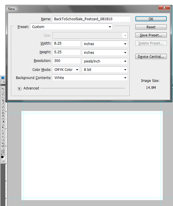
To start, open Photoshop and create a new document with the settings shown. Make sure that the Units are in inches, the artwork Resolution is set at 300 dpi, and the Color Mode is set to CMYK for printing. The postcard will be printed on an 8.5" by 11" piece of paper with two on a page, so the actual cut size of one panel of artwork will be 8" x 5". Since we have art that bleeds off the edges, we need to include the bleed area in our Photoshop file. Most bleeds in the US are 1/8″ or 0.125″, so our final postcard size adds .125" for each of the four sides, making our artwork 8.25" x 5.25". Click OK to get started. Then create the guides for the bleed by making sure rulers are on, View > Rulers (Cmd/Ctrl + R), click the ruler area and drag the guides to the 1/8" marker in each corner like shown. Next, lock your guides, if they aren’t already, View > Lock Guides (Alt + Cmd/Ctrl +  . (If you are doing this for a web only project, you could set the DPI to 72 to reduce the file size)
Step 2
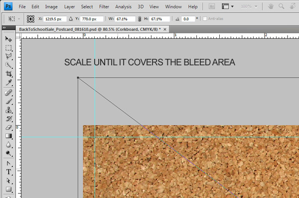
Starting with the background, go to File > Place and select the cardboard texture of your choice. I used the texture titled “890067_16350024.jpg" but you can use whichever one you want. After placing the image, scale it up a little (Hold ALT + Shift when you click to scale from the center). Make sure it covers the bleed area, then hit enter to set the image. Name this layer "Corkboard".
Step 3
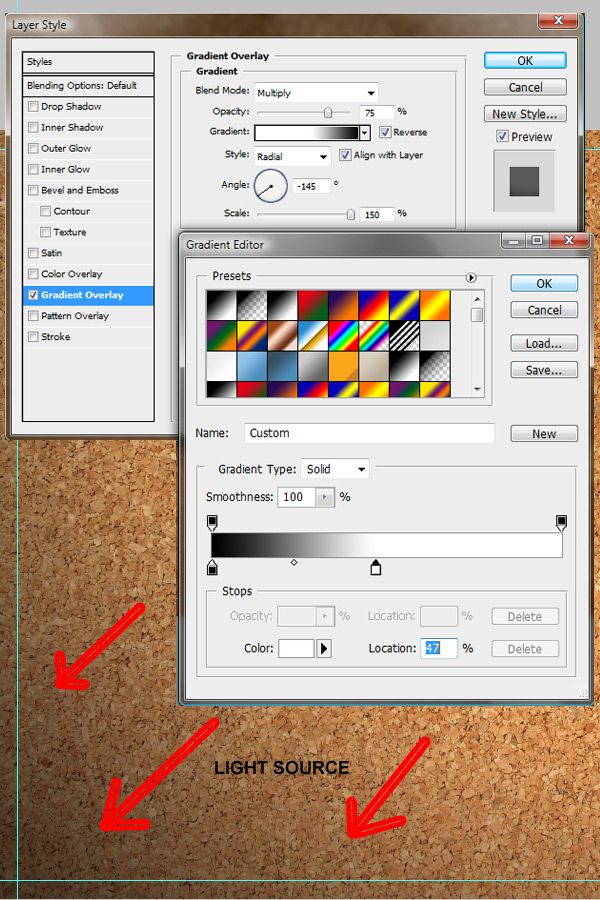
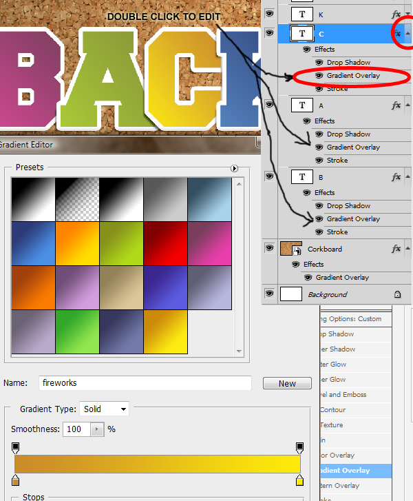
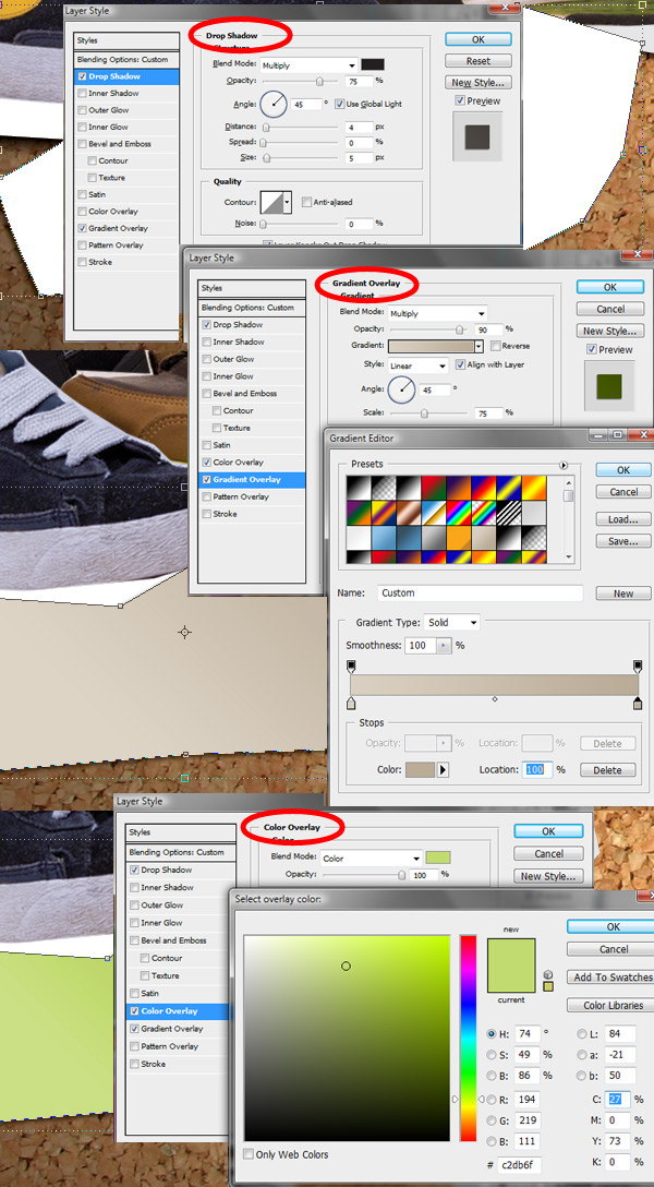
To create our light source we are going to add a Gradient Overlay to the "Corkboard" layer by going to the menu Layer > Layer Styles > Gradient Overlay, or you can click the FX looking icon in your Layers Palette and select the Gradient Overlay option. Choose a black to white gradient, set the Blend Mode to Multiply at 75% Opacity, set the style to Radial, click the Reverse checkbox so the white is in the middle, set the angle to -145, and then set the scale to 150% as shown. Click the Gradient drop down to edit it and move the white part out to the 47% marker as shown, this varies, but you just want a little darkness in the corner, not too much. Click OK. While in the Gradient Overlay menu, click anywhere on the artboard (you will notice the arrow change to a 4 pointed arrow), which means you, can drag the gradient to position it. Our light source goes from top right to bottom left, so move the gradient until the bottom left corner has some black coming up. You may want to set Opacity to 100% so you can see what’s happening here, and you can always re-tweak the gradient.
Step 4
To complete the paper letter effect there is a good amount of work here so let’s get an idea of what we’re going to do. We first need to create the basic letter text, add layer styles to get the right effect, then break the text into single letters and change their colors. Then we reposition each one to give it the random handmade look and place a paper texture over them. Next we go under each letter and add shadows where the letters overlap and curl away from the corkboard. Then for the final touch we add the staples that hold the letters to our corkboard.
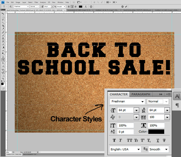
First things first, we need to set the font for the letters we will be using. So with the Type Tool (T) selected, choose your font settings as shown (“Freshman” Font at 64pt Font Size, 100pt Tracking to space it out a bit) then click the artboard, type out “Back to School Sale!” and hit Enter.
Step 5
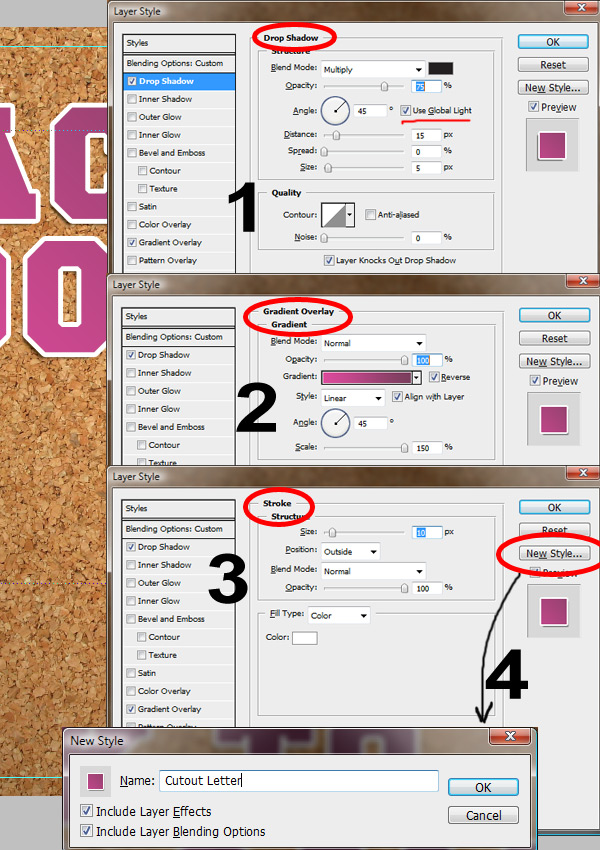
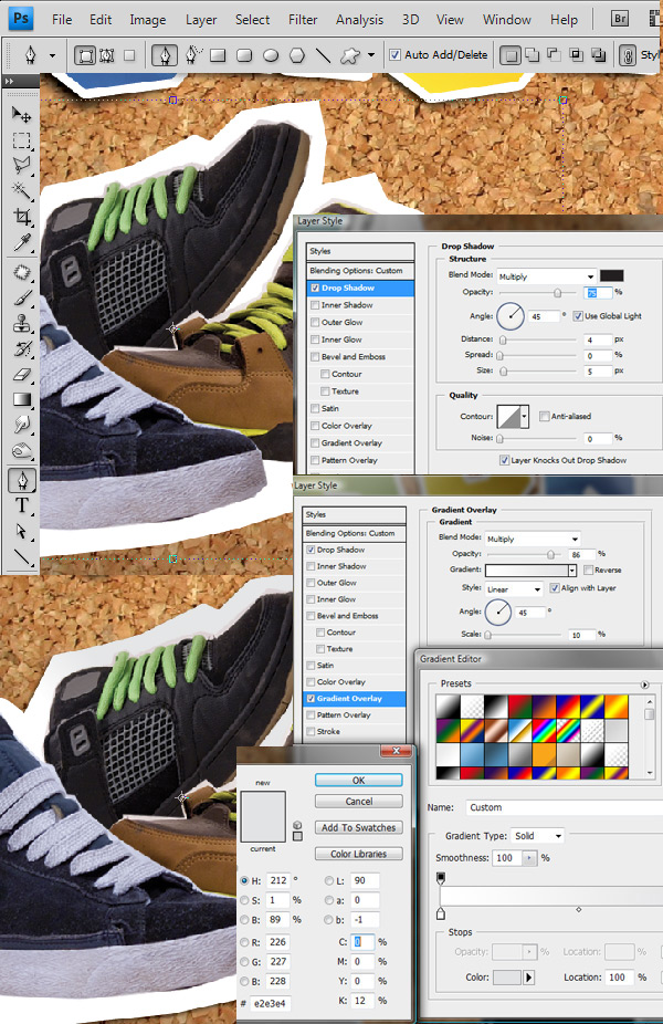
Now we apply the layer styles to the text layer, which includes a drop shadow, a gradient overlay and a stroke effect. So select your text layer and open up your Layer Styles menu. First, select the Drop Shadow and set your Opacity to anywhere between 50% and 75% (In this example I chose 75% so you could see them clearly, but normally I would tone them down to 50% or less because the light source is pretty soft). With the Global Light checkbox selected, set the angle to 45 degrees, the distance to 15px and the size to 5px.
Next select the Gradient Overlay checkbox, and for a color I chose a bright gradient for now. Set the Scale to 150%, and then set the Angle to 45 degrees, and reverse your gradient (if necessary). The letters should be dark at the top right and get lighter towards the bottom left where they curl away from the corkboard.
To finish it off, we add a Stroke effect, with Size at 10px, set the Color to white and the Position to Outside. Before clicking OK, save this new style by clicking the New Style button and name it something you will remember. You can always use that later to replicate the letter effect.
Step 6
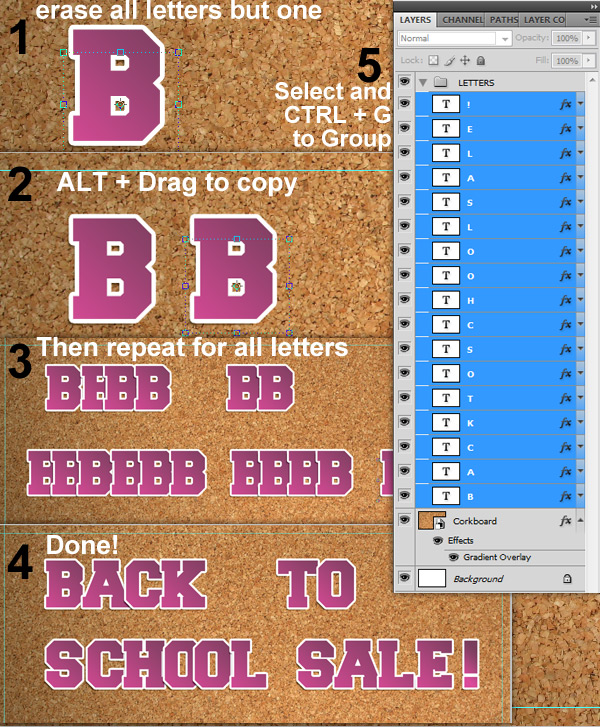
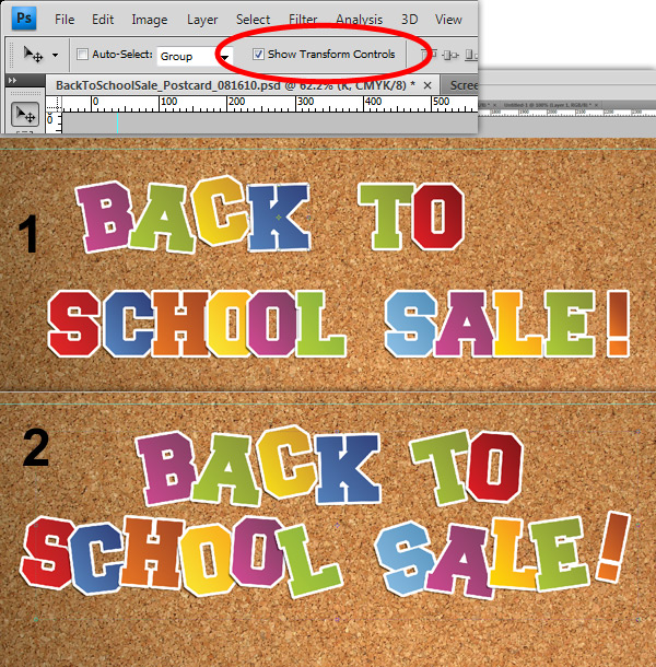
Next we need to break the letters apart and position them as if they were done by hand on a real corkboard. What I did here was to remove the text except for the first letter. Then with the Move Tool (V) and the one letter layer selected, ALT + Drag the letter over to the right to create a copy. You have to do this for all the letters in your string of text, so in the end we will copy the original ‘B’ 16 times. Then change them into the correct letter with the Type Tool (T).
Now you have a bunch of layers with just one letter of text, so select all your text layers (hold Shift when selecting) and hit Cmd/Ctrl + G to group them, or go to the menu Layer > Group Layers, and then rename that group "Letters". Now they’re nice and tidy for the next step.
Step 7
Hopefully you have some colorful gradients in your Photoshop Color Palette that you can use for coloring the letters, but if you don’t, I included the Gradient Swatches I used in this example. To change the color of each letter, expand the Layer Styles in the Layers palette by clicking the little down triangle then double-click the Gradient Overlay effect. With any gradient you use, make sure it goes from dark at the top right and lighter as it moves to the bottom left. Use the Reverse Gradient checkbox if necessary. I used some bright gradients here that are nice and bright, alternating the colors randomly for the handmade effect.
Step 8
Now that we are done coloring all our letters, we will need to make them appear crooked and out of line. The letters need to look like they were "stapled" to the corkboard. The way we do that is by rotating and positioning them with the Move Tool (V) randomly and quickly. Allow some letters to overlap so shadows can be created there too. The less time you think about it the better, and that goes for this whole handmade style (you can always tweak where needed).
So use the Move Tool (V) and select the layer that contains your first letter. Click the corner and rotate the letter to the position you want and hit Enter to set the transformation. Then move the letter around by dragging it with the Move Tool (V), or use the arrow keys with the layer selected to bump it around. Repeat that process for each letter. See below for the results.
Step 9
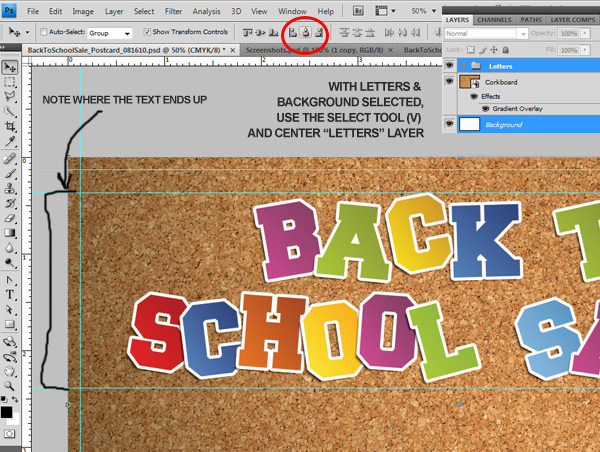
It’s time to zoom out and take a look at the "Letters" group. We just want to make sure the text is centered on the artboard and that it is up at the top, leaving plenty of room below for the other stuff. With the Move Tool (V) selected, click the "Letters" group and the locked Background layer to select them, and then hit the centering marker up top (circled). Now we don’t want to mess with the positioning of the text after this because we are about to add some shadows manually and some staples to hold the letters on that board. All these are in separate layers and groups, so moving the text later may result in stray objects that you will have to fix. So with the "Letters" group selected, use the Move Tool (V) to position the layer about a 0.5" from the top and make sure it looks good.
Step 10
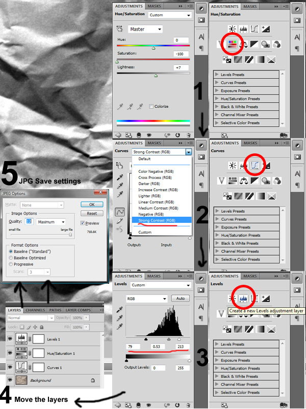
Before we add the cool paper texture to the letters to make them pop, we have to prepare the texture to bring out the contrast. Go to File > Open to open a new file and select the "papertexture9.jpg". Three adjustments need to be made. First, we desaturate it , so make sure your Adjustments Palette is open (Window > Adjustments) and click the Hue/Saturation icon. Set the Saturation to -100 and darken/lighten it a little bit if needed, I lightened it to +7.
Next we mess with the curves to bring out the contrast so select the background layer and find the Curves icon in your Adjustments Palette. In the Curves presets, select the Strong Contrast option and you’re done with Curves unless you need to tweak it a little bit.
Finally, we select the background layer again and click the Levels icon in the Adjustments Palette and set up the sliders as shown (79, 0.53, 213).
When you’re done with that click the "Levels" layer and bring it to the top (Cmd/Ctrl + Shift + ]), then move the "Hue/Saturation" Layer so it’s in the middle and the "Curves" layer should be at the bottom. Hit Cmd/Ctrl + S to Save As and save this file as a JPG, naming it "papertexture9_contrast.jpg" with the max settings shown (for printing). This texture can also be used with the displacement filter so feel free to save the PSD as "papertexture9_displacement.psd" if you want to use it later.
Step 11
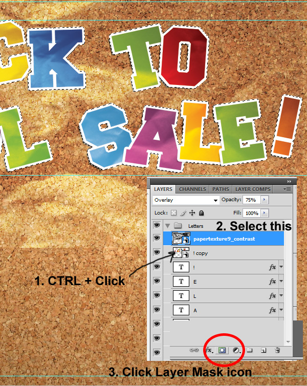
Before placing the texture we need to copy and convert the text to a smart object so we can use the selection from that to mask our paper texture. First, select all the letters within the "Letters" group, Alt-Drag them to the top of the "Letters" group to copy them all, then right-click (with all letters still selected) and select the Convert to Smart Object option.
Next go to File > Place and select the paper texture "papertexture9_contrast.jpg". Make sure its at the top of the "Letters" group, resize it if necessary to cover your letters, then change the Blend Mode to Overlay and set the opacity to something around 75% (depending on your letter colors, you can adjust until the texture blends in, or change the blend mode to Multiply). Move the texture around into a position that looks natural. Avoid showing an obvious crease line across multiple letters so that each letter look unique. You may want to try rotating, scaling, or even duplicating the texture.
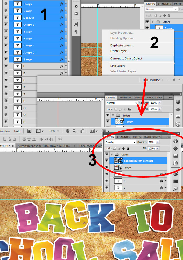
Once it’s in place and you like how it looks, it’s time to mask it with the smart object we just created. Cmd/Ctrl + Click on the thumbnail for the Smart Object to select it, then click the paper texture layer and click the little Mask icon at the bottom of the Layers Palette (shown) to create the mask. Then hide the smart object or delete it by dragging it into the Trash Can icon. Now the letters have some random depth that was created by a single texture.
Step 12
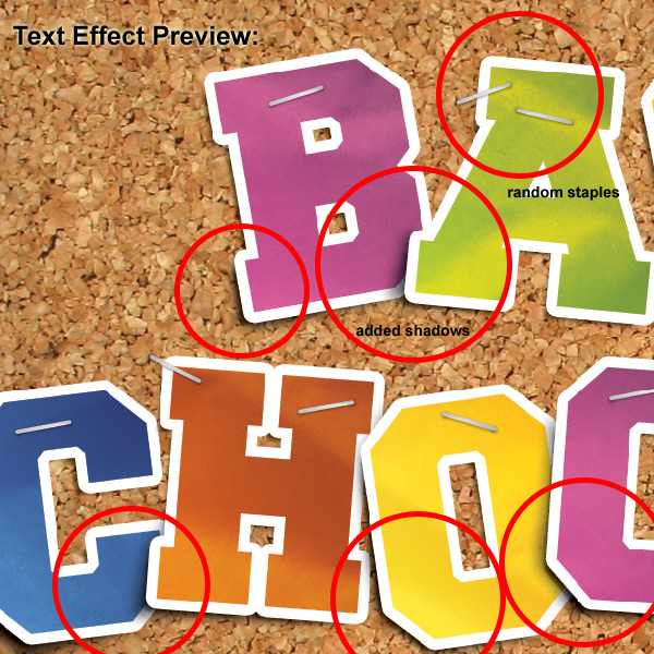
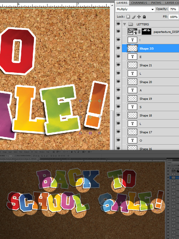
The next step is to create all the shadows under the letters. The key to drawing the shadows is to follow the lead of the drop shadows that are already there. For all the letters you want to accent those shadows, but the places where they overlap the shadows should be more prominent. This part can be done quickly and messy since it will be blurred afterwards.
To start, select the "A" letter layer, then grab the Pen Tool (P) with Black selected as your primary color, and start tracing to create a new black Shape Layer. Roughly trace the outline of the letter "A", going out about 5-10px from the shape of the letter as shown. After you draw the shape, set the Blend Mode to Multiply and set the Opacity to 75% (adjust this as necessary).
Then go to Filter > Blur > Gaussian Blur and blur 5px. It will ask you if you want to rasterize the layer, hit OK. From now on, you can just hit Cmd/Ctrl + F to apply the blur effect. Repeat those steps for every letter, with each shadow layer under its letter layer.
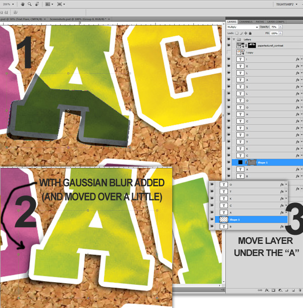
Feel free to move around or exaggerate the shadows on the letters to give them some depth, like the highlighted areas below.
Step 13
The final touch for our letters are the staples. The staples we create are just some basic layer styles applied to a rounded rectangle, and when copied and rotated around randomly, look like they’re done by hand. Just like the letters, the randomness in the placement and rotation of these staples adds to the effect so just remember the less time you think about it the better
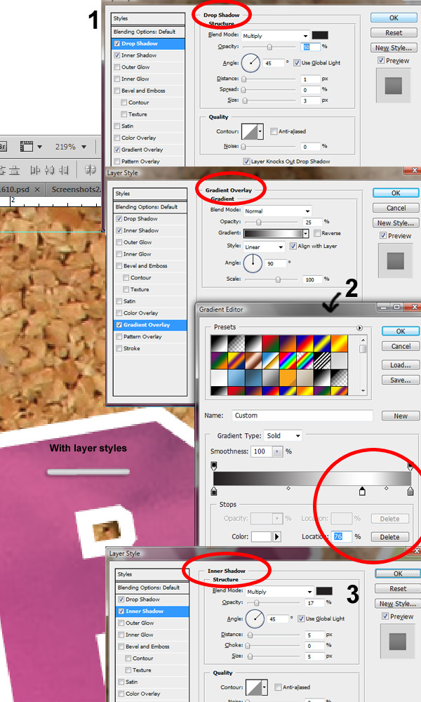
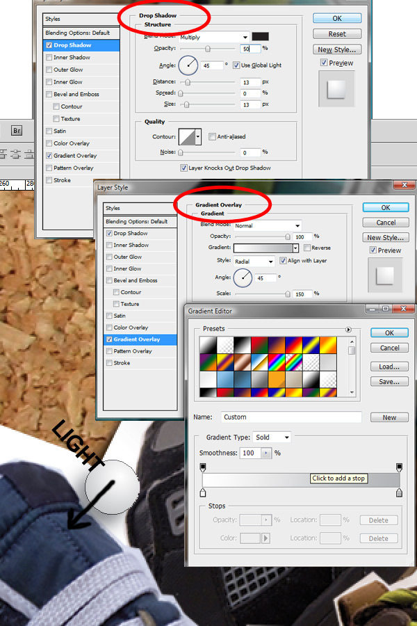
With white selected as the primary color, select the rounded rectangle tool from the Tools Palette (U, then Shift + U to cycle through), set the Radius to 3px (up top) and draw out a rectangle that’s about .0375" by .15". Name the layer "Staple", then open up the Layer Styles for this layer. We are applying a Drop Shadow, Gradient Overlay, and little Inner Shadow. For the Drop Shadow, set Opacity to 50%, check the Global Light checkbox, set the Distance to 1px and the Size to 3px.
For the Gradient Overlay, you need to create a gradient that goes from black to white to a medium-dark grey (K=60%). Set the white Position to 76% as shown. Click OK then set the Opacity to 25%, and keep the other default settings.
Lastly, select the Inner Shadow effect and set the Opacity to 17%, keeping the defaults.
Now just like you did the letters, rotate and move the staple into position. Then ALT + Drag to copy the staple for each letter, rotating and positioning randomly to make it look handmade. You can see some spots where I doubled up on staples, so have fun with it and feel free to get creative. It should look something like this when it’s all done.

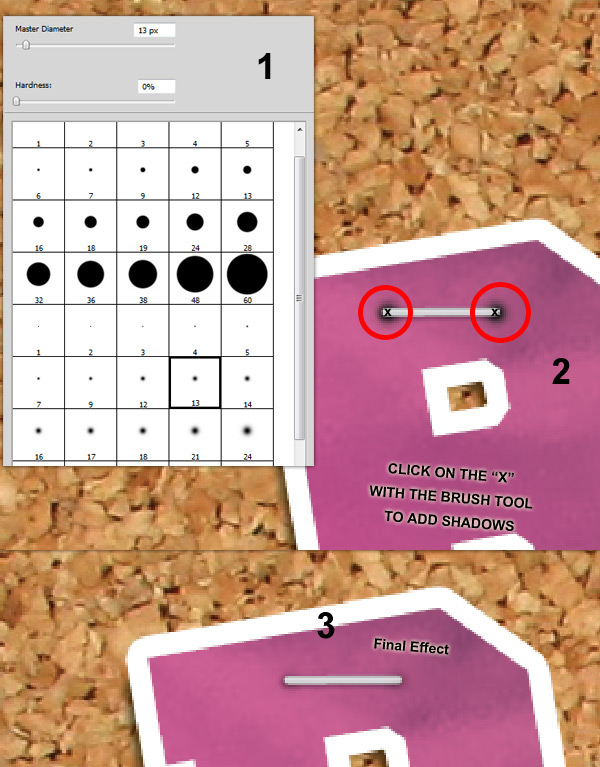
The staple looks good like this, but to give the final touch of realism we need to add shadows. So get out the Brush Tool (B), make sure black is your primary color, and select a soft brush about 10-15px in diameter. Create a new layer under the staple layer, rename it "Shadows". This layer will hold all your shadows, so make sure you get your staples in the right position before doing this. Then for each staple, just click the brush on the ends of each staple as shown. After that set the layer’s Blend Mode to Multiply and the Opacity to 75%. Finally, select all the staples and the "Shadows" layer and group them, then name this group "Staples & Shadows".
Step 14
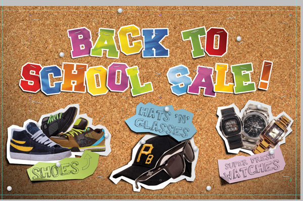
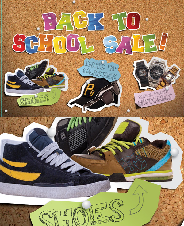
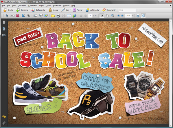
In this section we are going to stage the products and our other items on the corkboard, add realistic shadows, and hold them up with pins. Feel free to grab some photos of your own that you would like to showcase, but for this part of the tutorial I am going to assume you’re using the images provided. When you are done with this part, the postcard will look something like this.
Step 15
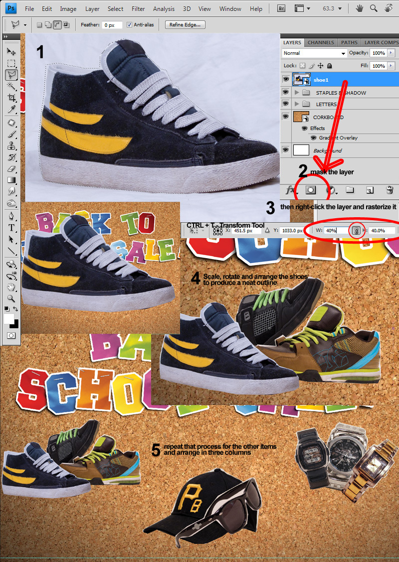
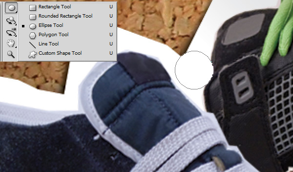
To get started place the "shoe1.jpg" onto your artboard (File > Place) and hit enter to set the image. Quickly trace 1-5px from the edge with the Polygonal Lasso Tool (L, then Shift + L) using long lines where you can but still leaving the edges rough and pointy. When you have traced the shoe and have your selection, click the Mask Icon to mask the shoe, then right-click the layer and select Rasterize Layer. Repeat that for the other 2 shoe images, "shoe2.jpg" and "shoe3.jpg".
Scale the images down the Transform Tool (Cmd/Ctrl + T) to about 40%. Then you can scale them down a little bit more with the Move Tool (V) and rotate and arrange the shoes. Try to make the silhouette more abstract and less square looking which will make the background look less boring.
I did this by rotating one shoe and sending it to the back of the layers, and horizontally flipping the other (Edit > Transform > Flip Horizontal) and moving it to the top of those layers. I used the same process for the Hat and Glasses images, and for the watches. Spread them out into 3 columns as shown in the preview.
Step 16
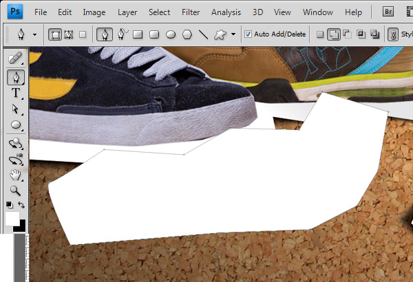
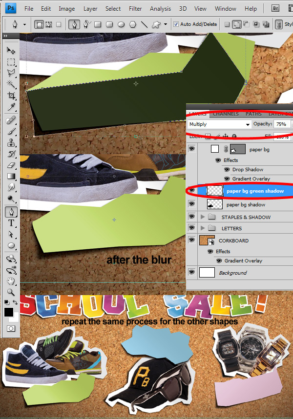
Once the items are cutout and arranged the way you want them, we give them the cutout paper background. Get out the Pen Tool (P), with white as the primary color and roughly trace the area around the 3 shoes using medium to shorter strokes than before. The shape should be rough and jagged, leaving 25-35px of space between the edges and should look as if cutout with scissors. Name the layer "paper bg" and then apply the layer styles as shown.
First, add a Drop Shadow and keep the default Blend Mode and Opacity settings, make sure the Global Light checkbox is checked, then set the Distance to 4px and the Size to 5px.
Next, add a Gradient Overlay and set the Blend Mode to Multiply at about 86% Opacity. Use a white to light grey (K = 12%) gradient at a 45 degree angle, making sure it goes from dark at the top right to light at the bottom left. I also changed the scale to 10% to bring out the gradient more.
When you are done, click the New Style button in the top right of your Layer Styles dialogue box to save that style as "paper bg". You can use that later for the other groups’ paper backgrounds when using the pen tool.
We are going to create shadows for this paper layer the same way we did for the letters, using the drop shadow as a guide. Get out the Pen Tool (P) with black as the primary color and create a rough outline around the shoes, exaggerating the outline around the bottom left as shown. When done, rename the layer "paper bg shadow" then apply a Gaussian Blur (Filters > Blur > Gaussian Blur) with a size of 5px. Repeat that process for the hat and glasses and watches.
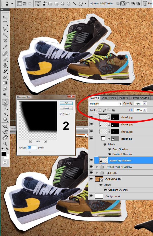
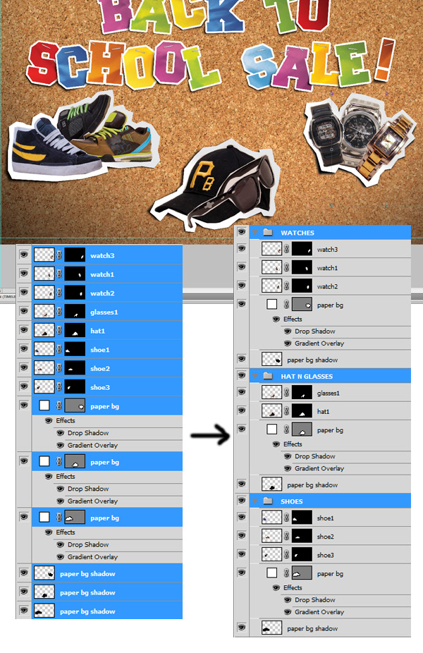
All done! Now let’s organize our layers a little bit by grouping the objects and their backgrounds, and naming them “Shoes”, “Hat and Glasses” and "Watches", respectively.
Step 17
In the next few steps we will be working with our fonts, but first we need to create the paper to put the text on. This is done the same way we created the "paper bg" and "paper bg shadow" layers in the previous step. The only difference is that I varied the color to make it interesting. And remember these are going to be pinned down later on.
Use the Pen Tool (P) with white as the primary color and roughly create a jagged rectangular shape as shown. Name this shape layer "paper bg green".
Then we add a Drop Shadow, a Color Overlay and a Gradient Overlay as shown. I used a tan gradient with a color overlay to make the paper color more subtle. So the base tan gradient is made with C=29 M=29 Y=41 K=0 and C=14 M=15 Y=23 K=0 and the green Color Overlay is made with C=27 M=0 Y=73 K=0.
Next we add the shadow layer with the Pen Tool (P) the same way as in Step 16. Roughly trace around the “paper bg green” layer, using the Pen Tool (P) with black as the primary color, then change the Blend Mode to Multiply and set the Opacity to 75% (keep in mind that you would probably want to tone that down for production). Rename this layer “paper bg green shadow”. I made the shadows a little more exaggerated with these paper tags.
Then, apply a Gaussian Blur of 5px. Repeat that process for the other two pieces of paper, with C=33 M=1 Y=0 K=0 for the blue and C=2 M=18 Y=0 K=0 for the pink Color Overlay.
Step 18
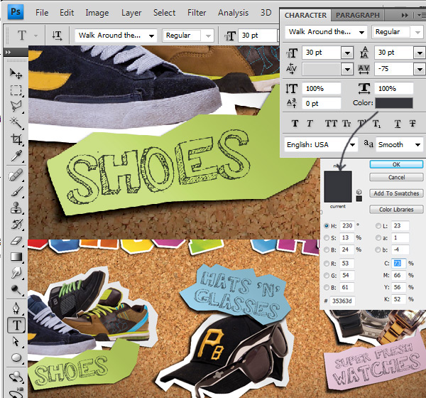
Time to add the text. With the Type Tool (T) selected, set the primary color to C=73 M=66 Y=56 K=52, set the Font to "Walk Around the Block", set the Font Size to 30pt, the Line Height to 30pt, and the Tracking to -75pt. Then click the artboard and type out "SHOES" and hit Enter. Set the Blend Mode to Multiply at 90% Opacity. Rotate the text and move it into position on the green piece of paper.
Then do the same for the other two pieces of paper, type out "HATS ‘N’ GLASSES" and "SUPER FRESH WATCHES". Rotate and scale if necessary to get the text to fit. In this case I scaled the hats part down and made "Super Fresh" a smaller font size before scaling. Make sure your layers are in the correct group as well.
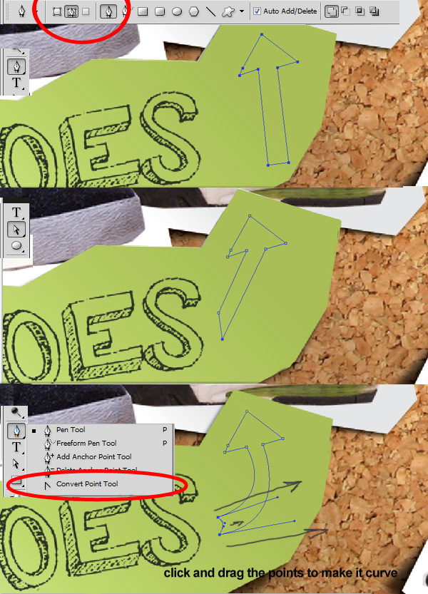
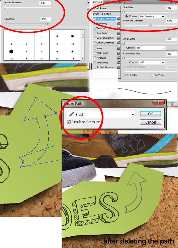
I’m going to add an arrow in there to fill up space on the shoes part, so with the Pen Tool (P) setting the mode to Paths as shown, draw an arrow shape starting from the top left (drawing my arrow I needed to use the Convert Point Tool as well, inside the Pen Tools Menu).
Next, switch to the brush tool and select a brush that’s around 5px in Diameter and set it to 90% Hardness.
Open the Brushes Palette, Window > Brushes (F5) and check the Shape Dynamics checkbox, changing the Minimum Diameter to 50% and leaving the other settings as shown.
Change the primary color to the same as the text color (C=73 M=66 Y=56 K=52) then create a new layer, Layer > New > Layer (Cmd/Ctrl + Shift + N). Switch back to the pen tool and right-click the path you just created. Choose the Stroke Path option, and when you are prompted with an options screen select the Brush Option and check the Simulate Pressure Checkbox and click OK.
To delete the path, use the Pen Tool (P) and right-click the path, choose the Delete Path option. Rename that layer "arrow". This will create a realistic pen fade effect that you can re-use later in your designs.
Step 19
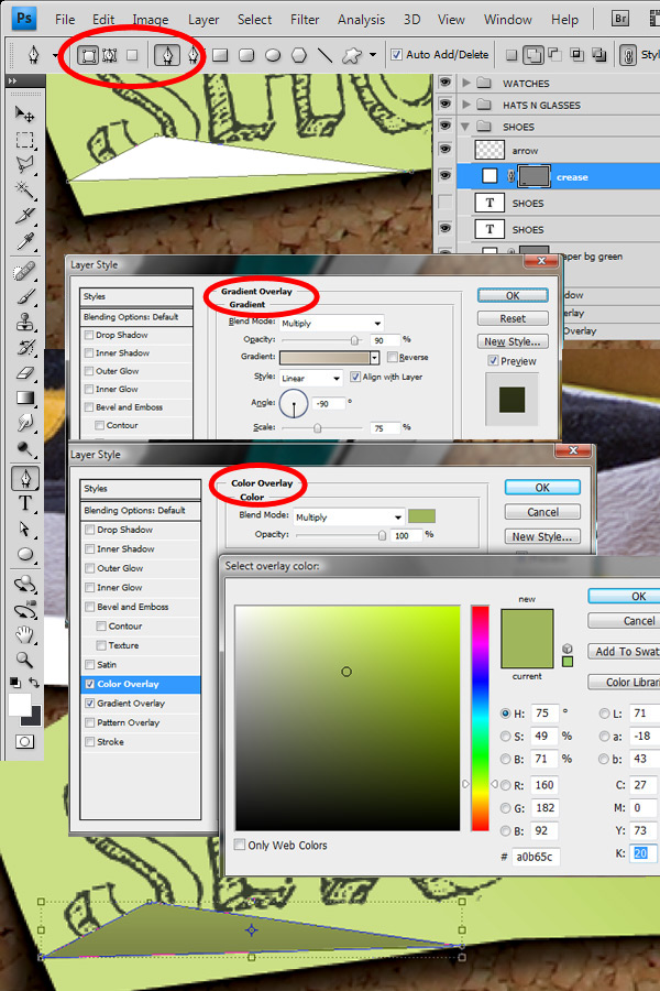
Since we have paper in our design, we have to add some creases in there to keep it real (but don’t over do it). For the creases, we are just manipulating our shape layers to give the effect of a folded piece of paper. This is nothing more than creating a couple triangles and adding a shadow afterwards, just like we have been doing this whole time. So we are going to continue using the Pen Tool (P), and find a good spot to create the crease. I chose the bottom left corner of the green piece of paper where it bends.
So using the pen tool, make sure you are back to using Shape Layers (icon up top) with white as your primary color, draw a triangle that you want to be your crease. Rename that layer "crease". Then copy the Layer Styles by ALT + Dragging from your "paper bg green" layer onto your crease layer. We won’t need a drop shadow though, so drag the Drop Shadow effect into the trashcan icon to delete it.
Change the Gradient Overlay angle to -90 degrees. Then change the Color Overlay Blend Mode to Multiply, alter the color by adding 20 to the K value, so the color is now C=20 M=0 Y=73 K=20.
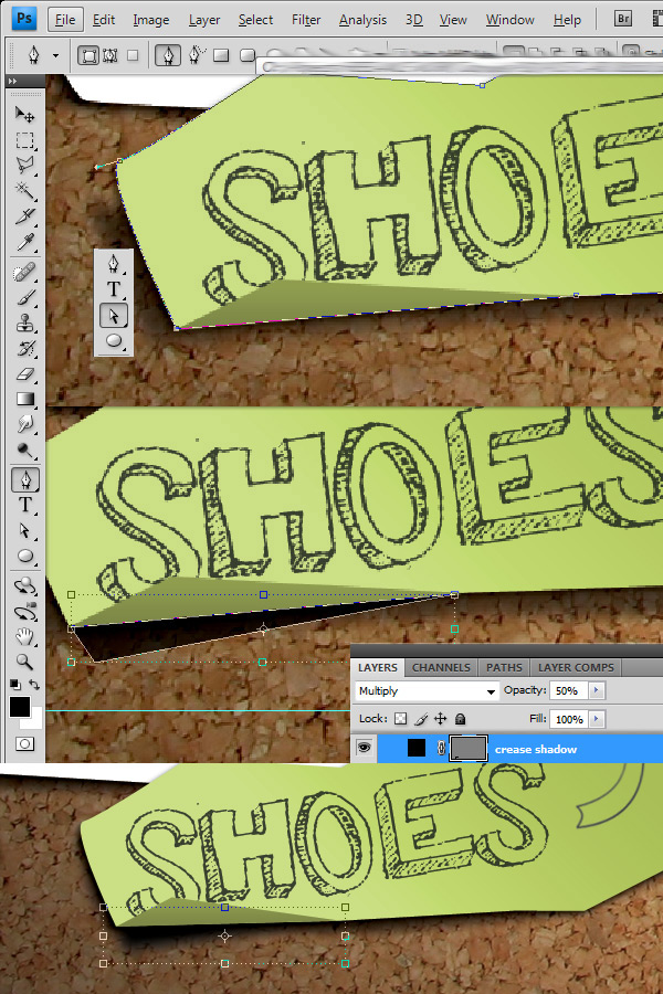
Now we just alter the mask of the "paper bg green" layer so it doesn’t show past the crease. Since it’s still a shape layer, we can just move the points so they align with the crease. First, click the thumbnail for the "paper bg green" layer so you can edit it’s vector mask, then with the Direct Select Tool (A) just click the points you need to move and drag them until they line up with the bottom of the crease. You may have to erase the extra shadow that sticks out where the vector mask used to be, so use the Erase Tool (E) with a big soft brush on the "paper bg green shadow" layer to remove the excess.
Then we add a custom shadow to the "paper bg green" layer the same way as you have in Step 16. Just remember the light source will make this shadow shift a little towards the bottom left. So with the Pen Tool (P) and black as your primary color, draw out a reflection of the crease as shown, then set the layer’s Blend Mode to Multiply and the Opacity to 75% to make it a little lighter than the drop shadow. Next, rename this layer "crease shadow", then go to Filters > Blur > Gaussian Blur (clicking OK to rasterizing the layer) and set it to 5px, click OK. Now you can move your shadow layer into place under the "paper bg green" layer.
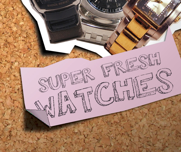
Then, I did the same thing for a crease on the pink piece of the paper and here’s what it looks like when it’s finished (I changed the Gradient Overlay Angle to 45). Feel free to get creative, try it on the letters or apply it to the images as well. Just try not abuse the effect too much.
Step 20
Next we add some pins to hold things up and throw some extra staples into the mix as well. Pins are easy because they’re just circles with some layer styles applied. To begin, let’s add a pin to the "SHOES" group.
With white as the primary color, make an ellipse with the Ellipse Tool (U, Shift-U) about 40px by 40px, or 0.15". Name this layer "Pin". We are going to copy this layer lot, so place it at the top of your layers.
Apply a Drop Shadow with the default blend mode and set the Opacity to 50%, make sure the Global Light checkbox is checked, and then set the Distance and Size to 13px. This will give the illusion that our pin is higher above the board.
For the Gradient Overlay, set the Angle to 45, the Scale to 150%, and change the Style to Radial. Then change the gradient color and use the default black to white gradient, change the black to grey (K=35%), then switch it so the white is on the left and click OK.
Now that one pin is done, just ALT + Drag them out to copy them, and use the Move Tool (V) to position them in place. I used pins for the images and the paper, positioning them according to the light and just what looked good. Then I scattered some pins around the corkboard too.
When you’re done, select all those pin layers, and use Cmd/Ctrl + G to group them. Name that group “Some Pins”.
Step 21
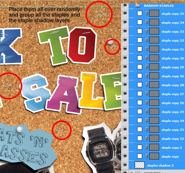
Now that our art is basically done, it’s time to add some finishing touches. First, lets add some stray staples to the corkboard just like we did with the pins. So open your "Staples & Shadow" Group and click on a staple layer and ALT + Drag it up to the top of your layers. Position it randomly on the corkboard, rotating it if necessary. Then ALT + Drag that staple out and position it randomly somewhere, again rotating if necessary. Do this 10-20 times or so, until you’re satisfied, making it look nice and random.
Then create a new layer for the staple shadows, and the same way we did the staples at the end of Step 13, use a 10-15px soft brush with black as the primary color, with the Blend Mode on Multiply and the Opacity at 50% and click on each end of the staple to create a little indent shadow for each staple. Name that layer "staple shadows 2", move it below all the staples, and then select it and all the staples and group them. Name that group "Random Staples".
Step 22
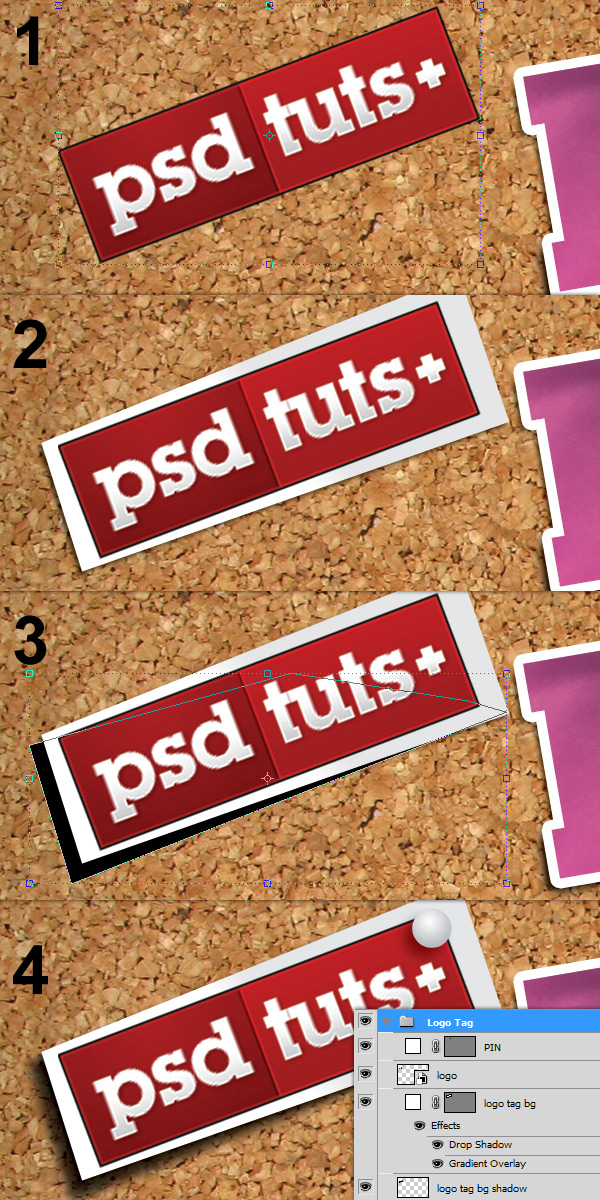
Next we are going to add two tags, one will be the Psdtuts+ Logo, and the other will be a sale tag that we will add text to. These are the same techniques we have been using in steps 16 and 17.
Place the "psdtutslogo.jpg" image, rotate and move it into position in the upper left corner. Use the Pen Tool (P) with white as the primary color and roughly create a rectangular shape 5-10px around the logo and move that layer under the logo image. Move the points around with the Direct Select Tool (A) so it looks like an uneven rectangle that was cutout by hand. Then copy the layer styles from your "paper bg" layer into this layer and name it "logo tag bg".
For the shadow, select black as your primary color and draw a triangle shape with the pen tool like shown. Set the Blend Mode to Multiply and the Opacity to 75%. Use Filters > Blur > Gaussian Blur of 5px to blur the shadow. Move this layer under the "logo tag bg" layer and name it "logo tag bg shadow". Then copy a pin above this layer and position it to hold the logo tag up in the top right corner. Grab all the logo tag layers and group them, name the group "Logo Tag".
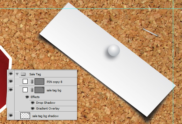
For the sale tag, we are going to put text on it so we just need to copy the "logo tag bg" layer and rename it "sale tag bg". Move it to the top right and rotate it to fit so most of it is within the bleeds. The shadow I created is curved, using the Covert Point Tool on the shadow path. Again copy a pin from the "Some Pins" group and position it above the tag to hold it up. Select all the layers associated with the sale tag and group them, name the group "Sale Tag" then move it and the "Logo Tag" group under the pins and staples layer.
Step 23
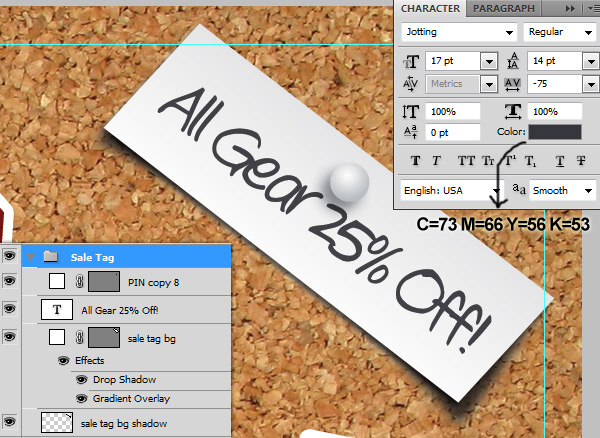
Finally we add some sale text, the website URL, some random text, or whatever you want here. In this case, I need to add some sale text first. So with the Type Tool (T), set the Font to Jotting, the Size to 17, the Tracking to -75 and the Color to C=73 M=66 Y=56 K=53. Click the artboard and type out "All Gear 25% Off!". With the Move Tool (V) scale and rotate the text into place so it’s still within the bleed marks and fits within the sale tag. Set the layer’s Blend Mode to Multiply, the Opacity to 90% and then move this layer into the "Sale Tag" group, making sure it’s at the top of the group.
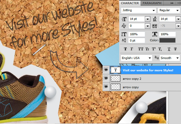
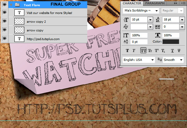
For more visual appeal, we can put some more random hand drawn text around the artboard. So with the type tool still selected, click the artboard and type “Visit our website for more styles!” (the same font settings for the sale tag text should be used). Scale it and place it like shown. Set the Blend Mode to Multiply and the Opacity to 70%. I also copied the arrow layer from the "SHOES" group and rotated it into place here. I copied it twice to make it darker.
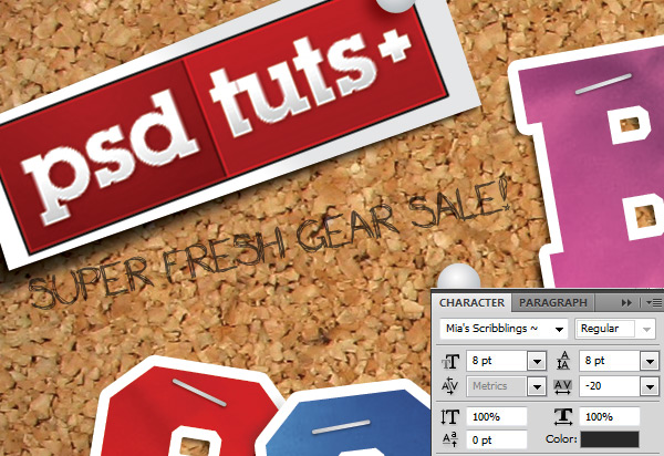
Next, with the Type Tool (T) still selected, change the font to Mia’s Scribblings, then click the artboard and type “SUPER FRESH GEAR SALE!”. Scale and rotate it into position as shown under the logo and set the Blend Mode to Multiply and the Opacity to 70%. Place that text layer in the "Logo Tag" Group at the bottom of the group.
Then do the same thing and type out the web address, "HTTP://PSD.TUTSPLUS.COM" and move it to the bottom right corner. Scale it up so it’s easily noticed and read. Now select this layer, and the 2 arrow copies, and the "Visit our website…" text, and group these layers, name the group "Text Flare" and place it at the top. If you have your own tablet, now would be the perfect time to add some doodles. Now look at that, you’re done!
Step 24
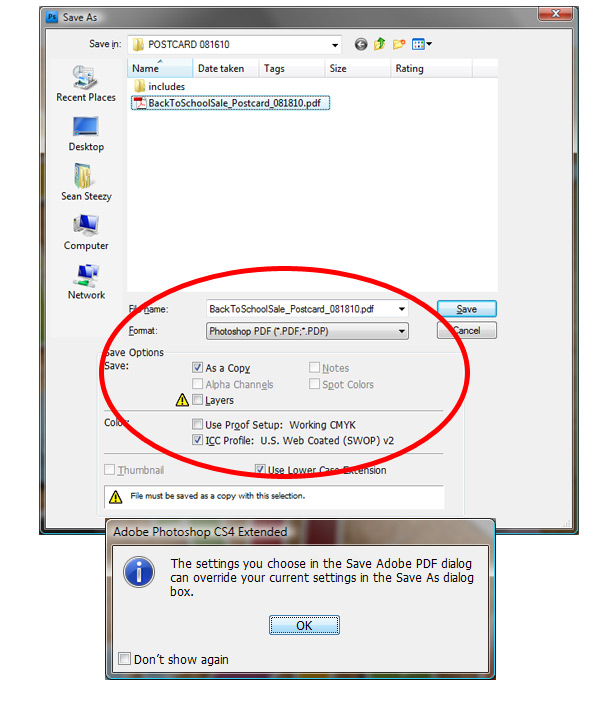
Saving the file for final output is fairly simple but a lot depends on how your print shop wants it. In this case we included bleeds in the document size, and we could go in and manually add the crop marks, but for the purposes of this tutorial, we assume our printer will do this for us (There are many tutorials already covering this aspect).
So go to File > Save as to bring up the file save menu and choose Photoshop PDF. Make sure you save it without the layers selected and then choose save as a copy as shown and make sure a color option is selected. When you click Save you are prompted with a warning, ignore it and click OK to bring up the Adobe PDF settings dialogue.
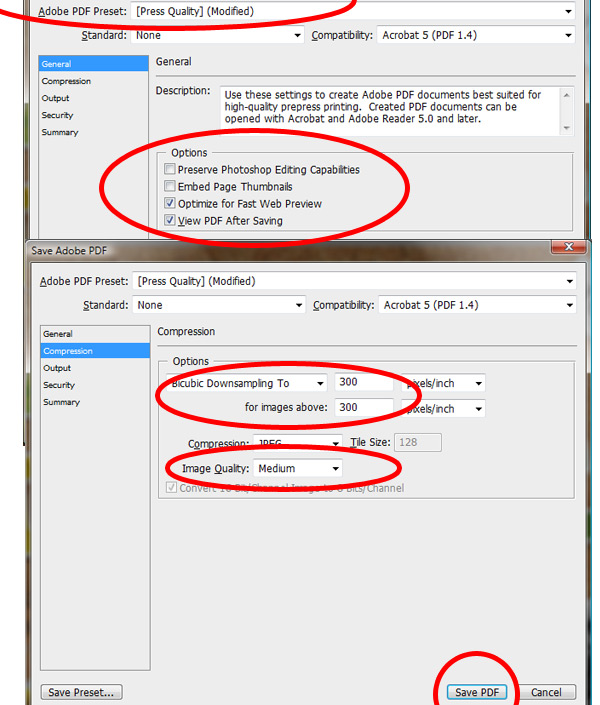
I saved the files using the Press preset and tweaking a couple settings to get the file size down to an email size. Saving this file as a full quality PDF would result in a file size of about 48MB, which isn’t good for email, but will work if you have an FTP connection you can upload directly to your printer. When printing, the higher quality is always best, but if I need to email I have to tweak a couple settings.
First, in the General options, de-select the Preserve Photoshop Editing Capabilities checkbox and select the View PDF after Saving checkbox so you can see your final PDF. In the Compression Menu set the Downsampling option to 300 and 300 pixels per inch. The biggest difference in file size comes from the Image Quality option. I set mine to Medium and the file size was about 12MB as opposed to 41MB with Maximum.
Conclusion
Finding other resources to customize this effect is easy here on Psdtuts+. There are a couple tutorials you can visit to get a better idea of some more objects you can add, such as How To Create A Desk Environment In Photoshop From Scratch and Create a Bulletin Board With Realistic Shadows [1] [2].
Really this tutorial was made to show you that creating the effect is the easy part. Your imagination should open up and all sorts of possibilities should come out of there. Create a photo corkboard, create a map of your area, create a cool wallpaper, add some post-its, use it for website design, anything you can think of you can make it happen. Hope you enjoyed and if you have any questions or a better or quicker way to do something, let us know!


0 comments:
Post a Comment