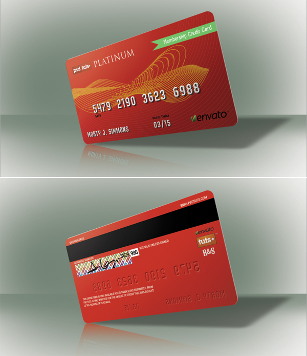
Final Product
In today’s quick tip tutorial we will demonstrate how to create a realistic-looking credit card using Photoshop and Illustrator in just a few short steps. Let’s get started!
Step 1
To speed up the process, we will begin by putting together some basic graphics in Illustrator. Make a 3.5in by 1.9in rounded rectangle, then fill the object with a color or gradient of your choice.
Draw some curvy lines as shown using the Pen Tool. Then go to Object > Blend > Blend > Blend Options > Specific Steps, enter 30 and click OK. Make two different lines with different colors.
Select the line art that you just created and apply a clipping mask using the shape of the credit card. Make sure that the credit card shape is placed on top of your line art and that you’ve duplicated your credit card background as well.
Note: if you are using Illustrator CS5, select the credit card and click the Draw Inside option to Paste (Cmd/Ctrl + V) inside the objects.
Use the Pen Tool to draw the ribbon as shown.
Step 2
We are now finished with Illustrator. Let’s get started by opening Photoshop, creating a new canvas that’s a bit larger than your Illustrator document and then by copying and pasting each element that you created in Illustrator individually. At this stage, you should already have some logos and graphics that you would like to place on the card. If not, go ahead and create some. Add your graphics to the card, as shown. Feel free to use the following fonts in your card as well. Download them here and here.
Step 3
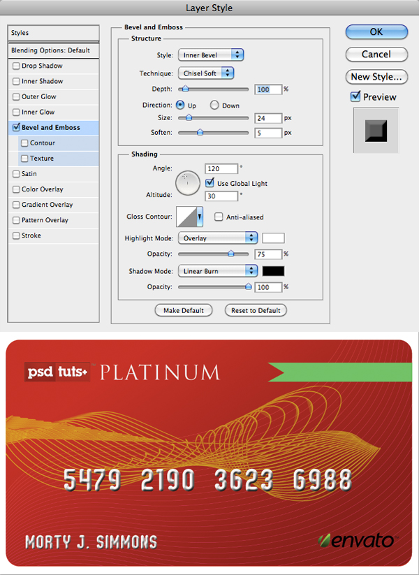
Now it’s time to add your text. Choose the Oval Typeface using #f1efed. Type out some random numbers and a name. Then apply the following layer styles.

Step 4
Now it’s starting to look more like a credit card, let’s add some shadows to make it look more realistic. Duplicate each layer, change the font’s color to black and turn off the Layer Styles, this will give us the base shadow. Now move the shadow numbers about 3-5 pixels to the right and 3 pixels down (do the same with the name as well), now go to Filter > Blur > Motion Blur, then type in Angle: -34 and Distance: 10px; set the Layer Blend to Multiply and 50% Opacity. For final touches of the front side, go ahead and look at your reference credit card and add an expiration date wherever you want it placed and you will be done with the front side, make a new folder and drop all the layers inside and name it FRONT.
Step 5
Now, let’s work on the backside of the credit card. Duplicate the credit card base, move the layer to the FRONT folder, then Right Click on the layer and rasterize, make a selection of it and fill it up with a color you used on the front side (I used the bright red on the top left of the credit card’s front side). Note: don’t use gradients for the back.
Go to the FRONT folder, duplicate the text layers that you used Layer Styles (credit card numbers, name and expiration date in my case) on and drag them to the BACK folder, then flip them Horizontally and change the color of the text to the same as the credit card’s back.
Now we need to change the Layer Styles of the text layers to make them look as if they were stamped and look as the reference credit card, Double Click on the layer and change the values as shown below, do the same for the other layers.
Step 6
Now the credit card looks like your reference, go ahead and arrange the rest of the elements you made for the back side of the credit card.
Some elements like the signature rectangle can be done in Photoshop, if you have a logo of your own you can rotate it 45 degrees and duplicate several times and make a pattern, then select each one and change the color of it with Hue and Saturation (Cmd/Ctrl + U), then Merge them all together, in another layer make a rectangle the size you want for the signature and fill it with white, make a selection of rectangle > select the pattern layer and click (Cmd/Ctrl + Shift + I) to inverse the selection and Erase, then merge both layers.
To make the signature make another layer, select a hard black brush and make a random signature. Finally, add the security codes.
Step 7
If you like, you could end the tutorial here but now we are going to add some perspective to the card. Duplicate each folder, then Right Click on the group folder and select Merge Group, do the same for each folder. Now we have 2 layers, one of the front and one for the back of the credit card, select both layers and Click Cmd/Ctrl + T to transform and make them smaller, then rotate a little and Right Click to select Perspective and transform as desired.
Step 8
Select a layer of the credit card (no matter if it’s front or back) and duplicate, make a selection of it and fill it with a light grey, then move it about 2px to the right. To make the shadow of the card, Duplicate the credit card and make a selection of it and fill it with black, then Click Cmd/Ctrl + T to transform > Right click and select Distort and transform as desired; Go to Filter > Blur > Gaussian Blur > 10 px radius; set the Layer Blend to Multiply at 30% Opacity.
To make the Reflection, Duplicate both credit card layers, select both layers and flip them vertically (Cmd + T > Right Click > Flip Vertical) and arrange them on the tip of the credit card; select a Soft Eraser Brush with 30% Opacity and erase each layer to make the reflection.
Step 9
Let’s make some lights and shadows, make a selection of the credit card, then make a new layer, select a white soft brush, Normal Mode at 20% Opacity and on the top left corner add some light, then change color to black and add some shadows on the lower right corner.
Final Image
Make a background and you are done! To make images of each side of the credit card just turn off the front side layer, remember to turn on or off the corresponding reflection layer as well; you can use this tutorial to make a credit card icon; remember that you can make different color credit cards by playing with Hue and Saturation.


0 comments:
Post a Comment