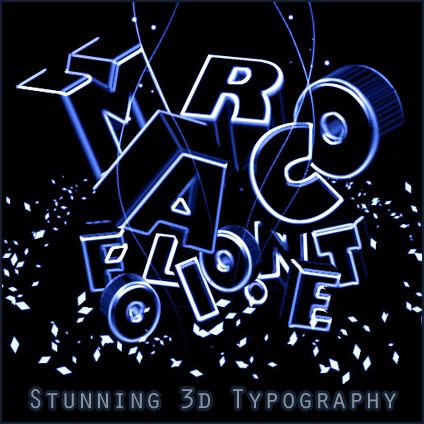
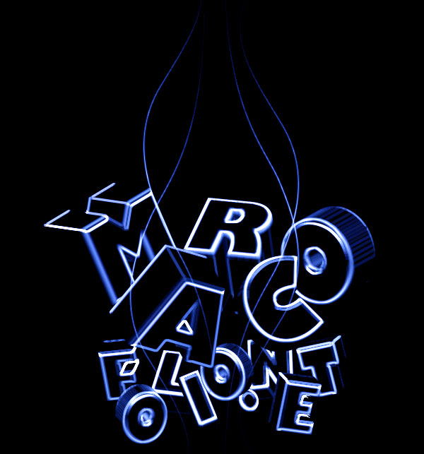
This tutorial is inspired by one of the creations I placed in the beauty of 3d typography article. By combining the powers ofIllustrator and Photoshop, you can recreate this awesome technique.
Typography is a really hot topic at this moment in the design sphere and neon light is and has always been an effective way to attract users. Combine these two to make some beautiful artwork.
with a size of 800 x 600. I gave the image a black background because I'll be placing white characters.
Place your character using the Text tool (T). I placed the letter "M", a font called Gill Sans Ultra Bold|
and a white (#FFFFFF) color. With the character still selected, go to Effect > 3d > Extrude & Bevel... A new window will pop-up. I used the following settings for the 3d character.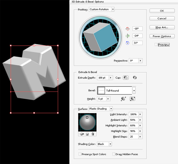
Create more characters in your file. Give each character another kind of rotation by rotating the cube in the Extrude & Bevel Window. Place them in a way that suits you, positioning them under / above other characters, rotating them, etc. Just play around. I created my name "Marco".
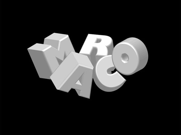
Now let's go to Photoshop. Start up the program and create a new file with a size of 600 x 800. Give this file also a black (#000000) background.
Drag each character from Illustrator on a new, different layers in Photoshop. The character will be placed as an Smart Vector Object.
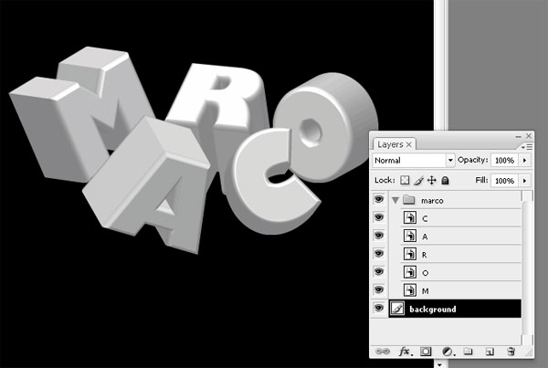
I wanted to add some more characters, so I did. I switched back to Illustrator, created more words (folio and .net) with the same font but with smaller size. I rotated them in all different ways and placed them, once again, in different layers in Photoshop.
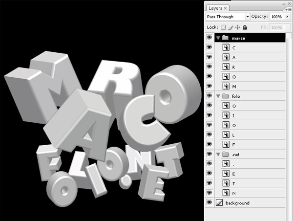
Select one of the layers containing a character. Go to Filter > Stylize > Glowing Edges. This will give the character the neon glow. I used an Edge Width of 3 px, Edge Brightness of 9 px and Smoothness of 5 px.
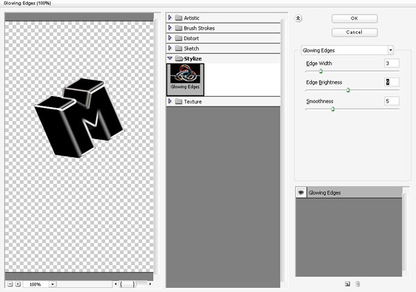
Apply the Glowing Edges filter to all other characters, using the same settings as the previous step.
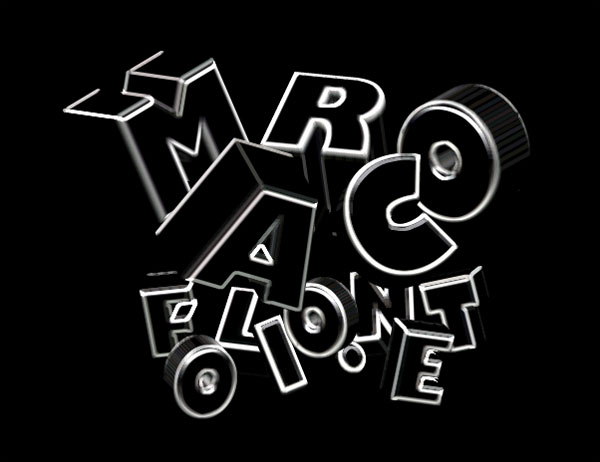
Now we're going to give this image a little bit more color. Make sure you have the top layer selected and go to Layer > New Adjustment Layer > Color Balance. A new window will appear.
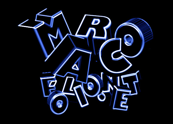
I used the following settings to create a neon glow blue color. Of course, you can change this to whatever color your like.
- Shadows : 0, 0, 0
- Midtones : -71, -20, +58
- Highlights : -34, -23, +83
Time to add some swirly "power lines" to the artwork. To do this, select your Pen Tool and set it to Paths. Draw a path, following the line where you want to power line to be.
Now grab a hard brush with a size of 2 px and a color of #FFFFFF. This white color will be blue because of the color balance layer. Now right-click on your work path in the paths palette and select Stroke path and make sure that the source is set to the Brush. Also, check if Simulate Pressure is selected. Press Ok to apply the brush.
Repeat this step several times to draw a couple of these swirly power lines to your artwork.
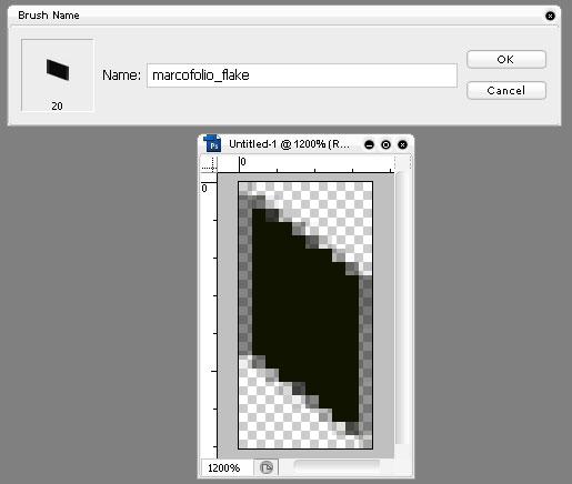
To create the flakes, we'll create our own brush. Start up a new file with a size of 10 x 20 px. With the Pen Tool, draw your own "flake".
When you're done, go to Edit > Define Brush Preset and give your brush a name. Check out my example below and please note I zoomed in to a zoom level of 1200%. When you're done, you can close the file.
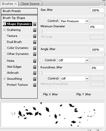
Go back to your other file to prepare the brush. Create a new layer beneath the color balance layer. Press F5 to bring up the Brush palette (or go to Window > Brushes). Make sure you have your custom made brush selected.
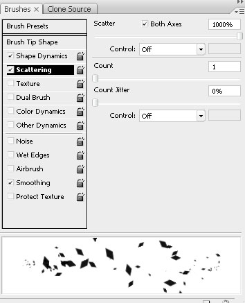
Now play around with the Brush Tip Size, Shape dynamics and Scattering to create a nice, random brush. I used the following settings.

Now draw a path (using the Pen Tool) around your typography to enhance the 3d effect.
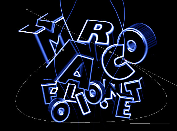
Apply your custom brush to the path, by right-clicking on your path in the paths pallette and selecting Stroke Path. Once again, make sure you have Simulate Pressure on and the source set to Brush. Press Ok to apply the brush.
Remove the parts that are behind the typography with your eraser tool (or mask it). You should end up with something looking like this.
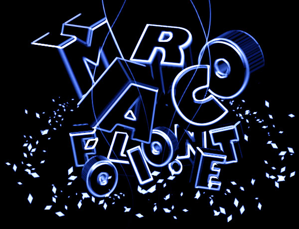
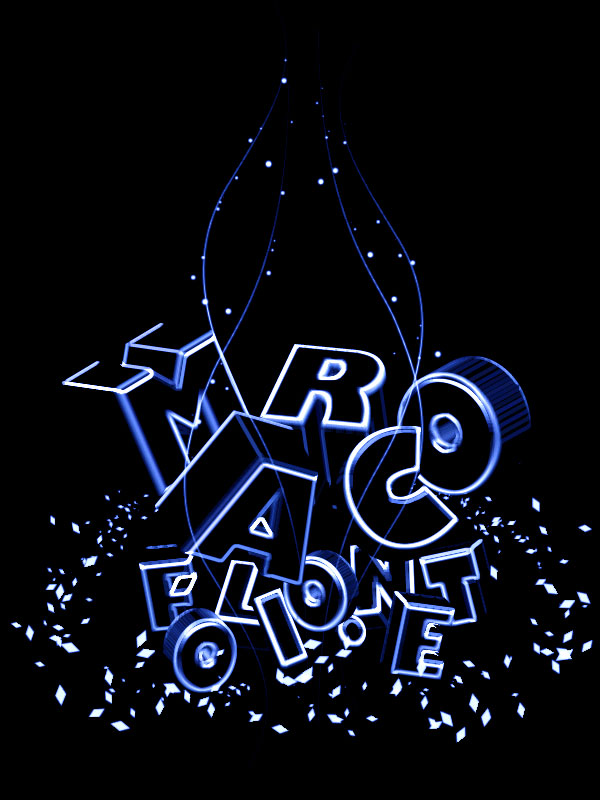
For the finals steps you can do whatever you want. I added a couple of sparkles using a round, small brush and playing around with Size and Spacing jitter. You can also think a little about adding another light source with nice shadow effects (Burn Tool).
0 comments:
Post a Comment