In this tutorial I will be showing you how to take any drawing and turn it into a mixed media masterpiece using Photoshop. We will be combining some digital painting techniques with textures and light effects to achieve the desired result. I will be showing you how you can use these techniques for just about any type of design. If you are ready to get started then let’s go!
Resources
Resources Used In This Tutorial


Resources
Resources Used In This Tutorial
- Paper Textures by Hibbary on Deviant Art
- Sparkle Brushes from Gimp
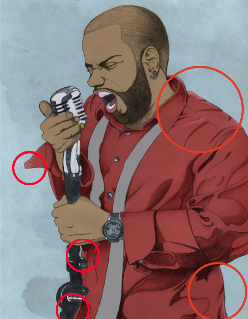
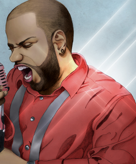
Final Image
Here is a preview of the image that we are going to be creating:
Step 1
When approaching a mixed media piece like this it is important to take your time to develop a strong sketch once you have an idea of the piece that you want to create. I strongly recommend gathering reference materials and doing a bit of research to find things that inspire you before taking it to the sketchbook.
Here I have done a drawing of a musician/singer that is full of energy and life. My inspiration for this has come from a recent trip to New Orleans where music and art are completely infused into the culture.
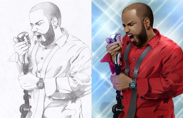
Once you have a drawing that you are happy with, scan it into Photoshop at 300 dpi. Alternatively, if you don’t have access to a scanner you could also use a digital camera to take a picture of your drawing and then import that image into Photoshop. Below is my drawing that I have scanned which we will be using as a starting point for this tutorial.
You will find this scanned drawing in the folder called ‘drawing’ inside of the resources folder.
Step 2
After opening the drawing, create a new document that is 8.5”x11” and 300 dpi. For now you can leave the color set to RGB as shown below:
Drag the drawing into the new document and position it so that the bottom and right edge of the drawing are flush with the document canvas. The original sketch that I have scanned was done on a standard sized paper so you shouldn’t need to scale it up at all. Keep this in mind when working on your own mixed media piece because if your drawing is very small you may run the risk of losing some of the quality if you need to blow it up after scanning.
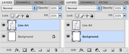
Now what we want to do is double click the Background Layer, which is currently locked, and press OK when the dialog box appears. Once the layer is unlocked we simply want to rename it ‘Background’ just to keep track of things. It is worth mentioning that as we go through the design process we should keep track of all of our layers by naming them. This will save you a headache later on, especially if we end up having 50+ layers to keep track of.
Step 3
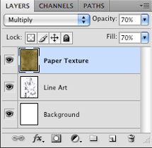
Next, open up the first paper texture from the textures folder nested inside of the resources folder. These textures are also quite large which is great, and by adding this to our design we will already begin to see some interesting results.
What we want to do is make sure that the texture covers the entire canvas before we change the Blending Mode to Multiply. From here, reduce the Opacity and Fill to 70% as shown below:
After doing this you should have a result that now looks like this:
Step 4
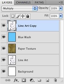
Create a new layer at the top of your Layers Palette and select the color #00C6FF as shown below:
Using your Paint Bucket Tool (G) fill the new layer with the vibrant cyan color we have just selected.
After doing this, we want to change the Blending Mode of the layer to Hue so that we get a nice toned down version of the color. This creates more of a cool gray-blue color. By adding this color and blending it with the paper texture we are beginning to establish the mood of our design.
Step 5
So far we have been building up some color and texture on top of our Line Art Layer, but by doing this we also start to lose some of the contrast of the drawing. To bring this back we will make a copy of the Line Art by selecting the layer and pressing Command+J to duplicate it. Move the newly duplicated layer to the top of the Layers Palette and change the Blending Mode of the layer to Multiply as shown here:
Below you will see the difference that this makes, bringing some of that good contrast back into the piece.
Another reason that we are making a copy of this layer is because we will be doing a bit of painting to add some color to the design and we want to make sure that we don’t cover the drawing.
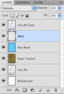
Step 6
Create a new layer just below the duplicated drawing layer and select the color #F35A53 as shown below:
Change the Blending Mode of the new layer to Multiply and with your Brush Tool (B) select a small-to-medium sized brush.
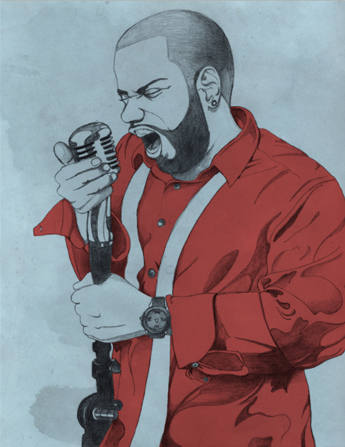
Begin to paint the shirt using the new color and your Brush Tool (B) staying inside of the lines. For this part I recommend zooming in at about 400-500% so that you can see the details. It’s okay if you do go outside of the lines in some spots, you can just go in and erase the areas outside of the shirt. After doing that you should have something similar to the image below:
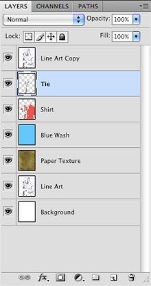
Step 7
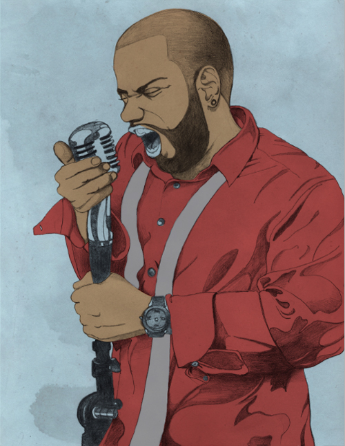
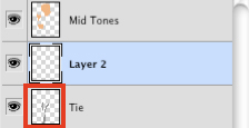
Next, we will create another new layer above the previous layer, but still below the line art. Choose a medium gray color (#929292) and using your Brush Tool (B) we want to paint the tie. For this part we will leave the Blending Mode set to Normal.
Zoom in while doing this to help stay inside of the lines. Again, if you go outside of the lines then you can use the Eraser Tool (E) to clean up the edges.
Step 8
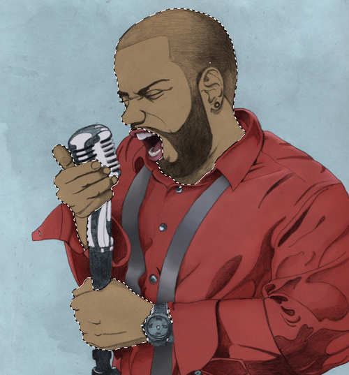
Now we want to focus our efforts on laying down some mid-tones for the skin. Select the color #FBB584 and on a new layer above the tie layer begin to paint with your brush inside of the hands as well as the head. For now we will color around the mouth because we will be using slightly different colors for this area. We also want to make sure that the Blending Mode of this layer is set to Multiply.
By doing this we can start to create a more realistic piece. We will be adding slightly darker values for the shaded areas as well as some lighter areas to create the highlights. All together we will try to stay in the range of 3-4 different values, but before doing that we need to have a foundation, which is why we start with a color somewhere in the middle.
Step 9
Next we will create another new layer above the skin and using the color #985E63 we will paint the lips.
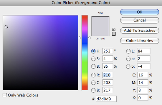
Create another new layer above the lips and use the same color to paint the tongue. Once you have done that we will need one more new layer. Choose the color #D2D0D9 to paint in the teeth.
This area may look a bit bright right now but we are going to be brightening up the skin and clothing once we add more values so everything will balance out. You should now have three separate layers for the mouth – teeth, tongue, and lips all with a single flat color applied.
Step 10
Create another new layer and using the same color that we used for the teeth in the previous step we will paint the highlighted areas of the microphone only – leave the shaded areas as is for now.
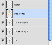
Create another layer for the watch and one for the buttons on the shirt. Use the same color to paint in a few of the highlights here as well. Once you have done that make sure to save your work in case you haven’t done so already. You can see all of the layers we have already, and this is why it is so important to name them so that we can easily locate specific layers when we need to.
We have now applied our flat colors over the image and from here we can begin to introduce some more values to enhance the depth of the design. This is what we have so far:
Step 11
Create a new layer above the shirt layer and set the Blend Mode to Multiply. Using the same color we used for the mid-tone (#F35A53) we want to choose a soft round brush at 20-40% opacity and begin to brush in the shaded areas to enhance the shadows.
Continue to go over the shaded areas to bring out some of the darker parts of the shirt. The effect should be subtle but you can see in the image below how we can gradually begin to add depth using this method.
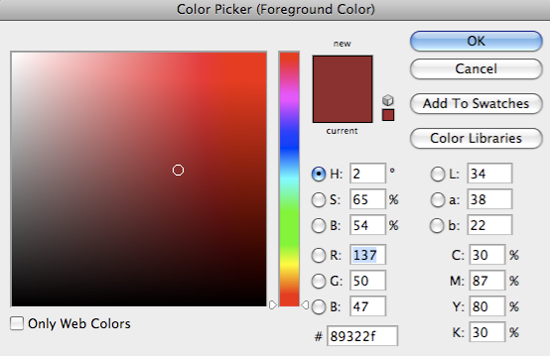
Create another new layer above the first shadow layer and select a slightly deeper shade of red, here I am using #89322F as shown in the image below:
Paint over the darkest parts of the shadows again using a low opacity soft round brush. Make sure that your Blending Mode is set to Multiply as we have done with our first shadow layer. As you paint you may notice some areas where the color doesn’t blend quite as well. In order to rectify this problem and create a smoother fade, use your Eraser Tool (E) at a low opacity setting (10-20%) and you will notice that the colors start to blend in a more subtle way.
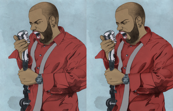
We have now added two shadow layers to the shirt on top of our original flat base color. In the image below you can really see how the shirt starts to come alive when we compare the before and after images.
Step 12
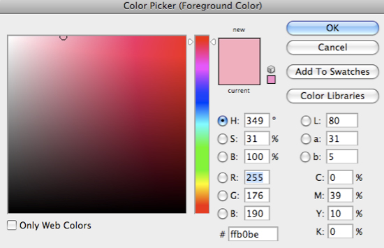
Now that we have added some shadows we want to add a few highlights to further enhance the shirt. Create a new layer above both shadow layers and choose a lighter shade of red (#FFB0BE) before switching to your Brush Tool (B) if it isn’t already selected.
On the new layer begin to paint with a soft brush at a low opacity like we used for the shadows in a few key areas. It’s important to keep the light source in mind as we paint, but in this instance the light is coming from behind the singer. For this reason we want to add the lighter color on the shoulder, the bottom right, and just a hint of color on the left side of the figure as I have indicated in the image below:
To smooth things out switch back and forth between the brush and the eraser at low opacities to blend the colors. This is the same technique we will be using for the other parts of the image – applying shadows and highlights with the brush and smoothing them out with a low opacity eraser.
Step 13
Create a new layer above the Tie Layer and while this layer is still highlighted in your Layers Palette, hold down the Command/Ctrl Key and click on the thumbnail icon of the Tie Layer.
Doing this will activate a selection around the tie. You should see your marching ants showing up around the shape of the tie to indicate this area.
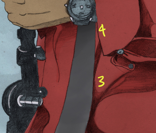
On your new layer, switch to your Brush Tool (B) and select a soft round brush set to about 20% opacity. Here is where we will repeat the process that we used earlier when we shaded the rest of the shirt.
The image above represents the values that we want to use to add some depth to the tie. The numbers are going from the lightest to darkest.
You can easily toggle between your brush and the eyedropper by holding down the Alt Key and clicking a color that you want to use. Sample the original gray color and go a bit darker with your brush, and then using a lighter color add a few light areas as well.
Take your time with these parts and try to create a smooth blend using the techniques we have covered. After working with these four values and blending them together we continue to develop a bit more realism in our image.
Step 14
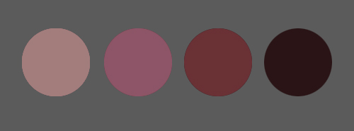
Create another new layer above the lips and switch to your Brush Tool (B). We want to use about four different values here that we are going to blend together using a low opacity brush.
From left to right the exact colors I am using are #A37D7C, #8E5568, #6A3235, and #2A1416.
The image below indicates the areas from lightest to darkest where I have used these colors and smoothed them out in order to create a nice blended feel. Notice how the highlights are being used sparingly around a few edges, but the rest of the lips are painted using these values to give the illusion of depth.
The teeth are created using the same method as above by implementing a few values and shading them to create depth. Again, use a soft round brush at about 10-20% to smooth out any hard lines that may appear.
Step 15
We are looking pretty good so far, so I hope that you are still with me here as we continue to shade and work on our painting. The two parts that still remain are some of the more difficult things to paint – skin tones and metal (the microphone).
Some people prefer to work on everything at the same time but for the purposes of this tutorial I thought it would be easier to break things down and focus on the separate parts individually. This also helps us because it allows us to isolate different pieces of our image like we are about to do.
Some people prefer to work on everything at the same time but for the purposes of this tutorial I thought it would be easier to break things down and focus on the separate parts individually. This also helps us because it allows us to isolate different pieces of our image like we are about to do.
Hold the Command/Ctrl Key and click on the thumbnail icon of your flat skin color layer as shown in the image below:
Doing this should then activate a selection around the skin.
Create a new layer while this selection is still active and set the Blending Mode to Multiply. Switch back to your Brush Tool (B). Select a soft round brush and begin to brush the darker shaded areas of the skin using the color #4D382A. Here is where you can use the sketch as somewhat of a guide: It helps us to see the value in the image like we did earlier with the shirt.
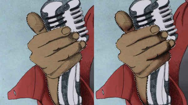
Begin with the hands and fill in the areas that are shaded before swapping your brush colors by pressing the X Key on your keyboard. Select a slightly pinkish value or a rose color to use in some areas like the ears and the thumb of the hand on a new layer above your shadows.
Begin to mix these colors together with the original flat color by sampling with the Eyedropper Tool (I) by holding the Alt Key and selecting a color then brushing with a light opacity brush.
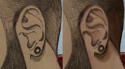
Use the darker brush again on the Multiply layer and paint the darker parts of the face such as the beard, underneath the ear, around the eyes, and continue to use the drawing as a rough guide.
Once you have blended the colors a bit further zoom out a bit by pressing Command and the Minus Key on your keyboard to see how things are looking from a bit further back.
Step 16
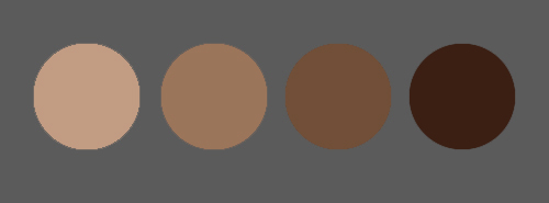
We now want to add a few additional values to the skin so that we can continue to blend them together creating a smooth gradient from light to dark. The colors I am using here from lightest to darkest are #C29C83, #9B755A, #714F38, and #3B1F13.
Use the same techniques that we have been using for the previous step where we hold the Command/Ctrl Key and click on the original flat skin color layer to activate the selection and add the new values on separate layers using a low opacity soft round brush.
This is another step where you can take as little or as much time as you would like in order to achieve a higher level of realism with the image. Continue to blend these different values together including some highlights on the nose, cheek, and forehead. From here we can toggle back and forth between the eyedropper and brush by pressing ‘B’ to select your brush and then while you are painting you can just press the Alt Key and click on an area that you want to sample.
At this point we just want to check and make sure that everything is balanced and check to make sure that we don’t have any areas that are too bright or saturated. As you paint you can also zoom in and out to concentrate on the larger areas first and then going in close for the details.
Step 17
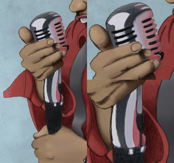
Next we will move onto the microphone and the mic stand. Create a new layer above the Microphone Layer and using a dark gray (not quite black, but close) we want to go over the darkest parts of the microphone stand. Remember that the drawing is here as a guide and the values and shadows can serve as a loose guide for us to follow.
In the image below you will notice that I have darkened the microphone stand and have also begun to blend in some other shades of gray as well. The lighter values have been added on a separate layer just like we did earlier with the other parts of our image. We want this part to look shiny and have some nice tones although these aren’t quite as smooth as the skin for example.
Using a low opacity hard round brush continue to blend these values into one another. I am keeping my brush opacity at about 10-15% for this part. This really starts to bring everything together and creates a nice contrast in our image. Remember to zoom out every once in a while to see your progress.
Step 18
Create a new layer at the top of your Layers Palette and with a hard round brush at a low opacity, begin to sample some colors from the shirt to add some ambient light to the microphone. The image below shows a few of the colors that I am blending and what we want to do is make the edges darker and more saturated and gradually blend them into the lighter gray color towards the highlighted piece.
You may notice from the image above that I have tweaked the microphone itself to suit my needs and this can be done on a new layer at the top of the Layers Palette where you would want to use a hard round brush at full opacity to create more defined lines that define the shapes.
Step 19
Create another new layer at the top of your Layers Palette and switch to your Gradient Tool (G). Make sure that you have a Radial Gradient that fades from solid white to transparent as shown in the image below:
On your new layer, create a gradient and change the Blending Mode to Overlay. Move the highlight over the top of the forehead, right in the corner of the hairline. From here, we just want to lower the Opacity to about 28-30% and also set the Fill to about 50%.
This is an easy way to add a bit of extra highlight to an image just to give it a little bit of extra shine. Experiment with using gradients set to different Blending Modes to create some interesting results.
Step 20
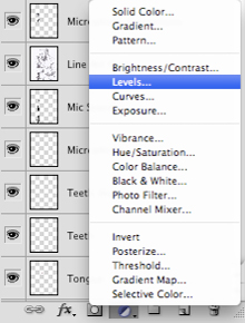
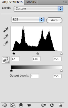
Next, make sure that you have your top layer highlighted in the Layers Palette and then click on the small black and white cookie icon along the bottom row of icons in the palette. This is the Adjustment Layer Menu where we want to scroll up and select ‘Levels’ to apply the adjustment.
Move the left slider in to the right so that it’s set to 8 as shown here:
After applying the Levels Adjustment everything below this layer will have been adjusted. Doing this helps to bring a slightly stronger contrast to the entire image.
Step 21
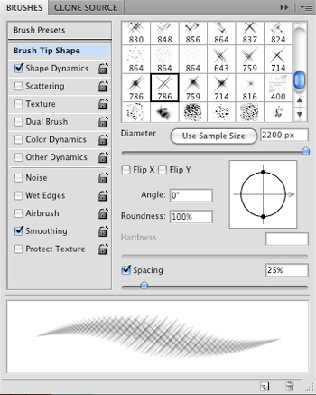
Load the Sparkle Brushes from the Resources Folder and create a new layer at the top of your Layers Palette. From here, switch to your Brush Tool (B) if you don’t already have it selected and press the F5 Key on your keyboard to bring up your palette.
Choose the brush you want to start with and select a solid white color. Use the right bracket key to enlarge the brush to about 2200-2400 pixels and paint on the canvas. Once you have applied the brush, changing the Blending Mode of the layer to Overlay and with the layer still highlighted in your Layers Palette, press Command/Ctrl+J to duplicate the layer once.
Move the brushes so that the diagonal lines intersect with the upper right of the body, near the collar and neck area.
Continue to add new brushes and experiment with the positioning of them, making sure that the Blending Modes are set to Overlay while using a solid white color. After trying a few additional brushes this is what I have come up with:
Step 22
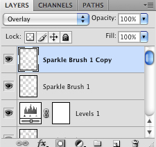
Select the first sparkle brush layer and then hold down the Shift Key and click on the bottom brush layer in your Layers Palette to select all of your brushes simultaneously.
While the layers are all selected, press Command/Ctrl+G to put them into a Group Folder and call them something like ‘Sparkle Brushes’ or any other name you like.
With the folder selected click on the Layer Mask Icon at the bottom of the Layers Palette where I have circled below:
Next, with a hard round brush select a solid black and paint over the skin to remove any parts of the brush that are overlapping the face, neck, and hands. Using a mask this way gives us more control over where the brushes are visible.
Continue to add brushes and experiment with the placement of them before adding more masks and painting out the areas that you don’t want showing.
After building up some light streaks in the background and over certain parts of the singer you can bring out not only more saturated colors, but the overall contrast of the image. Having angles like this will also make the design quite dynamic as well.
Step 23
Create a new layer at the top of your Layers Palette and switch to your Gradient Tool (G) selecting a Radial Gradient that fades from solid to transparent. For the color, we want to use a vibrant blue color (I am using #040EFE).
Create the gradient on our new layer and change the Blending Mode to Linear Dodge (Add) and position them around the singer and in the corners of the image. This will bring out more color in the background and enhance the overall light effect that we have created. To further enhance this effect you can make a duplicate of it by selecting the layer and pressing Command/Ctrl+G. The light may become too intense in which case all we need to do is lower the opacity to about 50% before pressing Command/Ctrl+E to merge it with the layer below.
Step 24
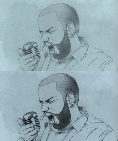
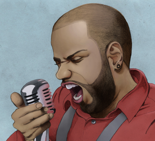
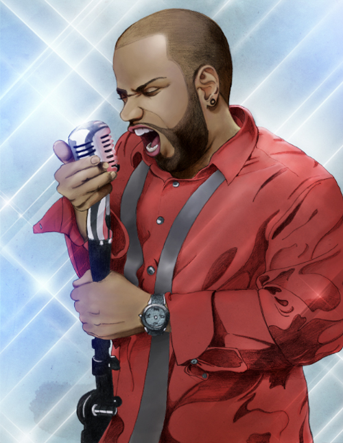
After blending the colors a bit more and adding a few details I think that our image is looking good. Let’s take a step back just to see where we are at now compared to what we started with.
At this point we have gone through the process of taking a scanned drawing and turning it into a mixed media piece that uses digital painting techniques along with some creative brushing and lighting. Make sure you save all of your hard work and give yourself a pat on the back if you have made it through! Thanks for following along! See you next time.
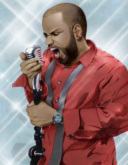
And We’re Done!
You can view the final outcome below. I hope that you enjoyed this tutorial and would love to hear your feedback on the techniques and outcome.
You can view the full-sized piece by clicking on the image below:


0 comments:
Post a Comment