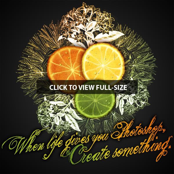
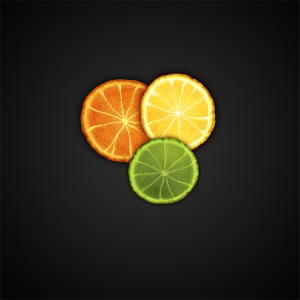
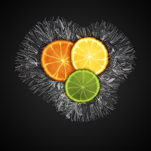
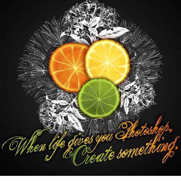
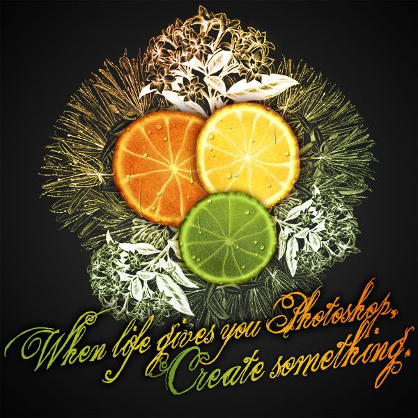
Final Image Preview
Before we get started, let’s take a look at the image we’ll be creating.
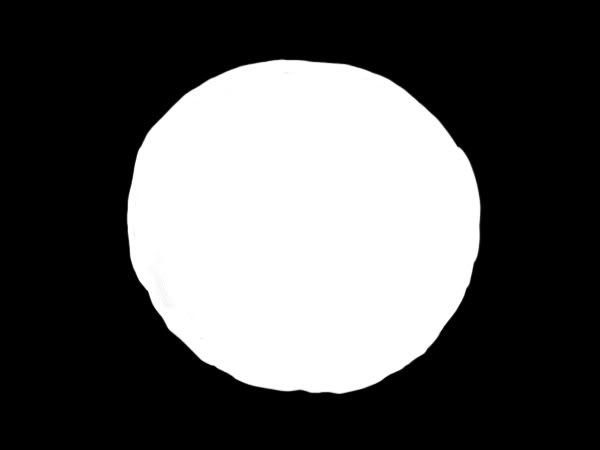
Start with a black canvas for the sake of simplicity. Create a layer called "orange," and draw a quick rough circle. The color doesn’t matter; we’re about to cover it up anyway. Now, you could have made something with the circle marquee tool, but where’s the fun in that? Imperfection makes it look more natural!
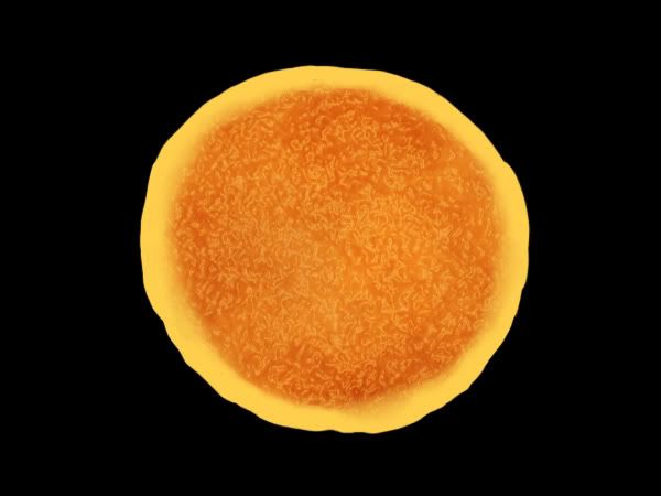
Step 2
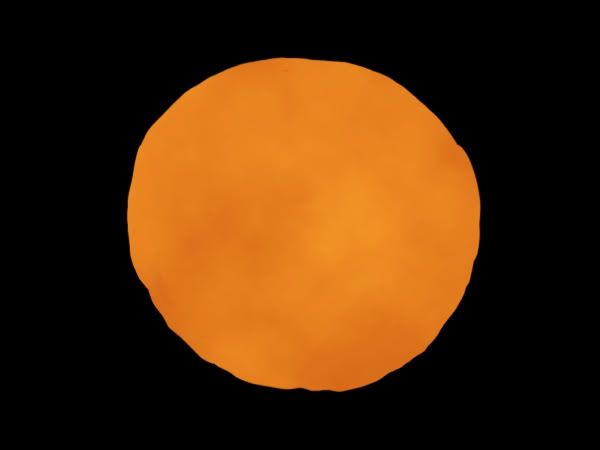
Lock transparency on the orange layer and pick two natural orange colors, one lighter and one darker. Avoid construction zone oranges and other neon or unnaturally bright colors. I chose #fa9c28 and #ca5812. Then go to Filter > Render and hit clouds.
Step 3
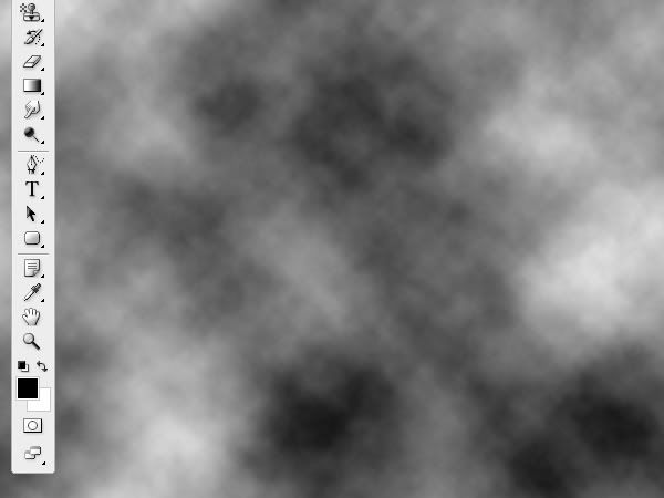
Now create another new layer called "core." Set the color to black and white, and render Clouds again.
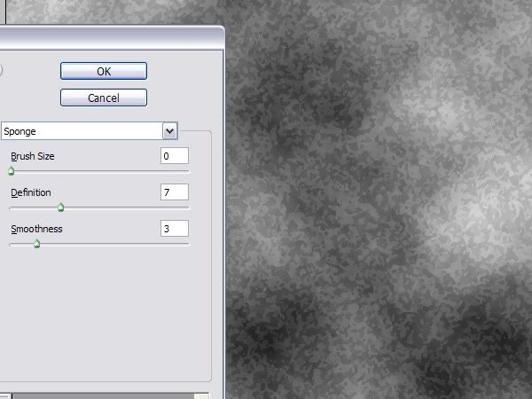
Step 4
Run the clouds through the Sponge Filter (Filter > Artistic > Sponge), and use the following settings.
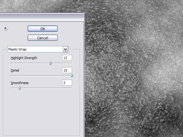
Step 5
Finally, use the Plastic Wrap filter (Filter > Artistic > Plastic Wrap). Use the following settings. Hey, do you see where I’m going with this?
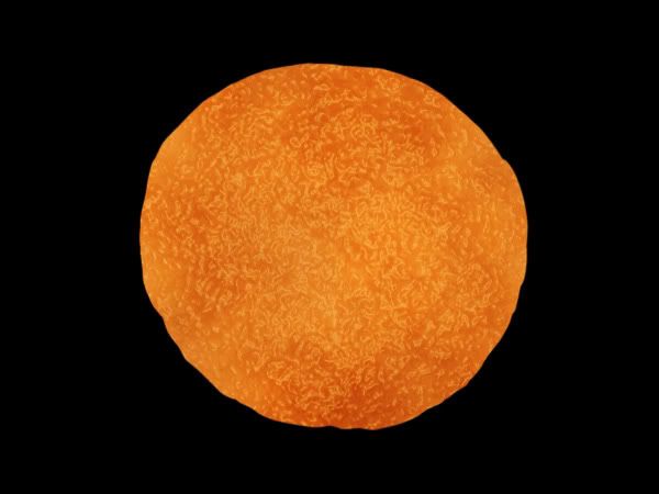
Step 6
Clip the "core" layer to the "orange" layer by pressing Alt + Command + G in CS3, or by clicking Create Clipping Mask from the Layers palette.
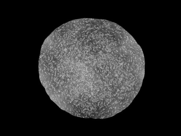
Step 7
Set the layer mode of the now clipped "core" layer to Soft Light. Look at that!
Step 8
Time to make the outer peel and inside membrane. Create a new layer named "peel," and clip it to the "orange" layer (just like you did for the core layer). Then draw a rough border around the edges of the orange.

Step 9
Now Use the Blur and Smudge tools to soften the edges. Don’t use an overall filter such as Gaussian Blur. This isn’t a uniform blurring, and you want some areas more blurred than others.
Step 10
Draw in the "pie slices." Be deliberately sloppy with the lines! They don’t need to be straight, or divided evenly, as they aren’t in nature either.
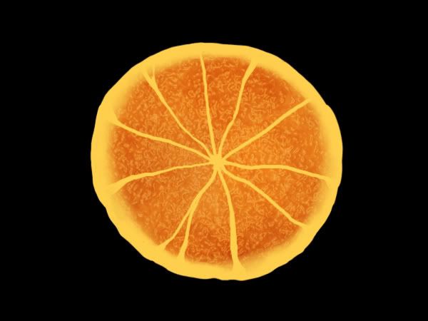
Step 11
Once again, use Blur and Smudge to soften the edges. It looks more convincing if you leave one side harder, and mostly soften the other. Note that I haven’t completely finished the blurring in this image.

Step 12
Now darken and shade the edges of the peel. I did this on yet another new layer, although you can keep it all on the same one if you like. Anyway, I used two darker colors here. Then use the Eraser to dab out little spots, which will roughen up the texture when you blend in the next step.

Step 13
Again, pull out the Blend and Smudge tools and don’t over blur. It’s important not to just blur all the details into oblivion. The contrast between hard edged areas and fully blurred areas is what makes the texture look organic, rather than plastic.

Step 14
On a layer called "detail," I used a small fine brush with a dark color to scribble on some shading in the peel. By the way, this is a seedless orange, but if you like, you could add seeds as well in the detailing stage.
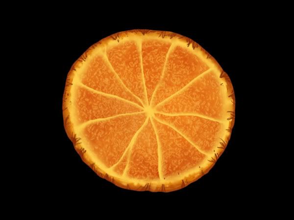
Step 15
Guess what comes next? Right, Blur and Smudge! When you’re done blurring, add some noise by going to Filter > Noise > Add Noise, and set the Amount at 2.
An interesting concept to consider when you’re blurring is that the parts you don’t blur are just as important as the parts you do. Again, contrast is key. I left some edges unblurred, and dabbed out some areas with the Eraser.

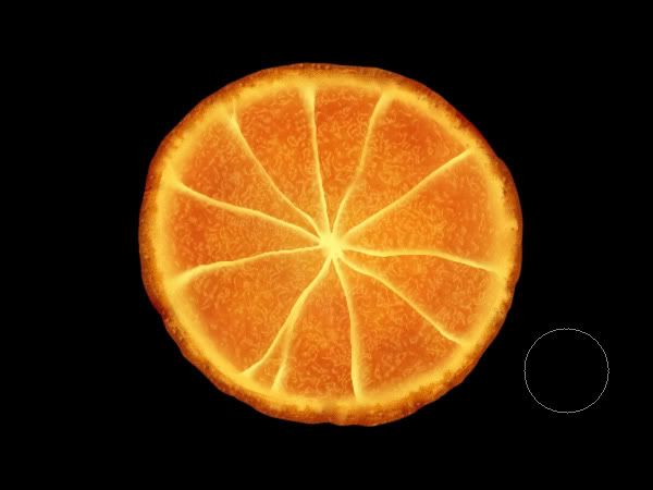
Step 16
On a layer named "color," I take a large soft airbrush set to Hard Light at 20% opacity, and I brush in some broad colors. Use lighter yellows near the center and darker oranges near the edges. This is a subtle yet effective way to give anything more depth.
At this point the orange is ready to be used in any sort of design! And you’re probably better at the whole designing part than I am, because I’m a digital painter and illustrator, not a graphics designer per se. But I’ll give you a quick example that will perhaps get the ideas flowing?
Step 17
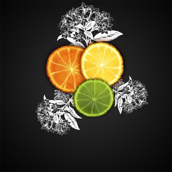
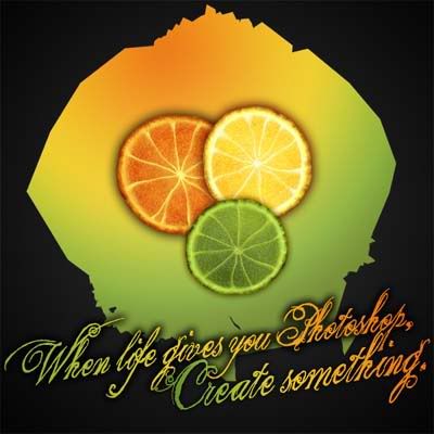
First, keep in mind that you can, of course, follow the above steps again to create more slices in various colors. I made a lemon and lime slice using the same technique as the orange. The nice thing about using Clouds as a main filter of any technique is that the result will be slightly different every time.
Moving along here, I created a canvas at 1200 px by 1200 px. For the background, I made a radial gradient with black and dark grey. Then I placed the slices on the canvas, using Edit > Transform > Scale to alter sizes where needed. I also applied an Outer Glow around each slice. The Outer Glow was set to Multiply, with a Spread of 0, and a Size ranging from 20 px (for the lime) to 38 px (for the orange).
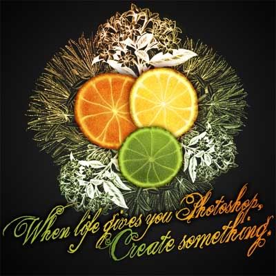
Step 18
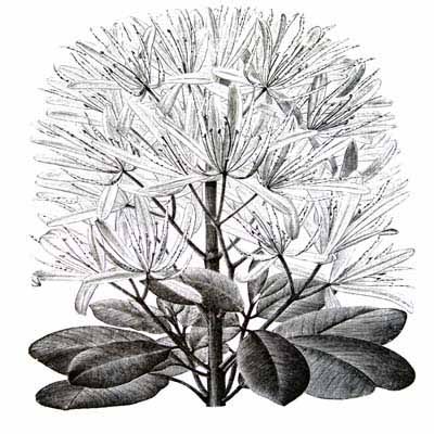
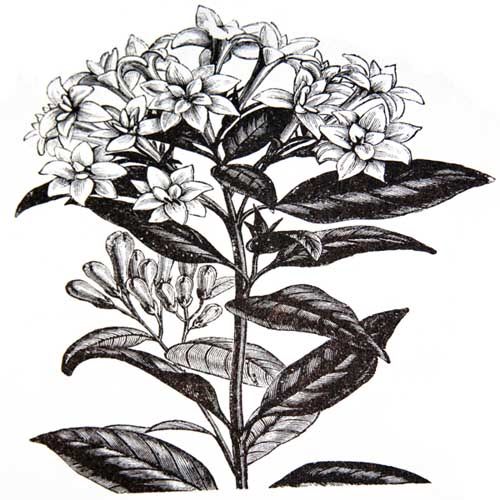
I took photos of orange blossom illustrations from one of my plant copyright-free plant books (yes photos, and not scans). I love the book, and didn’t want to mess up the binding. I put the blossom image on its own layer, called "back blossom."
As you can see, the original image is black ink on white paper, but I wanted white ink on black paper. So I hit Command + I to invert the colors. Then I set the layer mode to Screen. The black will be hidden, leaving just the white lines. I still had to do a bit of erasing on blemishes, but that generally saves me a lot of cutting-out work!
Step 19
Do a little weed whacking using a Layer Mask or the Eraser Tool.
Step 20
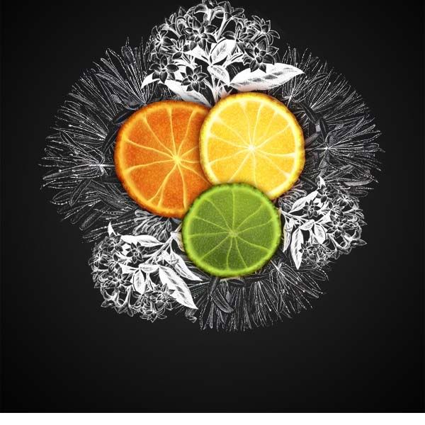
Duplicate, resize, and rotate the "back blossom" layer three times.
Step 21
For now, I turned off the "back blossom" layers. Then I took another orange blossom photo from my book. This image is also black on white, so I prepared it in the same way as the image in Step 18.
Step 22
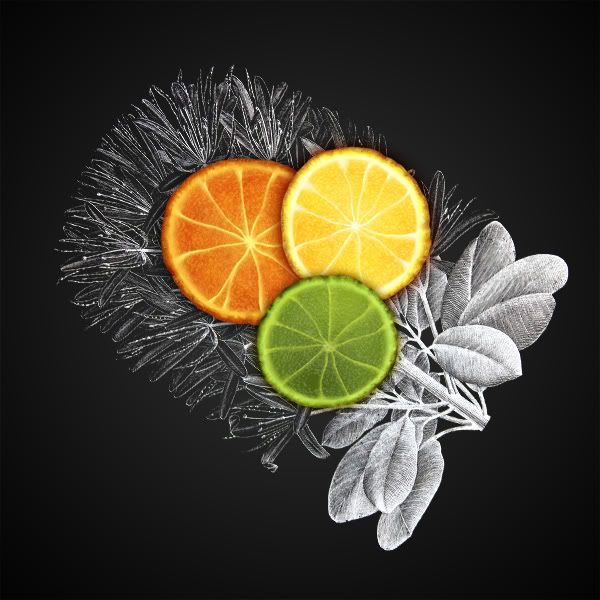
Turn back on the "back blossom" layers. It’s all coming together!
Step 23
Time for some finishing touches, like this rather predictable caption. I used a font called The King and Queen, and applied some Layer Effects, such as a green-yellow-orange gradient and an outer glow (black, set to multiply, Spread at 10px, and Size set to 30px.)
Step 24
Now merge all the "blossom" layers together, and create a new layer on top. Clip it to the merged "blossom" layer (remember Step 6?). Then fill it with an orange, yellow, and green gradient.
Step 25
I set the mode of the "gradient" layer to Overlay. Then set the Opacity to 80%. You can see what this has achieved: coloring the underlaying lineart, but not the grey background.
Step 26
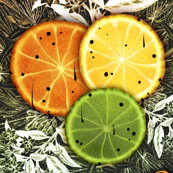
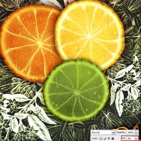
And of course, what juicy fruit image would be complete without water drops? Let’s make some! Create a new layer called "drops," and with a little black brush, draw some drip and drop shapes.
Step 27
Now set the Layer Styles as shown below. When you’re done, you should have shiny little black drops that (disturbingly enough) resemble oil.
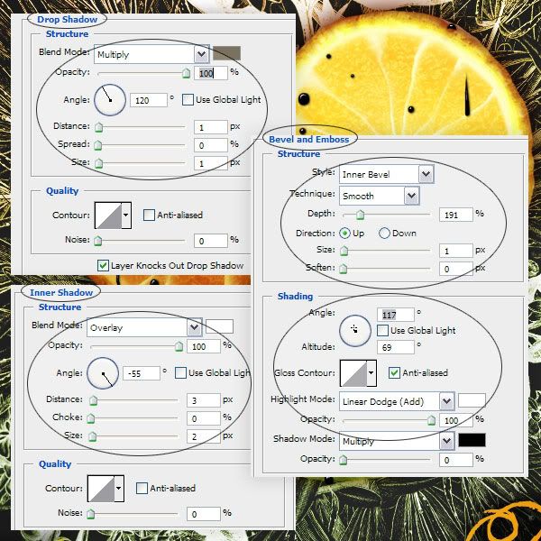
Step 28
Here’s where the magic happens. Adjust the Fill (that’s different from Opacity!) down to 0%, and suddenly the oil drops turn into water. Woot!
Finished!
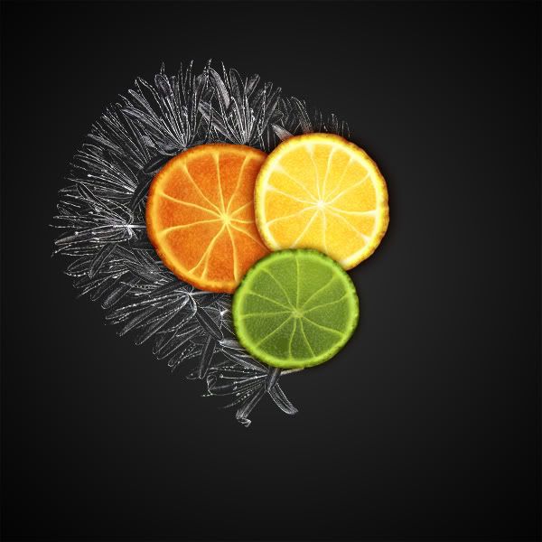
Last of all, I brightened the background just a pinch. It’s finished!
You know, a project like this really brings out all the benefits of digital creation; you can take advantage of filters for precise effects, but you can also enjoy a little good ol’ fashioned, uncomplicated freehand action, in a way that’s undemanding. It’s relaxing to not have to worry about precision, isn’t it? I hope you had fun following this!


0 comments:
Post a Comment