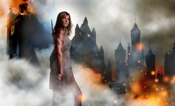
Final Product What You'll Be Creating
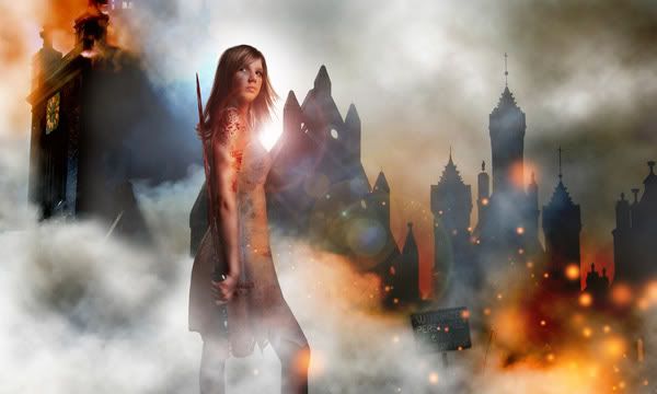
In today’s tutorial we are going to turn a flawless blonde beauty into a sword-wielding survival huntress. To
do this we are going to make her skin sweaty and dirty, her dress stained and torn, we’ll add blood stains to the sword, manipulate her hair, and create a post-apocalyptic background full of smoke and fire effects. It’s gonna be a gas!
Step 1
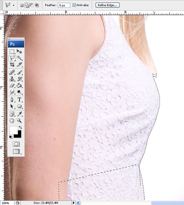
The first thing we need to do is cut out the girl from the background. So open the girl photo and use whatever method you prefer when creating a selection. (I prefer the Polygonal Lasso Tool (L). I make small selections at a time by holding down Shift to make additional selections within the same selection. Alternatively, you can hold down Alt to trim existing selections.
NOTE: Don’t worry too much about the hair right now. We’re going to work some more on it later.
Step 2
Click Select > Modify > Feather (or Shift+F6) and enter .5 pixels.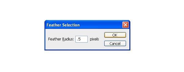
Step 3
When you’re satisfied with your selection copy/paste or drag the girl into a new document 3000px by 1800px at 200 resolution, and resize and position her to about where you see below. Name the layer “girl” since we’ll be referring to it often throughout.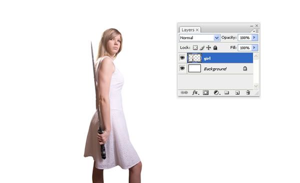
Step 4
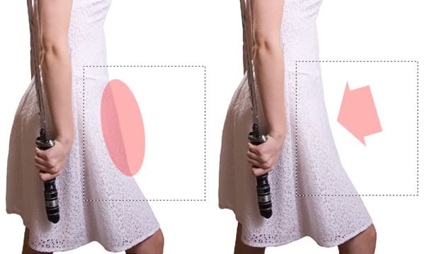
First we’re going to tweak a few things on the girl so that she will look more natural in our finished product. First, see the way the back of the skirt kind of feathers out? A dirty wet dress is heavier and would hang straighter. So select this part of the picture and then go to Filter > Liquify and push it in using the Forward Warp (W) and Bloat (B) tools.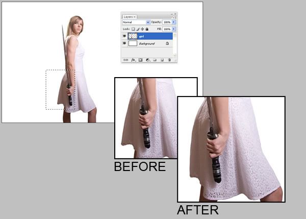
Do the same to the front as well, where the dress puffs out near her stomach.
Step 5
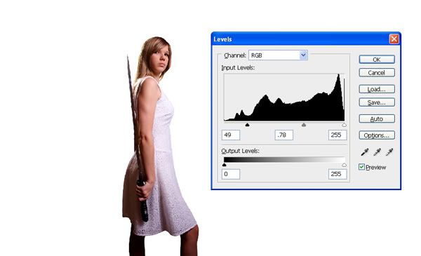
Go to Image > Adjustments > Levels (or just press Ctrl+L) and set it up as shown. This is one method out of several we will use throughout this tutorial to “crush” the black parts of the picture to create some well-saturated contrast.NOTE: This you must do if you want to pull off the sweaty skin look, which we’ll cover in a moment.
Step 6
To create some tears in the skirt, first open the torn fabric image. Separate the white from the black by opening up your Levels once again (Image > Adjustments > Levels) and set it up as shown.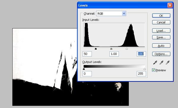
Go to Select > Color Range and click the Eyedropper Tool onto a white portion of the torn fabric image. Set the Fuzziness to 170.
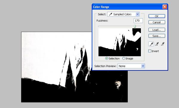
Go to Select > Modify > Feather and enter a value of .5px. Now you can either cut/paste or drag the selected portion of the image into the new document. Don’t worry if the selection retains any residual blackness around the edges. It won’t matter in a moment. Resize and position the layer as shown below. Name the layer “torn fabric.”
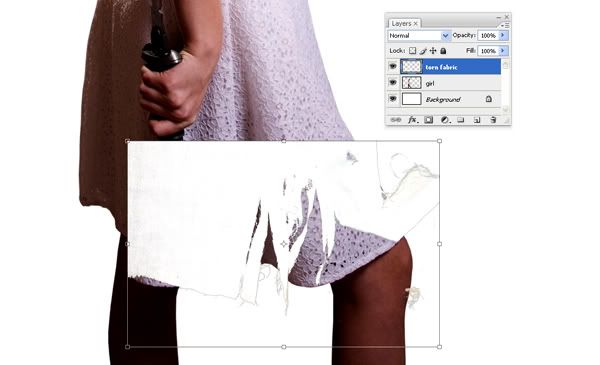
NOTE: If you want larger tears in the skirt, make this layer bigger, but bear in mind that the bigger the tears are the more you’ll have to paint in later. For the purpose of this tutorial, we’ll keep it fairly small.
Go to Edit > Transform > Warp and make the adjustments shown below. The key here is to get the bottom of the torn fabric in alignment with the bottom of the skirt. It doesn’t have to be precise.
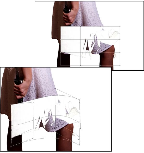
Hold down Ctrl and click on the Layer Thumbnail of the torn fabric layer. This will create a selection around everything within this layer, all the rips and tears and tiny threads. Feather the edge of this selection by .5px. You can now hide the torn fabric layer by pressing the eye icon next to the Layer Thumbnail.
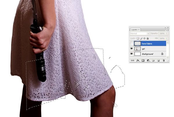
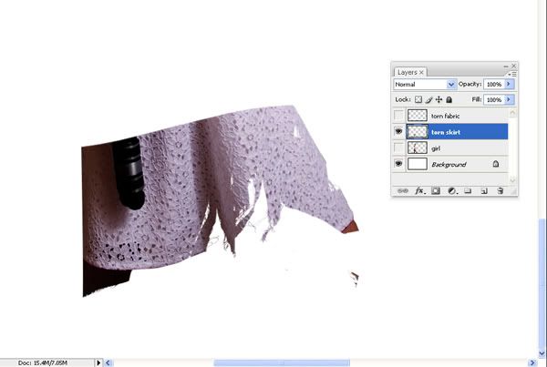
With the selection we created from the now hidden torn fabric layer, click on the girl layer and press Ctrl+J. This will duplicate ONLY the portion of the girl layer within the selection. This new layer, which we’ll call “torn skirt,” is going to, in a sense, be a mask for us as we edit the girl layer underneath. Here’s what the torn skirt layer should look like when the girl layer is hidden.
Step 7
It’s always a good idea to create a backup layer of any layer you’re about to do some irreversible editing on. So select the girl layer and duplicate it (Ctrl+J) just to be safe. You can hide the duplicate layer for now. It’s just a backup in case you want to start over.
With the girl layer selected, use the Eraser (E), Brush (B), and Clone Stamp (S) tools to get rid of all the areas of the skirt that show through the torn skirt layer. Start with the Clone Stamp Tool. (Hold down Alt and click on the area you want to clone, then release the Alt key and paint in the area you want to cover up.
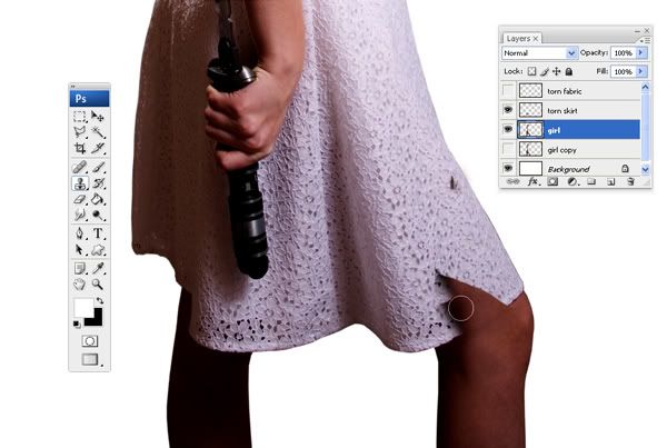
Use the Eraser Tool to get rid of the rest of the skirt.
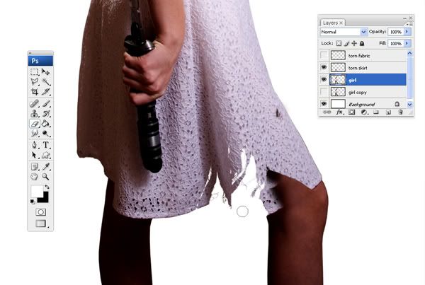
Paint in or stamp over the rest of the leg.
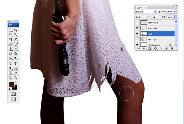
Lastly take the Brush Tool, select a shadow color, (Alt-click) and, using a very small brush (3 or 5), paint in a shadow around the tears. Take your time with this because, believe it or not, the shadowing is what will make or break this effect.
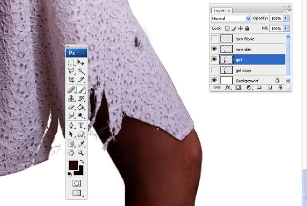
Using the steps outlined above, do the same thing with the torn fabric2 photo to create some additional tears along the hem of the skirt. Create as many or as few rips and tears as you want.
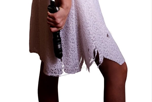
When you’re done, delete all of the torn fabric layers, and merge all the torn skirt layers with the girl layer. Make sure you rename the merged layer back to “girl.”
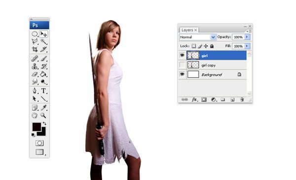
Step 8
We’re going to create a few small rips along the strap of the dress simply by painting in some skin and shadow. No fancy torn fabric layers used here, just a small feathered brush, size 3, with 100 percent Opacity. When painting in your shadows, use an Opacity of 40-50 percent.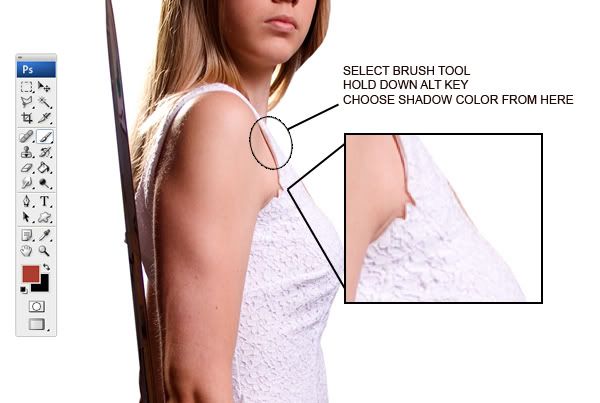
Step 9
We need to add a bit more reflectivity to the sword. So take your Polygonal Lasso Tool and select only the blade of the sword from top to bottom. Feather the selection by .5px. Create a new layer, name it “sword,” and fill the selection with white. Use a soft-edged eraser with an Opacity of about 40 percent to erase the bottom part of the sword layer. Go over it a few times. You want to eliminate the parts of the white layer that are in shadow and create more reflectivity on the parts that are in the light. Lastly, change the blend mode to Overlay.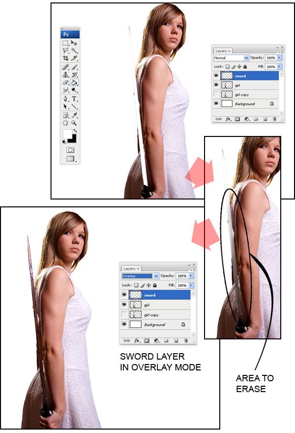
Step 10
Add some blood by using the Glossy Blood Splatter brush set from Brusheezy.NOTE: If you don’t know how to do this just download the file, unzip it and drag the Glossy Blood Splatter.abr file into Photoshop’s Brush Presets, which can be found in C:\Program Files\Adobe\Adobe Photoshop\Presets\Brushes. Then go into Photoshop, select the Brush Tool, open the Brush Preset Picker (by clicking the arrow on the top menu that’s next to the brush size indicator), and from the pull-down menu click the right-facing triangle in the top right of the menu. Select Load Brushes. Navigate to the brushes folder, find the Glossy Blood Splatter file, import it and wallah!
Try to select a brush from this set that is long and stringy to make it look like the blood is trickling down the blade. Create a new layer, name it “sword blood,” and pick a nice bloody red color (I used a50000) and splash on some blood.
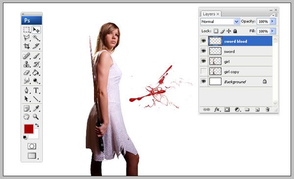
You may have to resize and rotate the layer to get it where you want it.
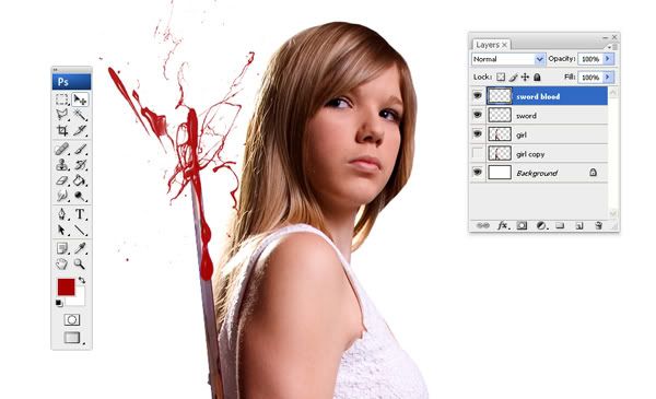
Create another layer and do the same thing. Then change the Blend Modes of both layers to Multiply.
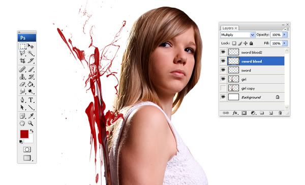
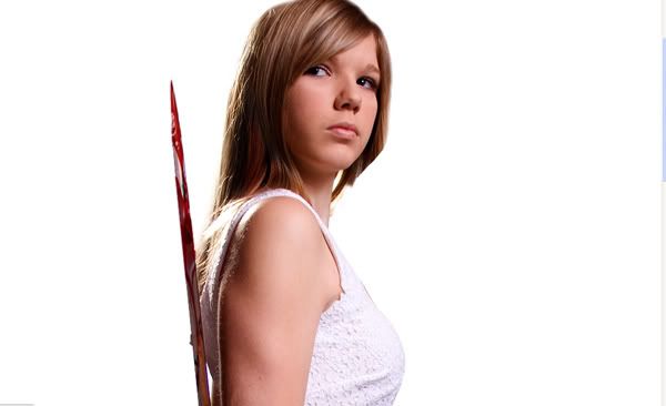
Ctrl-click on the Layer Thumbnail of the girl layer to create a selection (this will select everything within that layer). Feather the selection by .5px. Press Shift+F7 to inverse the selection. Make sure the sword blood layer is selected and go to Edit > Clear – or just press Delete – to get rid of all the excess blood. Do the same with any other sword blood layers you have created. Use the Eraser Tool to get rid of any excess blood that spills over onto the girl. The result should look like this.
Step 11
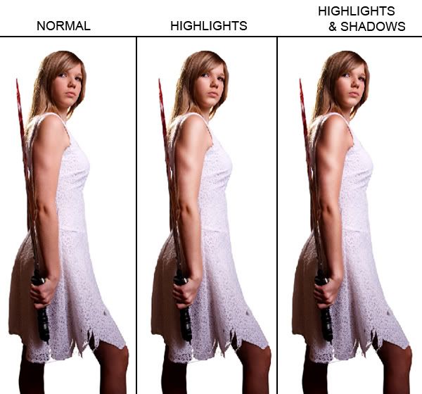
You can’t look like you’ve been through hell if you haven’t broken a sweat, so let’s moisten her skin with a nice layer of sheen.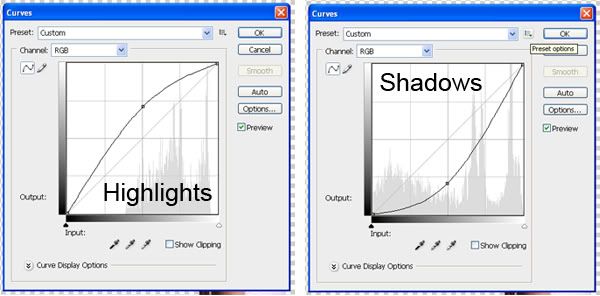
Begin by creating two Curves Adjustment layers (click the symbol at the bottom of your Layers Palette that looks like a half moon symbol. Select Curves.) When the Curves Menu appears, just click OK for now. Name one of the adjustment layers “highlights” and the other “shadows.” Adjust them to what you see below.
Press Ctrl+I to invert each adjustment layer. By doing this you create masks out of the adjustment layers, leaving you able to determine exactly WHERE the adjustments show through. Start with the highlights by taking a soft-edged brush, about 60-80 in size, with an Opacity of about 30 percent, and fill it with white. Now paint over the areas shown below, following the natural highlights on the model’s skin.
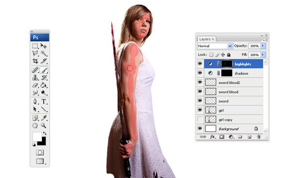
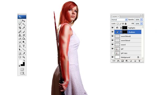
Make the brush size a bit smaller (30-45) and go over the highlights again, this time following her muscle more precisely. And now do the same for the shadows. These are the shadow areas you want to hit:
NOTE: When working on these adjustment layers, painting with white will reveal the adjustments while painting with black will hide them. So if you mess up and want to paint some of it back in, just make black your main color and paint over the spot you want to fix.
Step 12
Time to dirty her up by adding some dirt and stains. Begin by opening the painty fabric photo. Drag it into your project, name it “painted fabric,” and position it over the bottom of the girl’s skirt as shown. Oh, and change the Blend Mode to Multiply.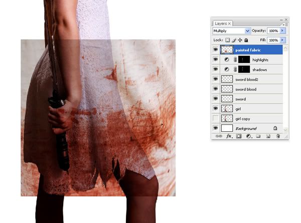
Use the Clone Stamp Tool, size 80-100, at 100 percent Opacity to scatter parts of this layer over the model.
NOTE: Real blood looks redder on skin, but when it dries on fabric it turns to a rusty brown color, so keep that in mind if you’re experimenting with different blend modes or using source material not found in this tutorial.
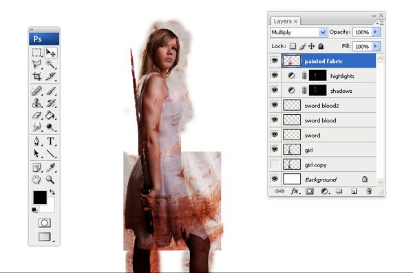
Using a soft-edged eraser, begin removing parts of this layer. You’ll want to erase 100 percent around the eyes, mouth, moist parts of the skin, and the sword (blade and handle), places where dirt and grim wouldn’t normally gather or would be washed away.
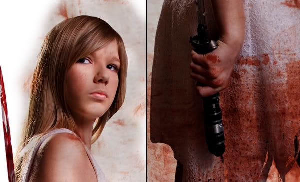
Open the photos dirty background and dirty surface 1 and drag them into your project. Resize and position them over the model and change the Blend Mode of both layers to Multiply and their opacities to 80 percent.
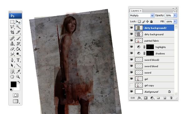
Finally take the soft-edged Eraser Tool to both of these layers and do the same thing you did with the painted fabric layer.
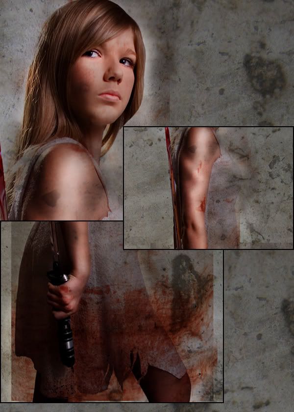
When she’s good and dirty, Ctrl-click the Layer Thumbnail of the girl layer. Go to Select > Modify > Feather and enter a value of .5px. Then go to Select > Inverse to invert the selection. Select the painted fabric layer and go to Edit > Clear. (Or just push Delete.) And do the same with the two dirty background layers and you should end up with this.
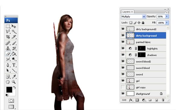
Step 13
To muck her up a bit more, drag into your project the coffee stains 2 and name it “coffee stains”, as well as the victim and dirty fingerprints photos – name them “bloody fabric” and “dirty fingerprints” respectively. Position each one as such and give each layer the following Blend Modes: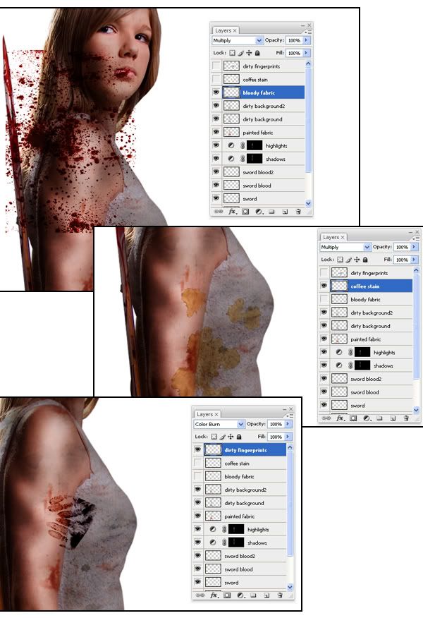
Reposition the layers to your preference. Stamp and replace parts of each photo onto other parts of the model. Erase all spillover and you should end up with something like what you see below.
NOTE: I didn’t want the coffee stains to look so much like coffee stains, so I desaturated the layer by –67 by pulling up the Hue/Saturation Menu – Image > Adjustments > Hue/Saturation, (Ctrl+U).
NOTE 2: Using the Clone Stamp Tool and a very small, soft-edged brush I clicked on the dirty background layer and streaked some tears around her eyes at 40-50 percent Opacity.
My, the future is looking grim.
We’re done with our girl for now. Create a new group by clicking on the folder icon in the Layers Palette and put within it all the layers we’ve worked on thus far. Name the group “girl.”
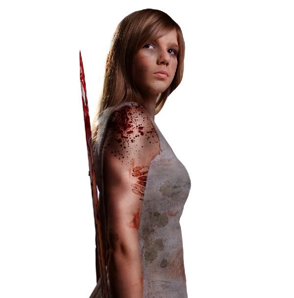
Step 14
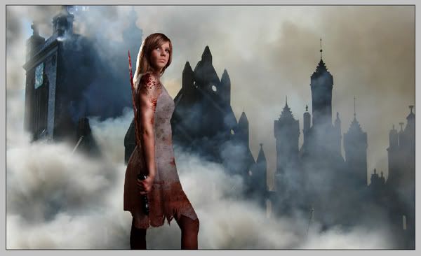
Open the burning photo and drag it into your project. Resize it so that it fills the background and name it “burning building.”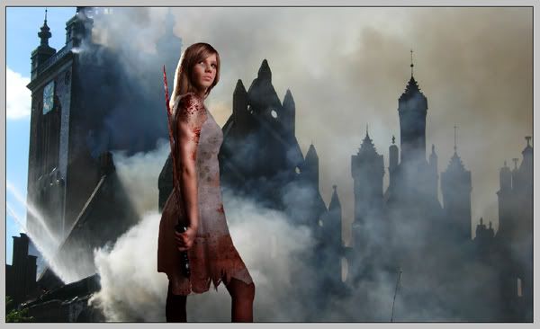
Begin by cloning and stamping out the blue sky and water sprays on the left side of the burning building layer.
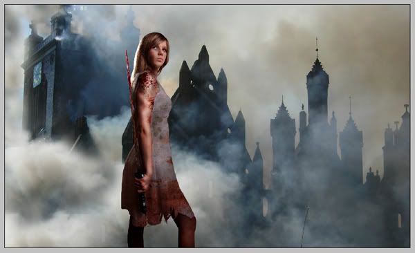
Using the Lasso Tool, select a big section of smoke and feather it by 100. Press Ctrl+J to copy the selection into a new layer.
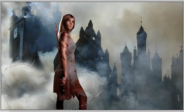
Move this new layer into the bottom center/right portion of the image.
Step 15
Open the authorized personnel sign photo. Use the Magic Wand Tool (W) and click anywhere in the outside white part of the image to select it.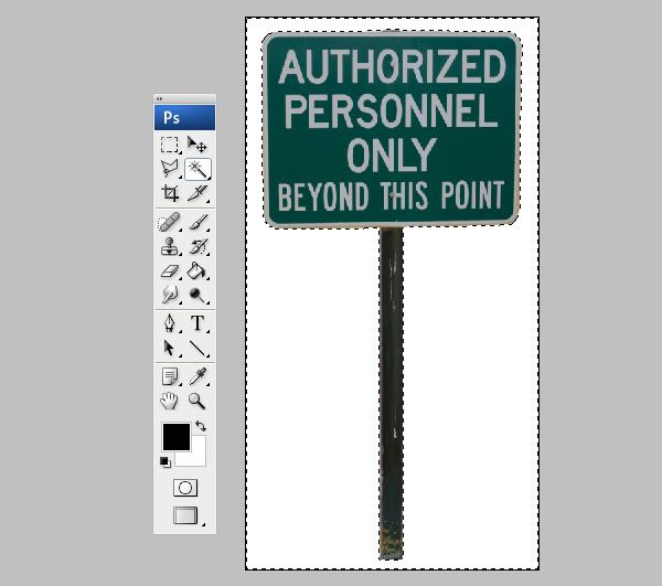
Go to Select > Inverse to invert the selection. Go to Select > Modify > Feather and enter a value of .5px. Now copy/paste or drag the sign into your document and place it above the burning building layer, but below the burning building copy. Resize and reposition the personnel sign layer to about here.
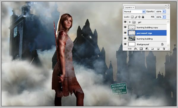
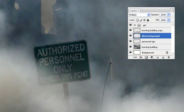
To make the sign look a little more war-torn, change the Blend Mode to Overlay. Then drag the dirty background photo back into your project, resize and position it over the sign and change the Blend Mode to Multiply. Oh, and erase whatever spills over the edges.
Step 16
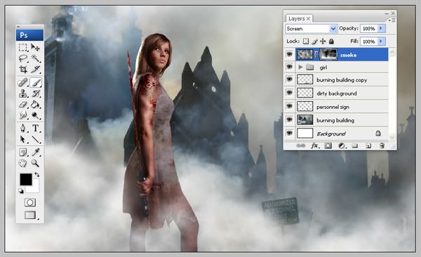
We need some smoke in the foreground to tie everything in with the smoke in the background. So create a new layer at the very top of your Layers Palette and name it “smoke.” With the Rectangular Marquee Tool (M) draw a rectangular selection in the middle of your document. Make sure that black is set as your foreground color and white as your background color and go to Filter > Render > Clouds.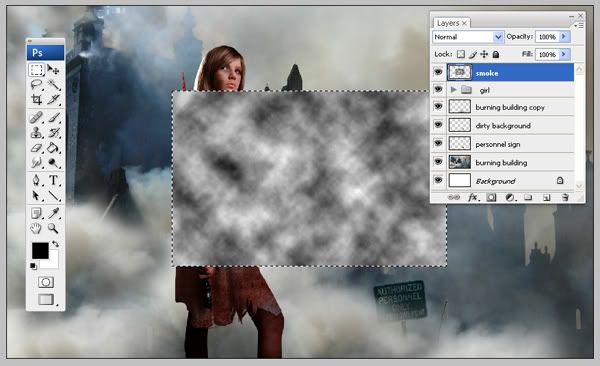
Resize the smoke layer so that it fills the document and change the Blend Mode to Screen.
NOTE: The reason we started out by creating the cloud layer within the small rectangular selection and then made it bigger was because this smoke layer is going to become our foreground smoke and, since such smoke would be closer, the billows of smoke need to be bigger. This helps create the illusion of depth.
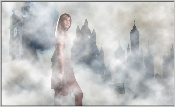
With the smoke layer selected click the Add A Mask button (third button from left at the bottom of your Layers Palette). Now you can “paint out” parts of the mask to reveal more of what’s underneath. Using a very large brush size, about 800-1000, and an Opacity of about 40 percent, fill the brush with black and click a few times over the smoke layer to reveal some more of the destruction in the background as well as the girl.
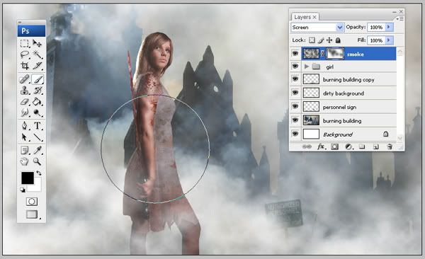
Change the brush size to 500 and go over the image again, this time hitting the sky, most of the girl (except for her legs), and most of the buildings. Be uneven. Be random. Remember that smoke billows and is therefore thicker in some places than others.
NOTE: The great thing about working with a mask layer as opposed to an eraser is if you mess up, just fill the brush with white and go back over the canvas to paint the smoke back in.
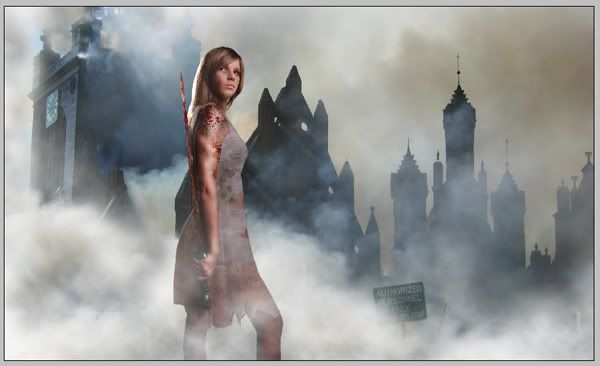
Decrease your brush size to about 100-200 and change the Opacity to 100 percent. Now go over the girl thoroughly to reveal most of her, but keep away from the legs.
Step 17
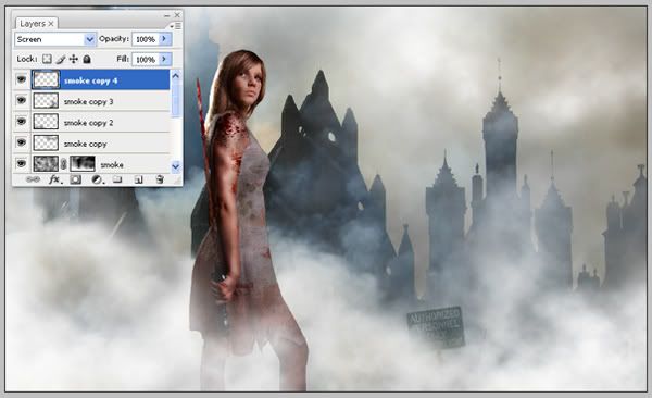
Take your Lasso Tool and randomly select parts of the smoke layer and duplicate it by pressing Ctrl+J. Do this about four or five times. Resize the layers. Rotate them. Place them here and there. Make the smoke thicker in parts.NOTE: In order to make these duplicates you need to make sure the smoke layer THUMBNAIL is selected and not the layer MASK.
Step 18
Create a new layer and place it BELOW the girl group layer. Name it “glow” and use the Elliptical Marquee Tool to draw a selection around the girl’s head. Feather the selection by 50. Fill it with white and change the Blend Mode to Overlay. This should insert a white glow behind the girl’s head.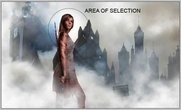
Step 19
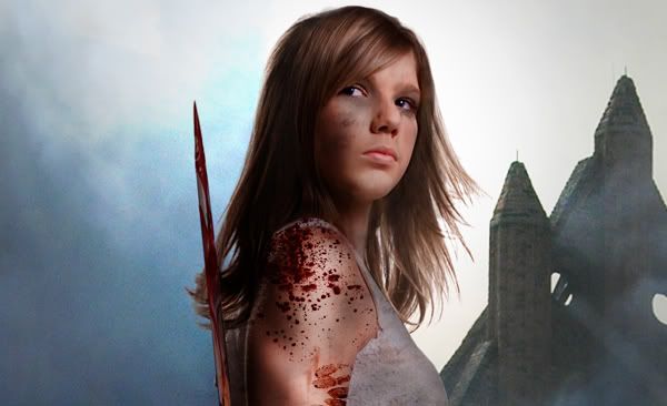
Hair. Ok, we’ve put this off for long enough. (I really want nice long sexy blowing hair, but I really, really, REALLY hate doing hair lifts. Thus, I’m sort of throwing this in last minute. Sorry.) Open the girl2 photo. (This is a photo I took for a photography class. It’s not the greatest, I know, but what we need for a good hair lift is a solid white background, so this will work perfectly.)Go to Select > Color Range and use the Eyedropper Tool to select anywhere in the white part of the image. (This isn’t usually the best way to do a hair lift since using the Color Range Tool can often leave an annoying halo around the selection, but since we’re basically lifting hair off of a white background to put it onto a mostly white background, the seam should be flawless.)
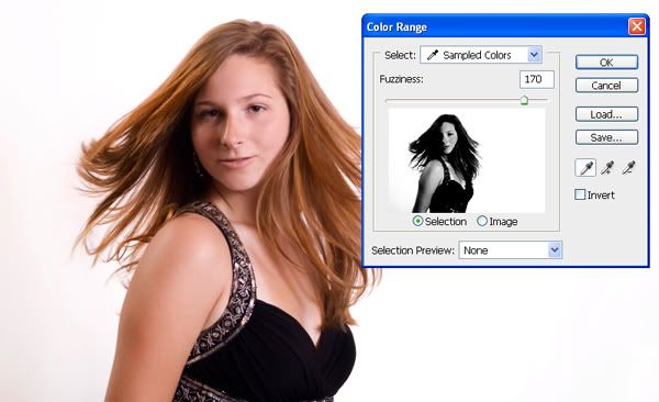
Go to Select > Inverse and copy and paste the hair into your document. Place it in the girl group right above the girl layer. Name it “hair1.” Resize, rotate and place the image about here:
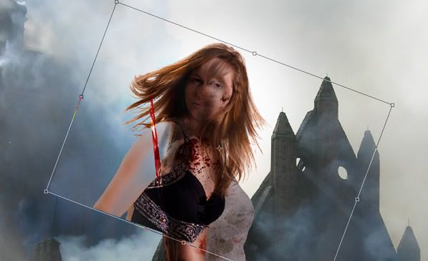
We’re only going to focus on the right portion of hair for now. Start by adjusting the color to match the girl’s hair. Go to Image > Adjustments > Hue/Saturation and decrease the saturation by –39. Go to Image > Adjustments > Levels and move the top middle slider to the right – to 56. Now add a layer mask to the hair layer. Load the brush with black and begin masking out all the unnecessary parts of the hair layer, including the entire left side. You should end up with this.
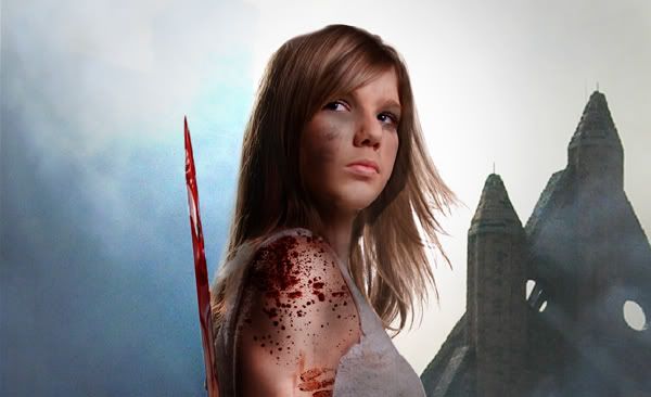
The blend looks good, but you’ll notice a thick dark line running along the side of the model’s neck and face. This is caused by the painted fabric, dirty background and dirty background2 layers which are cut to fit the shape of the girl layer and do not include the hair. The solution is simple: use the Clone Stamp Tool and a small feathered brush to paint in over the hair a little bit more of each layer.
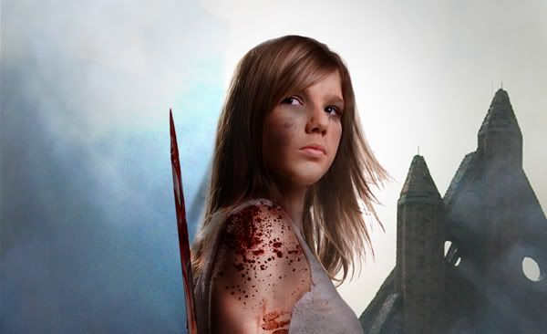
Copy/paste the hair selection from the girl2 image again. Resize it, rotate it, and place it as shown.
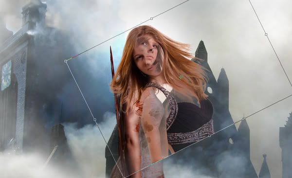
Follow the steps above to create a seamless blend – hue/saturation, levels, layer mask, clone stamp.
Step 20
Now to give the picture some “spark!” Create a new layer above the girl group layer, but below all the cloud layers. Name it “fire glow.” Draw a large selection using your Elliptical Marquee Tool and feather it by 100.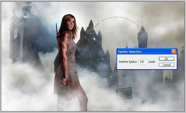
Fill it with an orange color – I used fc6e05 – and change the Blend Mode to Overlay and the Opacity to 70 percent. This will basically create the illusion that there is fire somewhere reflecting off the smoke. Duplicate this layer a couple times and place the duplicates throughout. You should get something like this.
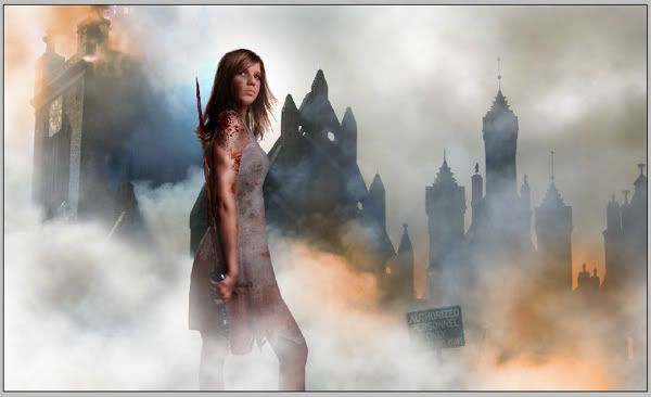
Step 21
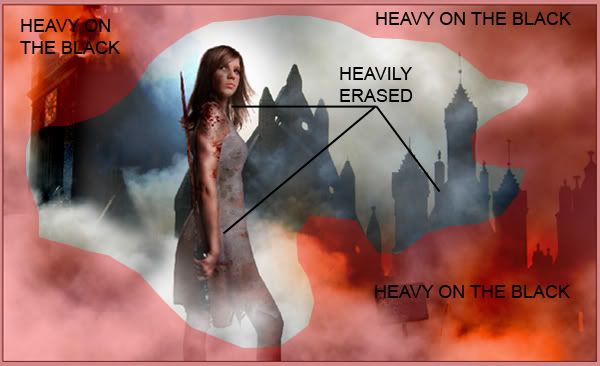
Not bad. But all of our smoke layers have created a problem – we have a very high contrast subject on a low contrast background. The two elements don’t look like they go together. We’re going to fix this by creating a new layer and placing it at the top of the Layers Palette. Call it “black crush.” Fill it with black. Change the Blend Mode to Overlay. Take your Eraser Tool and, using different sizes and different opacities, start erasing it from the center out. Eventually you should erase this layer completely in the middle and hardly at all on the edges.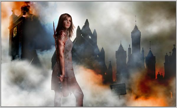
Bear in mind that distant objects should be lighter, nearer objects should be darker. For example, erase more over those background buildings to give the illusion that they’re further away. Keep the foreground objects darker. Your end result should look like this.
Step 22
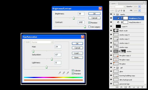
The picture is pretty much done! But if you’re interested in adding sparks, here’s how. (This technique I slightly modified from a wonderful fire tutorial by Jayan Saputra. So props to him for teaching me this wonderful trick!)Begin by creating a new group. Name it “sparks.” Within that group create a new layer and fill it with black. (The reason we’re doing this in a group is because we’re going to apply some adjustment layers that we want applied ONLY to the layers within this group and not the picture as a whole.) Create a Hue/Saturation adjustment layer and a Brightness/Contrast adjustment layer and set them up as shown.
NOTE: It’s very important that the Brightness/Contrast adjustment layer is on top.
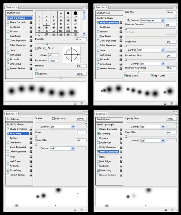
Select your Brush Tool. Open the Brushes Palette and set it up as shown.
Create a new blank layer above the black layer and below the two adjustment layers. Select 50 percent gray from the Swatches Palette and paint away! Try to image the natural flow of the sparks. In other words, pick an origin point and make them blow across the page from there, starting out larger and getting smaller. (The brush sizes I used ranged from 500 to 10.)
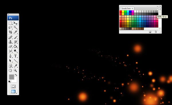
When you’re all done, merge the group into a single layer by right clicking on the group layer and selecting Merge Group at the bottom of the pop-up window. Now our adjustment layers have been applied only to the group and won’t alter the rest of the picture. Change the Blend Mode of this new layer to Screen. Wallah!
Conclusion
You’ll see that I duplicated the fire glow layer twice and placed it over the girl’s arm/shoulder and stomach areas for some added reflectivity. I duplicated the fire glow layer again, set the Opacity to 30 percent, and erased parts of it to give the illusion of fire behind the two middle buildings. I also used the Clone Stamp Tool on the bloody fabric layer to add a touch of blood under the girl’s nose and on her chin.Lastly I merged all the layers and added a lens flare (Filter > Render > Lens Flare.) I know a lot of people find lens flares annoying, but I kind of like it for this picture because lens flares lend a certain rawness to a picture, a suggested spontaneity that is meant to be as distracting as it is artful.
I hope you found this tutorial fun and interesting. This is my first tutorial, by the way, so please let me know what you think, and I can’t wait to see what you come up with! Cheers.

0 comments:
Post a Comment