In one of my Google surfing days I came across this beautiful design and i fell in love with the 'simple yet beautiful' concept suddenly. I am a novice in Photoshop and the question in my mind was “can i ever make such a design using Photoshop?”. This tutorial is my attempt to recreate the design using Photoshop.
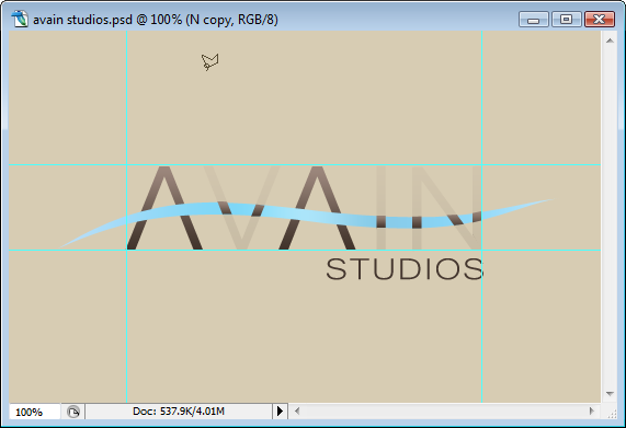
Preview of Final Results
Studios Logo Avian Photoshop Tutorial
Step 1 – Create a new document
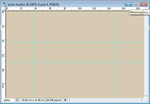
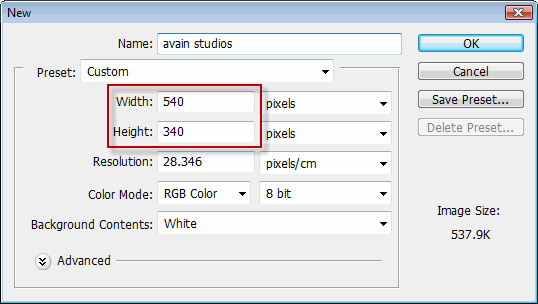
Let us start our tutorial with a new document. Set the width to 540 pixels and height to 340 pixels. Change the name to 'avain studios'. Click on OK to create a new file.Step 2 – Create the background
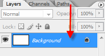
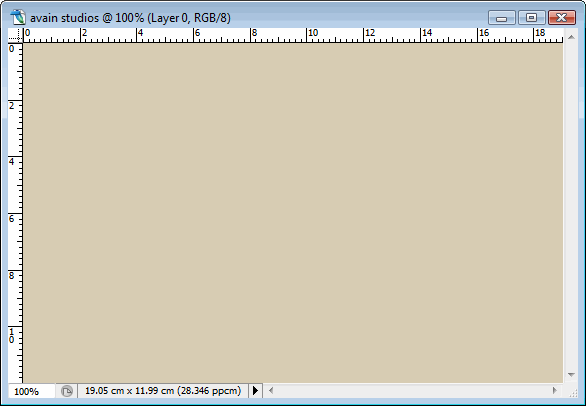
In every design a good background strengthens the foreground elements to a great extent. But always keep the background simple and clean. Ok now let us create a simple background. Select the Paint bucket tool from the tool-box . You can also use the keyboard shortcut 'g'.Step 3 – Enable ruler and create new guides
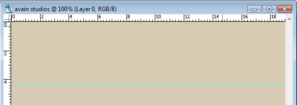
A 'Guide' is a 'visual line' which can be placed vertically or horizontally in our canvas. It is a great help to a graphic designer if he wants to perfectly align various design elements or if his composition consists of numerous elements. Also keep in mind that a 'guide' can never be printed; it will not be there if you print your image. 'Ruler' shows the measurement of our canvas in pixels,inches, centimeters, etc. It is also another visual aid as long as the alignment is concerned.
First let us add 'Rulers' to our canvas. Go to 'View' menu and Click on the item 'Rulers'. If it is activated it shows a 'tick mark' beside it.
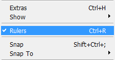
Now let us add a set of vertical and horizontal guides to our composition. First make sure that under the 'view' menu the items 'Extras','Rulers' and 'Snap' are having a 'tick mark' beside. If not click on them to activate. Also check under the 'show' sub menu 'guides' is having a 'tick mark'. You can insert 'Guides' to your canvas by two ways. Here we are going to use the first method. Don't worry, I'll show the second method too :)
Go to 'View' menu and Click on 'New Guide' which is towards the bottom of the menu.
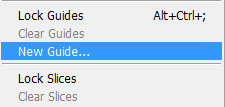
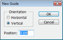
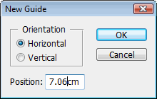
Now the 'New Guide' window opens. In that window you can select the option 'Horizontal' if you want horizontal guide or select the option 'Vertical' for vertical guide. You can enter the position of the guide which will place the guide exactly at that point.
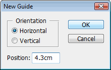
Ok let us insert a 'Horizontal Guide' first. When the 'New Guide' Window opens select the 'Orientation' as 'Horizontal' and in the 'Position' box enter the amount 4.3 cm.
Click on Ok which will place the 'Guide' in our canvas.
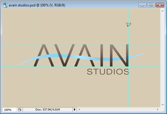
Ok that 'Cyan' coloured line is our first horizontal 'Guide'. Now we are going to add another 'Horizontal Guide' and a set of 'Vertical Guides'. First add another Horizontal Guide but Change the 'Position' to 7.06 cm.
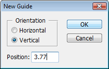
Now we are going to add two 'Vertical Guides'. First change the orientation to 'Vertical' and in the 'Position' box enter the amount 3.77 cm.
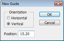
Add another Vertical Guide by entering the amount 15.20 cm in the position box.
Ok. Now we have set our 'Guides' in our canvas for the correct alignment of the design elements.
Now we are going to the next step in which we will precisely add our main text between the 'Guides'. But before that let me talk about the second method to add 'Guides' interactively into your canvas. In this method we drag from the 'Horizontal Ruler' to create a new 'Horizontal Ruler' and drag from the 'Vertical Ruler' for a 'Vertical Guide'.
We created a 'Horizontal Guide' by Clicking and Dragging from the 'Horizontal Ruler'. You can use the similar method to create a 'Vertical Guide'. Ok now you know both the methods to add 'Guides' to your canvas. Then we are going to the next step.
Step 3 – Add the text
In this Step we are going to add the text 'avain' to our image. It is a long step so you can have a cup of tea to refresh yourself.Ok. First select the 'Horizontal Type' tool from the toolbox.
In the Type Tool Options bar change the font to Dotum, font size to 106 pt,anti aliasing method to 'smooth' and the font colour to black.
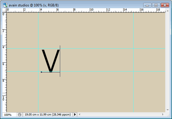
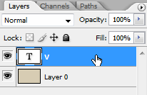
Then turn on the 'caps lock' in the keyboard because all letters should be in capital. Click somewhere near the left 'Vertical Guide' and write the letter 'V'.
Then select the 'Move' tool from the tool box. You can also select the tool by pressing 'V' on the keyboard.
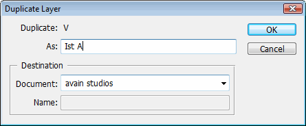
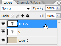
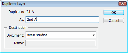
In the dialog box change the name as 'Ist A' and click OK
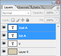
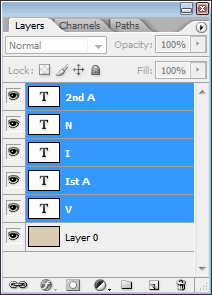
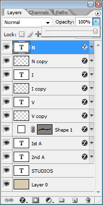
Hold the 'Shift' key on the keyboard then select the 'Ist A' and '2nd A' layer from the layers palate. Holding the Shift key will add to your selection when you make a selection. In this case you can use the Shift key to select more than one layer.
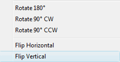
Then Right click inside the transform box and select 'Flip Vertical' from the dialogue box pops up.
You will end up at this.
Press 'Enter' to apply the transform. Now select the '2nd A' by clicking on it in the layers palate. Press 'V' to activate the 'Move' tool. Click somewhere in the canvas then drag towards the right. It will make the letter move to the right. You will be presented with the following image.
second letter 'A'. Write the letter 'I'.
Now we are going to add the letter 'N' to our design. Just click on the 'Move' tool to activate it(Do not try to activate it with the keyboard shortcut in this stage.You will get another letter 'V' in your design if you do so. Then press the letter 't' on the keyboard to activate the 'Type' tool. We are doing this additional step of selecting the 'Move' tool to get the letter 'N' in a new layer. Got it?
Click on somewhere near the letter 'I' and write the letter 'N'. Make sure that the 'caps-lock' is switched on.
Step 4 – Align the text
Ok. Now we are going to perfectly align these letters within the 'Guides. Press the letter 'v' on the keyboard to select the 'Move' tool. On its 'Option Bar' click on the 'Auto Select Layer' option to turn it on. This is a cool feature which will let you select any element in your design without actually going to the layers palate. Just click on any visible element and as you drag the element will start to move.Ok. Now using the 'Move' tool align all the elements within the 'Guides'.
Now they are within the 'Guides'. But look at the letter 'N'. It is a bit small in size when compared to the other letters in the design. Let's correct it. Click on the letter 'N'. Then press Ctrl+t on the keyboard to activate the transform option. A transform box appears around the letter 'N'. Use the Control point to change the width of the letter 'N'.
Now let's arrange all the letter precisely within the 'Guides'. Select all the layers except the 'Layer 0'. You can use the Shift key to select more than one layer.
Then press Ctrl+t to activate the transform option. You can see a transform box appears around the letters. Use the right control point to move the letters to the right side.
Until it touches the right 'Vertical Guide'.
You can also make some minor adjustments like adjusting the space between each letter with the use of 'Move' tool and adjusting the width of letters using the 'transform' option. You can stop where every letter is in perfect harmony with each other. I made some minor changes too.
Ok now we have entered the main text and aligned it perfectly. In the next step we are going to add the sub text to our design.
Step 6 - Add the “studios” text
Ok now let us add the text 'studios' to the image. Make sure that the Caps-Lock is turned on. Select the 'Type' tool by pressing 't' on the keyboard, and on the 'Options bar' set the font family to 'Microsoft Yi Baiti', font size to 34.74 pt and anti aliasing method to 'smooth'.Then type the word 'STUDIOS' just below the word 'AVAIN' and towards the right 'Vertical Guide'.
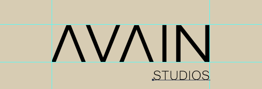
Yes, we have added the main text and the sub text to our design. Now it is time to give a proper colour to both the texts. We are going to add a nice gradient effect to the main text. But we should create that gradient from scratch. So let's move to the next step to create a cool gradient.
Step 7 – Create a gradient for the text
In this step we are going to create a gradient for the main text. First select the 'Gradient Tool' from the toolbox.On the Gradient tool's option bar click on the gradient box.
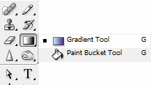
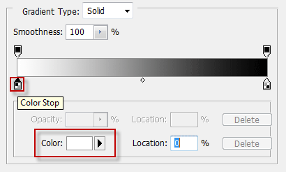
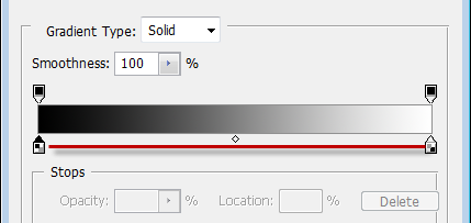
Which will open the gradient editor window. We are going to change the values of the two colour stops. Here you can see the gradient from white to black. Click on the white colour stop. On the stops sub section the colour of the current selected colour stop can be seen, in this case 'white'. Click on the 'colour' box.
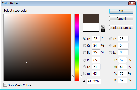
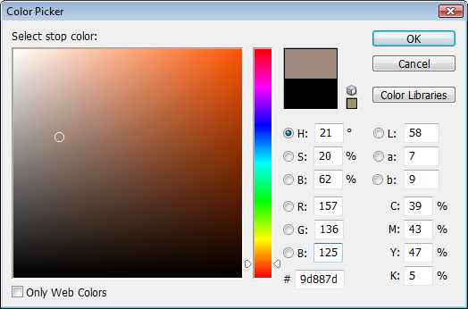
Which will open the 'colour picker' window. Change the 'RGB' values to R-65,G-51,B-43. Press OK.
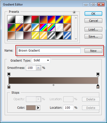
In the colour picker window change the RGB values to R-157,G-136,B-125
Ok. We have created a cool gradient. In the next step we are going to add the gradient to our main text.
Step 8 – Applying the Gradient to the Text
Ok. We have created a cool gradient and in this step we are going to apply it to the main text.First double click on the layer named 'Ist A'
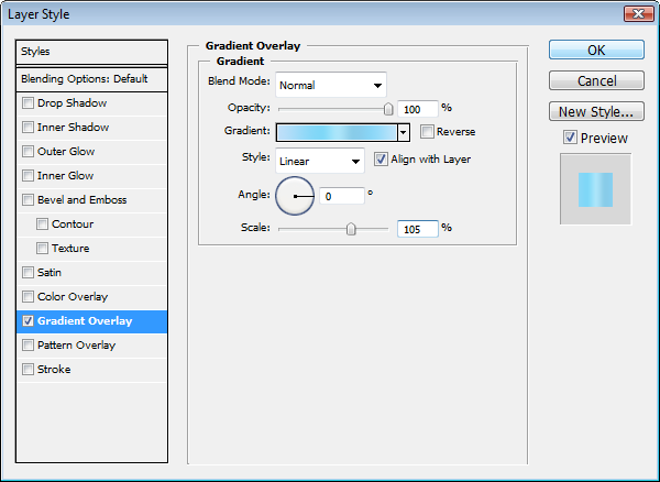
Which opens the 'layer style' window, click on the 'gradient overlay' on the left side. It will show various gradient overlay options on the right side. Just click on the small arrow beside the gradient colour box, another small window pops out showing available gradients. We can see the gradient 'dark brown' towards the bottom of the window. Click it to select the gradient.
Change the other options as shown in the following image and click O.K.
Now we have applied the cool gradient to the letter 'A'
Step 9 – Copy the Gradient to the Other Layers
Right click on the 'Ist A' layer and click 'Copy Layer Style'
....now right click on the layer 'V' and click 'Paste Layer Style'That applies the gradient to the layer 'V'
Ok now we have applied the gradient to the main text of our design. In the next step we are going to change the colour of the sub-text 'studios'.
Step 10 – Design the ribbon
In this important step we are going to design a ribbon which goes between the letters of the text 'avain'. This ribbon gives beauty to the design. Pay special attention to the curves of the ribbon. They should be smooth and dynamic. Have an eye for perfection in this step. If the ribbon is perfect the entire design will be beautiful. Ok now let's start our step.Select the ellipse tool from the toolbox.
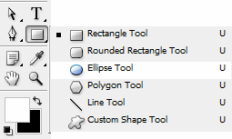
To accurately draw the ribbon we have to enlarge the image to a certain extent.
Enter the value 300 within the small box placed on the bottom left corner of the window which determines the percentage of the 'zoom'
You have to move the slider to view the specific part of the design.The slider can be used to reach to any part of the image.
Then press 'Ctrl+T' to transform the shape. From the window select the 'warp' option.
The warp option control has several control points on the left side and the right side. Move all the control points on the left side to the bottom. In the following image already one control point is moved to the bottom.
Do the same steps for the right side but move the control point towards the top side. Here you need not move all the points to the top guide as you did in the left side of the ribbon.
You will reach at this....
Now enter an amount in the little zoom box by which you can have a better view of the left side of the design.
And use the slider to move the view.
Then press 'Ctrl+T' and select 'warp'.
Then move the horizontal control lines of the warp tool upwards.
Play with the sensitive tool to make the curve smooth and identical.........
Stop when you are satisfied....
Do the same procedure to the right side but towards the bottom.
Make the curve smooth. You can use the 'vertical control line' to control the movement.
Keep an eye on the width of the shape...........
Now move the right end point of the shape to a little bit towards the centre.
Spend enough time to adjust the curve of the ribbon. Try to get perfect curves. You can move various control lines and points to make the curve perfect. If you are totally satisfied with the ribbon, then press 'Enter' to apply the transform and double click the 'zoom' tool to 100% view.
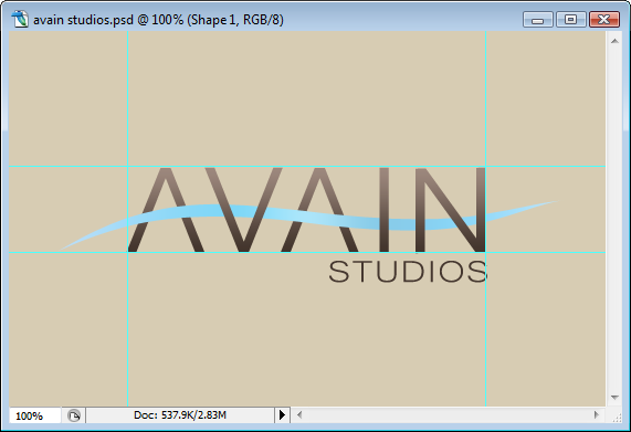
Voila, the hard part is over. In the next step we are going to create an effect using the ribbon.
Step 12 – Add a gradient effect to the ribbon
Ok now let us add some colour to the ribbon.Select 'gradient tool' and click on the colour box in the tool bar.
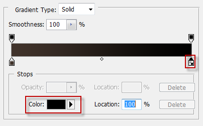
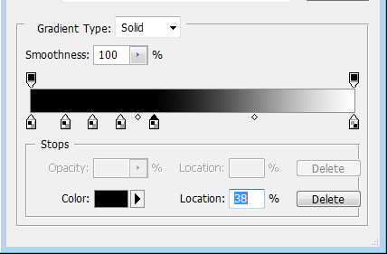
Ok. There are two colour stops. The first colour stop and its colour are shown in red boxes.
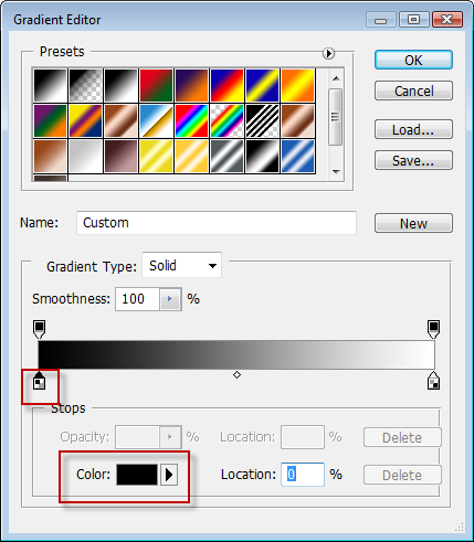
We need some more colour stops.You can insert new colour stops by clicking anywhere just below the colour bar.
Now click to add four colour stops,
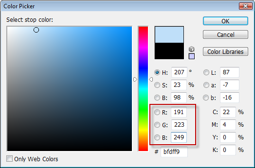
Click the first colour stop and change its colour to r-191,g-223,b-249
Then...for second colour stop-r-127,g-215,b-247
for third colour stop-r-171-g-229,b-250
for fourth colour stop-r-136,204,233
for fifth-142,216,248
for the last stop-195,229,250
Now we are going to change the location of each stop.
First click on the Fifth stop and change it location to 80%
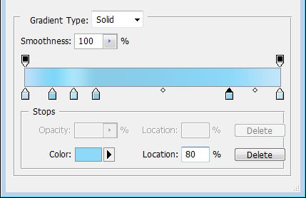
For fourth colour stop-63%
For third colour stop-50%
For second colour stop-36%
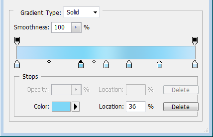
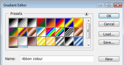
Now change the name to 'ribbon colour' and press 'new' and 'OK' which will save the gradient that we just made.
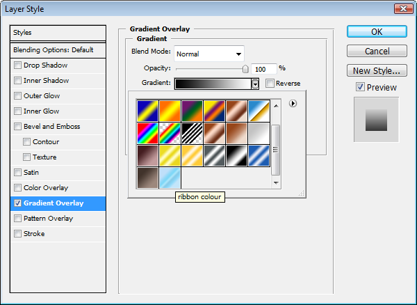
Now apply the gradient to the ribbon. select the shape(ribbon) layer and double click on it. Click the 'gradient overlay' option and select the 'ribbon colour' gradient from the gradient drop down box.
Then change the settings as shown in the following image.....angle-0, scale-105 and click OK...
It's done.
Step 13 – Adding shadow to the ribbon
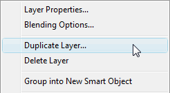
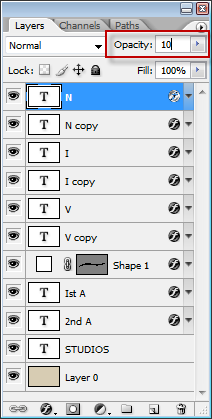
In this step we are going to add some shadows to the ribbon......Now right click on the layer 'v' and click 'duplicate layer'
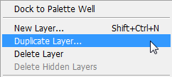
Now move the duplicated layers just below their parent layers one by one.
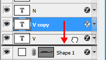
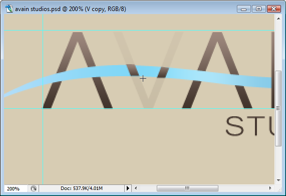
Now change the opacity of the parent layers 'v','n','i' to 10%
Now rasterize all the duplicated layers by right clicking on the layers and selecting 'rasterize type'.
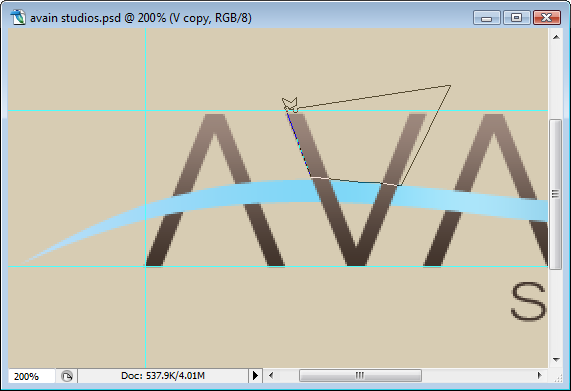
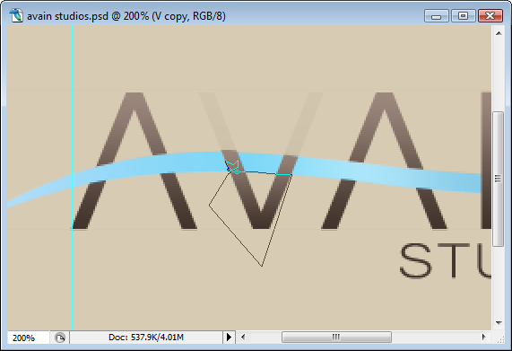
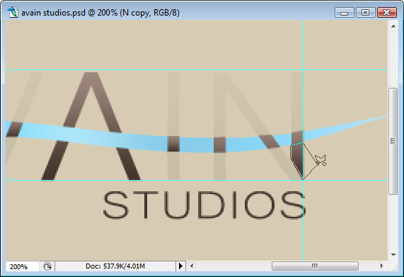
Then select 'polygonal lasso tool' from the tool box.
Then just delete the selection.....
Now the lower part....
We need only that part of the letter which is just above the ribbon. got it? repeat the steps for the letter 'n' and 'i'.
Then change the opacity of the parent layers from 10% to 100%.
Ok..
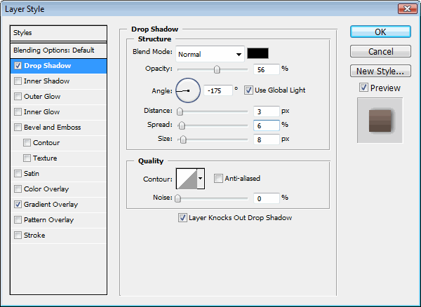
Then double click on any one of the duplicated layers (ncopy or vcopy or icopy) and click on the drop shadow effect. Change the values as shown in the following image..
Now right click on the duplicated layer that we just added a drop shadow effect and from the menu select 'copy layer style'.
Then right click on the other duplicated layers and from the menu select 'paste layer style'.
You will get this....
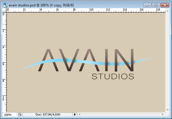
Step 14 – Add a border
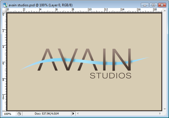
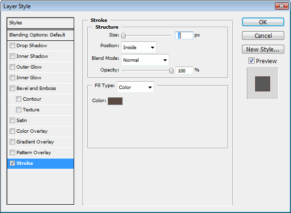
Then we add a border to the image. double click on the background layer- 'layer 0', from the window that pops out click on the 'stroke' to activate the effect. Change the settings as in the following image. Change the colour to R-91,G-75,B-66, click OK....You can of course do some minor alterations in this last step as adjusting the size,gradient colour and direction of the ribbon. Play with the transform option to change them. I too applied some minor corrections and the result was..........good.
Final Results
hope you like this tutorial.....
0 comments:
Post a Comment