Final Image Design with Swirls and Flourishes Tutorial
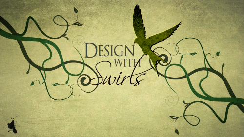
A quick thanks to Zoe who requested a tutorial like this, by dropping me a comment using my Community Suggestion Box. If their is a tutorial you would like to see covered, I would love to see your suggestions there.
Step 1
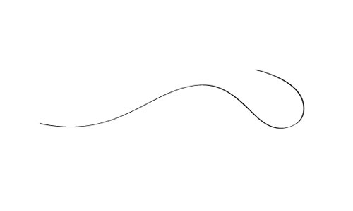
Open up Illustrator and create a new document. All the shapes I’m gonna draw are merely suggestions and I would encourage you to experiment with your own shapes and styles. Grab the pen tool and draw a nice wavy line.
Step 2
Throughout this tutorial we are going to create brushes and symbols to help us make the shapes. I want the vines to begin wide and gradually get thinner, so we are going to use a simple custom brush to create this look. Grab the pen tool or use a 3 sided polygon and draw a long triangle shape like below.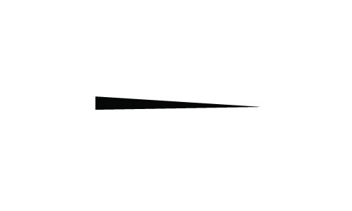
Step 3
Open up the brushes palette. If it’s not open click Window->Brushes. Drag the shape you made over to the brush palette. In the options that appear choose New Art Brush. In the second window of options keep all the defaults except change the colorization method from the dropdown menu to tints. That step is important if you want to change the color of the brush later.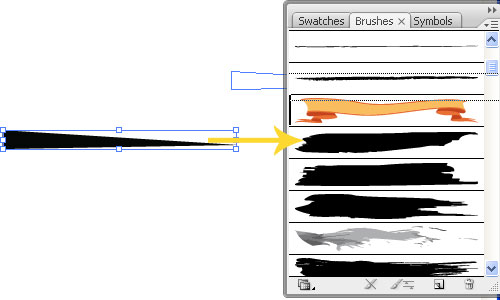
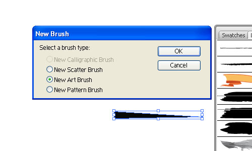
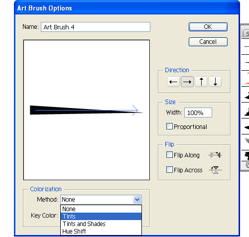
Step 4
Click on the swirl you made and then the new brush you made to apply the brush. You should now have a simple wide to narrow swirl shape like below.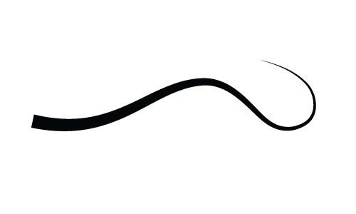
Step 5
Next up we are going to make a tighter swirl at the end of our line utilizing the spiral tool. Grab the spiral tool, which is nestled by default under the line segment tool. Single click anywhere on the canvas to bring up the spiral tool options. I used the options shown below.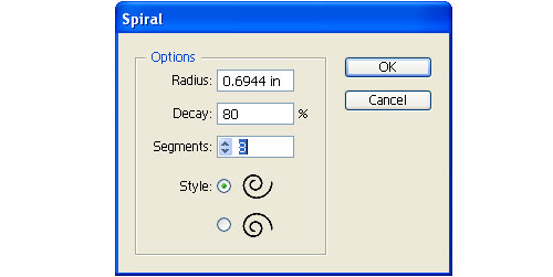
Step 6
Rotate and size the spiral into place.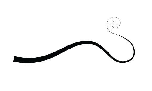
Step 7
Draw another branch coming of the vine. I think it really helps the design look organic if you vary the size of the vines. For this branch I changed the stroke to .5.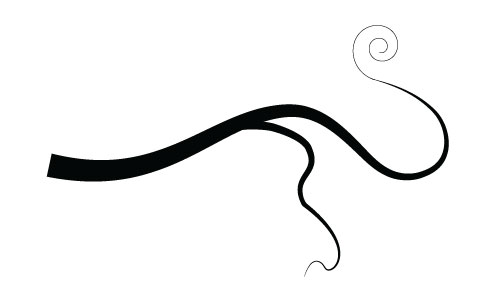
Step 8
Now we are going to design a leaf to make it into a symbol we can use throughout the design. Grab the pen tool and draw out a leaf shape like below. Draw the basic black shape and draw a highlight in white. Use the image below as a reference.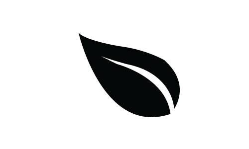
Step 9
Open up the symbols palette (Window->Symbols). Drag your leaf that you drew over to the symbols palette. Change the name to something applicable and switch the type to graphic.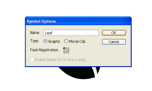
Step 10
Click and drag an instance of that leaf symbol onto your canvas. Rotate it and resize it into place at the end of the smaller vine. I also added a second smaller leaf and rotated a little more.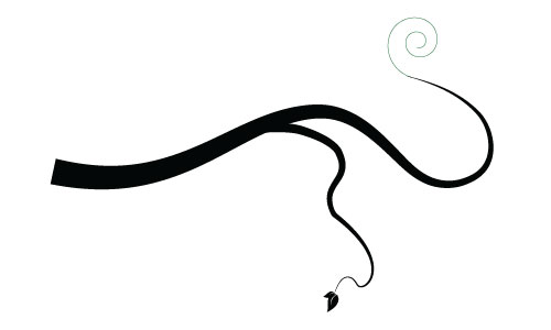
Step 11
Now we are going to make another brush for some of the smaller vine branches. Draw a long triangle like before, using the brush we made earlier, the pen tool or a 3 sided polygon. Then grab the ellipse tool and draw an oval at the end. Use the image below as your reference.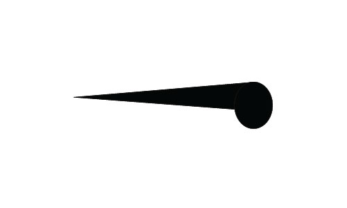
Step 12
Just like in step 3 select the shapes you made and drag it to the brushes palette to make a new brush. Don’t forget to select tint from the colorization method.Step 13
Grab the pen tool or the arc tool and draw a small branch. Click on the new vine brush you created and that will give you a simple branch you can use throughout the design. Change the stroke to .25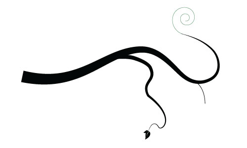
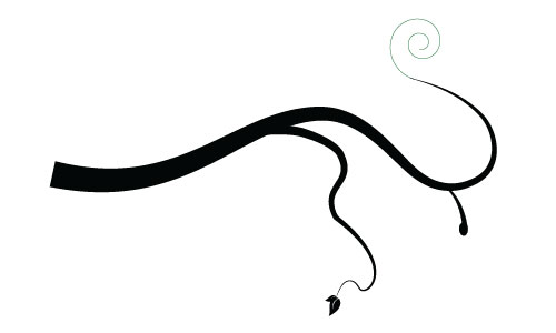
Step 14
The rest of the vines are more of the same. I did add two more leaf symbols to help vary the look. Use the image below to add two more symbols.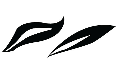
Step 15
The techniques for this second large branch are all the same brushes and symbols that we’ve already stepped through. To make the thicker swirl on the right side I used the twirl tool with a .5 stroke and stroked it with the second vine brush we created. Here’s were I’ve got so far: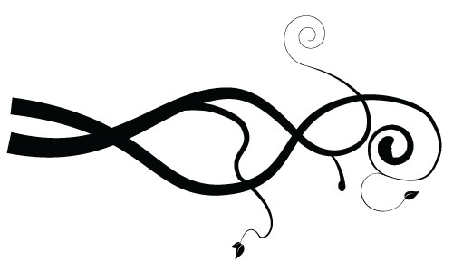
Step 16
Continue making swirls, branches and leaves until you have a design you’re happy with. Be creative and remember to experiment with different sizes and widths to keep the look organic. Here’s what I came up with.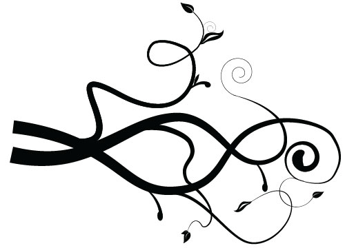
Step 17
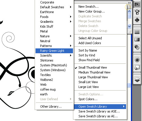
Now it’s time to add some color back into our design. If you have colors in mind that you want to use, feel free to color the image right now however you’d like. I decided to get some help from Adobe Kuler. I wanted a simple green theme for the vines. I found an awesome swatch theme called “Rainy Green Light.” If you’ve never used Kuler before you can learn a little more through a short tutorial I wrote about Using Adobe Kuler. Basically, all you need to do is signup for an account so you can use their service. Sign in, find a theme you like, download the theme and place the swatches in your swatches folder within your Illustrator folders (if you are using windows, that path will most likely be: C:\Program Files\Adobe\Adobe Illustrator CS3\Presets\Swatches). Within Illustrator open up your newly found swatch theme by clicking on the small arrow in the top right of the swatches palette, choose Open Swatch Library and choose your theme. Kuler is an awesome service, it’s definitely worth experimenting with.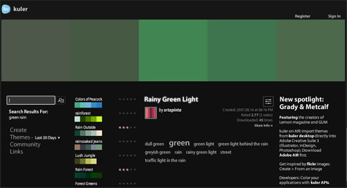
Step 18
Using your own color theme or the one you downloaded change the swirls to different colors. Play around till you get something you are happy with. Here’s where I’m at so far: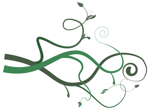
Step 19
Illustrator is perfect for making lines and vector shapes, and photoshop will service us nicely finishing off the look and adding some texture. So go ahead and open up photoshop and create a new document at the size you want. With the document opened up in Illustrator select everything, then click and drag it into your new photoshop window. Resize it and rotate it into the top left corner. Click enter to accept the placed object.
Step 20
Make a copy of the left swirl layer (while selected click Layer->Duplicate Layer). Then hit ‘ctrl, t’ to bring up the free transform tool. Rotate and place the copied flourish in the lower right portion of the canvas.
Step 21
Click on the text tool and add your text to the middle of the canvas. For the fonts I used OptimusPrinceps and Scriptina.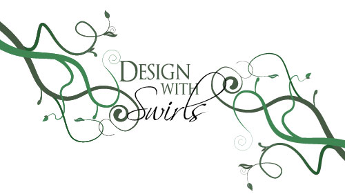
Step 22
Now you can add a nice design element I choose a cool bird silhouette. You can find this one in the Birds of a Feather font (letter t). All three of the fonts I used can be found for free at DaFont.
Step 23
I thought the background could use some more interest and texture. Click on the background layer and add a slight radial gradient like the one below. My colors are: #c4c083 and #f6f2ba.
Step 24
Next up, I went out and found 2 awesome free textures. If you’d like to use the same ones, you can download them here. Place the one called texture2 on the top layer. Change the layers blend mode to linear burn and the opacity to 20%.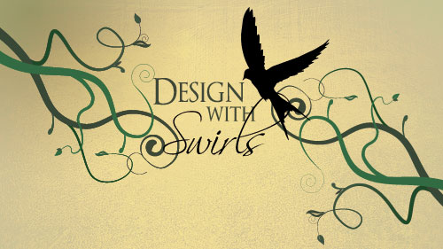
Step 25
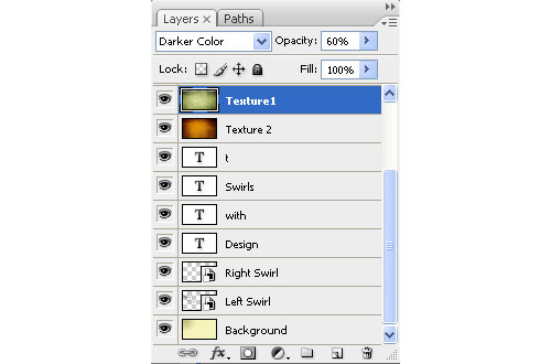
Place the file called texture 1 on the top layer. Change the blend mode to Darker Color and the opacity to 60%.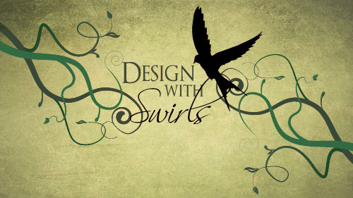
Step 26
I think that looks pretty slick already, but now the swirls and text looks like they could use a little texture as well. Copy the layer for texture 1 and paste it on it’s own layer at the top. Then ‘ctrl, click’ on the thumbnail in the layers palette for the left swirl to select it. Hit ‘ctrl, shift, i’ to select the inverse, then click delete to get rid of any part of that new texture layer that isn’t directly above the left swirl. Change the blend mode to Multiply and the opacity to 93%.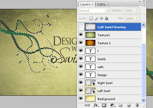
Step 27
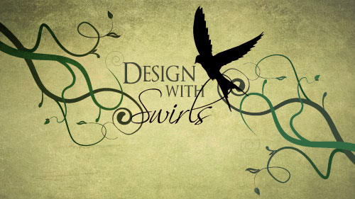
Repeat these texture overlay techniques for the right swirl and the bird. For the bird layer I used Hard Light for the blend mode at 73% opacity. Here is my final result.
0 comments:
Post a Comment