It would be lovely if every client gave you perfect photos to work with, but all too often this isn’t true. When you get photos that are too small, not visually interesting, or of poor quality you have to get creative. In this tutorial, I’ll take you through an instance where I had to make an A4 magazine cover out of a snapshot from a cheap camera.
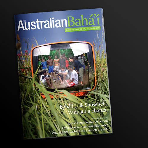
This tutorial is following an actual job I did maybe a year ago for one of our charity clients. They had had a couple of documentary film makers out in Vanuatu and had a pretty ordinary photo of them that they wanted for a monthly newsletter/magazine cover.
Note that I’ve scaled the sample PSD and the tutorial images down to a size that works for the Web, the real work was of course done at 300dpi and A4 size and everything was a lot bigger, but that doesn’t really matter for us here.
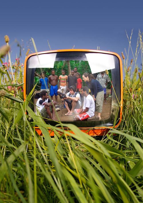
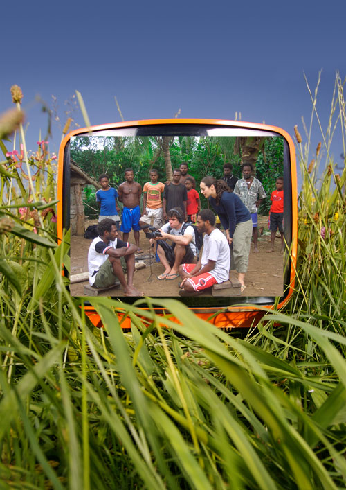
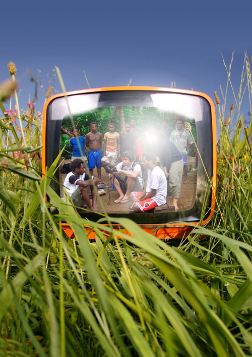
Here Look the Final Image
Step 1
So here’s the photo I was given. It’s a nice enough photo in that it shows the film makers and the locale well, but it’s small and the wrong dimensions. If I scale it up to A4 it’s going to look awful both because the quality in the photo isn’t there and because it’s the wrong dimensions, I’ll wind up cutting out most of the image anyway.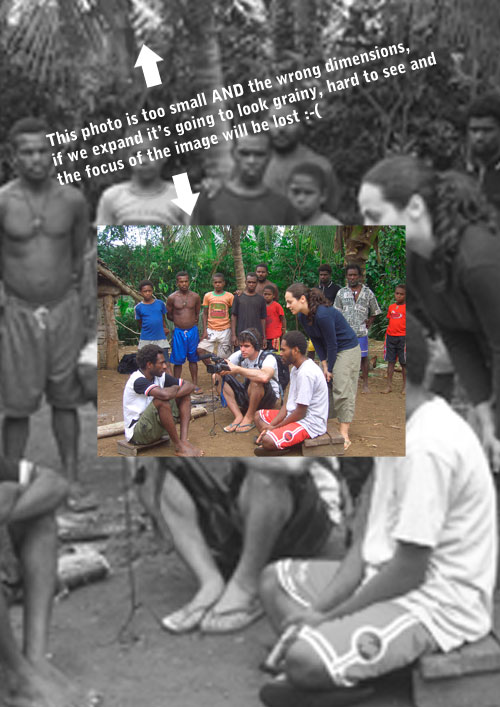
Step 2
So I paid a visit to iStockPhoto.com, which is where I get most of my photos, and I found this one of a retro looking TV out in the grass. This is perfect for the cover because they are making a film so it’s neat if the photo is on a TV and the scene looks sunny and tropical which matches Vanuatu.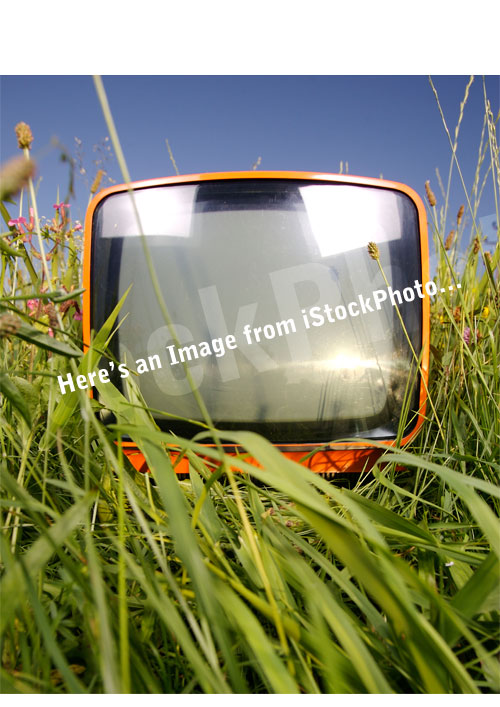
Step 3
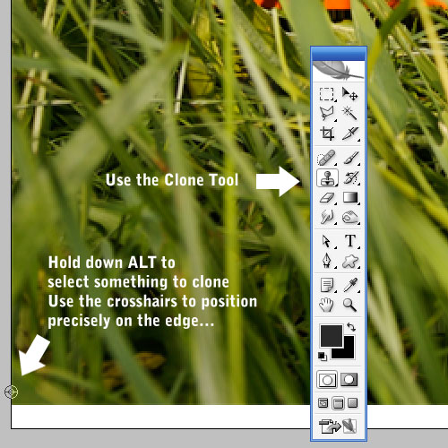
The image however is not quite A4, so the first thing we need to do is extend it. We can do this with the Clone Stamp Tool (S). If you’ve never used this tool, basically it works in two steps. First you hold down Alt and select what you want to clone then you paint somewhere else and it copies the first point. There’re a few things I’ll say about this tool. First when you hold down Alt, you’ll see some crosshairs that are extremely useful for ensuring you are positioning the tool correctly. So here I first select exactly the edge, then move the cursor down, and again press Alt just for a moment so I can see where the cross hair is again (but don’t click the mouse again or you will reposition where you are cloning from). Then you can align edges precisely. The other thing to note is that it’s generally better to use a soft brush when cloning.Anyhow so in this step I used a soft brush, duplicated the photo layer so there are two copies, switched the visibility of the top one off and then simply duplicated the background over the bottom white area. Note that this won’t look quite right but we’ll fix that in a moment.
Step 4
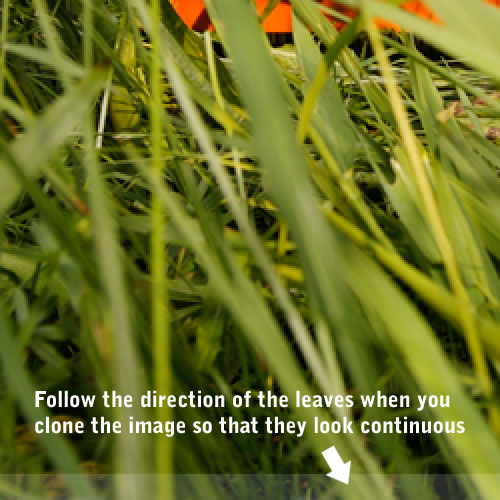
Now switch the top layer back on, and using the Clone Tool again, brush the larger strands of grass down following the angle of the blades. In the image below, I’ve faded out the bottom area so you can see which part is clone and which is original image.So what is happening here is in the previous step, you filled the layer with a general grass texture (which didn’t look 100% correct). Then in this layer on top, we are brushing the main blades of grass over the top. This should fool all but the most discerning eyes into thinking it is a continuous photo. The grassy texture is messy enough that unless you look closely you won’t realize isn’t quite right.
Step 5
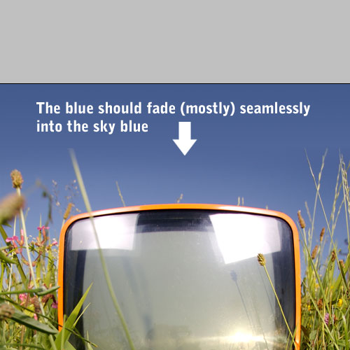
Now we create another layer on top and use the color picker to pick out the top-most blue for the foreground color. Then for the background color pick out a slightly darker blue. Then in our new layer draw a Linear Gradient straight down from dark blue to lighter blue. Make sure that the lighter blue begins just past the edge of the photo you are covering up.Then grab a soft eraser brush and erase the blue gradient layer so that it’s all gone except the top part fading into the photo. There are of course some problem areas where the grass stems continue on, but we’ll fix those next…
Step 6
Now zoom in close and with the Clone Tool taper off the grass stalks to look like they’ve ended (somewhat) naturally.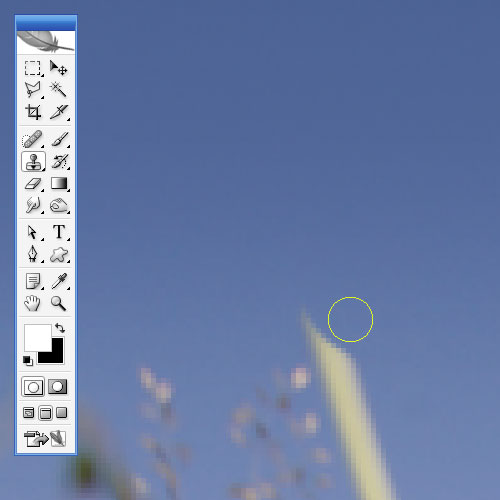
Step 7
So now we have our TV background going off to the edges with the television nicely centered. If you wanted, you could spend more time on the sky/grass stalks, but in this case we’re going to have text there anyhow so it’s not uber important.What we want to do next is get the photo to look like it’s part of the image (in particular like it’s on the screen). So first we place the photo on top of the screen and using Ctrl-T to transform, get it to roughly the right size.
Step 8
Now we switch off the visibility of the photo layer temporarily and using the Pen Tool go around the area of the television that would normally show pictures. Once you’ve got your path, right-click on the canvas (make sure you still have the pen tool on though) and choose Make Selection and the press OK in the dialog box that appears.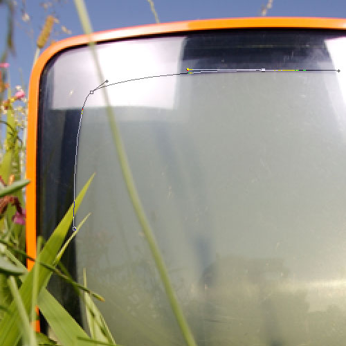
Step 9
With the selection still up, turn the photo layer back on and click on it so that you are working with the photo. Then press Ctrl+Shift+I to invert the selection and hit delete. This will cut away the rest of the photo that you don’t need.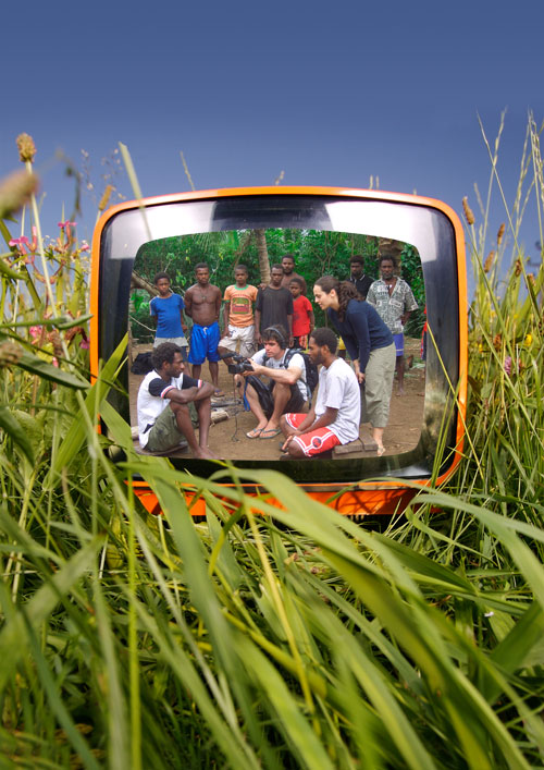
Step 10
Next we set the photo layer to 50% Opacity so that we can see what’s behind it. Then with a soft eraser brush selected, gently erase out the parts of the photo that cover the grass stalks.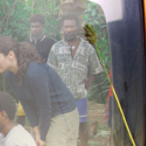
Step 11
With some stalks of grass it’s better to use the Pen Tool. Here for example I’ve drawn a path around the stalk which is pretty triangular and then right clicked and chosen Make Selection and the hit Delete once the selection was up.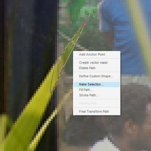
Step 12
So once this is all done, the photo is starting to look like it’s part of the scene, but not quite. The lighting for the photo is pretty wrong still, so that’s what we’ll work on next.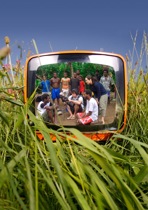
Step 13
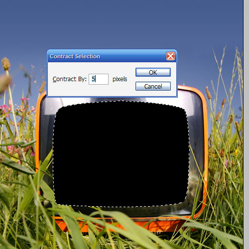
So first of all go back to the duplicate of the photo layer we made in step 9 and hold down Ctrl and click on that layer to select its pixels. Then create a new layer on top of the other photo and fill it with black. You can delete the duplicate photo now as we don’t need it any more. Next we hold down Ctrl again and select the black layer to select its pixels and then go to Select > Modify > Contract and use a value of 5px.Then hit Delete to leave a 5px border. Set the Opacity of this layer to about 20%. This will be a sort of shadow at the edges of the TV screen to give the impression that it’s slightly curved.
Step 14
Now hold down Ctrl and click on the main photo layer to select its pixels. Then press Ctrl+Shift+I to invert the selection and go to the new shadow layer and hit Delete. This just stops the shadow from going over the top of the grass stalks.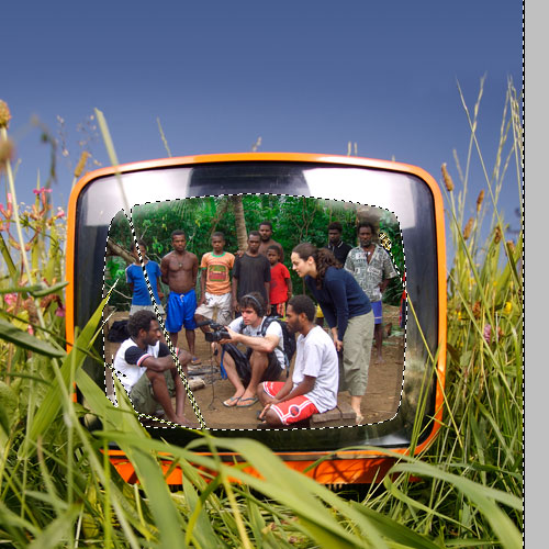
Step 15
Next with a fat Eraser brush selected, go to the photo layer and erase a little of the top left and right corners. We do this because we want those two highlight layers to continue on over the photo (which we’ll complete in a couple of steps).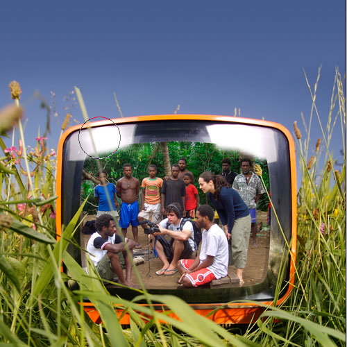
Step 16
Next in a new layer on top, I added a white to transparent radial gradient towards the top right corner. I then faded this out to about 20%.I also added with a soft brush a little white down the bottom, though it’s hard to see. If you open the sample PSD at the end of the tutorial you’ll see what I mean.
The main thing we are trying to do here is give the impression that you are looking at curved glass, which is a little reflective.
Step 17
Next we switch off the photo layers so we can see the original photo at the back and using the Pen Tool trace out the two highlights in the top left and top right. Once you have a path around each, right-click the path and choose Make Selection. Then in a new layer at the top, fill the selection with white. Do this for both highlights.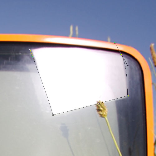
Step 18
Now we can switch the photo back on and the highlights will still be over the top. You might want to fade them out a little and erase away any areas where a grass stalk is meant to be poking through (as we did earlier for the photo itself). The final image is shown below.Step 19
As I mentioned earlier, this was in fact for a cover of a newsletter/magazine I did a year or so ago. You can see roughly what the final thing looked like in the picture below.The main point of this tutorial is partly to show you some basic ways to merge a photo with another and extend a photo, but more importantly to show how you should not be limited by the things your client gives you. It’s so tempting as a graphic designer to bemoan the quality of photos or a logo or other design constraints, but with a little creativity you can often do a lot with very little and still achieve a professional effect.


0 comments:
Post a Comment