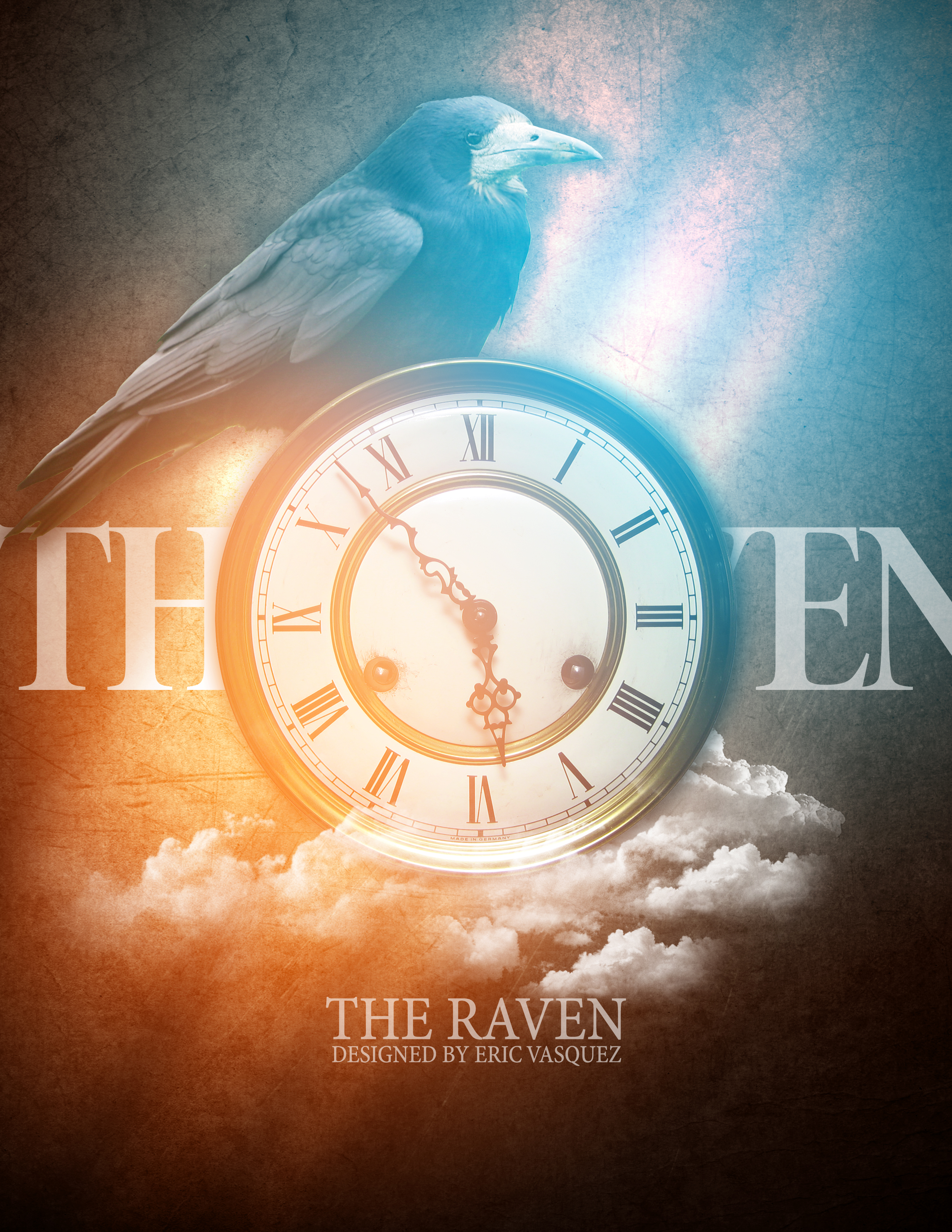
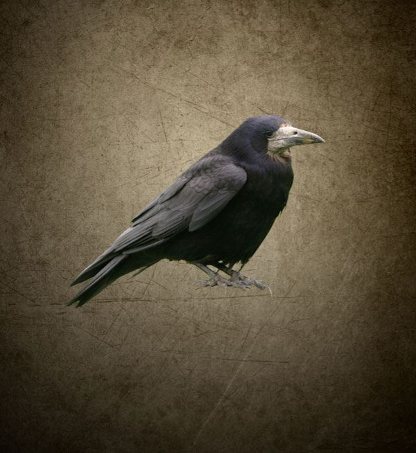
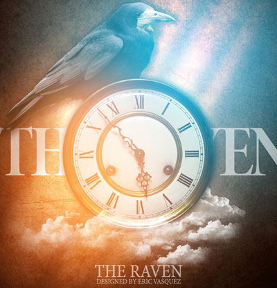
In this Photoshop design tutorial, we are going to be creating a striking, dark-themed piece with colorful highlights using stock photos, textures, and Photoshop brushes. The scene is built around a raven and a clock that represents fate and waiting for your time to come. With this tutorial, however, we will be depicting this theme in a fresh and edgy way that will surely give you some new things to try in Photoshop!
Tutorial Resources
- Texture: Parched ii by Struck Dumb (deviantART)
- Texture: Grunge v by Struck Dumb (deviantART)
- Stock Image: Raven by Philip MacKenzie (stock.xchng)
- Stock Image: Oma’s Old Clock by Jean Scheijen (stock.xchng)
- Brushes: Cloud Brushes by Javier Larios (QBrushes)
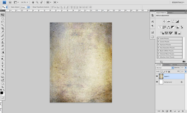
Step 1: Adding the Background Texture
Start up Photoshop and then create a new document that is 8.5" wide x 11" tall.We want to bring in some texture to begin to build up our background. Download and open up the Parched ii texture in Photoshop. Place the texture into our main document.
Press Cmd/Ctrl + T to initiate the Free Transform command. Hold Shift (so that our rotation is done in 45-degree increments), then rotate the texture 90 degrees so that it is oriented vertically, fitting nicely in our canvas.
I really love incorporating textures into my artwork, combining different images and playing with blending modes to add a nice bit of complexity. I would encourage you to try combining different textures to create some interesting visual effects. Find free textures in the Design Instruct Freebies section.
Step 2: Desaturate the Background Texture
Next, with the texture layer selected in the Layers Panel, press Cmd/Ctrl + Alt/Option + U to bring up the Hue/Saturation image adjustment dialog window. Move the Saturation slider all the way to the left to completely desaturate the image.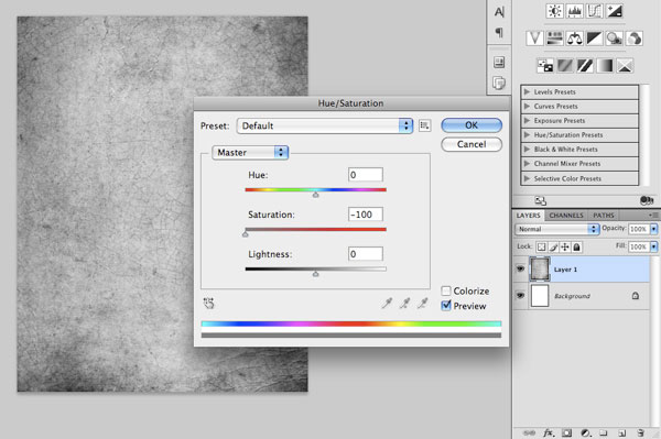
Step 3: Add Another Background Texture
We are going to repeat the previous steps with the other grunge texture. To start, download and open the Grunge v texture. Place the texture into the document and then rotate and size it using Free Transform (Cmd/Ctrl + T). Afterwards, desaturate it by pressing Cmd/Ctrl + Alt/Option + U to bring up the Hue/Saturation image adjustment dialog window and moving the Saturation slider (middle slider) all the way to the left.
Step 4: Blending the Textures Together
You should now only be seeing the top texture that we have just placed into our composition. From here, we want to blend both the textures. To blend them, we are going to change the top texture layer’s Blend Mode to Multiply and reduce the layer Opacity to 75%.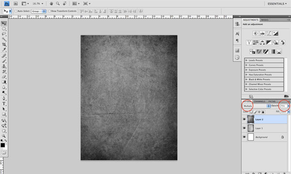
Now create a new layer on top of all the other layers. Then choose the Gradient Tool (G) from the Tools Panel. In the Options Bar, pick the Radial Gradient option and set up the gradient so that it fades from solid black (#000000) to transparent. In addition, choose the Reverse option.
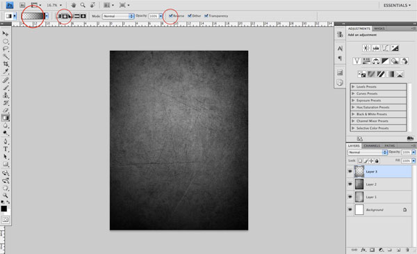
Click-and-hold in the center of the canvas and drag your mouse outwards to create a radial gradient in the new layer that will fade out to black. You may need to use Free Transform (Cmd/Ctrl + T) while holding Shift to drag one of the corners outwards in order to enlarge the gradient (holding Shift constrains the proportions). Also, you might need to move the radial gradient slightly upwards so that more of the gradient is showing on the bottom of the composition, and less on the top.
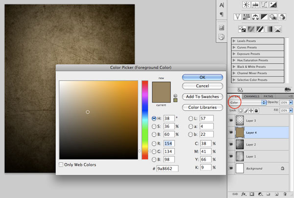
Create a new layer below the radial gradient layer. Fill the new layer with a light tan color (#9a8662) using the Paint Bucket Tool (G). Afterwards, change the Blend Mode of the layer to Color.
Step 5: Adding a Focal Point
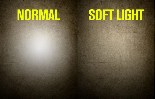
So far, we have been working on building up a background with textures and it’s looking pretty good. What we want to do now is add a focal point to the center of the scene where we will be placing most of our design elements. Before we bring in those elements, we will lighten up the center of the image a bit to make the fade to black even more gradual. This, in effect, gives greater emphasis and prominence on the center of the composition where our major elements will be.On a new layer just above the light tan color layer from the previous step, use the Gradient Tool (G) set to a solid white color (#FFFFFF) to transparent gradient. Make sure that you still have Radial Gradient selected and that it fades from solid to transparent, just like before. This time, however, uncheck the Reverse option so that the color of the gradient will originate from the middle, rather than the outside. Click and drag the mouse outwards from the center of your canvas to create the radial gradient on the new layer.
By default, the color will just be solid white; this is OK, but we are going to change the Blend Mode of this layer to Soft Light so that we get a more subtle result. Below you can see the difference between the Normal blend mode (left) and the Soft Light blend mode (right) that we have the layer set to.
Step 6: Adding the Raven
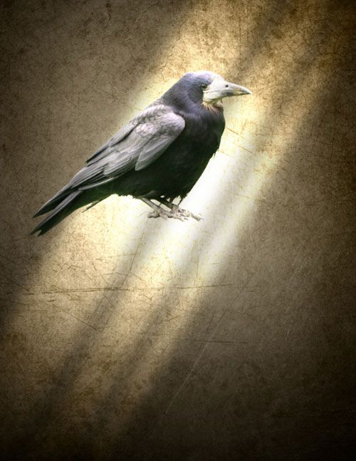
We can now begin to add some of the key elements that we will be using for this piece. For starters, let’s download and open up the Raven stock image in Photoshop. We need to isolate the raven from the background, and to do that, you can trace around it with the Pen Tool (P). If you have the benefit of using a tablet or are just good with the mouse then you can use a Quick Mask (Q) to mask out the background.Once you have isolated the raven and removed the background, drag the image over into the main document. After bringing in the raven, you may need to do a bit of additional cleaning up in case there is any part of the green background left over; just use the Eraser Tool (E) to tidy it up as needed.
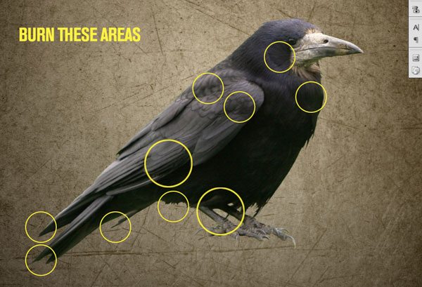
Step 7: Improving the Raven’s Tone with the Burn Tool
Select the Raven layer in the Layers Panel and then press Cmd/Ctrl + J to make a duplicate layer. Hide the visibility of the original layer and then make the duplicate layer the active layer.Choose the Burn Tool (O) from the Tools Panel. In the Options Bar, have the Exposure set low at around 20-30% and also pick a soft, round brush. The idea is to darken up the edges and also to enhance the darker areas of the feathers and claws. Use the following image as a reference.
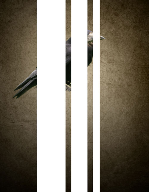
Step 8: Create Rays of Light
Next, create a new layer at the very top of the Layers Panel. With the Rectangular Marquee Tool (M), create a tall and fairly wide rectangle selection. Fill the selection with solid white using the Paint Bucket Tool (G).Duplicate this rectangle (Cmd/Ctrl + J) and move it to the right of the first one. Press Cmd/Ctrl + T to switch to Free Transform. Grab one of the handles on the side and drag it to the opposite side in order to make this rectangle narrower than the first. Repeat this process once more so that you have three tall rectangles, side by side, each one slightly narrower than the one to the left.
Select all three layers in the Layers Panel. Press Cmd/Ctrl + E to merge these three rectangle layers together into one layer. Then change the Blend Mode of the merged layer to Overlay.
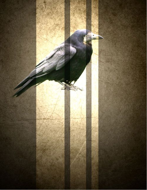
Switch back to Free Transform (Cmd/Ctrl + T). Hold down Shift + Alt/Option, click-and-hold on the top-middle handle, and then drag it upwards. This will extend the rectangles vertically on both the top and bottom at the same time so that it stretches outside the boundaries of our canvas.
With the rectangles layer still selected, go to Filter > Blur > Gaussian Blur and apply the filter with Radius at about 56px.
Lastly, use Free Transform (Cmd/Ctrl + T) while holding Shift to rotate the rectangles clockwise so that they are diagonally oriented. As you can see, it now looks like rays of sunlight shining through a window. Easy technique, great results.
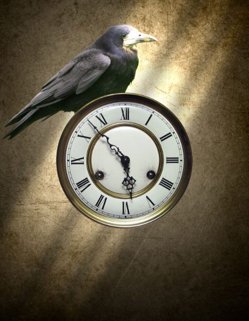
Step 9: Adding the Clock
Next, we need to bring in the Oma’s Old Clock stock image. Go ahead and download and open it in Photoshop. You will see that the clock is on a solid white background that will make it very easy for us to isolate.Double-click on the Background layer of the stock image — this will open up the New Layer dialog window, just hit Enter or press OK to unlock this layer.
With the Magic Wand Tool (W), simply click on any part of the white background and then press Delete to remove it.
Place this image into our main document. Locate the clock at the center of the composition, and make sure that it is on top of all of the other layers.
Step 10: Adding a Subtle Hue to the Textured Background
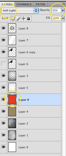
I want to inject a subtle hue into our nicely textured background before moving on. I think that this will help blend the background with some of the effects that I would like to add in the upcoming steps.To begin, grab the Paint Bucket Tool (G), select a vibrant red color (#ff0000) for your Foreground color, create a new layer below the two background radial gradient layers and just above the layer with the light tan color, then fill it with the red color.
Afterwards, change the Blend Mode of this layer to Soft Light and lower the Opacity to about 35%.
By adding this extra bit of color to our image, not only will it help blend some of the elements together, but it also adds a bit of warmth and almost a slightly dangerous feeling to the image.
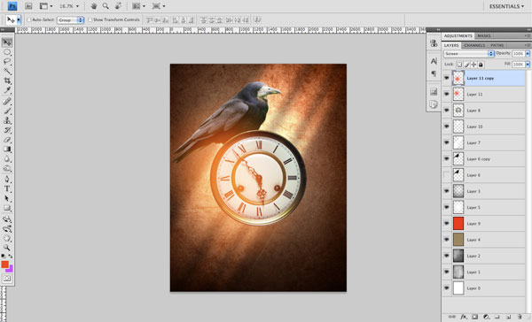
Step 11: Tweaking the Effect of the Light Rays
I want to reduce the strength of the overlay on the raven that is being caused by the rays of light layer. I like the way it looks on the background, so I only want to reduce it on the raven. To do this, I am thinking that the best way would be to use a masking technique that I find very useful and that I find myself using quite often in my workflow.Start by holding down Cmd/Ctrl and then click on the Raven layer’s thumbnail to load a selection around the raven.
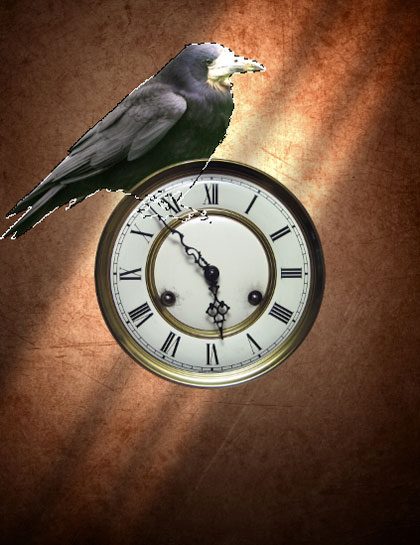
Keep the selection active, but switch to the rays of light layer that is just above the Raven layer. Now that you are on the rays of light layer, press Cmd/Ctrl + J to copy the selected area into a new layer. For the moment, doing this will just intensify the effect, but we are going to fix that soon.

Again, hold down Cmd/Ctrl and click on the Raven layer’s thumbnail to load a selection around it. Select the next layer above the raven (which should be the original rays of light layer) and then press Delete to remove the area inside our selection. The image will now look like it did before we began this step, but now we have complete and separate control over the effect on the background and the effect on the raven.
On the layer just above the rays of light layer is the duplicate selection we have made, so we want to reduce the Opacity of this layer to about 50% and you should end up with something like this:

Step 12: Introducing Spots of Color
Create a new layer on top of all the layers. Then choose the Gradient Tool (G) from the Tools Panel. Set up the tool so that it will create a Radial Gradient that fades from a vibrant orange (#F6520A) to transparent. Create a medium-sized radial gradient by dragging from the center of the canvas, going outwards. Once you have done that, change the Blend Mode to Screen.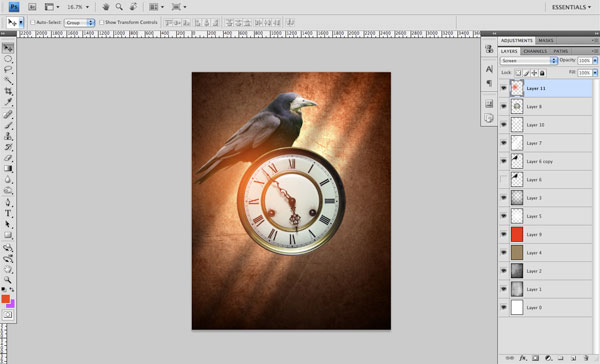
Press Cmd/Ctrl + J to duplicate the layer with the medium-sized radial gradient and feel free to play around with the positioning of these two gradient layers until you are happy with the results.
Next, we are going to create another radial gradient in a new layer, but this time using a vibrant blue color because it is the complementary color of orange. I am using the color #0AC7F6. Set the Blend Mode to Screen as well.
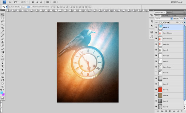
You may notice from the image above that I have actually made a third copy of the orange radial gradient and scaled it up so that it balances out the color of the overall image. We have now added some vibrant colors that really give a fresh feel to the piece. I wanted to steer clear of doing something that feels completely dark and morose, but instead putting my own spin on the "grungy" genre. Feel free to try this step with different colors as you may end up with some very interesting results!
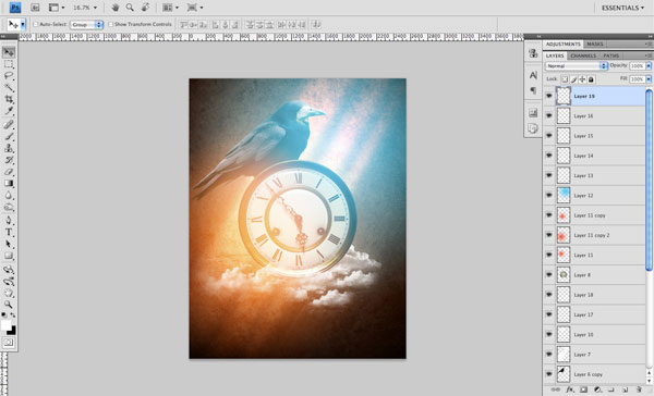
Step 13: Adding Clouds Using Brushes
Create a new layer at the top of the Layers Panel. For this new layer, we will need the free Cloud Brushes library; download and load up the brush library in Photoshop. Set your Foreground color to white, switch to the Brush Tool (B), pick several cloud brushes, and then paint a few clouds on this layer, experimenting with the placement.Create a few additional layers where you can add more clouds; place some of them in front of the clock and a few behind it to add some depth and visual interest.
Step 14: Final Adjustments
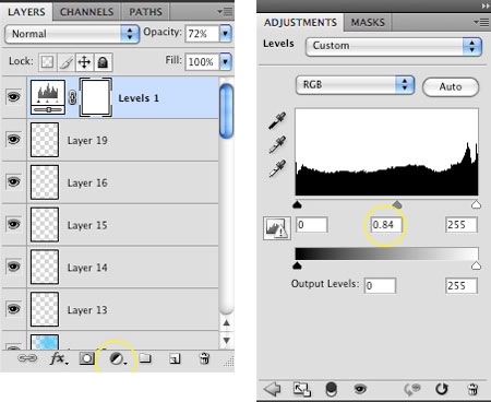
To finish off the piece, I want to make a few last adjustments to the composition. One of these changes is to add just a bit of additional contrast to the overall image to help the colors pop a little more.To enhance the contrast, I am going to click on the Create new fill or adjustment layer icon at the bottom of the Layers Panel, and then choose Levels to add a Levels adjustment layer on top of all the other layers. Thus, this adjustment layer will affect all of the layers underneath it. When you add an adjustment layer, the Adjustment Panel will appear, showing the options for the current adjustment layer (in this case, Levels). Move the middle slider (which is the slider that sets the gray point) to the right so that it’s set to around 0.84. Afterwards, lower the adjustment layer’s Opacity to around 72%.
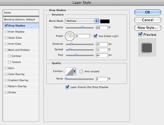
Next, double-click on the Raven layer to access the Layer Style dialog window. Add a Drop Shadow layer effect using the following settings:
Lastly, I’m just going to add a bit of text to the background and my name and title underneath using the Horizontal Type Tool (T) — this step is optional, of course.
Tutorial Summary
We covered many techniques in producing this grungy, mysterious, but also colorful piece. We made a nice textured background using stock textures and Hue/Saturation image adjustments. We created rays of sunlight using a simple technique of drawing rectangles with the Rectangular Marquee Tool, tweaking the blending mode of the layer and applying the Gaussian Blur filter. We enhanced the raven’s highlights using the Burn Tool. We finalized our composition with a Levels adjustment layer to give it the perfect overall color contrast. I hope you enjoyed this tutorial!


0 comments:
Post a Comment