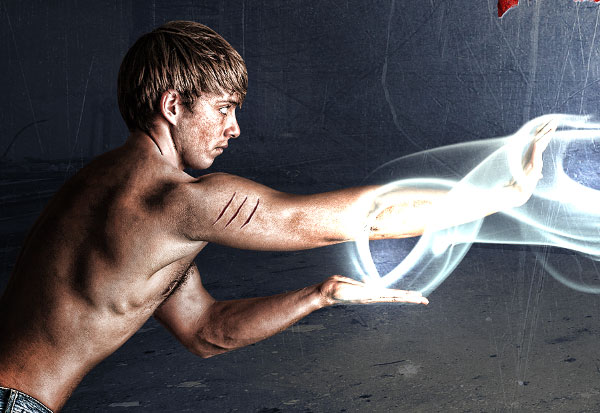
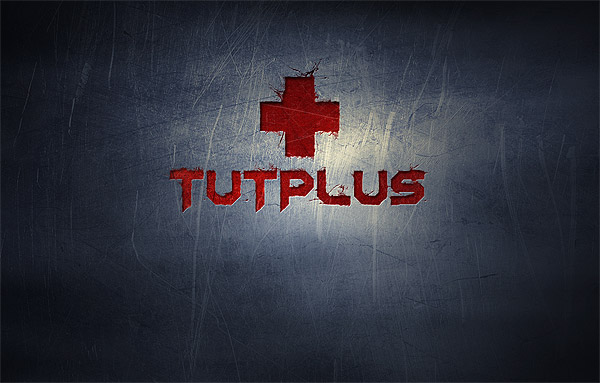
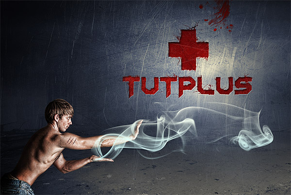
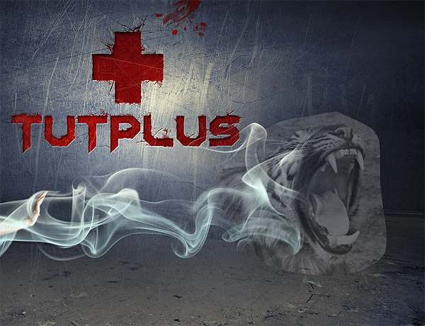
Final Product What You'll Be Creating
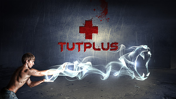
Creating light effects is often a pretty easy process. Giving those light effects life and making them resemble real-life objects can require a bit more skill, time, and patience. Today, we will demonstrate how to create a grungy, Street Fighter inspired composition that includes light, photo, and text effects. Let’s get started!
Tutorial Assets
The following assets were used during the production of this tutorial.
- Faded blue texture
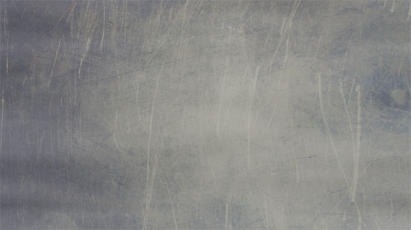
- Scratched metallic texture
- Tiger
- Chateau Noisy
- Edistys font
- Toxic Paint brushes
- Cracked edges brushes
- Smoke brushes
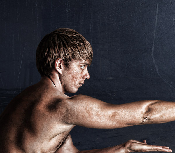
- Young man
Inspiration
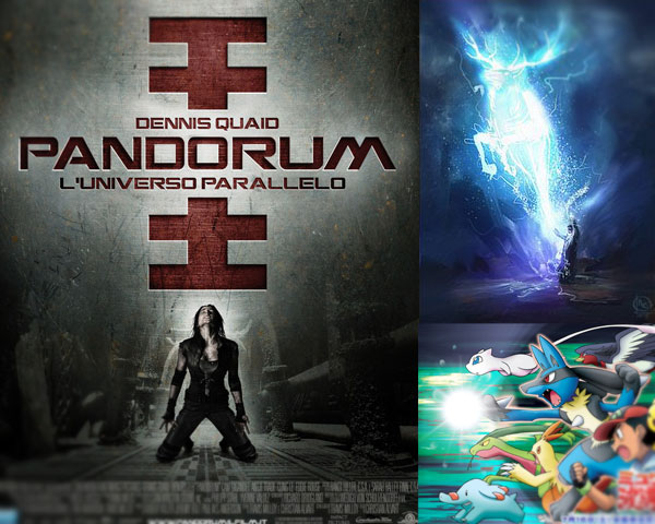
The inspiration for this piece was derived from the movie poster Pandorum. I like the engraved type treatment and in particular the way it contrasts with the rest of the composition. So my first aim was to focus the tutorial on this text effect. Then, to introduce a character. I’m a great fan of sci-fi and supernatural scenes, so it comes naturally to me to create a kind of superhero. I wanted to introduce a character similar to Ryu of Street Fighter, with light energy as a continuous of his body. Finally since Ryu’s energy bubble looked too flat to me, I decided to create the animal face, in this inspired by cartoons like Pokemon and film like Harry Potter, where the main characters have "magical" animals that they can control as personal defenders.
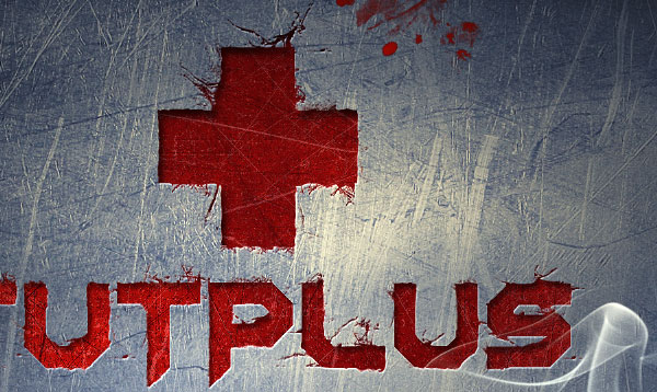
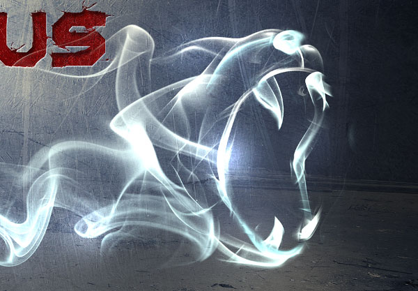
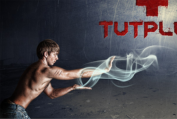
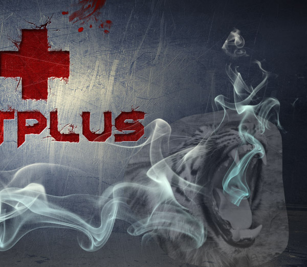
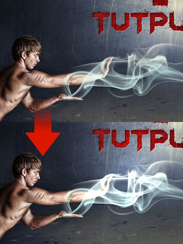
And here are some close-ups so you can see some details that can’t be seen in the 600px wide final preview.
Step 1
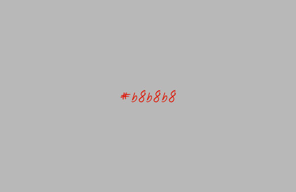
Create a new document in Photoshop. Mine is 1920×1200, the resolution of my screen, so I can use it as a wallpaper. You could do the same. Once created, fill the canvas with grey (#b8b8b8).
Step 2
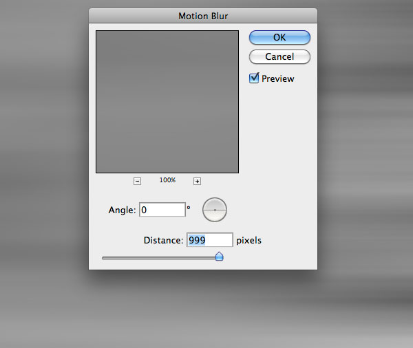
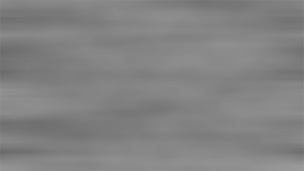
Create a new layer and fill it with black. Make sure to have white and black as foreground and background colors and go to Filter > Render > Clouds. My aim is to turn these clouds into nice linear effects. So go to Filter > Blur > Motion blur and enter a distance of 999px and angle 0. Set the layer to multiply with opacity of 60%.
Step 3
Download the faded blue texture and paste it onto the canvas. Reduce opacity to 35%.
You can notice that the left area is darker than the right one. So grab the Burn Tool (O) and paint over the edges of the right area to give more balance to the texture.
Finally create a new layer, grab a black soft brush (hardness 0%) and paint over the edges of the canvas. Reduce the opacity to around 15%. We will place the text in the center. By making the edges darker, we will drive the user attention to the center.
Step 4
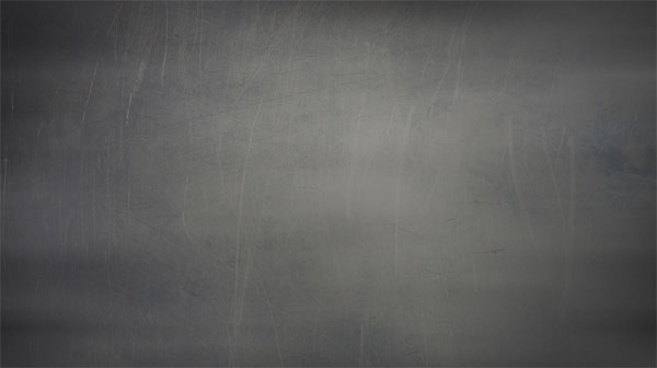
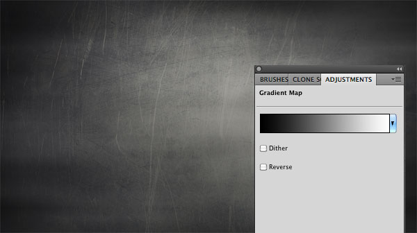
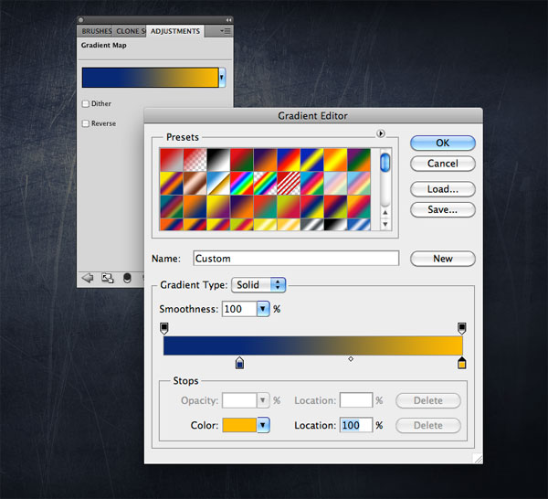
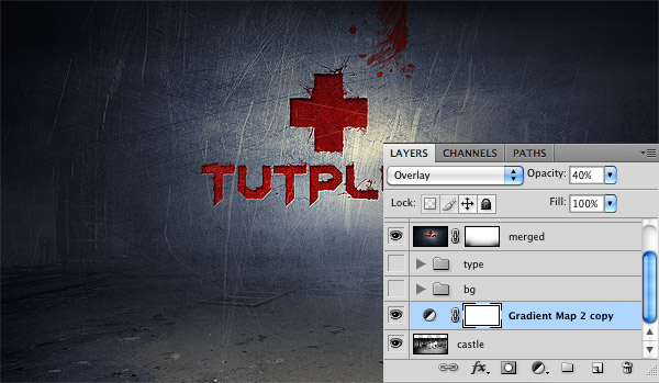
The background is still flat. We will add 3 adjustment layers to complete it. Let’s start with a black/white gradient map (Layer > New Adjustment Layers > Gradient Map) set on overlay with opacity 70%.
Secondly add a brightness/contrast layer (Layer > New Adjustment Layer > Brightness/Contrasts) and set brightness to -18 and contrast to + 80.
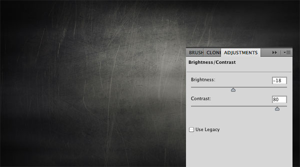
Finally add another gradient map, but this time use a dark blue (#082a75) and orange (#ffba00) as colors. Set the layer to overlay with opacity 40%.
Step 5
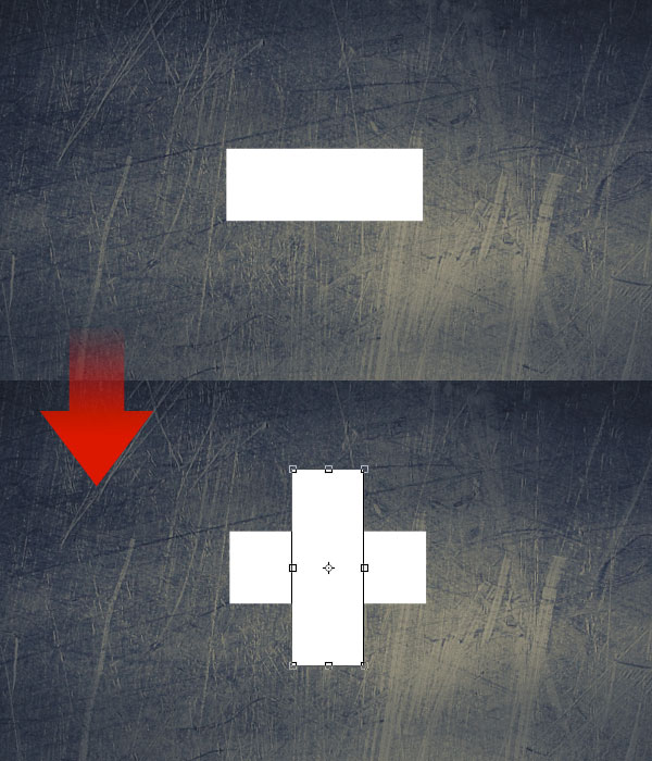
It’s time to create the type treatment, starting from the plus of the Psdtuts logo. Use the Rectangle Tool (U) to create the first shape, then duplicate it by pressing Cmd/Ctrl + J and rotate it of 90¡ (in order to rotate the shape you can active the transform tool by pressing Cmd/Ctrl + T).
Step 6
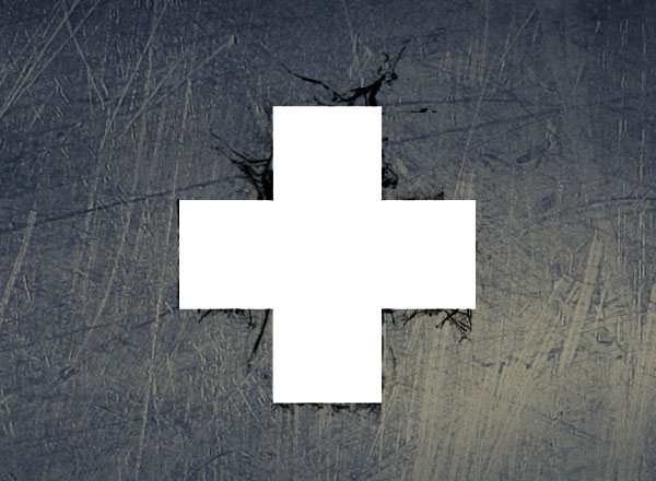
Create a new layer, grab the cracked edges brushes and paint over the edges of the ” + “. We will use these brushes to give a distressed painted look to the type. Don’t worry about the color, we will modify it later using the blending options
Step 7
Select the 3 layer of the “plus” (the 2 rectangles and the grunge brushes) and press Cmd/Ctrl + Alt+ E to merge them into a new layer. You can now hide the visibility of the original 3 layers since from now go on we will use only the merged one.
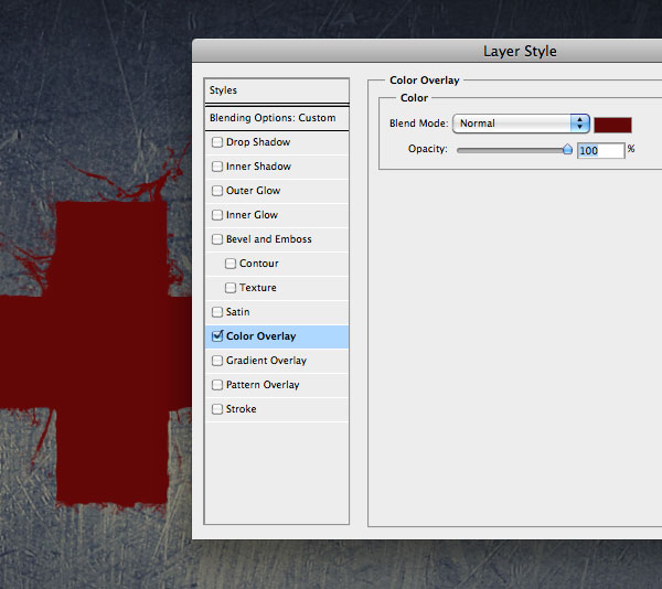
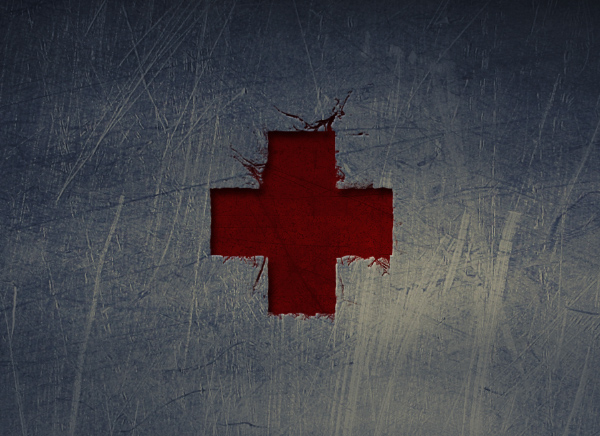
Right-click on the merged layer and select Blending options. Firstly add a red (#630707) color overlay.
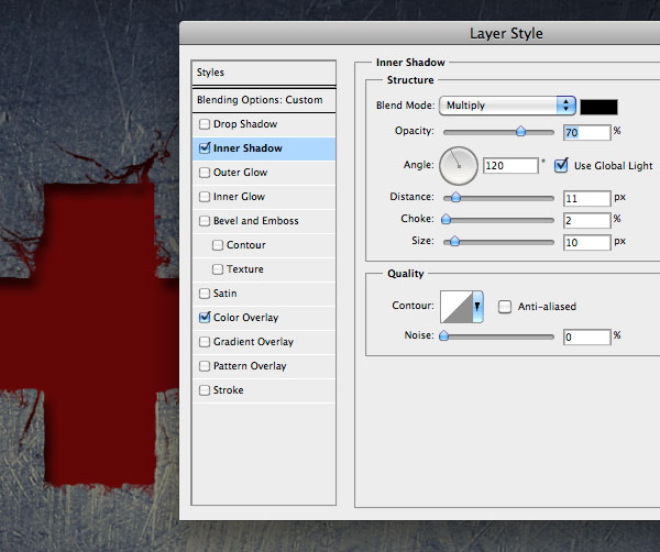
Secondly add an inner shadow to create the engraved effect. Remember that these values depend on the dimensions of the rectangles, so in case your are not satisfied with the result, play with the values of distance, size and opacity
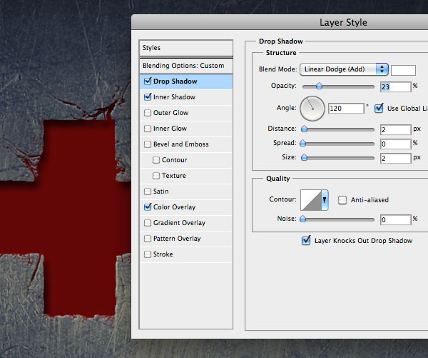
Finally add a white drop shadow set on “linear dodge” to complete the engraved effect:
Step 8
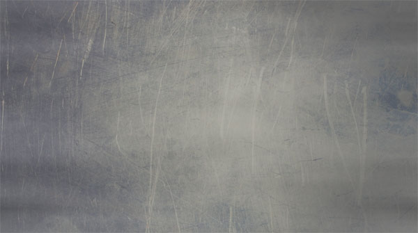
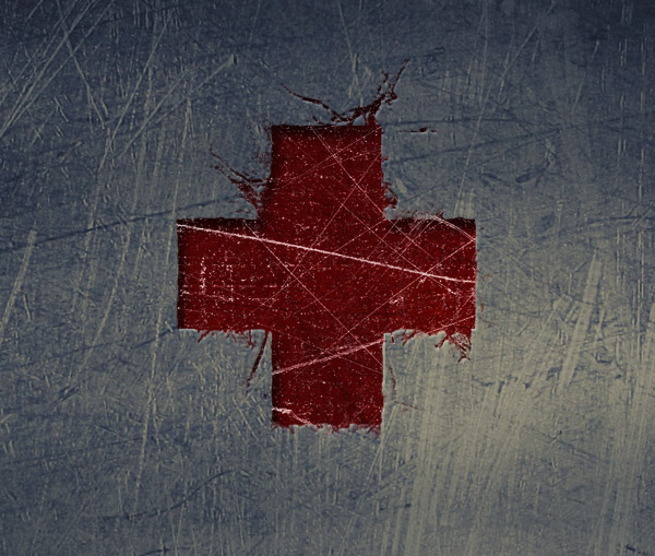
Now we have to add the scratched metallic effect of the background to the text too. So download the WeGraphics Scratched metallic textures (the free sample will work fine). Place the texture into the canvas, resize it (Cmd/Ctrl + T) and set the blending mode to overlay. Keep in mind that this effect will be applied only on the “plus”, so move the texture until you think the result over that area will be satisfactory.
Step 9
With the texture layer still active, Cmd/Ctrl + click on the ” + ” layer to select its pixels and press the “add layer mask” button ad the bottom of the layers window. In this way the scratched effect will affect only the plus. Reduce the opacity to 60%.
Step 10
I think the effect would look more realistic with a mix of white and black scratches. So duplicate the texture and delete the layer mask. Move the texture so that white scratches won’t overlap black ones. Cmd/Ctrl + I to invert the texture’s colors and set the blend mode to screen. In this way we will retain only white areas. Finally apply again the mask using the ” + ” shape as reference.
If you set opacity to 100% you can notice a little problem: white scratches are on top of inner shadow. Don’t worry, we will fix this bug in the next step;-)
Step 11
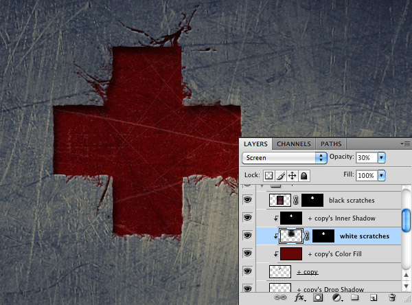
To move the white scratches below the inner shadow we need to put every style on a single layer. Fortunately this is possible in Photoshop. Right-click on the styles (in the layer window) and select “Create layers”.
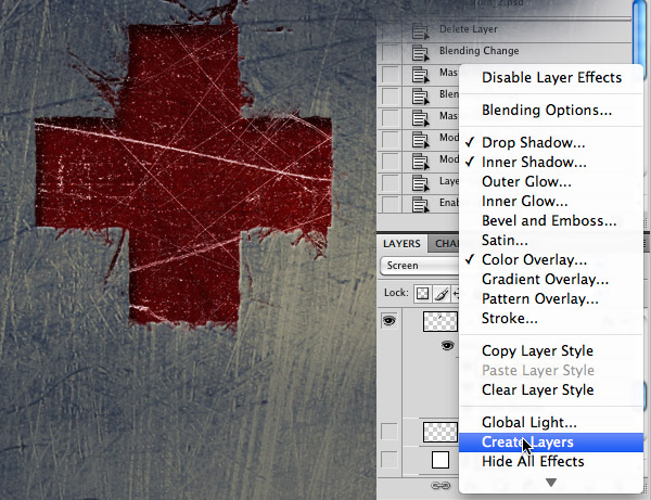
At this point simply place the white scratches layer between the inner shadow and the color fill ones. Also reduce opacity to around 30% to make the effect more subtle.
Step 12
In this step we simply have to apply to the text “TUTPLUS” (the font used is Edistys) the same method used with the “plus” logo. Play with brushes and textures to obtain a distressed grunge text effect.
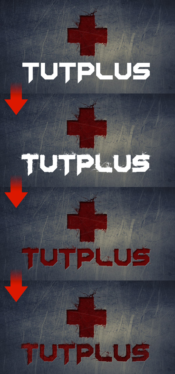
Step 13
The atmosphere is too dark in my opinion. So create a new group and switch the blending mode to “color dodge”. Create a layer inside the group, grab a large soft rounded white brush and click once over the center of the canvas. Reduce the opacity to around 45%. Now the type is more visible and vivid.
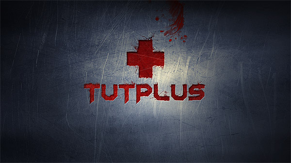
Create a new layer, set red as foreground color, grab a brush from my Toxic Paint brushes set and click once over the canvas. Then place the brush where you prefer. In my case I put it on top, not completely visible.
Step 14
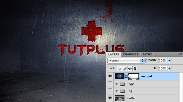
If you observe the Pandorum poster, you will notice a subtle floor below the type treatment and the metallic surface. I want to reproduce the same effect. To do so, select all the layers created till now and merge them into a new layer (Cmd/Ctrl + Alt+ E). Title this layer "merged". Hide the visibility of the other layers. We will use only the merged one for the next steps.
Download the image of a Chateau Noisy and place it inside the Photoshop document, below all the other layers. Now select the “merged” layer and add a layer mask. With a black large soft brush, gently erase the bottom area so that some details of the floor will appear.
The floor doesn’t match the metallic surface. I think it’s a problem related to the colors used: the floor is too desaturated. So, from the background folder, find the gradient map (blue/orange), hold down alt and drag the gradient map immediately above the floor. In this way we’ve duplicated the gradient map layer and moved it above the floor.
Step 15
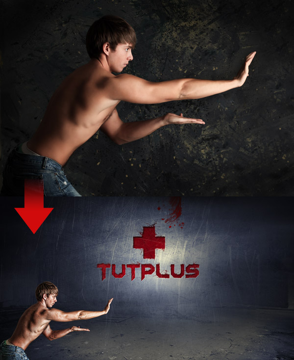
Now that the background is finished, we can focus our attention on the young man and the light effects. The first thing to do is to extract the boy from the background and paste it into the main canvas. Next let’s apply the technique seen in my first tutorial (step 14) written for Psdtuts to create a sort of hdr effect: duplicate the boy’s layer and set the duplicated layer to overlay (opacity 70%); duplicate again and this time applied the smart sharpen filter (Filter > Sharpen > Smart Sharpen) to create this kind of dirty effect and to enhance the details. Finally duplicate again and apply the High pass filter (Filter > Other > High pass) with the layer always set on overlay.
Step 16
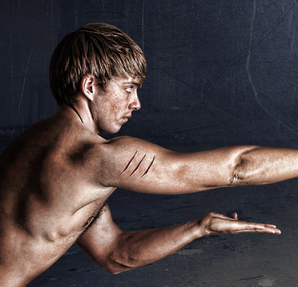
With the burn tool (O), darken the left area of the man. Keep in mind that from the boy’s hands will come out light effects, so his back will be dark.
Step 17
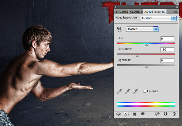
Our superhero is too saturated. Select all the layers of the boy and merge them into a new layer (Cmd/Ctrl + Alt+ E). Press Cmd/Ctrl + U to open the Hue/Saturation window and reduce saturation to -30.
Step 18
It’s time to add some details to the boy, who looks at the moment more like a dirty kid than a superhero after a fight. Create a new layer, zoom on the eye and, with a white brush, paint over the pupil. In this way the superhero will look like in a state of trans.
Step 19
Another cool detail we will work on is a scar. It can be created by painting over the boy’s shoulder with the brush tool. I’m using a tablet, so it’s more comfortable to create the three cuts. Once selected a round dark red brush (around 5px), if you have a tablet open the brushes window (Window > Brushes) and check the “Shape dynamics” option, so the brush thickness will depends by your pen pressure.
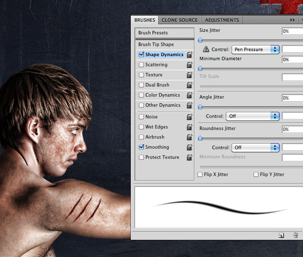
Create a new layer and move it below the red scar one. Always using a brush, but this time setting white as foreground color, paint over the edges of the scar. It’s going to look more realistic now.
Step 20
We can now play with light effects. Create a new group and title it “light effects”. Create a layer inside the group and grab the Smoke brushes. Let’s start from the lights that come out from the hands. Choose a brush from the library and click once over the canvas.
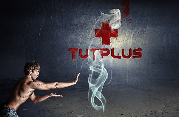
Try to imagine how this smoke effect could match the superhero’s positioning. Resize, rotate and if it’s the case, eliminate it and try with another smoke.
Use the eraser tool (E) or a layer mask to eliminate some areas of the smoke.
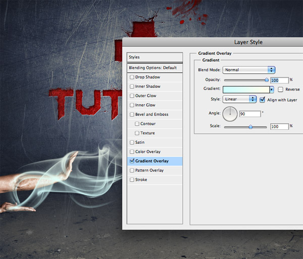
Step 21
You can notice the smoke effect isn’t unicolor. That’s because I’ve applied a gradient overlay going from a light azure (#cffeff) to a light yellow (#fffeeb).
Step 22
Using the same method from step 20, create a second light trail.
Step 23
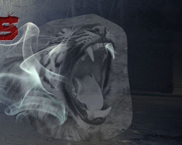
To create the face of the tiger, we need a reference image. So download this tiger and open the image in Photoshop. Using the pen tool, or the lasso tool, roughly extract the head of the animal and drag it into the main canvas. Place it where you want the light effect to be.
Desaturate the image (Cmd/Ctrl + Shift+ U) and lower its to help you in the process of creating this light effect.
Step 24
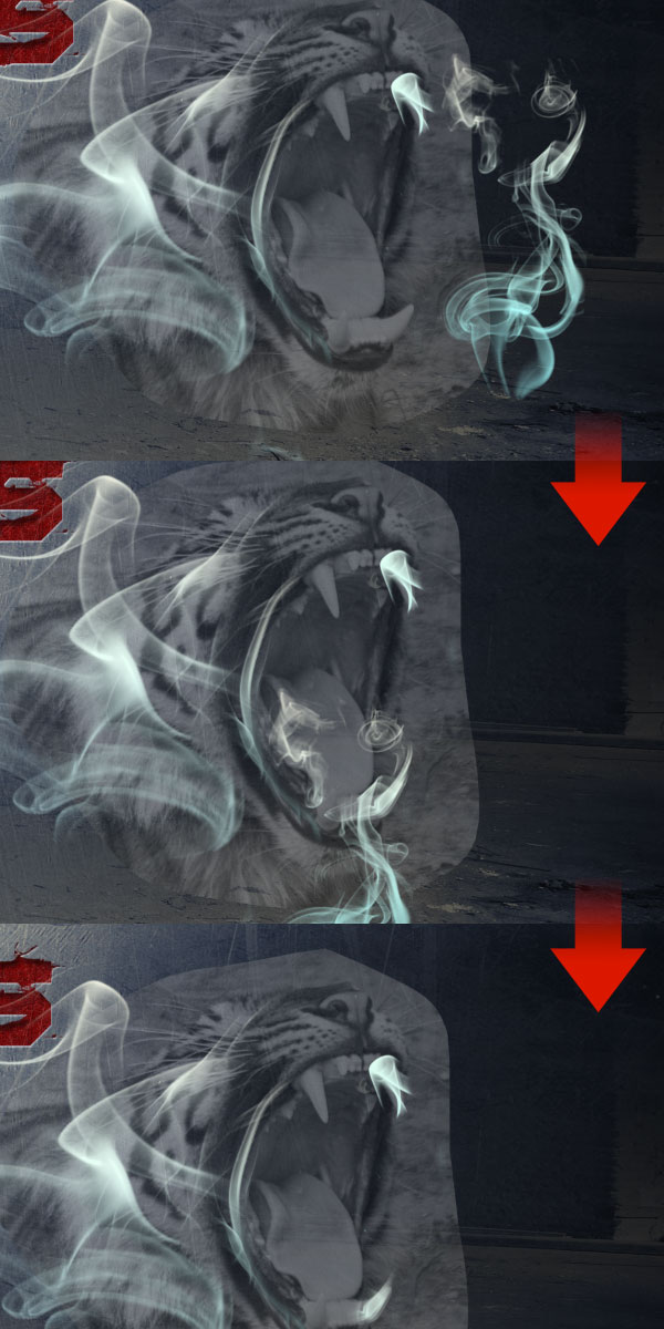
He result may be cool, but the process of creating the tiger face is not so exciting. Create a new layer and click once using a smoke brush.
Observe the form of the smoke. Locate areas that may work for various parts of the tiger’s face. In this case, I found what resembles a tiger’s tooth.
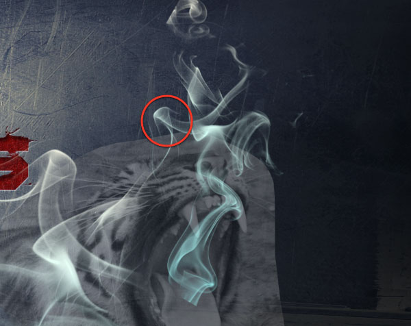
Move it in the opposite position.
Finally, use the eraser tool to remove all the extra parts of the smoke.
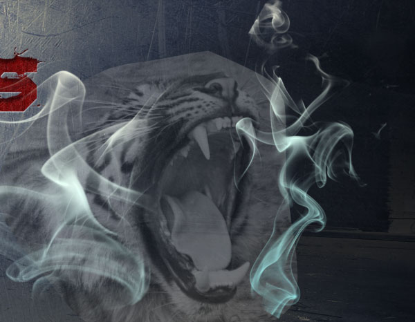
Step 25
The process is always the same. Focus on small details of the smoke, move them over the tiger to see it come to life. When required, duplicate the light layer to make the effect stronger.
Step 26
Sometimes, hide the visibility of the tiger’s layer. In this way you can personalize the effect by moving smoke brushes as you prefer. You don’t have to exactly reproduce the lines of the photo.
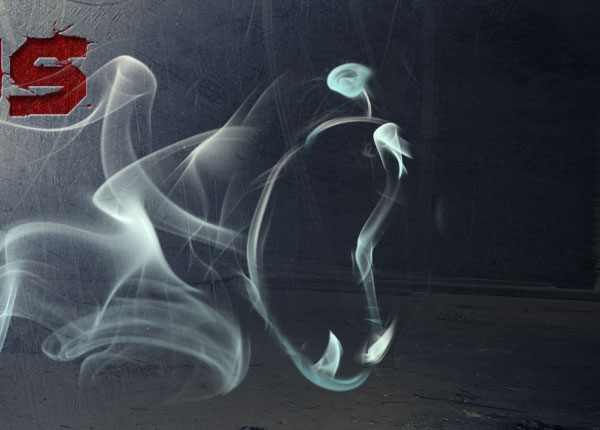
Step 27
As you may have noticed, this technique is very simple to use. You can try to apply different brushes and add more details. Also you can play with colors to achieve a different result. All you need is patience, because the process is easy but slow. After 1 hour of work, this is what I’ve obtained.
Step 28
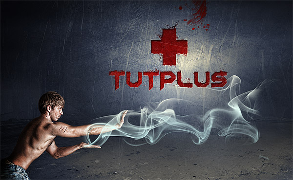
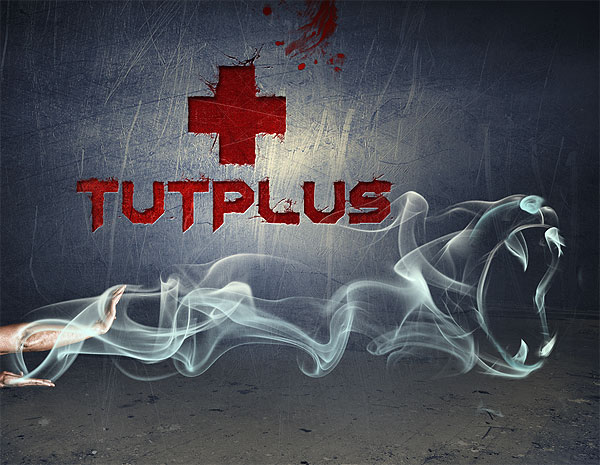
The composition is almost complete, but there is still something we can do. Create a new group and switch the blending mode to color dodge. As you can imagine, we will use this group to add the final light spots to our work. Create a layer inside the group, grab a soft and large white brush and paint over the light effects. Reduce the opacity of the layer or the effect is too strong.
Here is the final light effect.
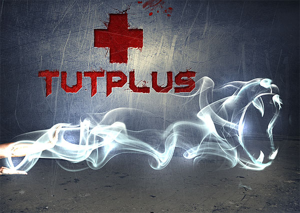
Final Image
Here is the final result. Hope you have enjoyed the tutorial and learned some new Photoshop tricks.


0 comments:
Post a Comment