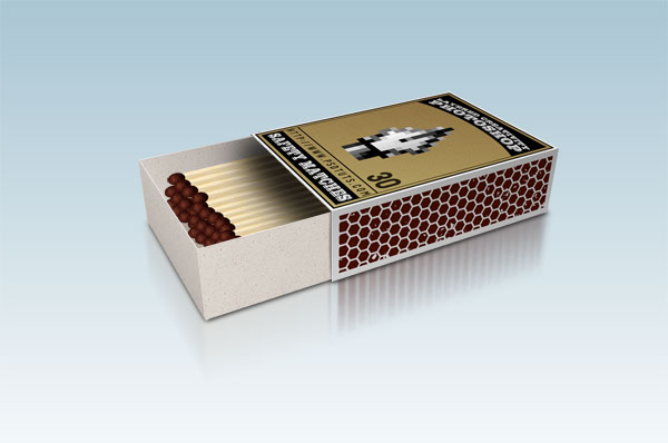
This tutorial consists of creating a digital illustration in Photoshop of a box of matches. We’ll be creating the matchbox cover design, the striker on the matchbox from a pattern, and placing the cardboard texture on the box. We’ll also create the matches and align everything into a 3D perspective.
Final Image Preview
Before we get started, let’s take a look at the image we’ll be creating. Click the screenshot below to view the full-size image. As always, the layered Photoshop file is available via our Psdtuts+ Plus membership.
Step 1
Create a New Document with a width of 525 inches by 750 inches. Set the Resolution at 300 pixels per inch. Then create a new layer, name it "Texture" and fill it with white. Apply a Pattern Overlay Layer Style with these settings: Blend Mode of Normal, Opacity at 60%, and the Pattern set to Charcoal Flecks (it is in the Grayscale Paper set).
Step 2
Create a new layer, name it "Border," and fill it with black. Then apply a Stroke Layer Style with these settings: Size of 10, Position set to Inside, and a Color of white. Now we need to rasterize the layer style. In order to do this, create a new layer. Select the new layer and the "Border" layer, then merge them with Command + E. Then set the layer Blending Mode to Multiply.
Get the Magic Wand Tool and click on the black area . Now create a new layer, and fill the selection with "baa36d" color. Name this layer "Color." Hide it for now, as we’re going to need this one later. Now go back to the "Border" layer. Contract the selection. Go to Select > Modify > Contract. Contract by 5 pixels and hit Delete. Contract again by 10 pixels and fill the selection with black. Contract the selection once more by 2 pixels and hit Delete. Now the border is ready. Turn the "Color" layer visible and set the Blending Mode to Linear Burn.
Step 3
Create a new layer. Select a rectangular area and fill it with black. Drag and snap a vertical guideline to the center. Pick up the Elliptical Marque Tool. Starting from that guideline, while holding down the Alt key, make a selection and hit Delete. Then create two black rectangles on the same layer.
Step 4
Get the Type Tool. Choose your favorite font and put some text on your design. You can go to Edit > Transform > Warp to bend the text.
Step 5
Now we’re going to take a screenshot of the Photoshop toolbox and use the Pen Tool icon in our design. You can follow the instructions below and do it yourself, or skip this step and download a copy ofPentool.png.
Take a screenshot using whatever tool or shortcut you prefer (Hit PrintScrn on the keyboard in Windows). This will copy the screenshot image to the clipboard. Create a new Photoshop document and go to Edit > Paste. Zoom 1600% to toolbox area in order to take a close look at our pen tool.
Hit Alt + PrntScrn to capture the active window only. Create a new document and paste. Go to Image > Adjustments > Levels and tweak to increase the contrast. You can use the Magic Wand or Rectangular Marque Tool to clean up around the pen. Then drag and place it in your matchbox design. Now if you are happy with your design, flatten the image by going to Layer > Flatten Image. Save it as "Design.jpg."
Step 6
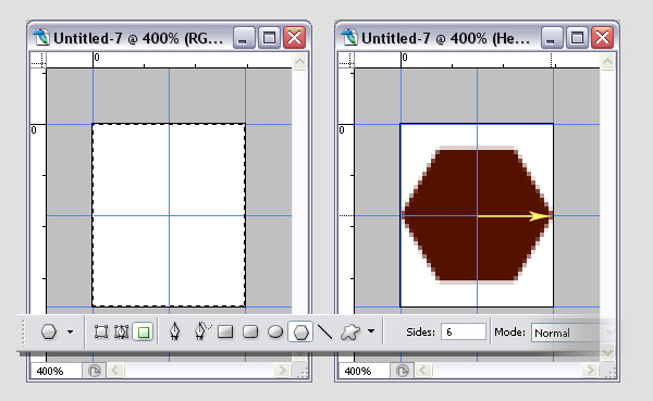
Create a new document with a width of 35 pixels and a height of 42 pixels. Se the resolution to 300 pixels/inch. Hit Command + A to select the whole canvas, then drag and snap guides to all edges and the center of the selection. Then hit Command + D to deselect.
Pick #551100 as your foreground color. Then grab the Polygon Tool, and use these settings: set it to Fill Pixels and set the sides to 6. Create a new layer and name it "Hexagon." Then click and drag starting from the center of the layer to the right edge.
Step 7
Go to Image > Canvas Size. Make sure Relative is checked. Enter 200 percent for Width and Height. Duplicate the "Hexagon" layer. Move it up and snap the bottom of the hexagon to the upper guide. Duplicate the layer again, this time move it down and snap the top of the hexagon to the lower guide. Merge the two duplicated layers by selecting them both and going to Layer > Merge Layers. Name the merged layer "Hex2."
Step 8
Duplicate the "Hex2" layer and rotate it -60 degrees. Duplicate the "Hex2" layer again and this time rotate it 60 degrees. Name this layer "Hex60." Goto View > Clear Guides. Now grab the Polygonal Lassoo Tool and make a selection that covers the lower left hexagon.
Right-click inside the selection and choose Layer Via Cut. The selected hexagon is now placed into a new layer. Drag vertical and horizontal guides to the center of that hexagon. Go back to the "Hex60" layer and drag two guides to the center of the upper right one. Flatten the image and make a selection with the Rectangular Marque Tool. Go to Edit > Define Pattern, name the pattern "Hexagon," and click OK.
Step 9
Create a new document 750 pixels wide by 210 pixels high with a resolution of 300 pixels/inch. Create a new layer named "Striker" and fill it with any color. Apply the Layer Styles shown below.
Step 10
Now let’s add some texture. I used this free texture from the Urban Dirty website. Download this file, open it in Photoshop, and drag the texture into your document in front of the "Striker" layer.
Go to Image > Adjustments > Threshold, and change the value till you get something similar to that shown below. Invert the image by going to Image > Adjustments > Invert. Then go to Filter > Blur > Gaussian Blur, and enter a radius of about 1.5.
Go to Image > Adjustments > Levels, and try to get something as shown in the below image. Set the layer Blending Mode to Screen. If you’re happy with the striker, flatten the image by going to Layer > Flatten Image. Save it as "Striker.jpg."
Step 11
Let’s create a nice cardboard texture now. Create a new document again with the same settings as we did for the striker, which are a Width of 750 pixels, a Height of 210 pixels, and a Resolution 300 pixels/inch. Create a new layer and fill it with white. Apply a Pattern Overlay Layer Style and choose "Charcoal Flecks" pattern. Flatten the Image.
Hit Command + U to bring up the Hue/Sauration controls. Use these settings: Colorize set to checked, Hue of 30, Saturation of 20, and a Lightness of 0. If you’re happy with the striker, flatten the image by going to Layer > Flatten Image. Save the image as "Cardboard.jpg."
Step 12
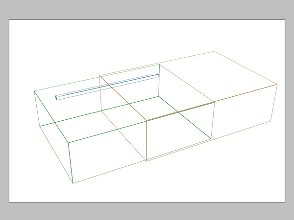
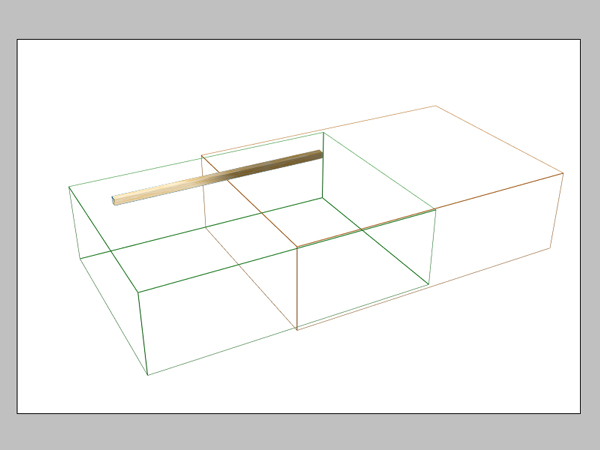
Now we have all the parts we need for the box. Because we’re going to give a perspective look to our box, using a reference image is a good idea. You can use a photo of a matchbox or make a simple model in your favorite 3D application to use as a reference. I modeled three boxes and rendered the wireframe. You can download the reference image here. Go ahead and open the reference image in Photoshop. Duplicate the "Background" layer, name it "3D Reference" and fill the "Background" layer with white.
Step 13
Open the "Design.jpg" file. Select all by going to Select > Select All. Then go to Edit > Copy. At this point, I turn on the magnifier in the operating system. I use Windows XP. The magnifier can be very helpful in the following steps. You can get information about the magnifier from this link.
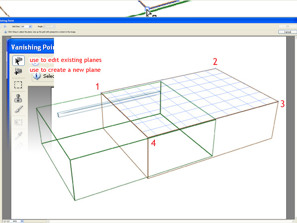
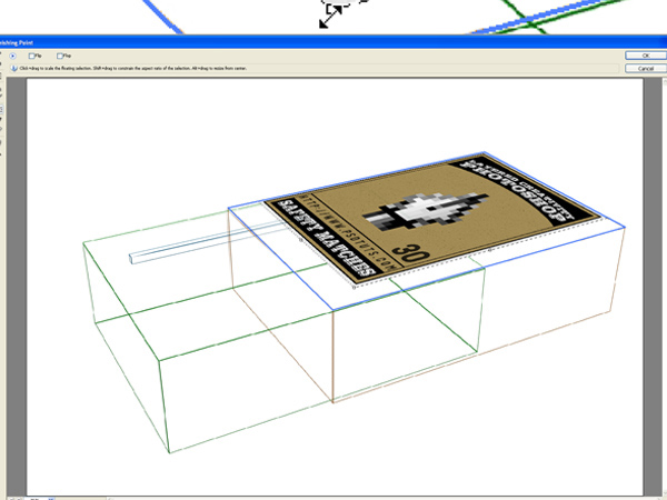
Create a new layer and name it "Design." Now go to Filter > Vanishing Point. Click on 4 points to create a perspective plane. Then hit Command + V to paste the image. Hit Command + T to transform the image, scale it down a little bit, rotate it CCW 90°, and drag it inside the plane.
Step 14
Place it, scale it to fit the perspective plane, and click OK. Set the Opacity of the Layer to 50% so that you can see the reference image because we will repeat this step a few times more.
Step 15
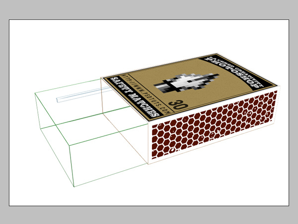
Now repeat the previous step for the striker. Create a new layer and name it "Striker." Open the "Striker.jpg" file. Select all and Hit Command + C to copy. Go to Filter > Vanishing Point, and create another plane to match the side of the box. Paste the image and adjust the size and position.
Step 16
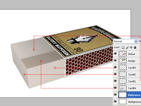
Repeat the process with the "Cardboard.jpg" for all four sides of the inner box. Note that the layer order is important.
All the cardboard pieces look flat for now. We’ll add some depth to them by applying a Gradient Overlay to these layers. Use the following settings for all Card layers: a Gradient that goes from Black to White, a Style set to Linear.
Following are some other parameters to change for each layer:
- For the "Striker" layer, set the Blend Mode to Multiply, Opacity to 30, and Angle to -95.
- For the "Design" layer, set the Blend Mode to Multiply, Opacity to 30, and Angle to -95.
- For the "Card03" layer, set the Blend Mode to Multiply, Opacity to 10, and Angle to 180.
- For the "Card02" layer, set the Blend Mode to Multiply, Opacity to 25, and Angle to 180.
- For the "Card01" layer, set the Blend Mode to Multiply, Opacity to 40, and Angle to -145.
- For the "Card04" layer, set the Blend Mode to Multiply, Opacity to 40, and Angle to -125.
- Select the "Card04" layer, go to Image > Adjustments > Hue/Saturation, set Lightness to -15
Step 17
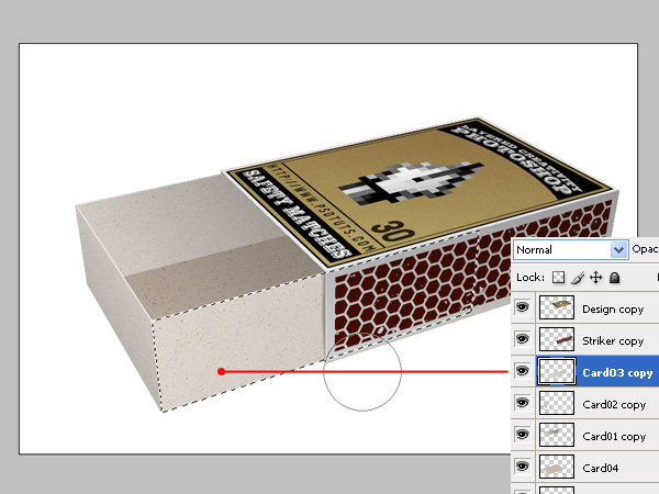
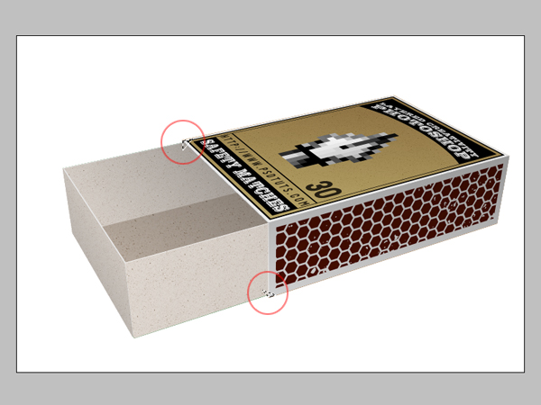
The pieces of the matchbox has no thickness, so let’s fix that. Select the "Card03" layer, Duplicate the layer, and move the original (not the copy) 1 pixel up. Hit Command + U and bring the lightness up to make it lighter until you have the thickness effect, as shown below.
Repeat this for all the parts except the bottom part of the box which is "Card04" Layer. Now select each layer and it’s duplicate, then merge them. Command-click the "Card03 copy" layer to load the selection. Then using the Brush Tool set to a soft brush, paint the edge to black. Then adjust the Opacity.
Step 18
Finally, make a selection with the help of the "3D Reference" layer. Create a new layer above the "3D Reference" layer and fill the selection with dark gray. The box is now finished. Save the file as "Matchbox.psd."
Step 19
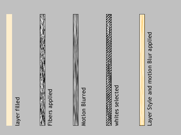
Create a new document 32 pixels wide by 750 pixels high with a resolution of 300 pixels/inch. Fill the Background Layer with the color ffeecc. Hit D on the keyboard to change to default colors. Create a new layer and fill it with black.
Go to Filters > Render > Fibers, and set the Variance to 55, Strength to 40, and apply it. Then go to Filter > Blur > Motion Blur, then set the Angle to 90 and Distance to 40. Go to Select > Color Range. The cursor will turn to an Eye Dropper. Click white on the Swatches Panel to select white areas in the image. Bring Fuzziness up to 200.
Create a new layer and fill the selection with the color "ffeecc" again. Apply Bevel and Emboss with these settings: Style of Inner Bevel, Direction set to Down, Size of 1, Depth of 510, and the Shadow Mode set to Color Burn.
Delete the fibers layer and flatten the image. Hit Command + A to select all and Command + C to copy. If you don’t want all your matches to be the same, you can repeat this step as many times as yo wish. Clicking on the Randomize button when applying the Fibers filter will produce different textures.
Step 20
Now go back to "Matchbox.psd." Drag the "3D Reference" layer to the top of the layer stack. Hit Command + V to paste the stick above the "3D Reference" Layer. Turn off snapping by opening the View menu and unchecking Snap. Turning off Snap will make things easier in the next step. Go to Edit > Transform > Distort. Fit the perspective of the stick to the perspective in the reference image by dragging the corners.
First make the top side of the stick. Hit Command + V again. This time create the facing side of the stick. This side should be a little bit darker so hit Command + U and lower the Lightness value. Apply a Gradient Overlay to both stick layers with these settings: Blend Mode set to Linear Burn, Opacity set to 40, and an Angle set to -140.
Step 21
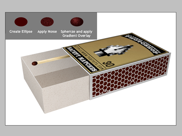
Select both stick layers and merge them. Name the layer "Matchstick." Make the "3D Reference" layer invisible. Drag the "Matchstick" layer down below the "Card02" layer. Create a new layer and name it "Tip." Get the Elliptical Lassoo Tool and make a selection for the tip of the match. Fill the selection with the color #410000. Go to Filter > Noise > Add Noise. Apply with these settings: Amount of 22%, Uniform, and Monochromatic checked.
Go to Filter > Distort > Spherize. Use these settings: Amount of 100% and Mode set to Normal. Now apply a Gradient Overlay Layer Style: Blend Mode set to Soft Light, Opacity of 75, Gradient of Black to White, Reverse checked, Style of Radial, and Scale at 150%.
Now place the ellipse on the tip of the matchstick and go to Edit > Transform > Skew. Make it parallel to the stick and adjust the scale and position. Finally, select the "Matchstick" and "Tip" layers and merge them.
Step 22
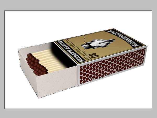
Populate the matchstick by holding the Alt key and dragging. Go to Edit > Transform > Distort. Distort the layer to match the perspective of the sticks to the perspective of the box. Now we’ll make the shadow of the box on the matches. Now Command-click the "Card04" layer to load the selection. Command + Shift-click "Card01 copy" layer to add the selection. Then Command + Alt-click "Card02 copy" layer to subtract. Then Command + Alt-click "Card03 copy" layer to subtract. You should have a selection like this one.
Step 23
Create a new layer above the matchsticks. Paint it with black, as you can see in the image below. Then give it some Gaussian Blur.
Step 24
It’s now time to make the reflection and the shadow of our box. Now make the "Background" layer invisible. Make sure the "3D Reference" layer is also turned off. With one of the visible layers selected, go to Layer > Merge Visible. Name the merged layer "Reflection." Hit Command + T and scale about 70%. Duplicate the "Reflection" layer and name it "Matchbox." Turn the "Background" layer on.
Select the "Reflection" layer and apply a Motion Blur with an Angle of 90 and Distance of 270 pixels. Hit Command + T to scale the "Reflection" layer horizontally to line up the edges of the reflection with the edges of the box. Select and clear the upper part of the reflection, then Deselect by hitting Command + D. Go to Filter > Blur > Gaussian Blur and set the Radius to 5.
Step 25
Make a selection, as in the image below. Command + Alt + Shift-click the "Matchbox" layer to get the intersection selected. Create a new layer above the "Reflection" layer and fill it with black. Deselect by hitting Command + D and apply a Gaussian Blur with a Radius of 8.
Conclusion
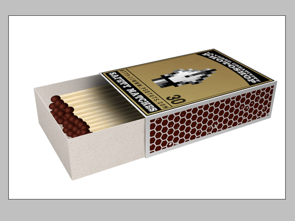
Yes, we’re done! You can change the background color if you want. I filled it with a gradient. Hope you liked the tutorial. The result is below and you can view the larger final version here.






0 comments:
Post a Comment