Dark and Eerie Photo Manipulation Scene Photoshop CS2

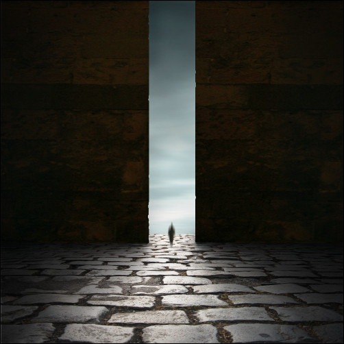
this Photo-manipulation tutorial, we will learn how to create a dark photo manipulation scene with an eerie yet magical atmosphere. We will tackle basic techniques to create an ancient-looking room, using various stock photographs and applying adjustment layers and creating shadows using the Brush tool to blend the images seamlessly. We will also learn how to create a ghostlike creature from only one stock image using the Motion Blur tool and finally, how to create a vignette using a new layer, which you could also use in your future projects.

Preview of Final Results
How to Create A Dark and Eerie, Ancient looking Photo  manipulation scene small

Dark and Eerie Photo Manipulation Scene Photoshop Tutorial

Tutorial Details

  • Program: Adobe Photoshop CS2
  • Version: 9
  • Difficulty: Easy
  • Estimated Completion Time: 1 to 1.5 hours

Resources

  • Walking on ice 1 by Arctic-Stock (Creative Commons License)
  • Stone floor – stock xvii by jesuisautre (Creative Commons License)
  • Gate 1 by Michael Vincent Manalo (Creative Commons License)
  • Stormy sky by Michael Vincent Manalo (Creative Commons License)

Step 1 - Create a new image

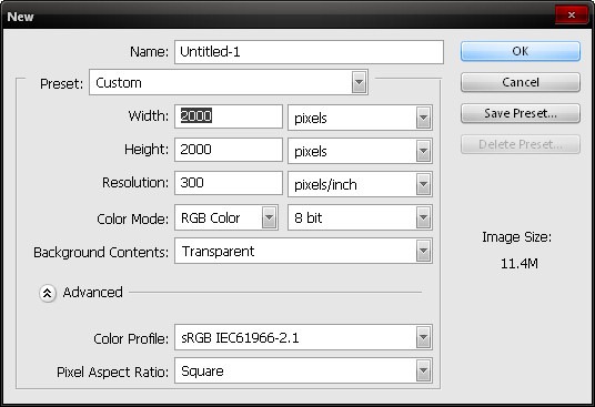
To start, we will be creating a new image file, go to the Menu bar and click on File > New and input the following settings when the New box appears:
  • Width: 2000 pixels
  • Height: 2000 pixels
  • Resolution: 300 dpi
  • Color Mode: RGB Color; 8bit
  • Background Contents: Transparent
step1_create_new

Step 2 - Create the walls and the floor and their shadows

In this step, we would be creating the floor and the walls of our background. To begin, let’s open Stone floor – stock xvii. We would need to activate the Marquee tool (M) to select the region we would need and that is the stone floor.
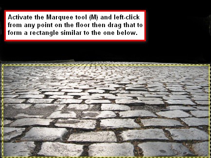
step2_select_using_the_marquee
Once you’re done, activate the Move tool (V) which would add a small arrow-cross to your pointer and then drag the selected area to our 2000x2000 canvas. Rename the layer to “stone floor”. To rename a layer, just double click on “layer 1” (for this image) and a text box would appear and you may now rename the layer.
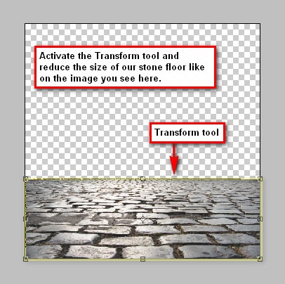
You’d notice that the selected area is larger than the canvas, so we would need to reduce its size, to do that, activate the Transform tool (Ctrl/Cmd + T) and then drag the small boxes inward to reduce the image. See image below:
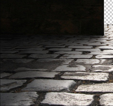
step2b_transform_the_stone_floor
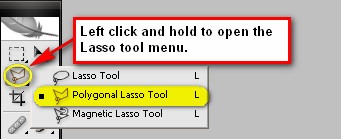
Now let’s add the walls; open the Gate 1 stock image. We won’t exactly be using the gate of this image, instead we are going to use its walls and move it to our canvas. To do that, activate the Polygonal Lasso tool (L).
step2c_polgonal_lasso_tool
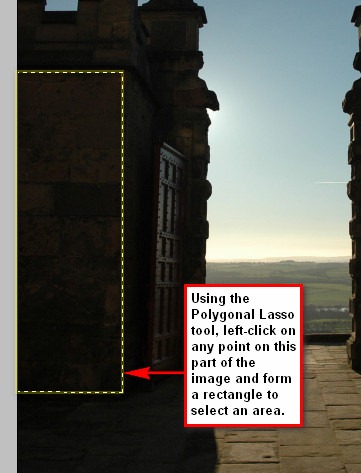
To use the Polygonal Lasso Tool (L) on the gate stock image, follow the instructions found on the image below:
step2d_plt_selection
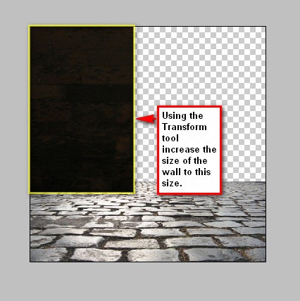
After you’ve done that, move the selected area using the Move tool (V) to our canvas and rename it to “Wall 1”. You’d notice that the selected area that you have moved is rather small compared to the stone floor image, so we would have to transform it. Activate the Transform tool (Ctrl/Cmd + T) and resize the image.
step2e_transform_the_selection
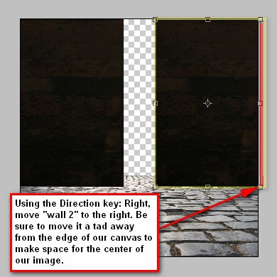
Now that that’s done, let’s create the second wall. Click on the “Wall 1” layer and then press Ctrl/Cmd + Shift + J to duplicate the image. Once it has been duplicated, activate the Transform tool (Ctrl/Cmd + T) and then right-click on the image to bring up the transform tool’s contextual menu. When the menu opens, click on Flip Horizontal. After flipping “wall 1”, activate the Move tool (V) and press the direction key: Right to move it to the right to make it appear as the other wall. Rename this new layer to “wall 2”.
step2f_wall2
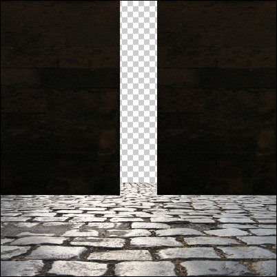
At present, the image should be similar to the image below:
step2g_final
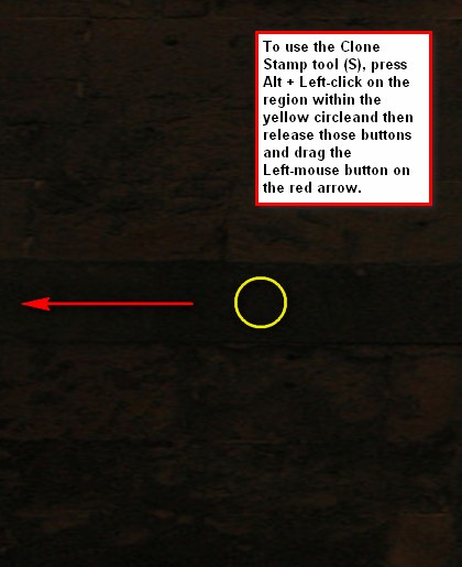
To make the walls unique and not identical to each other, we would have to clone some parts of the image to make it look like a different wall. Click on “wall 1” and activate the Clone Stamp tool (S) and input the following values:
  • Brush size: 175 px
  • Hardness: 0%
  • Opacity: 15%
  • Flow: 100%
step2g2_clone_stamp_tool
Note: To change the Hardness setting, click on the drop-down menu beside the Brush size and a menu would appear and you would see the Brush Hardness tab. You may also press B and then right click on the image to bring up the Brush menu.
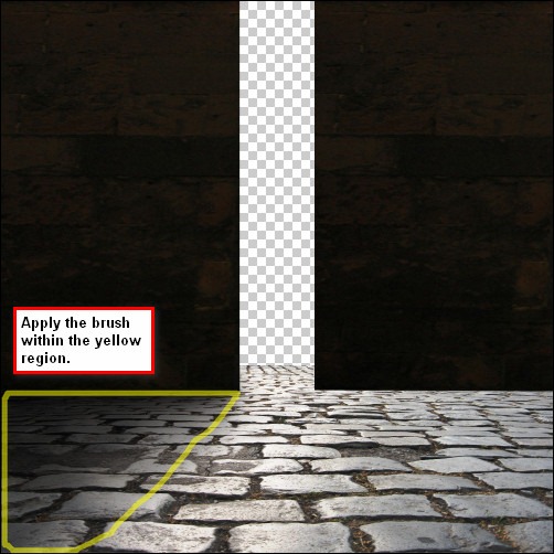
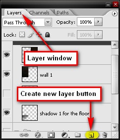
Because the light is coming from the outside, we would need to add shadows, without these shadows of the walls, it is impossible to form any depth on our image and the result would be a flat picture. So we would have to add shadows on the floor to make it appear realistic. Create a new layer by pressing Ctrl/Cmd + Shift + N or you may click on the paper like button in between the folder button (New Group) and the Trash can button (Delete layer) on the Layer window. Once the new layer has been created, rename that layer to “shadow 1”. Note that the succeeding layers on this step should be below the layers “wall 1” and “wall 2”.
step2g3_create_new_layer
Now, activate the Brush tool (B) and input the following values:
  • Brush size: 125 px
  • Hardness: 0%
  • Opacity: 15%
  • Flow: 100%
step2h_brush_within_the_yellow_region
It should be similar to this image:
step2i_shadow1_outcome
For the shadow of “wall 2”, just duplicate “shadow 1”, then activate the Transform tool (Ctrl/Cmd + T) and then right click on the image and pick Flip Horizontal from the contextual menu and then position it under “wall 2” using the Move tool (V). Rename this new layer now to “shadow 2”.
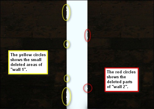
Now let’s add some cracks on the gate to give it an ancient feel. First, click on the “wall 1” layer and activate the Eraser tool (E) and input the following values:
  • Brush size: 20 px
  • Hardness: 100%
  • Opacity: 100%
  • Flow: 100%
step2j_delete_area
Now let’s add some shadows on the walls to add more depth. Create a new layer and position it above all the created layers and rename it as “wall shadow” and then activate the Brush tool (B) and input the following values:
  • Brush size: 150 px
  • Hardness: 0%
  • Opacity: 15%
  • Flow: 100%
Now that we’re done with this step, we would need to organize the layers under a group to avoid confusion in the next steps. Before creating a new group, select the layers “wall 2”, “wall 1”, “shadow 2” and “shadow 1” and then, create a new group by pressing Ctrl + G, now all those layers that you have selected would be automatically included in that new group. Rename the new group to “walls and floor and their shadow”.
Note: Upon doing that, the new group will hide the layers inside of it. To unhide it, just press the “play” button on the left side of the new group, and it will then roll the layers down.
Step 3 - Create the sky
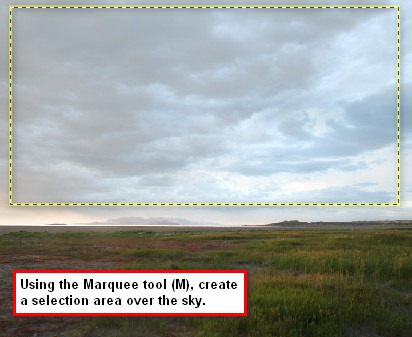
Now, what we’re going to do on this step is that we would be adding the epic sky which is outside of the big doorway. Let’s open the “Stormy Sky” stock and then activate the Marquee tool (M) to select the sky in the image.
step3a_marquee_sky
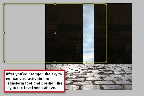
After that, drag the sky to our canvas using the Move tool (V) and once it is in our canvas, rename the layer to “sky” and then activate the Transform tool (Ctrl/Cmd + T) to reposition the sky. Make sure to place the layer under the “walls and floor” group so the sky would appear only on the opening of the doorway or gate.
step3b_transform_the_sky
Now let’s change the color of the sky. From the Menu bar, go to Image > Adjustments > Hue/Saturation. Once the Hue/Saturation box opens, input the following values respectively:
  • Edit: Master
  • Hue: -25
  • Saturation: -50
  • Lightness: -3
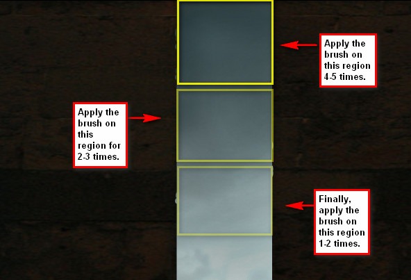
Now we will add a dark area on the sky to give it depth. Create a new layer and rename that layer to “dark area: sky”. After that position, that layer above our “sky” layer and then activate the Brush tool (B). Input the following settings:
  • Brush size: 300 px
  • Hardness: 0%
  • Opacity: 15%
  • Flow: 100%
step3c_dark_area
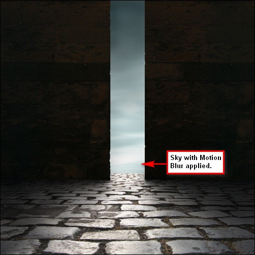
Finally let’s give the sky a calming yet eerie feel through blurring the sky. Select the “sky” layer and from the Menu bar go to Filter > Blur > Motion Blur and input the following settings:
  • Angle: 180’
  • Distance: 100 pixels
step3d_sky_with_motion_blur
Now that we’re finished with this step, let’s group the layers that we have made. Rename that group to “sky and its dark area”.

Step 4 - Add the shadowy-figure

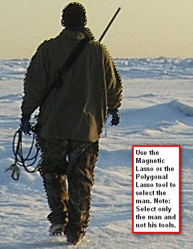
In this step we would be adding our subject, the dark figure. Open “Walking on ice 1” stock; we would need to remove the man from his background and move him to our canvas. So, activate the Polygonal Lasso tool (L) or the Magnetic Lasso tool (L).
Note: The Magnetic Lasso Tool can also be activated by left-clicking and holding the Lasso tool for a few seconds to bring up the Lasso tool menu on the Tools window.
step4a_lasso_the_man
When you’ve successfully selected the man, drag him to our canvas using the Move tool (V) and rename that layer to “man”. Make sure to put the man outside on top of all layers and groups.
We would need to reduce his size, so activate the Transform tool and scale him down by bringing up the contextual menu and picking on “Scale”.
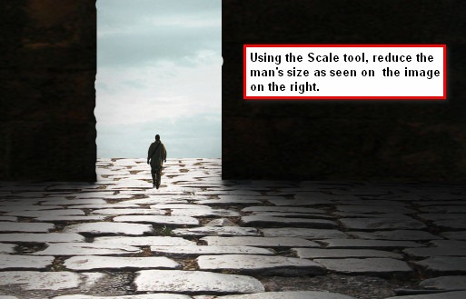
step4b_reduce_the_man
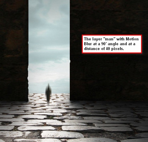
Now we will turn him into a shadowy-figure. Click on “man” and from the Menu bar go to Filter > Blur > Motion >blur and input the following settings:
  • Angle: 90'
  • Distance: 40 px
step4c_motion_blur_man
Step 5 - Add a Vignette
What we are going to do here is we would be adding a vignette to give emphasis on the center of our image to where our subject is positioned.
To start off, go to the Menu bar and click on File > New and use the same settings we used to create our canvas. (Refer to Step 1).
But take note, the background contents should be: WHITE
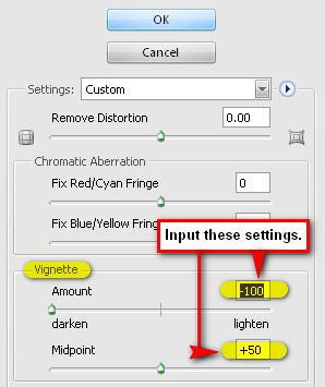
Once it has been created, go to Filter > Distort > Lens Correction. Find the tab Vignette and use these settings:
  • Vignette amount: -100
  • Midpoint: +50
step5a_vignette_settings
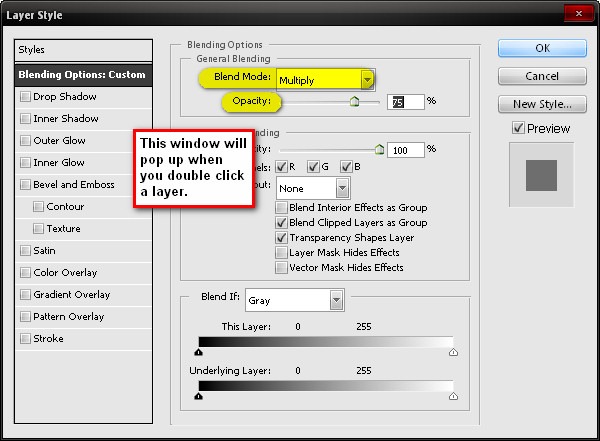
Now that that’s done drag the vignette to our canvas using the Move tool (V) and put it on top of all the layers that we’ve created, and then set its Blending mode to Multiply and its Opacity to 75%.
Note: The Blending mode can be found in the Layer window, the Opacity tab is just beside it. You may also access the Blending mode by double clicking on the layer that you want the Blending mode changed.
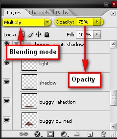
step5b_blending_mode_opacity
step5c_blending_mode_2xclick
The image with the vignette should be similar to the image below:
step5d_vignette_applied
You may also want to use this Vignette layer in future projects. How? You just have to create a new file, drag the Vignette using the Move tool to that canvas and save it as a PSD file. (Saving as a PSD file is explained on Step 7 of this tutorial).

Step 6 - Retouch the image

In this step, we would be changing the overall color tone of our image, correcting the Brightness/Contrast, adjusting the colors of the wall to make it blend in seamlessly with the rest of the image.
To start, let’s retouch the walls, but first we would have to merge them. Click on both layers “wall 1” and “wall 2” and right click on any of them and click Merge Layers from the contextual menu.
With the two layers merged, we can now change their color. From the Menu bar, click on Image > Adjustments > Color Balance and input the following settings, respectively:
Midtones:
  • Color Levels: 19, 0, -28
  • Preserve Luminosity: Checked
  • Shadows:
  • Color Levels: 0, 0, -3
  • Preserve Luminosity: Checked
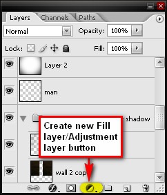
Next, let’s create an adjustment layer on top of all our layers. To do that, click on the Create New Fill layer/ Adjustment layer button which is found on the Layer window, situated to the left of the Create New Group button.
step6a_create_new_adjustment
Now let’s create a Solid Color adjustment layer from the Create New Fill layer/ Adjustment layer menu. When the Solid color (Color Picker) box opens, input the following value on the “#” box:
  • #: 010014
Change its Blending mode to Exclusion and its Opacity to 40%.
After that, create a new Solid Color adjustment layer and this time input this value on the “#” box:
  • #: 61461f
Set this layer’s Blending mode to Overlay and its Opacity to 20%.
Next, create a Photo Filter adjustment layer, still from the Create New Fill layer/ Adjustment layer contextual menu. When the Photo Filter box opens, use the following values:
  • Filter: Cooling Filter (82)
  • Density: 25%
  • Preserve Luminosity: Checked
After you press OK, change the Blending mode to Darken and the Opacity to 50%.
Next, let’s create a Brightness/Contrast adjustment layer. Input the following values when the box opens:
  • Brightness: 5
  • Contrast: 5
Next, let’s create a Color Balance adjustment layer, when the box opens, let’s input the following values:
  • Midtones:
  • -5, 0, -7
  • Preserve Luminosity: Checked
Now, we will need to adjust the color of the sky, because it is too green for our image, it doesn’t seem to fit well. To change its color, we will have to create a Selective Color adjustment layer. From the Create New Fill layer/ Adjustment layer button pick Selective Color and input the following values:
  • Colors: Cyans
  • Cyan: -40
  • Magenta: 0
  • Yellow: -10
  • Black: +50
  • Method: Absolute
Next, let’s add another Photo Filter adjustment layer. When the box opens, use the following:
  • Filter: Orange
  • Density: 25%
  • Preserve Luminosity: Checked
Finally, let’s add a Curves adjustment layer. Now, when the Curves adjustment layer box opens, input the following:
  • Channel: RGB
  • Input: 125
  • Output: 134

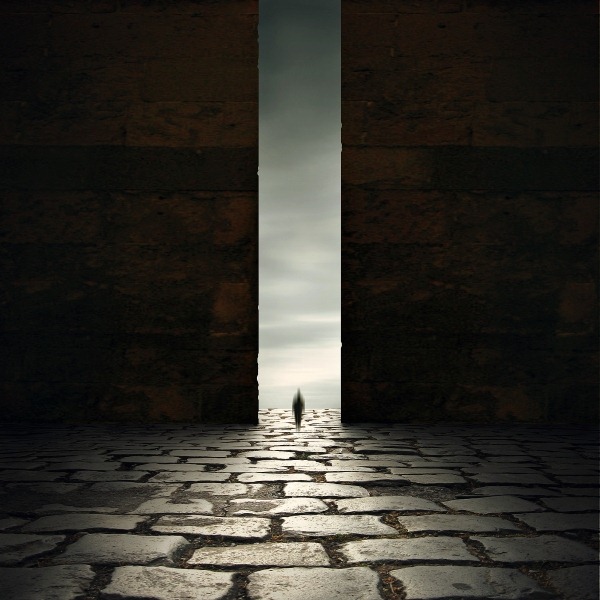
Final Results

How to Create A Dark and Eerie,  Ancient looking Photo manipulation scene small

0 comments:

Post a Comment