In this tutorial, we’re going to create a metallic effect using layer styles and gradients that you can apply to different objects. We’ll put it on a nice background and create a style for lettering that makes it look like it’s embedded into the metal. You can download the sample PSD file from the link at the bottom of the tutorial if you’d like to simply copy+paste the layer styles.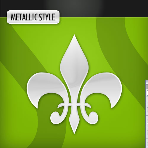
Step 1:
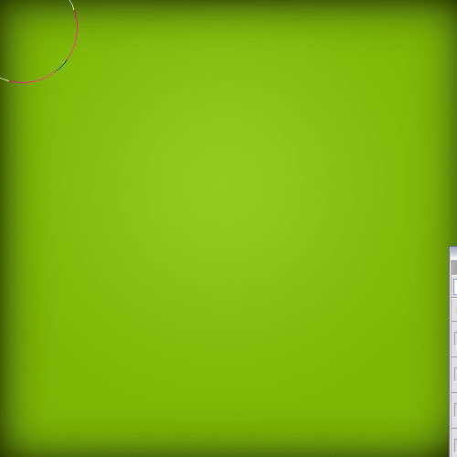
BACKGROUND LAYERWe start as always with a background gradient. I’ve used a Radial Gradient with two shades of a lovely light green. The exact color codes are:
Foreground color – #93cc1a
Background color – #7eb704

Step 2:
To give our background a bit more oomph we will next fade it off at the edges. So using a big soft brush and a foreground color of black, create a new layer and just go around the edges as shown.Then switch the layer to opacity 30%.
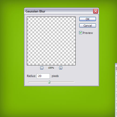
Step 3:
Now duplicate that last layer of black edge and go to Filters > Blur > Gaussian Blur and use a setting of 20px to blur out the layer and give it a softer effect.You may be wondering why we didn’t just use a different radial gradient in the first place, and indeed you probably could do that. I like to use this method on the edges as it’s more precise.
Step 4:
Now to get a bit of background effect, I grabbed a font called "TW Cen MT (T1)," which I think might be a default font, and just made two "S" letters. I used the color #cecfd0 and then made them gigantic and set the layers to Multiply. This created some nice curvy shapes in the background.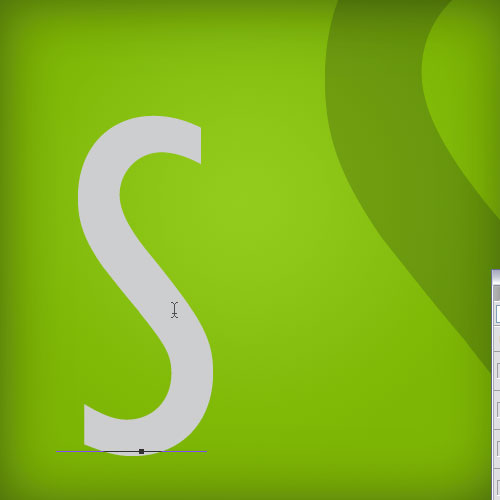
Step 5:
Now I need a shape to use my metallic effects on so using the Custom Shape Tool (U) I select this Fleur De Lis shape to use because it’s a reasonably complex and nice shape. Again, I used the color – #cecfd0 – because it’s a nice light grey to base our metallic effect on.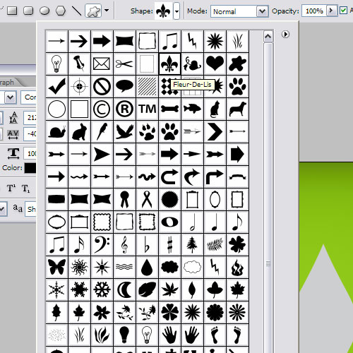
Step 6:
To start the metallic effect, right click on the layer and choose Blending Options.First add a Drop Shadow to lift the shape off the background. The key to drop shadows is to NOT make them too full on. A good drop shadow should be subtle. I often don’t use black, but rather a variation of the background color–so in this case a dark green.
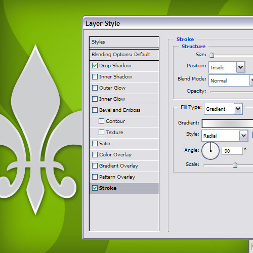
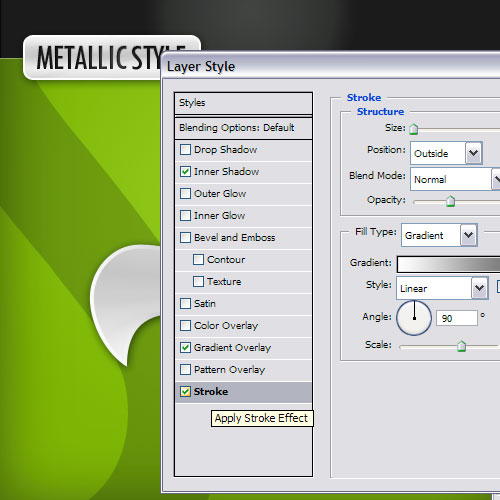
Next we add a Stroke. I’ve used an Inside stroke of 4px. But the key here is to switch Fill Type to Gradient and then use a nice gradient of grey and white.
The reason we do this is that if you look at metal in real life, you’ll see that it tends to go from light grey to darker grey to light grey and there are a lot of different shades. It isn’t one single flat color. Actually nothing in real life is a single flat color, but that’s another story.
So to get some realism, we need these gradients. But also you don’t want a full on gradient. Subtlety is the name of the game when it comes to gradients. Make soft changes. So here I’ve gone from white to that same light grey we used for the shape itself and back to white and back to grey and back to white.
Step 7:
Next to counter the stroke gradient, we add a Gradient Overlay using the same gradient. This appears on the main body of the shape and you can see how it contrasts really well with the stroke on the edge to make a metallic shine effect.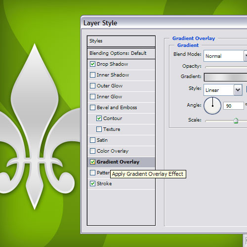
Step 8:
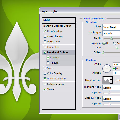
Finally to get a chromy effect, we’ll use the Bevel and Emboss Tool set to an Inner Bevel with a huge size and an odd Gloss Contour. I must admit I made this just by experimenting, so there’s no special reasoning behind it. Just move the sliders around until you get some nice reflections happening in the middle of the shape.And now we have our metallic style! You can copy and paste the style by right clicking on the layer and selecting Copy Layer Style.
Step 9:
To finish off, I added a black band up the top and then drew a rounded rectangle over it with the usual grey, applied my metallic style by pasting the style on to that layer.Then I added some text saying Metallic Style and created a new style for the text. With the new style I used a different bunch of settings as follows:
Inner Shadow – Because I want the letters to look like they are punched into the metal, I added an inner shadow. Make it nice and subtle though, not too full on!
Gradient Overlay – Because gradients make things look more natural, but again subtle color changes only!
Stroke – Again I use a gradient stroke, however this time it is an Outer Stroke and it is a gradient going from dark at the top to light at the bottom. The reason for this is that it makes it look like the letters have an edge where they were punched into the metal. And it looks like there is light coming from the top and landing on that edge so that one side is lit up and the other is in a bit of shadow. This gives it a much more metallic effect.
Step 10:
And there you have it: a nice pair of metallic styles!

8 comments:
Garbage!
Wow this is actually not that bad sir
Oh yeah? Prove it!
Do you like fish sticks?
Well yeah.
You like putting fish sticks in your mouth?
Yes....
.....****!
Post a Comment