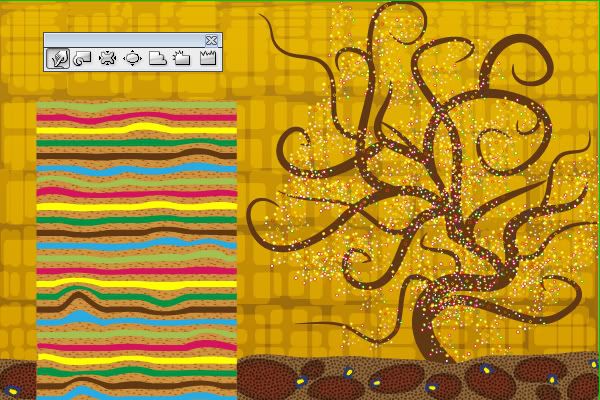
Final Product What You'll Be Creating
In this tutorial we will travel back in time to recreate the painting style of one of the most outstanding symbolism artists – Gustav Klimt. His works are full of warm golden colors, simple ornaments, irregular patterns, natural symbols, and asymmetric shapes. We will work to produce this style with the help of Adobe Illustrator tools.
Introduction
I recently got a beautiful gift – a reproduction of a Gustav Klimt painting. This outstanding work made me understand that we, designers, are used to looking for inspiration in everything around us, rather than behind us.
Back in centuries past there were hundreds of brilliant artists whose paintings became immortal. There were numerous interesting periods in art history that offer plenty of sources of inspiration. So today we start a series of tutorials devoted to various historical periods of art, where we’ll recreate the most challenging styles through modern graphics. We begin the series with artwork inspired by Gustav Klimt paintings.
Gustav Klimt, an austrian artist of the nineteenth century, was a founder of European modern art. His works are full of hidden symbols and ornaments, warm golden colors, asymmetric patterns and natural shapes. The major object of his paintings are female bodies, and his portraits remain favorite artworks for plenty of people until now. You can search his brilliant art (through Google, for example) and visit the Gustav Klimt Wikipedia page to get familiar with artist works.
We will recreate Klimt’s unique style and technique with the help of Adobe illustrator tools, applying brushes, symbols, textures and patterns, blending modes, and few more tricks.
Part 1: Background
Step 1
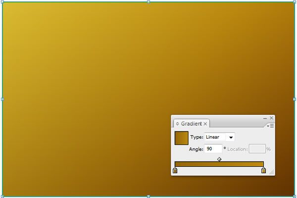
Open Adobe Illustrator and create a new document 1200 px by 800 px in RGB color mode. Draw a background rectangle (M) that covers the entire canvas with the same dimensions (1200 px by 800 px) and fill it with a golden-brown gradient that goes form a darker color at the bottom (#936509) to a lighter one at the top (#BC8B0F). Now lock this rectangle (Command + 2).
Step 2
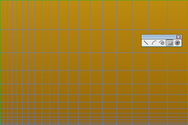
Now we need a chaotic ornament on the background. I found a clever way to do it with the help of the grid. Choose the Rectangular Grid tool and drag a mouse to cover the background. Now, while you’re still holding down the mouse button, change the amount of divisions with the up or down arrows for number of rows, and left or right arrows for number of columns.
Also, we need more irregular order, so let’s skew the columns’ width by pressing C or X keys, and the rows’ height with F or V keys. You can release the mouse button when the grid looks irregular enough. It is also possible to create such grids entering exact values – press Enter and insert size, number of rows and columns, and distortion as you please.
Step 3
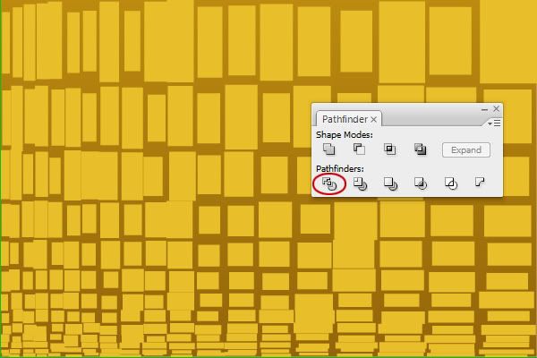
Change the fill color of grid to light yellow (#E8BF2A) and ungroup it (Command + Shift + G), as it is actually a group of rectangles and lines. Now open the Pathfinder panel (Shift + Command + 9) and click the Divide button to divide it into separate shapes.
Ungroup again, and go to Object > Transform > Transform each, check both the Preview and Random boxes, and enter about 70% for horizontal and vertical scale, then drag the Move sliders a bit if you want to achieve a random effect. Apply when you are satisfied and group the shapes again (Command + G) to get the image below.
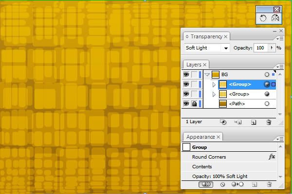
Step 4
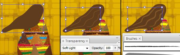
With the group of rectangles selected, go to Effects > Stylize > Round corners and enter a value of about 10 px. Now in the Transparency panel (Command + Shift + F10) change it’s blending mode to Soft Light. Finally, make a copy of it and rotate it 180 degrees with the Rotate Tool (R), and click Enter. Now insert 180 for the angle and press Copy. You’ll have two layers of shapes on top of each other creating a random effect. Lock this layer for now and name it “BG.”
Part 2: Tree
Step 5
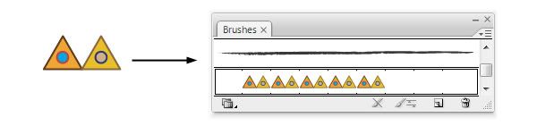
Create a new layer and name it “TREE.” We’ll make a tree now, an element that is present in many Gustav Klimt paintings. The artist loved depicting natural shapes, oftentimes using spiral objects. We’ll draw a simple asymmetric tree with smooth lines to achieve a similar effect. To do it, we’ll create a custom brush.
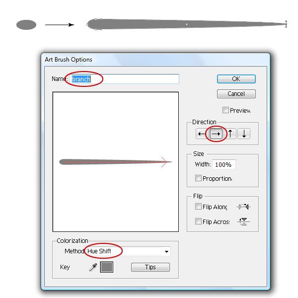
Take the Ellipse Tool (L) and create a small ellipse 40 px by 20 px, with no stroke and a medium gray fill. Now use the Direct Selection Tool (A) to move the rightmost anchor point about 400 px to the right to get a distorted shape.
Now open the Brushes panel (F5) and drag the shape to the brushes’ list. In the dialog choose Art Brush. In the brush options window leave all parameters intact, only change its name, select Hue Shift color method, and the appropriate direction (from left to right).
Step 6
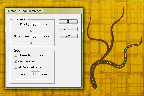
You can delete the shape now. Choose the Brush Tool (B), change the stroke color to dark brown (#603813) and fill color to none. Adjust the brush parameters as shown below by clicking Enter and inserting the appropriate values. In the Brushes panel choose the brush we just created. Now we’ll draw a tree, start with one curved line and change its stroke width to 2 pt. Create a few more thick branches.
Step 7
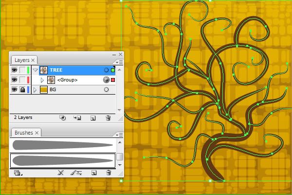
Continue drawing branches with the Brush tool. This time with a 1 pt stroke width. Create as many lines as you want, but try keeping a tree at the right part of your document. You need smooth curvy shapes to imitate a tree, which is what Klimt usually depicted. We won’t be adding leaves, so when the branches are ready just select them all and group them.
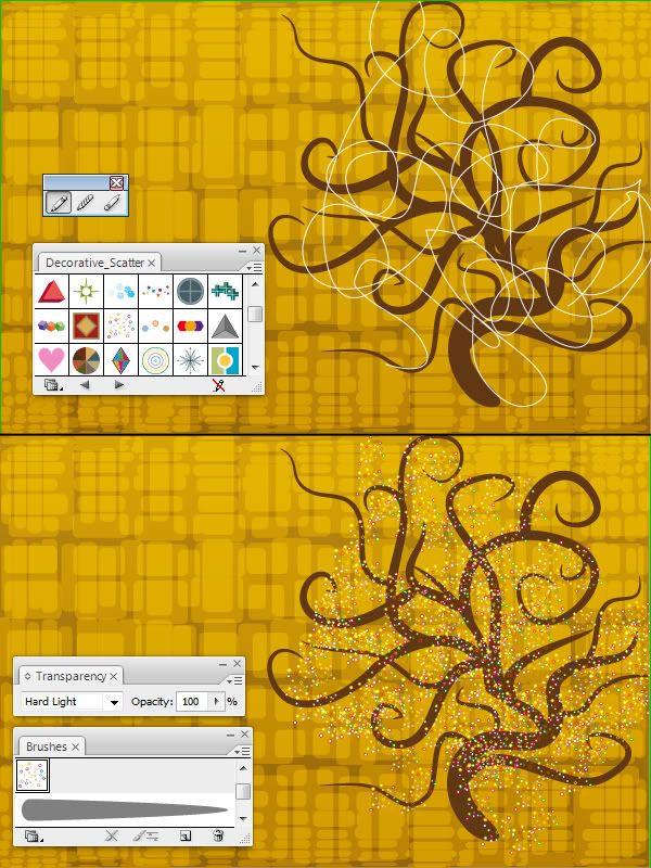
Step 8
We still need to decorate the tree, so grab the Pencil Tool (N) and draw a long wavy line that crosses several times above the tree. Make it no fill and 1 pt stroke of any color.
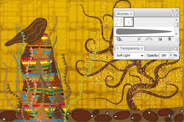
We’ll apply a nice small scattered dots to it now. Open the brush library: Window > Brush libraries > Decorative > Decorative_Scatter, and choose the Dot Rings brush. It will appear in your main Brushes panel – now you can select the line you created and apply this brush to it. Finally, in the Transparency panel change the dots’ blending to Hard light. The tree is ready – you can lock this layer now.
Part 3: Ground
Step 9
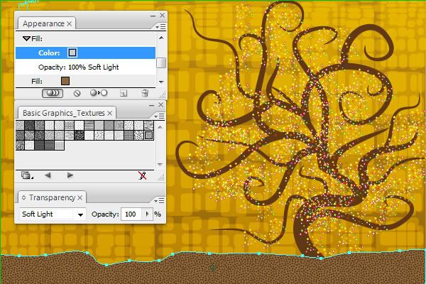
Let’s create a ground now. We’ll use ornaments and patterns for the ground rather than a plain color, as the artist loved chaotic elements on every surface. First, create a new layer and name it “GROUND,” now draw a shape in the bottom part of the image with no stroke and a medium-brown fill (#8C683C). You can do it with the Pencil Tool (N) or with the Pen Tool (P) if you feel comfortable with it.
Now open the Appearance panel (Shift + F6) and add a new fill to this shape. Navigate to Window > Swatches libraries > Patterns > Basic graphics > Textures and choose a pattern you like most for the new fill. I chose USGS_20_Scrub. The only thing left is to change the blending mode of this texture fill to Soft Light in the Transparency panel (Command + Shift + F10).
Step 10
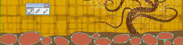
Draw an ellipse shape, but don’t use the Ellipse tool – take a Pencil (N) and draw a circular shape, so that the object looks irregular and hand-drawn. To close the path while drawing with the pencil, press the Alt button. Create several more similar ellipse shapes and position them within the ground object, altering the size, angle, and position. Give them a copper color fill (#BF6143) and no stroke, and group all the shapes.
Step 11
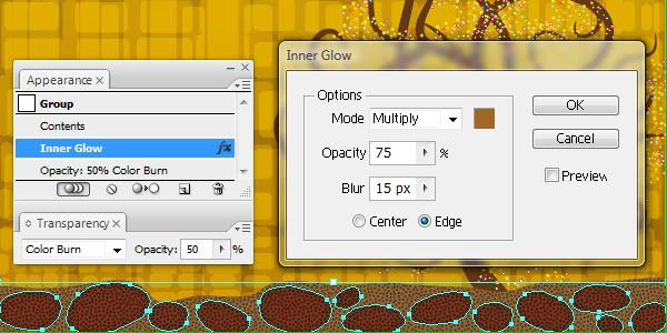
With the group selected, go to the Transparency panel (Command + Shift + F10) and change it’s blending mode to Color Burn while reducing the Opacity to about 50%. Now go to Effects > Stylize > Inner glow, and adjust the effect parameters as shown below: color, blending mode, and blur radius.
Step 12
Draw a small ellipse about 35 px by 30 px, fill it with dark blue with no stroke. Create another smaller ellipse about 20 px by 15 px, make it a yellow fill and black stroke, and position it on top of the first blue one.
Now group both shapes and go to Effects > Distort & Transform > Roughen, with a small values of size and detail (about 15 for both) and smooth corners. Now drag this resulted shape to the symbols panel.
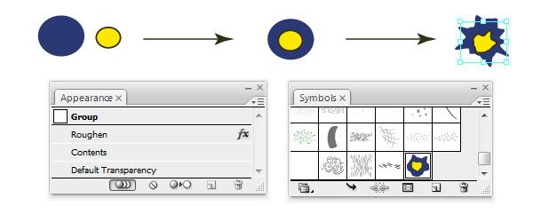
Now grab the symbol sprayer Tool (Shift + S) and spray the new symbol on the ground. Spray 10-15 shapes, then choose the Symbol Shifter, Symbol Sizer, and Symbol Spinner tools to alter the symbol instances a little in order to achieve a more natural look, change their size, angle, and position. When you are satisfied, lock the “Ground” layer.
Part 4: Figure
Step 13
We have come to the most important part of our work – the female figure. This element is essential in Gustav Klimt paintings. His portraits are well-known and popular all over the world. The artist payed great attention to details when portraying women figures, so let’s try to convey his painting style.
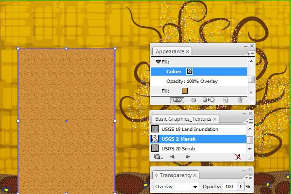
Create a new layer and name it “FIGURE.” Now, in the left part of your document, create a rectangle (M) about 400 px by 600 px and fill it with a light-brown color (#CC9340) with no stroke. Now, in the Appearance panel (Shift + F6) add a new fill to the rectangle and change it from a plain color to an irregular pattern texture. Navigate to Window > Swatches libraries > Patterns > Basic graphics > Textures and choose a pattern called USGS_2_Marsh. Now, with a new pattern fill chosen in the Appearance panel, change its blending mode to Overlay in the Transparency panel (Command + Shift + F10).
Step 14
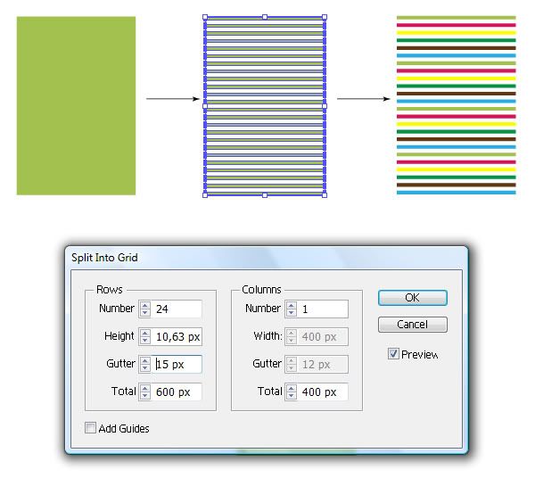
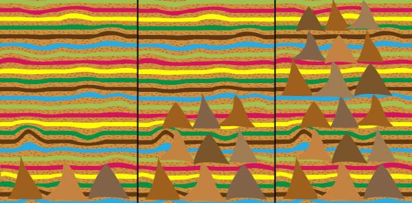
The next step is adding stripes to the figure. To do it, create another rectangle 400 px by 600 px over the previous one (or duplicate the first one) and fill it with a light-green color with no stroke. Now, go to Object > Path > Split to Grid in order to cut the rectangle into many thin stripes. In the grid window enter 24 rows and change the gutter value to 15 px, while leaving 1 column (see the image). Finally, change the color of stripes to any random colors you like – I used fuchsia, yellow, dark-green, blue, and brown. Now group all 24 stripes (Command + G).
Note: I’ve turned off the visibility of underlying objects in the image below for convenience.
Step 15
Now select the group of stripes, and we’ll distort them to achieve a more random look. Take a Warp Tool (Shift + R) and deform stripes a little bit to make them wavy. You may want to adjust tool options by pressing Enter, or try other tools from this group. You’ll need an image similar to the one below.
Step 16
The next ornament we want to add to this figure is a set of triangles. We won’t use polygon shapes for it, as we again want a more irregular look. Take the Pencil Tool (N) and draw a row of 3 triangular shapes with it (to close a path hold down the Alt button). Fill the shapes with various shades of brown and make them no stroke.
Now duplicate them by Alt + Shift-dragging above, and align the copy with the original triangles. Now repeat the duplication to get another set of triangles. You need to have 3 rows of 3 shapes each. I also recommend you to change the position of shapes so that they look less regularly ordered. Now copy the 9 shapes and move them up again to position them above, and change the color of shapes if you want. Group all 18 shapes now, as in the image below.
Step 17
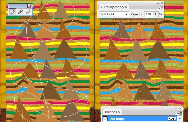
Adding a little detail to the figure can be done with the Scatter Brush, just like we did with the tree decoration. Use the Pencil Tool (N) to draw a curvy random path that crosses a few times above the triangles. Make sure the fill is turned off and the stroke is 1 pt wide with any color. Now just choose the same brush we used for the tree – Dot Rings from the Decorative Scatter library, and apply it to selected path. Now change the blending mode of this shape to Soft Light.
Step 18
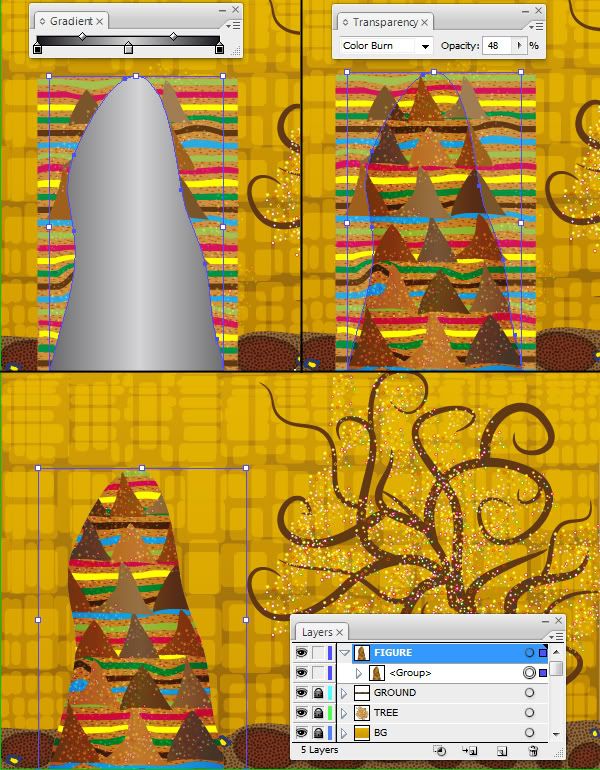
Now we should crop the group of elements we created for the figure, adding an appropriate shape. Again, use the Pencil Tool (N) to draw a shape that roughly looks like a female figure – refer to the image below. Change the stroke to none and fill to a linear gradient that goes from black to gray to black. In the Transparency panel reduce the shape Opacity to 50% and change the blending mode to Color Burn.
Now copy and paste the shape in front (Command + C and Command + F), select all the shapes we created on this “Figure” layer and make a clipping mask with the shape copy above (Command + 7). Now all the artwork is hidden outside the masking shape we created. The body is ready, and we can lock this group for now.
Step 19
It’s time to add a head. I’ve decided to make a woman view from behind, as I think it is not that easy to imitate the technique Gustav Klimt used for female faces.
Just draw a shape with Pencil Tool (N) that represents a view of a woman’s head from behind and fill it with a dark-brown color (#5E3C1D). Now add three open paths above the head using the Pencil Tool to imitate hair highlights. Make them no fill and light-brown (#D0AF89) 3 pt stroke, and change their blending mode to Soft Light.
Finally, apply a brush to the three highlight lines by going to Window > Brush libraries > Artistic > ChalkCharcoal_Pencil, and choose Charcoal-Pencil brush. Group the head and 3 hair shapes. The figure is ready now, and you can lock this layer.
Part 5: Decoration
Step 20
The main composition is ready, so let’s add some details to enhance the unique Klimt style. Create a new layer and name it “DETAILS.” First, let’s create a custom pattern brush. To do so, create a small triangle (about 20 px by 20 px) with the Polygon Tool, give it an orange fill and a brown 1 pt stroke. Draw a small circle with the Ellipse Tool (L) and put it in the center of the triangle, give it a blue fill with a red stroke.
Now duplicate both shapes by Alt + Shift-dragging them to the right and align a copy with the original. Now change the fill and stroke of the triangle copy to lighter shades, and alter the colors of the circle copy to your liking. Make sure both triangles touch each other, now select all four shapes and drag them into the Brushes panel (F5). In the dialog choose Border (pattern) brush. Leave all options intact, do choose the Hue Shift colorization method, and enter the name for the new brush.
Step 21
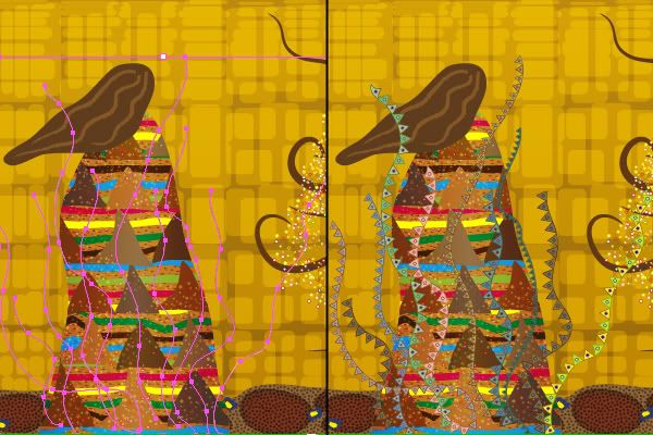
Now with the Pencil Tool draw around ten curvy lines that go from the base of the female figure. The idea is to apply a new triangle pattern brush to them, but using different settings. To do it, apply different stroke color to the lines, then select them and choose new brush from the Brushes panel.
Change the stroke width of some lines between 0,5 and 2 pt for more random effect. You can also alter options of the brush applied to separate paths by choosing Options of selected objects from the Brushes flyout menu and tweaking any settings. Once you are ready, group all the lines.
tep 22
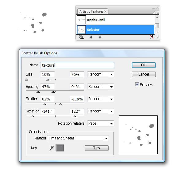
Open the Symbols library (Window > Symbol libraries > Artistic textures) and drag the Splatter symbol to your artboard. Now with the symbol instance selected, create a new scatter brush in the Brushes panel and insert the following options.
To complete the decoration, again take a pencil and draw a few curvy lines above the entire document. Change their stroke color to brown, yellow, or orange. Now apply a new splatter brush to it and set the blending mode of lines to Soft Light, Overlay, or Color Burn to add some texture. You can lock this layer now.
Part 6: Texture
Step 23
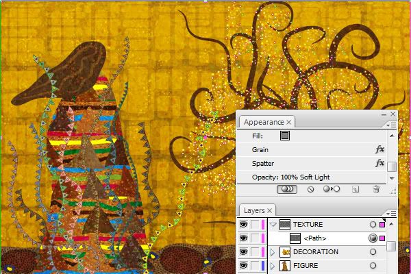
Create the last new layer and name it “TEXTURE.” We will add a textured surface look here to complete the effect of painting on the canvas. Create a rectangle (M) with the document dimensions 1200 px by 800 px that covers the entire image. Fill it with a medium gray color and change the stroke to none.
Now go to Effects > Texture > Grain, and enter the following settings: 70 for Intensity, 80 for Contrast, and Clumped for Grain type. Now go to Effects > Brush strokes > Spatter, and enter 14 for the Spray radius and 7 for Smoothness. Finally, change the blending mode of this rectangle to Soft Light in the Transparency panel.
Step 24
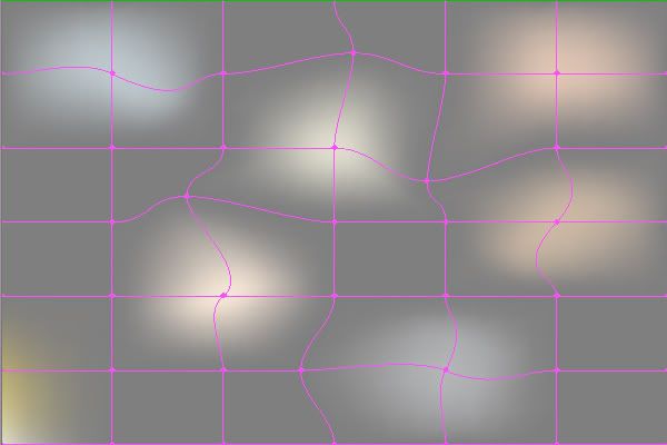
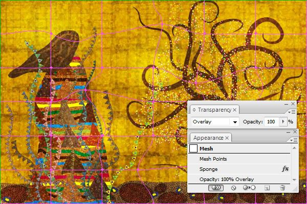
Create another rectangle 1200 px by 800 px covering the entire image with the same gray fill and no stroke. Go to Object > Make Gradient Mesh, and enter 6 rows and 6 columns. Now you can recolor separate points by taking the Direct Selection Tool (A) and changing their color to yellow, pink, lighter gray, and white. Also drag point handles randomly to achieve irregular color spots – either with the white arrow or with the Mesh Tool (U).
Step 25
With the mesh selected, go to Effects > Artistic > Sponge, and enter the following options: 3 for the Brush Size, 12 for Definition, and 5 for Smoothness. When the effect is applied, you can change the object blending mode to Overlay. You may want to reduce the Opacity if the texture looks too harsh.
Step 26
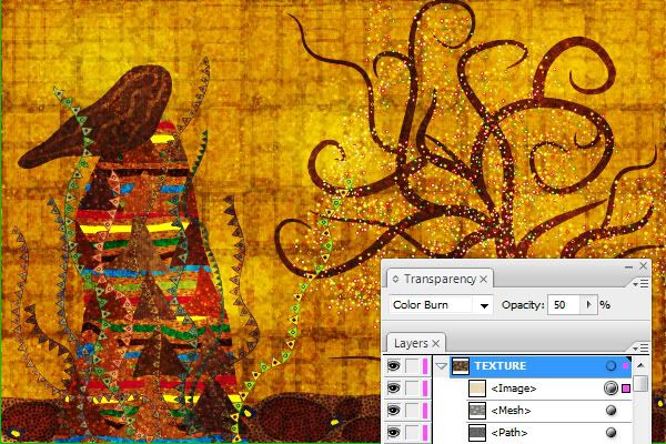
To complete the texture, I decided to use an image of a real canvas. You can take a photo of a canvas texture, or use a stock image, I used this wonderful image from Cristian Jungwirth.
Place the canvas texture into your Illustrator document (File > Place) and make sure the Link box is unchecked in the Place dialog so that the image is embedded. Transform it to fit the image size and open the Transparency panel. Here, change the blending mode of the texture to Color Burn and reduce its Opacity to about 50% so that it does not look too dark. You may experiment with other modes, however.
Conclusion
That is it for today – the work is ready! We’ve completed an interesting and challenging task today, imitating a painting of Austrian artist Gustav Klimt. We recreated his memorialized style using various Illustrator tools, and gave this vector painting an irregular hand-drawn look.
With the help of symbols, brushes, patterns, textures, and Pencil tool it turned out to be not that difficult. Experiment and create your own Klimt-style artwork. And wait for more tutorials on various historical periods of art. I’m happy to hear your suggestions in the comments.
Download Source Files


0 comments:
Post a Comment