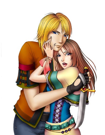
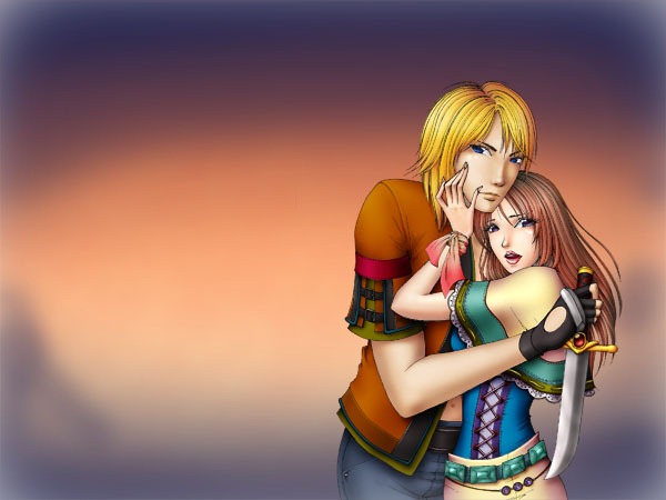
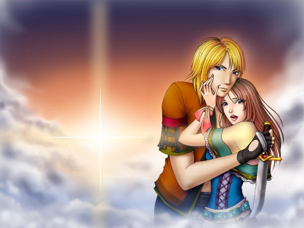
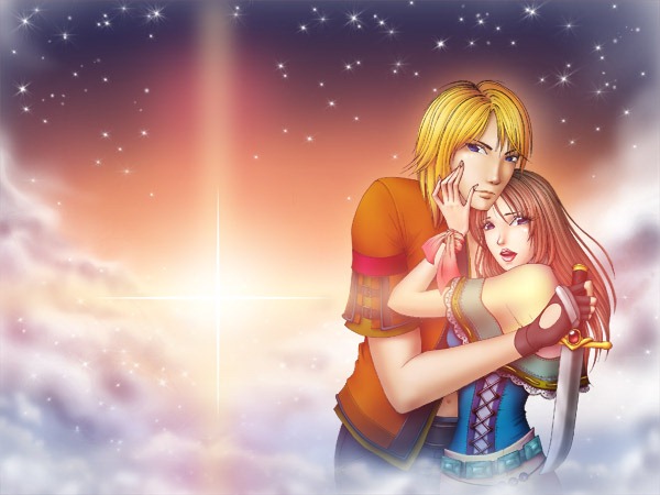
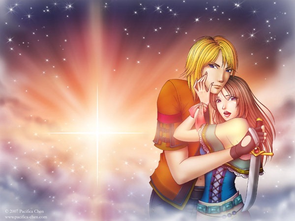
This tutorial will teach you how to transform an inked drawing into a full-color piece of fantasy artwork entirely through the use of Photoshop. You’ll learn how to paint clouds, stars, and more!
Preview of Final Results
For this project, you’ll need:
- An image inked in black
- A scanner
- A Wacom tablet
- Some artistic understanding
- And a lot of patience
Part 1 – Prep
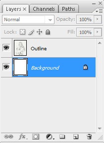
First let’s draw an image and ink it with black ink. Although you can use a quill, a thin ball-point pen will suffice. Then we’ll scan the image and import it into Photoshop.As you can see, the scanner caught all sorts of detail in paper texture that we don’t want—all we want is black outline of the image. So first, duplicate this image so it’ll be on a separate layer and fill (G) the background layer in with white (#FFFFFF).
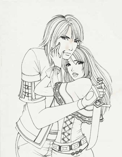
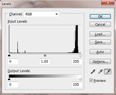
Next, we’ll be making the gray paper texture of this image disappear. Make sure the layer with the outline on it is selected and go to Image->Adjustments->Levels… In the window that will appear, choose the rightmost of the three eyedroppers. With this eyedropper, hold down the shift key and click on every shade of gray in the image that you want to turn to white. This eyedropper will lighten the same shade of every color you choose throughout the image. Press OK.
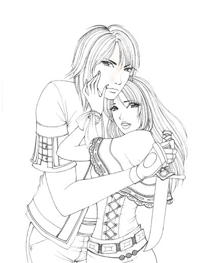
Now we have a crisp, clean line drawing to start filling in with color!
Part 2 – Subject
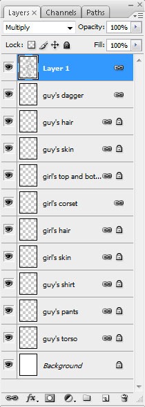
Since we’ll be creating our colors on different layers (it would be way too difficult to shade in a bunch of colors on a single layer), we want all of the white in our outline to be transparent. By setting the Blending Mode to Multiply, all of the white in the image will disappear, leaving only the black, just like that!Now first, let’s fill the entire image in with the colors that we later shade and add depth to so we can get an idea of how the colors will work out together in the end. We’ll make quite a few layers to keep different sections of the image apart so we will be able to easily shade in every section without disturbing the colors around it. Since the clothing our two subjects are wearing are quite detailed and will be very colourful, we will have to use quite a number of layers. Also, make sure the layers make sense. For example, we want the clothes and the hair to be in front of the body rather than behind it.
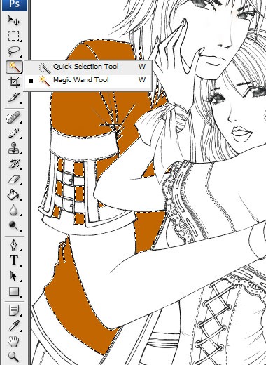
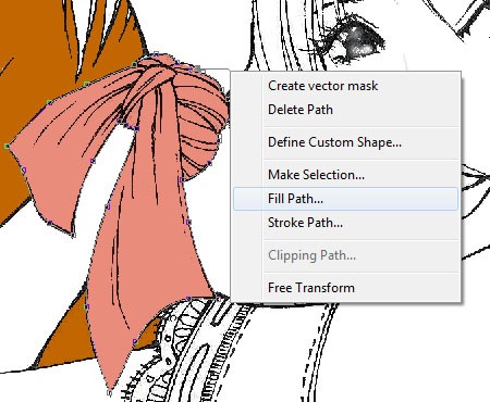
For parts of the image—such as the hair or bunched up fabric—where the outline is not simply a border but also helping to emphasize the texture of the particular part of image—such as the direction and flow of hair or the way fabric creases—then you may run into difficulty making selections with the Magic Wand tool, which will often want to grab the entire outline in the selection of the black lines of the outline are drawn too close to each other. In such cases, we’ll have no choice but to either color everything in by hand with a hard brush. Or we can use the Pen Tool (P). With the Pen Tool, we draw a path around the hard-to-fill-in parts of the image and then right click->Fill Path…
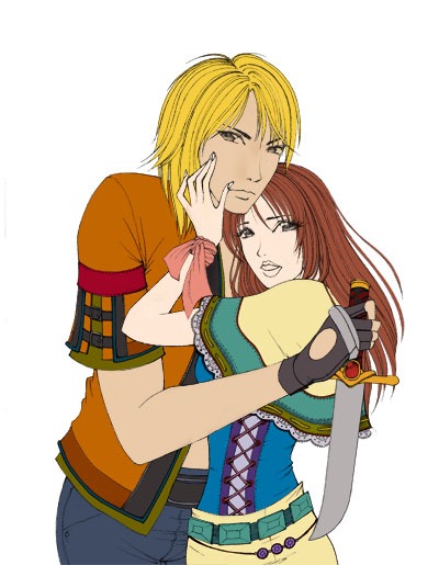
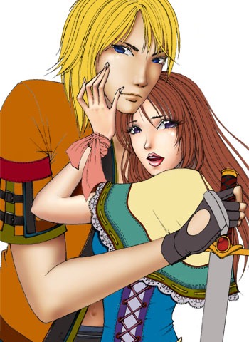
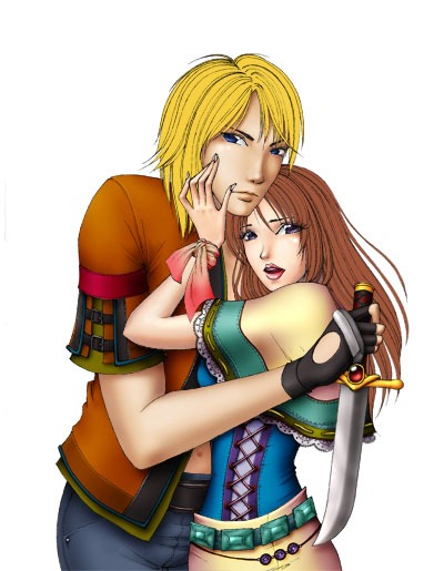
It will take quite a while, but once you finally filling the image in with color, it will look something like this.
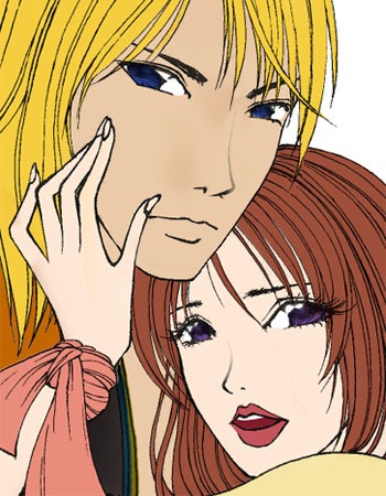
While we could technically start anywhere with shading in the image, I usually like to start with the subjects themselves. After all, they are the life of the image—the clothes and hair and everything else are simply accessories. So let’s start with coloring in eyes, lips, and skin. We’ll make the guy’s eyes blue, the girl’s eyes purple, and her lips pink.
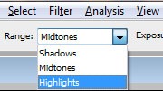
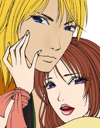
Now we’ll do some shading using a combination of the Brush tool (B) and the Dodge tool (O). I usually like to use the Brush tool to manually select lighter or darker shades of the same color for highlighting or adding in shadow, and then use the Dodge tool set to Highlights to create a bit of a glow around the highlights.
So let’s use these techniques and shade in the eyes and the lips.
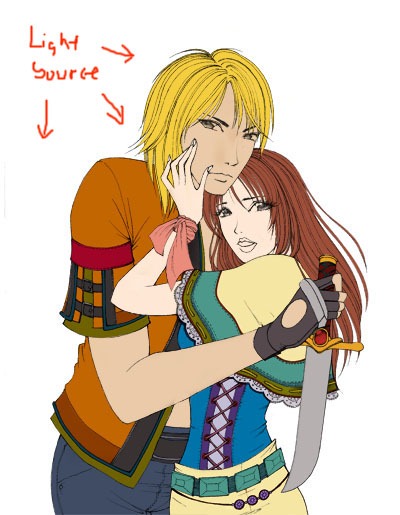
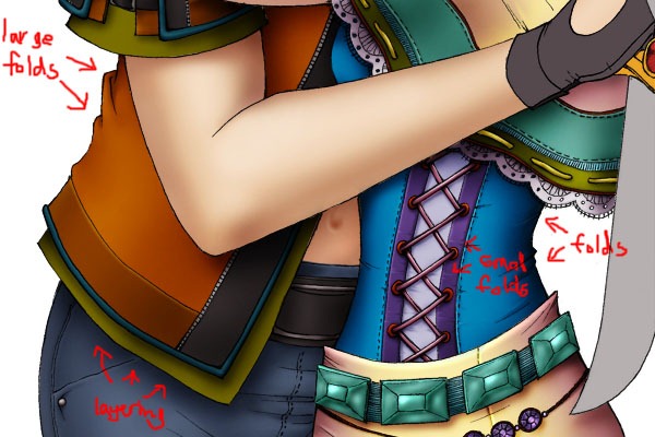
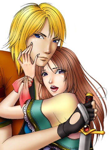
Using the same Brush and Dodge tool techniques, let’s shade in the rest of our subjects’ bodies, being mindful of the direction of the light source and the shadows their hair or their clothes will cast on their skin.
We are almost done our subjects!
The last step with our subjects is what I think is the most annoying and time consuming part of coloring a human—the hair. First let’s generally shade in the hair using the Brush and Dodge we should be very familiar with by this stage.
Now pull out your Wacom tablet, make sure it’s pressure sensitivity functions are working, choose a small Smudge tool (R) and set its Strength to something really high, like 90%.
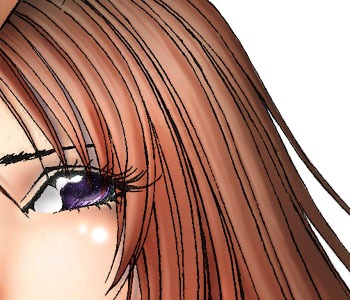
Now use the Smudge tool with the Wacom tablet and drag the colors in the rough highlights and shadows that we filled in before back and forth in the direction of hair flow. You will get the effect that a mass block of color is actually countless individual strands of hair.
And our subjects are complete!
Part 3 – Background
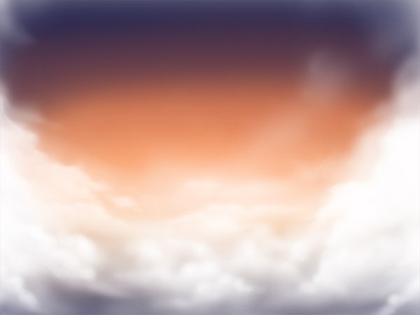
First, let’s merge all of the layers used for creating our subject so they don’t get confused with the layers we will use to create our background. I like to create a new file to finish off my images so I can still keep a file with all of the subject’s layers. Because the plan for the background is to be a landscape, let’s make the new image horizontal. We’ll paste the subject in and then fill the background. I thought for a long time about what to make the background before finally settling on using a dramatic sunset. So let’s fill in the background with a vibrant orange gradient fading into a paler orange where the sun meets the horizon using the Gradient tool (G).Next, let’s take a big brush and color in some dark blue to give a feeling of the night time that will come once the sun has set.
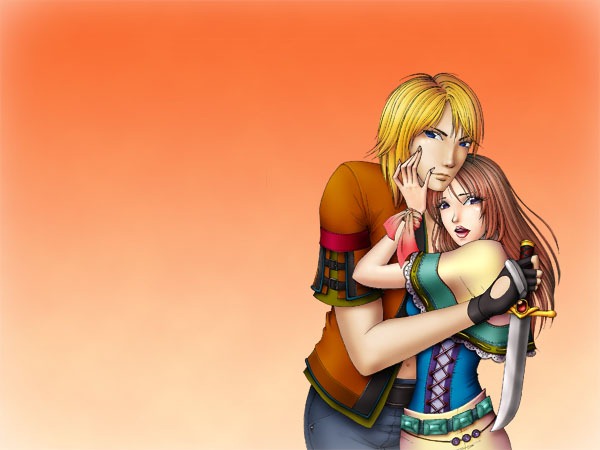
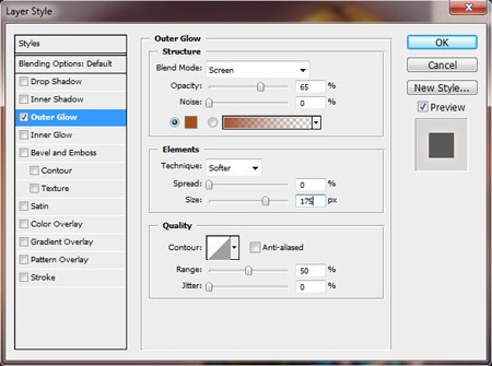
Before we go any further, let’s put a ring of light/color around our two subjects so they won’t completely disappear into the background once we’re done. Go to Layer->Layer Style->Outer Glow… and set all of the properties as such.
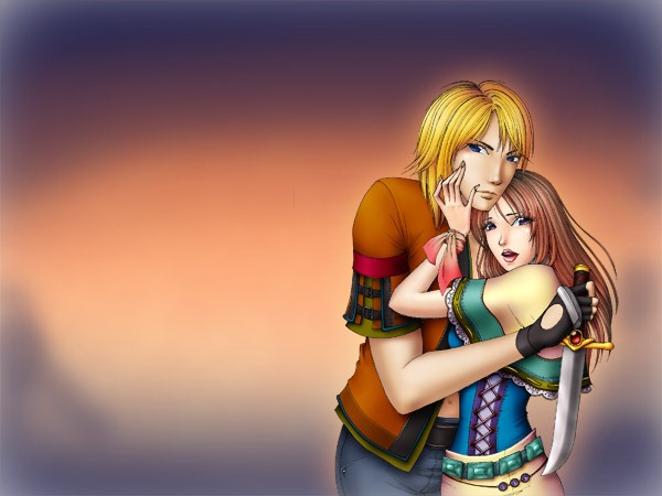
So if you compare the before and after Outer Glow images, you’ll see that there’s a ring of color around our two subjects, making them subtly stand out from the background.
Next let’s add in clouds. Take a soft brush, set the opacity lower, and draw lots and lots of circles on top of each other. Layer more for where you want the clouds to be thicker and less where you want them wispier.
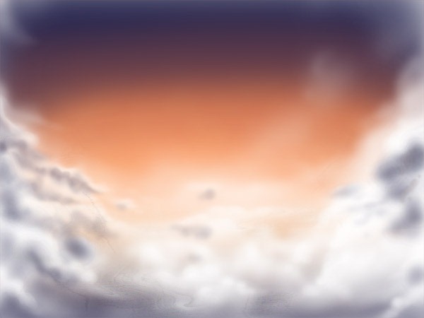
Let’s add some more depth to the clouds. Because the sun at sunset is really bright, the portion of clouds facing it will be really brilliantly lit, whereas the parts facing away will be quite dark. So let’s use the same color and, using the same brush pattern, fill in some shadows to make it look almost like a storm is brewing.
Let’s put a layer of clouds in front of our subjects too so it looks like they are actually a part of the background rather than subject and background being two separate images. While we could manually draw more again, let’s just cheat, duplicate the cloud layer that we already have, bring it in front, lower it, and set the layer opacity to about 70% so the clouds don’t completely obscure the subjects.
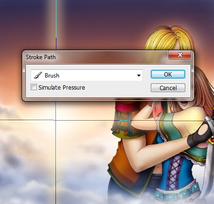
Next, let’s add the sun onto the horizon. Instead of just dotting a glowing spot in, I opted to instead draw in rays shooting in four directions to make it more dramatic. With the pen tool, draw an X, right click Stroke Path… and stroke the path with a large, soft, semi-transparent brush.
Then draw a smaller X and stroke it with a hard, thin brush and we should have something like this.
Now let’s add a little more drama to the image and redden the horizon, allowing the red light to sweep over our subjects. With a really large brush, take a dark red color and sweep it in the same X shape as the sunlight. Then set the layer Blending Mode to Screen and the Opacity to 75%.
And we should have a red glow sweeping through.
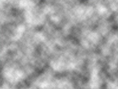
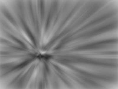
Now let’s add in one last element of drama—great blinding rays! In the two color palettes to on the left of the workspace, choose white for one and gray for another. Then go to Filter -> Render -> Clouds and we should get something like this.
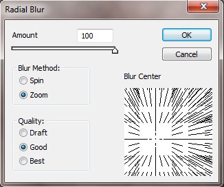
Then, go to Filter -> Blur -> Radial Blur. Set the Amount to its 100 maximum and the Blur Method to Zoom. Then adjust the direction of the blur so that its epicentre comes from the location of the sun that we draw in earlier and press OK.
And we’ll get a motion like this.
Final Step
Set the layer to Overlay and its Opacity to 70%. All of the black in the image will disappear and we will have dramatic shooting rays of light!I’m going to sneak in my watermark because I’ve spent way too long on this image for some person to steal it and pass it off as their own (you might want to do the same) and WE’RE DONE!!!
0 comments:
Post a Comment