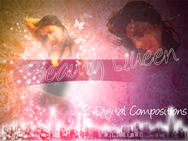
This is the list of things we need for making this artwork.Stock Photos
- Model
- City Skyline
- BG Pattern
- Displacement Map
Brushes Needed
- Splash Of Paint
- Butterfly Brush
OK. Now before you guys think this is a really easy artwork with some cheap filters , let me tell you that it isn't so. In fact it's quiet long and detailed so if you get stuck while skipping steps then i guess you're on your own. Also I'm taking a different approach to this tutorial. While most tutorials go by the order of steps, I'm dividing the tutorial into 7 Groups so as to make things easier. Here is the arrangement of Groups. You can set these up before we start.![1[4] 1[4]](http://photoshoptutorials.ws/images/stories/FashionModelPoster_10B6D/14.jpg) Group 1 - Background(BG)Lets start off with a new blank canvas with white (#ffffff) as the background. Make a new layer (Ctrl + Shift + N) and fill it with a gradient going from the top left to bottom right corner of the canvas.
Group 1 - Background(BG)Lets start off with a new blank canvas with white (#ffffff) as the background. Make a new layer (Ctrl + Shift + N) and fill it with a gradient going from the top left to bottom right corner of the canvas.![2[4] 2[4]](http://photoshoptutorials.ws/images/stories/FashionModelPoster_10B6D/24.jpg) I used these to as the colors for the gradient.
I used these to as the colors for the gradient.- Orange : #ffb33a
- Pink : #fd0083
Next we add the patterned background over it.- Blend Mode : Luminosity
- Opacity : 55%
Make sure to group these layer into Group BG. Now we need to add the main element for this artwork - the girl. So let's save this for now and open up the image of the girl in Photoshop.Extraction Of Girl
As you can see, this image is totally messed up. Nothing matches with the artwork we've made so far; lighting , color , mood. And this is where Photoshop comes in.![5[4] 5[4]](http://photoshoptutorials.ws/images/stories/FashionModelPoster_10B6D/54.jpg) Using the Pen Tool(P) or Polygonal Lasso Tool(L) extract the girl from the image. I personally prefer the Pen Tool in such images since there's mostly straight lines and you get greater smoothness while cutting along the turns.
Using the Pen Tool(P) or Polygonal Lasso Tool(L) extract the girl from the image. I personally prefer the Pen Tool in such images since there's mostly straight lines and you get greater smoothness while cutting along the turns.![6[4] 6[4]](http://photoshoptutorials.ws/images/stories/FashionModelPoster_10B6D/64.jpg) Don't worry about the jagged edges of the cutting around the hair since that can be dealt with once we put the picture in our canvas. If you've done it with the pen tool, after making the path, right-click on it and select make selection.
Don't worry about the jagged edges of the cutting around the hair since that can be dealt with once we put the picture in our canvas. If you've done it with the pen tool, after making the path, right-click on it and select make selection.- Feathered Radius : 2px
- Check anti-aliased.
![7[4] 7[4]](http://photoshoptutorials.ws/images/stories/FashionModelPoster_10B6D/74.jpg) Now select the Move Tool(V) and transfer the girl to our canvas. Re size appropriately and move her to the left side of the canvas since this is the side that we first see in any image. Name this layer "girl" It goes in the group 'Girl'.
Now select the Move Tool(V) and transfer the girl to our canvas. Re size appropriately and move her to the left side of the canvas since this is the side that we first see in any image. Name this layer "girl" It goes in the group 'Girl'.Group – Girl
Using a soft round brush on the layer mask of the girl, remove the part of the hair where the background is showing. Also move it at places where the edge is too rough. Now we have one complete image. Good.![8[4] 8[4]](http://photoshoptutorials.ws/images/stories/FashionModelPoster_10B6D/84.jpg) Now here's the tricky part. Duplicate this and hide the duplicated. Select the original "girl" layer for applying the displacement map. Go to Filter > Distort > Displace.
Now here's the tricky part. Duplicate this and hide the duplicated. Select the original "girl" layer for applying the displacement map. Go to Filter > Distort > Displace.![9[4] 9[4]](http://photoshoptutorials.ws/images/stories/FashionModelPoster_10B6D/94.jpg) There apply the following settings.
There apply the following settings.- Horizontal Scale 40
- Vertical Scale 40
- Stretch To Fit
- Repeat Around Edges
Click ok and select the displacement file. Name this layer "displaced" then change the blend mode to Lighten.Choose Layer > Layer Style > Drop Shadow. In the layer style select Drop Shadow with the following settings.![properties[4] properties[4]](http://photoshoptutorials.ws/images/stories/FashionModelPoster_10B6D/properties4.jpg) Group - Girl - ContinuesIn the Girl Group , we have 2 layers 1. "displaced" girl 2. hidden copy of the original girl. If you don't have this then go back and recheck. No point going further and later cribbing that you couldn't get the output. Unhide this copied layer,name it 'overlay' and make another copy. Hide this 'another copy' for now. So far so good? Select 'overlay'. Ctrl+Click on thumbnail of 'displaced' girl then click on the button at the bottom saying 'add vector mask'. Now with the splatter brush remove some of the hair and with a soft brush, some of the arms. Change the blending mode to Overlay and set opacity to 50%.Now in the Girl Group we have 3 layers 1.'displaced' girl. 2.'overlay' girl 3.hidden copy of original girl. Unhide this hidden copy name it 'smoothing' and make another copy. Hide the 'another copy' for now. This 3rd girl layer is just to smooth things up. Change the opacity to 50%, add a vector mask and paint it black so everything's hidden. Now with a soft white brush paint over the layer mask to reveal certain parts as shown below.
Group - Girl - ContinuesIn the Girl Group , we have 2 layers 1. "displaced" girl 2. hidden copy of the original girl. If you don't have this then go back and recheck. No point going further and later cribbing that you couldn't get the output. Unhide this copied layer,name it 'overlay' and make another copy. Hide this 'another copy' for now. So far so good? Select 'overlay'. Ctrl+Click on thumbnail of 'displaced' girl then click on the button at the bottom saying 'add vector mask'. Now with the splatter brush remove some of the hair and with a soft brush, some of the arms. Change the blending mode to Overlay and set opacity to 50%.Now in the Girl Group we have 3 layers 1.'displaced' girl. 2.'overlay' girl 3.hidden copy of original girl. Unhide this hidden copy name it 'smoothing' and make another copy. Hide the 'another copy' for now. This 3rd girl layer is just to smooth things up. Change the opacity to 50%, add a vector mask and paint it black so everything's hidden. Now with a soft white brush paint over the layer mask to reveal certain parts as shown below.![15[4] 15[4]](http://photoshoptutorials.ws/images/stories/FashionModelPoster_10B6D/154.jpg) Now in the Girl Group we have 4 layers 1.'displaced' girl. 2.'overlay' girl 3.'smoothing' girl 4.hidden copy of original girl. Unhide this hidden copy, name it 'cutout' and do not make any more copies :D ( Yeah, i know, thank god) Move it to the right side of the canvas and enlarge it such that the head occupies a significant position .
Now in the Girl Group we have 4 layers 1.'displaced' girl. 2.'overlay' girl 3.'smoothing' girl 4.hidden copy of original girl. Unhide this hidden copy, name it 'cutout' and do not make any more copies :D ( Yeah, i know, thank god) Move it to the right side of the canvas and enlarge it such that the head occupies a significant position .![16[4] 16[4]](http://photoshoptutorials.ws/images/stories/FashionModelPoster_10B6D/164.jpg) Make Blend Mode : Multiply Opacity : 55% Go to Filter > Artistic > Cutout. Use these settings:
Make Blend Mode : Multiply Opacity : 55% Go to Filter > Artistic > Cutout. Use these settings:- Levels: 3
- Simplicity: 4
- Fidelity: 3
Make a layer mask and with the 'splat of paint' brush remove most of the girl leaving the head.![17[4] 17[4]](http://photoshoptutorials.ws/images/stories/FashionModelPoster_10B6D/174.jpg) Now make a new layer on top with opacity set to 15%. Paint the part over the girls legs pink. This is just to blend it with our background pink.
Now make a new layer on top with opacity set to 15%. Paint the part over the girls legs pink. This is just to blend it with our background pink.![18[4] 18[4]](http://photoshoptutorials.ws/images/stories/FashionModelPoster_10B6D/184.jpg) Here's the image you should have so far. Move all the 4 "girl layers" + this pink layer into a group "Girl". Ignore this point if you setup the empty groups in the beginning. This brings us to the end of the Girl element (Pheww~!)
Here's the image you should have so far. Move all the 4 "girl layers" + this pink layer into a group "Girl". Ignore this point if you setup the empty groups in the beginning. This brings us to the end of the Girl element (Pheww~!)![19[4] 19[4]](http://photoshoptutorials.ws/images/stories/FashionModelPoster_10B6D/194.jpg) Group - SparkleThis group will be below Girl group and will have two layers. Sparkle & small Sparkle We could download tons of sparkle brushes from the internet but i thought of making my own. Here’s how. Take a soft round brush of approx. 35-40 px size. Go to Window > Brushes or F5. Apply the settings as given below.
Group - SparkleThis group will be below Girl group and will have two layers. Sparkle & small Sparkle We could download tons of sparkle brushes from the internet but i thought of making my own. Here’s how. Take a soft round brush of approx. 35-40 px size. Go to Window > Brushes or F5. Apply the settings as given below.![21[4] 21[4]](http://photoshoptutorials.ws/images/stories/FashionModelPoster_10B6D/214.jpg)
![22[4] 22[4]](http://photoshoptutorials.ws/images/stories/FashionModelPoster_10B6D/224.jpg)
![23[4] 23[4]](http://photoshoptutorials.ws/images/stories/FashionModelPoster_10B6D/234.jpg) Now for the large sparkles, use it either free hand around the girl or make a path with the Pen tool and creating a stroke. To create a stroke, Right click on the path in the Paths palette (Window > Paths) then choose Stroke Path. In the Stroke Path window, choose Brush. For the smaller sparkles. Just reduce the size and apply it .
Now for the large sparkles, use it either free hand around the girl or make a path with the Pen tool and creating a stroke. To create a stroke, Right click on the path in the Paths palette (Window > Paths) then choose Stroke Path. In the Stroke Path window, choose Brush. For the smaller sparkles. Just reduce the size and apply it .![24[4] 24[4]](http://photoshoptutorials.ws/images/stories/FashionModelPoster_10B6D/244.jpg) Group - ButterflyThis group is the simplest. Just get some butterfly brushes from the net. The reason it has 3 layers is that i have made just one butterfly per layer so that i can adjust size and placement without affecting the others.
Group - ButterflyThis group is the simplest. Just get some butterfly brushes from the net. The reason it has 3 layers is that i have made just one butterfly per layer so that i can adjust size and placement without affecting the others.![25[4] 25[4]](http://photoshoptutorials.ws/images/stories/FashionModelPoster_10B6D/254.jpg) Sometimes the butterfly produced with a single click is very faint in some brushes - there I'd advice to click several times to make it prominent. Additionally you could create fine 'trails'(technique explained in next group) behind the butterflies as detailing , though I haven't. Group the three layers and place it above the Girl Group.Group - City SkylineThis group is above Butterfly and contains basically 2 layers. The upper Skyline & below it Skyline Glow. Just extract the skyline from the image onto the canvas and place it in that group. Make Create a new layer above it. Ctrl+Click on thumbnail of skyline to get its shape. Now with the Rectangular Marquee Tool (M) set to "Intersect with selection" select about 3/4 of the skyline from the right and paint it black. Apply the following settings
Sometimes the butterfly produced with a single click is very faint in some brushes - there I'd advice to click several times to make it prominent. Additionally you could create fine 'trails'(technique explained in next group) behind the butterflies as detailing , though I haven't. Group the three layers and place it above the Girl Group.Group - City SkylineThis group is above Butterfly and contains basically 2 layers. The upper Skyline & below it Skyline Glow. Just extract the skyline from the image onto the canvas and place it in that group. Make Create a new layer above it. Ctrl+Click on thumbnail of skyline to get its shape. Now with the Rectangular Marquee Tool (M) set to "Intersect with selection" select about 3/4 of the skyline from the right and paint it black. Apply the following settings- Blend Mode: Soft Light
- Opacity: 70%
Select the skyline layer with the current layer then merge by pressing Ctrl+E.Now change the Blend Mode of this merged skyline to Soft Light. Now make a layer BELOW skyline and name it skyline glow. If you notice the glow is very uneven. More in some places and very less in others. Before we start with the glow we need to make the brush. Again like the with the Sparkle brush, select a soft 3px brush. Go to Windows > Brushes (F5) then apply the properties shown below.![29[4] 29[4]](http://photoshoptutorials.ws/images/stories/FashionModelPoster_10B6D/294.jpg) The brush is now ready. Select the glow layer. Next Ctrl+Click on thumbnail of skyline layer. You've now got marching ants (yeah! that's what it's called) in the shape of the skyline. Select the Polygonal Lasso Tool (L) or any other selection tool and right click near the marching ants. Select > Make work Path > Tolerance : 2px.
The brush is now ready. Select the glow layer. Next Ctrl+Click on thumbnail of skyline layer. You've now got marching ants (yeah! that's what it's called) in the shape of the skyline. Select the Polygonal Lasso Tool (L) or any other selection tool and right click near the marching ants. Select > Make work Path > Tolerance : 2px.![30[4] 30[4]](http://photoshoptutorials.ws/images/stories/FashionModelPoster_10B6D/304.jpg) This makes the selection into a path. Select the Pen Tool(P) and right click near the created path and select Stroke Path --> Brush Do Not select Stimulate pressure. Click ok. Right click over the path and select Delete Path.
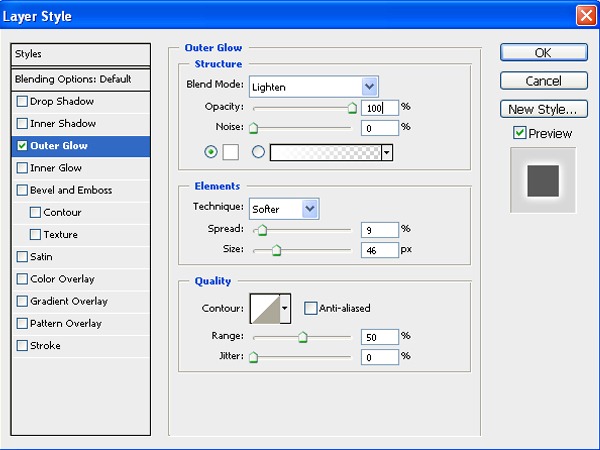
This makes the selection into a path. Select the Pen Tool(P) and right click near the created path and select Stroke Path --> Brush Do Not select Stimulate pressure. Click ok. Right click over the path and select Delete Path.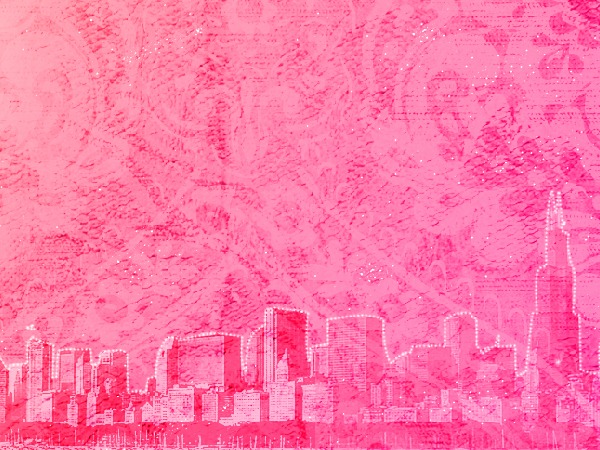 Now we have a dotted line over the skyline. Right click on the layer and select Blending Options. Select Outer Glow and apply the options as given in the picture.
 There you go - the glowing skyline.
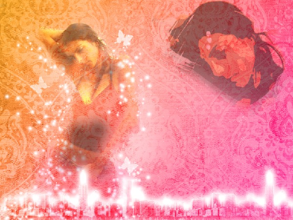 The trick here is that parts where the dots are packed together (around changing of buildings) will produce a comparatively greater glow.
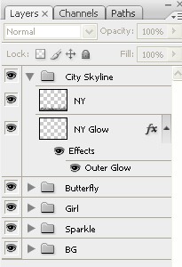 Check all the layers.
Group - TAG
This group stays below Sparkle and contains 2 layers ; one copy of the other. This is probably the oldest (and my favorite) trick in the book. Using the Rectangular Marquee Tool(M) make a selection above the belly of the girl. Fill it with Purple : #a52d5c I've added another color within it (#831734) but you can stick to one for simplicity.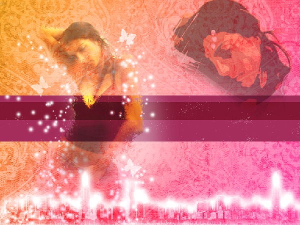 Ctrl+Click on thumbnail to select the rectangle the then press (Q) for Quick Selection Mode. Go to Filter --> Pixelate --> Color Halftone Fill the options as given in the picture and select OK.
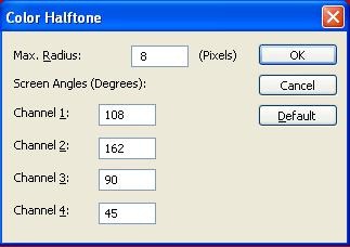 Now press Q again to exit the Quick Selection Mode. Press Ctrl+Shift+I to invert the selection and press delete.
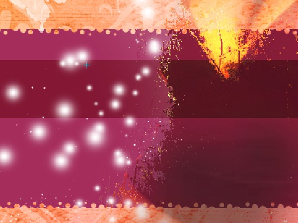 You'll see a pattern at the edge. Now to bend it on both side, and push inside the middle portion using Warp. Goto Edit --> Transform --> Warp Selecting the ends of the rectangle gently pull down the sides and push in the middle, also raise the top a bit to give it a proper bend look.
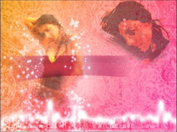
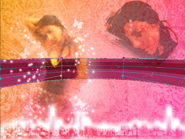 After you are satisfied, hit enter to complete the transformation. Now we have to fade the sides. For doing this add a layer mask. Take the Gradient Tool(G) with Black and White as colors. Give a tilted gradient on both sides as shown. Reduce the Opacity to 35% and duplicate the layer to make the colour deeper.
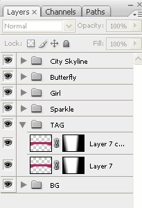
 Check your layers.
 Done with this group~!Group - TXTAgain this text employs the same method used in the Skyline Glow case with a different approach. Select a nice font(Angelina) and write out whatever text you want. Keep it over the TAG part of the image so as to bring out contrast. Hide the layer. Ctrl+Click on thumbnail . Select the Lasso Tool(L). Right click near the marching ants and select Make Work Path --> Tolerance 2px.
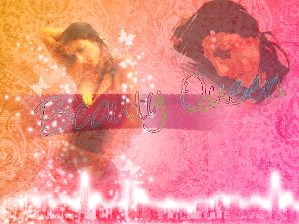 Now that its a path make a new layer. Make the dotted brush as in Skyline Brush. Select the pen tool and apply brush stroke . Delete path. Simple.Group - Background(BG) - Final TouchesStill find something missing? That's right. Only one layer, but which changes the artwork completely. Go to the Background(BG) Group Above the Pattern layer, make a new layer and name it "lens flare' Paint it black completely. Go to Filter > Render > Lens Flare Select the 105mm Prime with 150% Brightness. Angle the flare such that the main part falls on the body and the tail on the 'cutout' girl (face) This might take a few attempts to get right. Set the layer blend mode to Hard Light and opacity to 90%. Presto~! Notice the difference. The artwork looks much more attractive now. If you feel the brightness is still less then you can add an additional layer above the flare with 25% opacity and paint some splashes white.
Final Setup Of Layers
Have a look at the final Set up of layers. It should help you eliminate any doubts.Hope you enjoyed this tutorial as much as you found it helpful. If you have any doubts,get stuck at any point, or just need some info, you can leave a comment or just contact me at my email address - princesslibraa@gmail.com
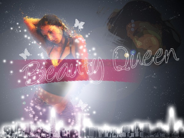
Final Results


This is the list of things we need for making this artwork.
Stock Photos
- Model
- City Skyline
- BG Pattern
- Displacement Map
Brushes Needed
- Splash Of Paint
- Butterfly Brush
OK. Now before you guys think this is a really easy artwork with some cheap filters , let me tell you that it isn't so. In fact it's quiet long and detailed so if you get stuck while skipping steps then i guess you're on your own. Also I'm taking a different approach to this tutorial. While most tutorials go by the order of steps, I'm dividing the tutorial into 7 Groups so as to make things easier. Here is the arrangement of Groups. You can set these up before we start.
![1[4] 1[4]](http://photoshoptutorials.ws/images/stories/FashionModelPoster_10B6D/14.jpg)
Group 1 - Background(BG)
Lets start off with a new blank canvas with white (#ffffff) as the background. Make a new layer (Ctrl + Shift + N) and fill it with a gradient going from the top left to bottom right corner of the canvas.
![2[4] 2[4]](http://photoshoptutorials.ws/images/stories/FashionModelPoster_10B6D/24.jpg)
I used these to as the colors for the gradient.
- Orange : #ffb33a
- Pink : #fd0083
Next we add the patterned background over it.
- Blend Mode : Luminosity
- Opacity : 55%
Make sure to group these layer into Group BG. Now we need to add the main element for this artwork - the girl. So let's save this for now and open up the image of the girl in Photoshop.
Extraction Of Girl
As you can see, this image is totally messed up. Nothing matches with the artwork we've made so far; lighting , color , mood. And this is where Photoshop comes in.
![5[4] 5[4]](http://photoshoptutorials.ws/images/stories/FashionModelPoster_10B6D/54.jpg)
Using the Pen Tool(P) or Polygonal Lasso Tool(L) extract the girl from the image. I personally prefer the Pen Tool in such images since there's mostly straight lines and you get greater smoothness while cutting along the turns.
![6[4] 6[4]](http://photoshoptutorials.ws/images/stories/FashionModelPoster_10B6D/64.jpg)
Don't worry about the jagged edges of the cutting around the hair since that can be dealt with once we put the picture in our canvas. If you've done it with the pen tool, after making the path, right-click on it and select make selection.
- Feathered Radius : 2px
- Check anti-aliased.
![7[4] 7[4]](http://photoshoptutorials.ws/images/stories/FashionModelPoster_10B6D/74.jpg)
Now select the Move Tool(V) and transfer the girl to our canvas. Re size appropriately and move her to the left side of the canvas since this is the side that we first see in any image. Name this layer "girl" It goes in the group 'Girl'.
Group – Girl
Using a soft round brush on the layer mask of the girl, remove the part of the hair where the background is showing. Also move it at places where the edge is too rough. Now we have one complete image. Good.
![8[4] 8[4]](http://photoshoptutorials.ws/images/stories/FashionModelPoster_10B6D/84.jpg)
Now here's the tricky part. Duplicate this and hide the duplicated. Select the original "girl" layer for applying the displacement map. Go to Filter > Distort > Displace.
![9[4] 9[4]](http://photoshoptutorials.ws/images/stories/FashionModelPoster_10B6D/94.jpg)
There apply the following settings.
- Horizontal Scale 40
- Vertical Scale 40
- Stretch To Fit
- Repeat Around Edges
Click ok and select the displacement file. Name this layer "displaced" then change the blend mode to Lighten.
Choose Layer > Layer Style > Drop Shadow. In the layer style select Drop Shadow with the following settings.
![properties[4] properties[4]](http://photoshoptutorials.ws/images/stories/FashionModelPoster_10B6D/properties4.jpg)
Group - Girl - Continues
In the Girl Group , we have 2 layers 1. "displaced" girl 2. hidden copy of the original girl. If you don't have this then go back and recheck. No point going further and later cribbing that you couldn't get the output. Unhide this copied layer,name it 'overlay' and make another copy. Hide this 'another copy' for now. So far so good? Select 'overlay'. Ctrl+Click on thumbnail of 'displaced' girl then click on the button at the bottom saying 'add vector mask'. Now with the splatter brush remove some of the hair and with a soft brush, some of the arms. Change the blending mode to Overlay and set opacity to 50%.
Now in the Girl Group we have 3 layers 1.'displaced' girl. 2.'overlay' girl 3.hidden copy of original girl. Unhide this hidden copy name it 'smoothing' and make another copy. Hide the 'another copy' for now. This 3rd girl layer is just to smooth things up. Change the opacity to 50%, add a vector mask and paint it black so everything's hidden. Now with a soft white brush paint over the layer mask to reveal certain parts as shown below.
![15[4] 15[4]](http://photoshoptutorials.ws/images/stories/FashionModelPoster_10B6D/154.jpg)
Now in the Girl Group we have 4 layers 1.'displaced' girl. 2.'overlay' girl 3.'smoothing' girl 4.hidden copy of original girl. Unhide this hidden copy, name it 'cutout' and do not make any more copies :D ( Yeah, i know, thank god) Move it to the right side of the canvas and enlarge it such that the head occupies a significant position .
![16[4] 16[4]](http://photoshoptutorials.ws/images/stories/FashionModelPoster_10B6D/164.jpg)
Make Blend Mode : Multiply Opacity : 55% Go to Filter > Artistic > Cutout. Use these settings:
- Levels: 3
- Simplicity: 4
- Fidelity: 3
Make a layer mask and with the 'splat of paint' brush remove most of the girl leaving the head.
![17[4] 17[4]](http://photoshoptutorials.ws/images/stories/FashionModelPoster_10B6D/174.jpg)
Now make a new layer on top with opacity set to 15%. Paint the part over the girls legs pink. This is just to blend it with our background pink.
![18[4] 18[4]](http://photoshoptutorials.ws/images/stories/FashionModelPoster_10B6D/184.jpg)
Here's the image you should have so far. Move all the 4 "girl layers" + this pink layer into a group "Girl". Ignore this point if you setup the empty groups in the beginning. This brings us to the end of the Girl element (Pheww~!)
![19[4] 19[4]](http://photoshoptutorials.ws/images/stories/FashionModelPoster_10B6D/194.jpg)
Group - Sparkle
This group will be below Girl group and will have two layers. Sparkle & small Sparkle We could download tons of sparkle brushes from the internet but i thought of making my own. Here’s how. Take a soft round brush of approx. 35-40 px size. Go to Window > Brushes or F5. Apply the settings as given below.
![21[4] 21[4]](http://photoshoptutorials.ws/images/stories/FashionModelPoster_10B6D/214.jpg)
![22[4] 22[4]](http://photoshoptutorials.ws/images/stories/FashionModelPoster_10B6D/224.jpg)
![23[4] 23[4]](http://photoshoptutorials.ws/images/stories/FashionModelPoster_10B6D/234.jpg)
Now for the large sparkles, use it either free hand around the girl or make a path with the Pen tool and creating a stroke. To create a stroke, Right click on the path in the Paths palette (Window > Paths) then choose Stroke Path. In the Stroke Path window, choose Brush. For the smaller sparkles. Just reduce the size and apply it .
![24[4] 24[4]](http://photoshoptutorials.ws/images/stories/FashionModelPoster_10B6D/244.jpg)
Group - Butterfly
This group is the simplest. Just get some butterfly brushes from the net. The reason it has 3 layers is that i have made just one butterfly per layer so that i can adjust size and placement without affecting the others.
![25[4] 25[4]](http://photoshoptutorials.ws/images/stories/FashionModelPoster_10B6D/254.jpg)
Sometimes the butterfly produced with a single click is very faint in some brushes - there I'd advice to click several times to make it prominent. Additionally you could create fine 'trails'(technique explained in next group) behind the butterflies as detailing , though I haven't. Group the three layers and place it above the Girl Group.
Group - City Skyline
This group is above Butterfly and contains basically 2 layers. The upper Skyline & below it Skyline Glow. Just extract the skyline from the image onto the canvas and place it in that group. Make Create a new layer above it. Ctrl+Click on thumbnail of skyline to get its shape. Now with the Rectangular Marquee Tool (M) set to "Intersect with selection" select about 3/4 of the skyline from the right and paint it black. Apply the following settings
- Blend Mode: Soft Light
- Opacity: 70%
Select the skyline layer with the current layer then merge by pressing Ctrl+E.
Now change the Blend Mode of this merged skyline to Soft Light. Now make a layer BELOW skyline and name it skyline glow. If you notice the glow is very uneven. More in some places and very less in others. Before we start with the glow we need to make the brush. Again like the with the Sparkle brush, select a soft 3px brush. Go to Windows > Brushes (F5) then apply the properties shown below.
![29[4] 29[4]](http://photoshoptutorials.ws/images/stories/FashionModelPoster_10B6D/294.jpg)
The brush is now ready. Select the glow layer. Next Ctrl+Click on thumbnail of skyline layer. You've now got marching ants (yeah! that's what it's called) in the shape of the skyline. Select the Polygonal Lasso Tool (L) or any other selection tool and right click near the marching ants. Select > Make work Path > Tolerance : 2px.
![30[4] 30[4]](http://photoshoptutorials.ws/images/stories/FashionModelPoster_10B6D/304.jpg)
This makes the selection into a path. Select the Pen Tool(P) and right click near the created path and select Stroke Path --> Brush Do Not select Stimulate pressure. Click ok. Right click over the path and select Delete Path.

Now we have a dotted line over the skyline. Right click on the layer and select Blending Options. Select Outer Glow and apply the options as given in the picture.

There you go - the glowing skyline.

The trick here is that parts where the dots are packed together (around changing of buildings) will produce a comparatively greater glow.

Check all the layers.
Group - TAG
This group stays below Sparkle and contains 2 layers ; one copy of the other. This is probably the oldest (and my favorite) trick in the book. Using the Rectangular Marquee Tool(M) make a selection above the belly of the girl. Fill it with Purple : #a52d5c I've added another color within it (#831734) but you can stick to one for simplicity.

Ctrl+Click on thumbnail to select the rectangle the then press (Q) for Quick Selection Mode. Go to Filter --> Pixelate --> Color Halftone Fill the options as given in the picture and select OK.

Now press Q again to exit the Quick Selection Mode. Press Ctrl+Shift+I to invert the selection and press delete.

You'll see a pattern at the edge. Now to bend it on both side, and push inside the middle portion using Warp. Goto Edit --> Transform --> Warp Selecting the ends of the rectangle gently pull down the sides and push in the middle, also raise the top a bit to give it a proper bend look.

After you are satisfied, hit enter to complete the transformation. Now we have to fade the sides. For doing this add a layer mask. Take the Gradient Tool(G) with Black and White as colors. Give a tilted gradient on both sides as shown. Reduce the Opacity to 35% and duplicate the layer to make the colour deeper.

Check your layers.

Done with this group~!
Group - TXT
Again this text employs the same method used in the Skyline Glow case with a different approach. Select a nice font(Angelina) and write out whatever text you want. Keep it over the TAG part of the image so as to bring out contrast. Hide the layer. Ctrl+Click on thumbnail . Select the Lasso Tool(L). Right click near the marching ants and select Make Work Path --> Tolerance 2px.

Now that its a path make a new layer. Make the dotted brush as in Skyline Brush. Select the pen tool and apply brush stroke . Delete path. Simple.
Group - Background(BG) - Final Touches
Still find something missing? That's right. Only one layer, but which changes the artwork completely. Go to the Background(BG) Group Above the Pattern layer, make a new layer and name it "lens flare' Paint it black completely. Go to Filter > Render > Lens Flare Select the 105mm Prime with 150% Brightness. Angle the flare such that the main part falls on the body and the tail on the 'cutout' girl (face) This might take a few attempts to get right. Set the layer blend mode to Hard Light and opacity to 90%. Presto~! Notice the difference. The artwork looks much more attractive now. If you feel the brightness is still less then you can add an additional layer above the flare with 25% opacity and paint some splashes white.
Final Setup Of Layers
Have a look at the final Set up of layers. It should help you eliminate any doubts.
Hope you enjoyed this tutorial as much as you found it helpful. If you have any doubts,get stuck at any point, or just need some info, you can leave a comment or just contact me at my email address - princesslibraa@gmail.com

Final Results

![3[4] 3[4]](http://photoshoptutorials.ws/images/stories/FashionModelPoster_10B6D/34.jpg)
![11[4] 11[4]](http://photoshoptutorials.ws/images/stories/FashionModelPoster_10B6D/114.jpg)
![13[4] 13[4]](http://photoshoptutorials.ws/images/stories/FashionModelPoster_10B6D/134.jpg)
![27[4] 27[4]](http://photoshoptutorials.ws/images/stories/FashionModelPoster_10B6D/274.jpg)
0 comments:
Post a Comment